
The curious story of the title of Walter Hamady’s book on hand papermaking.
The last half century has seen many novel experiments in fine press printing. From the die-cutting, blind-embossed images (made with wire) and primary colors at Ron King’s Circle Press, to pochoir and splattered ink in the Caliban Press’s edition of The Tempest, to colored pulp paper and pop-ups at the Janus Press, there has been no want of unusual approaches to printing and bookmaking. One of the most notable among this coterie of experimenters is Walter Hamady and his Perishable Press. Hamady has employed multiple paper colors of text stock within one book, machine sewing on pages, brass grommets, collage, and a host of other techniques in his book making.
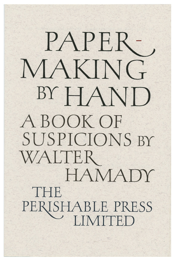
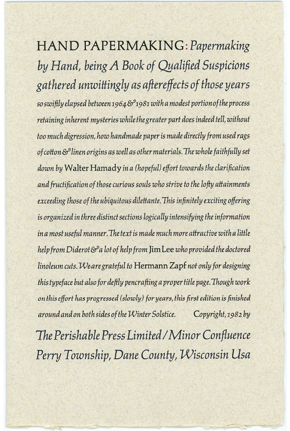
Hamady and the Perishable Press was the subject of an article by Alastair Johnston in Parenthesis 27. In it, Johnston relates one of the more curious episodes in Hamady’s work: his book on making paper by hand has two title pages, a calligraphic one by Hermann Zapf, preceded by a typographic one, set by Hamady in Zapf’s Palatino type. They give two different titles for the same book: Zapf’s reads “Papermaking by Hand: A Book of Suspicions”; while Hamady’s says “Hand Papermaking: Papermaking by Hand, being A Book of Qualified Suspicions . . .”
I know both Hamady and Zapf personally, and had heard from each that the other changed the title. From what I knew I suspected Zapf had written the title as given to him and Hamady might have been engaging in a little a posteriori reasoning, but I couldn’t be certain. After all, I know what it is like to be setting metal type in rigid sizes and the words not fitting as you would like, especially in justified lines, as with Hamady’s typographic title page. The temptation to change a little punctuation or even a word or two is great. With Hamady being the author of the book he was setting, the appeal of revising text to fit must have been overwhelming.
I want to add here that both the calligrapher (Zapf) and the printer (Hamady) told me the story with a smile, and each has always maintained a warm friendship with the other. Neither would let a change in title wording get in the way of their friendship, even if there was some pointing of fingers.
In his article on Hamady’s work for Parenthesis, Johnston relates the inconsistency of the wording of the title this way: “Hamady also had Hermann Zapf calligraph a title-page, but Zapf got the title wrong. ‘You can’t tell the world’s greatest calligrapher he screwed up,’ says Hamady, so there is a second title-page.”
As I said, knowing how meticulous Zapf was I suspected that was not the case, but with Zapf having passed away in June of 2015 there was no way of confirming what he had told me; at least until I was doing research in the Zapf archives at the Herzog August Bibliothek in Wolfenbüttel, Germany, for a book I am writing on Zapf’s life and work. There, housed in hundreds of binders, is the complete correspondence between Hamady and Zapf, including the pertinent information about the title page wording.
The first contact between Zapf and Walter Hamady was 23 December 1971, when Hamady wrote to Zapf to tell him how much he loved his Palatino type. Later, Hamady asked Zapf if he would consider creating a calligraphic title page for his upcoming Perishable Press book on hand papermaking, which Zapf agreed to do. Then comes the curious progression with the title page Zapf lettered for Hamady’s book. At first Hamady was unsure of what wording he wanted, writing to Zapf, “I suppose the words ought to be ‘Papermaking by Hand’ or ‘Hand Papermaking,’ whatever is most economical or influential design-wise, ‘by Walter Hamady, The Perishable Press, Limited.’” Wisely, Zapf insisted on getting precise wording from Hamady. Hamady wrote back a few months later, “I guess it is ‘Papermaking by Hand, a manual and book of suspicions by Walter Hamady, The Perishable Press Limited’.” That is exactly what Zapf lettered (except it was decided to leave out “a manual and”– those words appear in neither the calligraphic nor the typographic title page). Sometime afterwards Hamady decided to add a typographic title-page, and Hand Papermaking fit his layout better than Papermaking by Hand, so he set in that way.
As mentioned above, happily neither Hamady nor Zapf harbored animosity towards the other due to this incident; they both laughed it off. Proof of that is the fact that a few years later they worked together on the Sequoia typeface, so obviously there were no hard feelings. In addition, in the early 1990s Hamady printed one of the leaves designed by Zapf for Poetry Through Typography.
But two different titles certainly is a problem for librarians and bibliographers!
Thisarticleisbased onmaterial intheforthcoming book, Hermann Zapf: His Life and Work, tobepublished onKickstarterlaterthisyear. Theauthorgratefully acknowledgesthecooperationofHerzog AugustBibliothekinWolfenbüttel, Germany, wheretheZapfarchiveisheld.