
Leonard Baskin (quoting many authors), Flosculi Sententiarum (Northampton, Massachusetts: Gehenna Press, 1967).
Just for fun, in my fifth and final issue as editor of a North American issue of Parenthesis, I thought I’d tell you about the favorite fine press book in my collection. Its title is Flosculi Sententiarum. Though I took four terms of high school Latin, I cannot tell you what that means, but the online Latin-English dictionary I used said “florets of thought,” which is playful, especially when compared to the English subtitle, “Printers Flowers Moralised.” The Oxford English Dictionary says that to moralize is “to interpret morally or symbolically.” It takes both languages to convey the subtleties of the title.
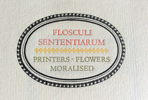
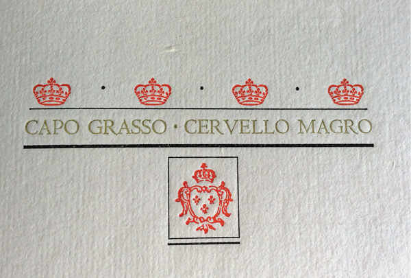
Each spread of the book has a slogan written out in Centaur capital letters on the recto. The type is small, probably none over 16 point. Various languages are used (even a few in English) and interpreted with printers’ flowers arranged around it; either two or three colors of ink are used. For example, “CAPO GRASSO – CERVELLO MAGRO” (“fat heads, lean brains” in Italian) is topped by four crowns and underlined by a small shield, perhaps suggesting an anti-royal sentiment.
There are two reasons this is such a wonderful book, and their names are Leonard Baskin and Harold McGrath, for this is a production of the Gehenna Press in Northampton, Massachusetts. Baskin is an incredible designer and clearly a wit. And just about nobody has ever succeeded in printing as well as Harold McGrath. As the colophon says, “The ornaments were arranged by Leonard Baskin. Harold McGrath was the pressman.” The paper in this 1967 edition is a handmade French sheet from 1905! The ornaments are said to have been collected by Bruce Rogers.
My copy is in the plebian marbled-paper binding, but 50 copies (roman numerals I through L) were bound in leather by Arno Werner.
For the linguistically impaired among us, translations of the slogans (and a few attributions) are provided just before the colophon.
The book was produced in 1967, when “form follows function” was in the ascendant, and ornament was decidedly out of fashion. So it was determined to add a theoretical argument for ornament, supplied under the slogan Humani Nihil a me Alienum Puto (“nothing human is alien to me”). By now the pendulum of opinion has swung back, and ornament is everywhere, so today the argument seems superfluous, but it will still be in the book when the pendulum has swung back and ornament is again denigrated.
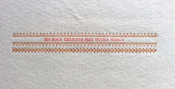
The relation between the slogan and the art is sometimes subtler than other times. For example: “KEIN MENSCHMUSS MUSSEN” (translated in back as “No man is compelled to be compelled”). There is a vertical group of ornaments, to which a crossbar is attached. Do we have an empty hangman’s setup? The tiniest arrangement is for the slogan that translates to “a fly does not enter a closed mouth.” The saying which translates “justice by all means but not in my house” shows a female head in a cameo topped by a floating crown.
It seems to me that the formula for this book encapsulates exactly what the “fine press” book offers that no other art form can: the combination of historic crafts (paper making, ornament, and typographic design and production, incredible presswork) with wit and meaning.
I may be ending with this magazine, but I’m not giving up the love of these books.