
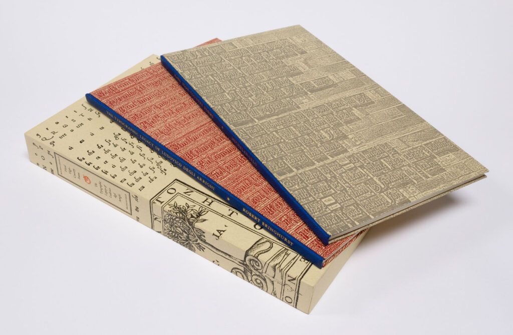
Michelangelo Buonarroti Simoni, Hard High-country Poems, translated by Robert Bringhurst. Robert Bringhurst, The Typographic Legacy of Ludovico degli Arrighi, Peter Koch Printer, 2015.
This is a two-volume set. The first consists of ten poems by Michelangelo, presented in both the Italian and in English translation, all sharing a connection to the woman Robert Bringhurst describes as ‘the sculptor’s late, great love… his spiritual sister and perhaps his closest friend’, Vittoria Colonna. Both books are set in Arrighi and its variant Vicenza – either by hand, hot-metal, or digitally and printed from polymer plates. The choice is significant, in that the type’s source of inspiration, the scribe, printer, publisher and type designer Ludovico degli Arrighi, would probably have been active in Rome at around the same time as Michelangelo was working on the Sistine Chapel, and would almost certainly have known Vittoria Colonna. The second volume describes for us Arrighi’s aesthetic landscape and the arc of his unfortunately short-lived career in printing, probably fatally terminated by the invasion of Rome by forces of the Holy Roman Empire in 1527, before moving on to the twentieth-century creations of the type that bore his name. Both volumes are printed by Peter Rutledge Koch, assisted by Jonathan Gerken.
‘It is hard to imagine the typographic culture of twentieth-century London, San Francisco, or New York without Monotype Centaur and Arrighi,’ says Bringhurst. In truth, the slightly earlier foundry version of Arrighi was far better than it had any right to be – on the face of it a Fancy-Dan, pretentious attempt to channel the DNA of the script of a papal scribe to carry the words of the incumbent British poet laureate, Robert Bridges, in a slim, expensive volume of poetry, The Tapestry. It was in essence a vanity project – apart from the fact that it needed to make some financial return on its outlay. Yet what resulted was what Bruce Rogers would later call ‘one of the finest and most legible cursive letters ever produced’. In this he was referring to Monotype’s freshly-minted Arrighi Italic of 1929, but the description could equally be applied to the original incarnation of 1925.
The first Arrighi recutting continues to exercise a fascination and to cast its spell, over 90 years after its first appearance. Part of this mystique might be due to its fluidity of identity. The first version had barely borne ink before its co-instigator, the equally shape-shifting Frederic Warde, had decided to create a second, modified version. Then only a couple of years later, the face was redrawn again, this time at the suggestion of Bruce Rogers, to partner Centaur in the Monotype listings, losing much of what was distinctive about it in the process and, by stages, its very name.
Yet Arrighi still insists on our attention. It has an effortless beauty on the page, flamboyance combined with control, a hard act to pull off. In terms of visual appeal, any design in which you use it is already halfway there. Any shortfall in quality will be your responsibility alone.
The mystique – possibly – and the ill-feeling, definitely, associated with the type, can be ascribed to the presence in its story of Warde, who seemed similarly to disappear from view, both physically, dying shortly after turning 45 in 1939, and in terms of his reputation. The ill-feeling was provoked by the additional presence of Stanley Morison, typographic advisor to what was still called Lanston Monotype in Britain, and Warde’s wife Beatrice. The atmosphere around the type was intensified by the breakup of the Warde marriage. One explanation for this was, bluntly, that Morison stole the affections of Warde’s wife. This is Warde in a letter to Hans Mardersteig in 1927, on his former creative partner:
as I had for some time been ignored and forgotten in the arrangements which both [Morison] and Mrs. Warde have made, I now would make it quite plain that I would insist upon being entirely forgotten for the future. I refused very positively to have anything to do with any of their affairs. Morison admitted that he had treated me very badly and unfairly, and that he had not done the right and fair thing with me at London, and that he was very weak and had no back-bone, etc. etc. I merely laughed at him, and said goodbye to him, and left him. He certainly knows what I think of him and his tricks, and hope he will not attempt to bother me any more.
In the mid-1980s things flared up again. Herbert Johnson’s article ‘Notes on Frederic Warde and the true story of his Arrighi type’ appeared in the journal Fine Print in 1986, and accused Morison of trying to rewrite the facts in subsequent reminiscences and squeeze Warde out of any significant role in the story. John Dreyfus, in what became over the years his self-appointed role as guardian of Morison’s reputation, countered the following year with his ‘A rejoinder and extension to Herbert Johnson’s “Notes on Frederic Warde and the true story of his Arrighi type”’, on behalf of what he emotively termed ‘my dead friends Stanley Morison and Beatrice Warde’. Johnson had described Frederic Warde as having been ‘duped’ and ‘deceived’, and widened his criticisms to Morison’s general presentation of his career and his achievements. This was too much for Dreyfus to allow to pass unchallenged, slipping in some personal barbs of his own along the way.
Designers, printers and type aficionados occasionally like to pretend that their interest lies purely in the creative contributions and legacies of those involved, but in reality most are no different to humanity in general. We love this kind of stuff – add a personal dimension to Arrighi’s intrinsic merits, and you have type history dynamite.
The beginning lay in Morison’s 1924 visit to the United States. The impression he made on his fellow enthusiasts there was at best mixed, avoiding some who wished to meet him, and quarrelling or behaving with extreme lack of grace with some who did. A haven was provided by the deft manoeuvre of Beatrice Warde, employed in the American Type Founders’ library, who got in quick to offer Morison the hospitality of her and husband Frederic’s home. There at least, harmony, understanding and probably mutual attraction flourished, to the extent that Morison persuaded the Wardes to throw in their current employments and head to the UK. He was later to paint Warde as ‘good with his hands’, essentially his practical assistant.
The high point of their period of collaboration, which was over by the middle of 1926, was the Arrighi typeface. Morison had been circling Arrighi the man in articles he had contributed to The Fleuron, and had a copy of the book, a 1524 Arrighi production, to whose type they would look for inspiration, the Coryciana of Blosius (or Blossius, as Robert Bringhurst opts for here) Palladius. He also sought out the subject matter for the type’s first use: poems by Robert Bridges, with whom Morison had struck up a friendship. Warde seems to have conducted the correspondence and contact with the Parisian company given the task of cutting the punches, G & H Plumet, and would later state that he had paid for the face’s production. Its first appearance in The Tapestry was in late 1925. Warde then spiritually moved Arrighi to mainland Europe, specifically to Hans Mardersteig’s Officina Bodoni in Switzerland, whose production values and printing he rightly considered superlative. Much credit for Arrighi’s quality must be given to the punchcutter Charles Plumet, who seems to have been handed Morison’s Coryciana and told to work from what he found there.
With Mardersteig, Warde produced a second book, The Calligraphic Models of Ludovico degli Arrighi, surnamed Vicentino, which reproduced pages of Arrighi’s writing manuals alongside an introduction written by Morison and set in Arrighi. The title page and colophon, where Warde asserted the ownership of ‘his’ type, featured the modified version, later called Vicenza. In November of 1925 Warde had written to Daniel Berkeley Updike of the Merrymount Press in Boston: ‘That the italic will not look wild, due to the pear-like turn at the top of the ascending characters, I think it will be much better to have the five ascending lower-case characters re-cut – in fact I have these in hand now…’ This version would debut fully in Crito: a Socratic Dialogue by Plato, the first of four books Warde produced for his own imprint, The Pleiad.
Warde now, in his letters, began to assert his rights to the type, clearly determined that people should not be under, as he saw it, the false impression that it had anything much to do with Morison. Warde had previously been assistant to Bruce Rogers at the New York printer and publisher William Edwin Rudge, and Rogers was now working on an edition of John Drinkwater’s poem Persephone, which Rudge would publish in 1926. He was using his ‘foundry’ version of Centaur, and had the idea of using Arrighi for italicised sections. Here he made two faux-pas, one stylistic, the other to have approached Morison about using the type. In March 1926 Warde wrote to Rogers:
I have just received Morison’s letter about your request for use of some of ‘my’ Arrighi type. I say ‘MY’ in order to make it clear that the punches, matrices and type are, and have been from the beginning entirely mine and fully paid for. The idea was mine … All Morison did was to provide encouragement and useful criticisms while the punches were being cut; and, of course, he has a hearty interest in the type because it revives the letter, to some extent, of his much adored Ludovico Vicentino.
Warde, trying now to make a go of it in Paris as both publisher, designer and printing consultant, saw Arrighi as part of his intellectual and financial capital. It proved hard to sell. His assertion to Henry Watson Kent of the Metropolitan Museum, who had bought the type, that he didn’t want to sell any to the Merrymount Press ‘or anyone else’, was mere face-saving: Updike had baulked at the price. Eventually, in late 1934, back in New York, out of regular employment and financially in very low water, Warde sold the punches and matrices to the Museum.
Robert Bringhurst gives us a thorough and detailed presentation of Arrighi’s story, from its inception to where it stands today, culminating in rueful reflections and comparisons of the respective natures of metal and digital type. ‘Real type is better than imitation type’, he tells us, ‘because its own weight and substance tend to rhyme with the weight and substance of real poetry and prose.’ He has examined all the characters and variants, and applied a Holmesian eye to the matrices and punches, now in the Cary Collection at the Rochester Institute of Technology. In doing so he comes up with fascinating insights and food for thought. He says that ‘much that appears in Warde’s correspondence … was wish-fulfillment through fiction’. Most of Warde’s letters are actually highly factual, but in respect to Arrighi, they do indeed become hazier. As well as avoiding naming Charles Plumet, whom he terms simply ‘my punchcutter’, he wrote to his great confidant William Kittredge of Chicago’s Lakeside Press in March 1926 that he had ‘three working alphabets in type. Soon I shall have a fourth alphabet which I can use with the other three’, and told Updike and George Parker Winship that he was having a roman face cut to partner Arrighi.
This was surely his intention, but beyond this, Warde needed to keep up the image of himself as someone making a huge success of his move to Europe. He clearly felt himself to have made a jump ahead of people in America whom he admired, such as Updike and Kittredge, by getting into the heart of things. Should you want type cut cheaply, a rare book on Claude Garamont, or something looked up at the Bibliothèque Nationale, Warde could manage it for you – because he was there.
Warde spoke in his letters of how Plumet’s eyesight was troubling him, and that he had had to take rest. Robert Bringhurst tells us that Plumet was beginning to send customers to his former student Charles Malin, but completed the Vicenza characters, all bearing his stamp or looking to be from the same steel, and by the same hand. But, in explaining to Henry Watson Kent in May 1926 why his type order was only just ready to be shipped, Warde said that the punchcutter, who had promised to finish the punches and some recuttings of the Arabic numerals, was not able to do this, ‘so I had to find another punch-cutter who lived out of the city of Paris’. Unless this is a fabricated excuse, it sounds as though someone else was involved somewhere along the line. If this was, despite his Parisian address, in reality Malin, it would at least provide some excuse for Morison’s later statement that Malin had cut the type – he of course shared a first name with Plumet, which might have contributed to an honest error, if that is what it was.
Robert Bringhurst interprets this misattribution as Morison’s actual ignorance of who had been commissioned to do the work, deliberately ‘kept … in the dark about what was happening in France’ by Warde. I would be interested to know on what he bases this. The Morison/Warde relationship was in this period on its best footing. It seems hard to imagine why Warde at that stage would have wanted to conceal details of the type’s production – Morison does not seem to have ever contested his right to use it – nor, sharing an office, would he easily have been able to.
Another mystery: Ernest Ingham, manager of the Fanfare Press, where The Tapestry was printed with his assistance, sent the printer Will Carter a proof in 1948 of the type he still held, which included Vicenza fl and ffl ligatures, to the author’s knowledge never used anywhere by anyone; nor are the punches and matrices known to exist. Why were they sent to London rather than to Warde in Paris or at the Officina Bodoni? Robert Bringhurst suggests that the typefounders ‘found Warde difficult to reach or unresponsive, and shipped the sorts to London in the hope of being paid’. It is these and so many other little uncertainties that make Arrighi such a fascinating subject, worthy of the continuing attention because it is such a beautiful face.
The first volume of the set, Hard High-country Poems, with its intaglio portrait of Michelangelo by Joseph Goldyne, is an equally beautiful and fascinating production, though the price is probably a deterrent to many who would like to own it.
126 sets in a slipcase, US$900.
Peter Koch
www.peterkochprinters.com
Simon Loxley has edited and published ‘Believe Me, I Am’, a collection of 135 pieces of Frederic Warde’s correspondence, which includes many related to Arrighi. A copy can be had by contacting him at www.simonloxley.com