
Everything began rather more than ten years ago, with a new visual identity [1] that we designed for the Hessisches Landesmuseum in Darmstadt (HLMD). We both run independent design studios, but occasionally join forces for large-scale projects, particularly in the cultural sphere, bringing in architects and other specialists when necessary. Christof Gassner, born in 1941, studied at the Kunstgewerbeschule in Zürich, and Katrin Holst, born in 1971, at the Hochschule in Darmstadt, and the Royal Academy in The Hague.
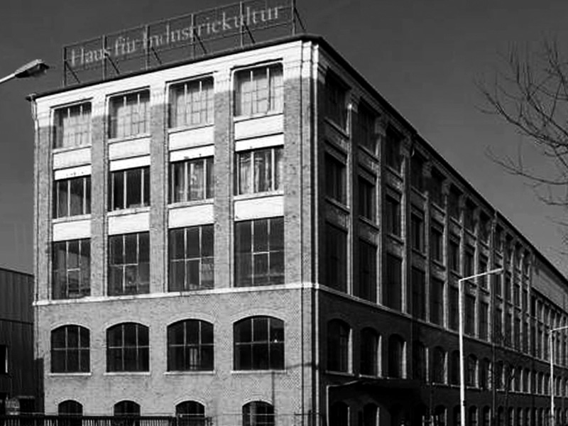
The HLMD is one of the most recently established multidisciplinary museums in Europe, and the Haus für Industriekultur is one of its departments. The building [2] was originally constructed in 1905 for the Ludwig Alter furniture company. High quality furniture was made in the workshops, to designs by such well-known Jugendstil artists as Albin Müller, Peter Behrens and Joseph Maria Olbrich. The business closed in 1929, and the building was put to a variety of uses, such as a distribution centre for Opel cars, before being bought by the Haus für Industriekultur Verein (Association) in 1991, with financial support from the city of Darmstadt. The Association was set up in 1985 with the aim of preserving and showing to the public the legacy of the industrial period of printing machinery that was being superseded by electronic technology. After the Association had lost the support it relied on until 1999, the Haus für Industriekultur was adopted in 2001 as a department of HLMD. The collections, which the Association had taken on in 1986, consisted in large part of the equipment of the famous typefoundry D Stempel AG of Frankfurt, which had ceased trading in 1985. This consisted of type, matrices, trial castings, punches, patterns and casting machines.
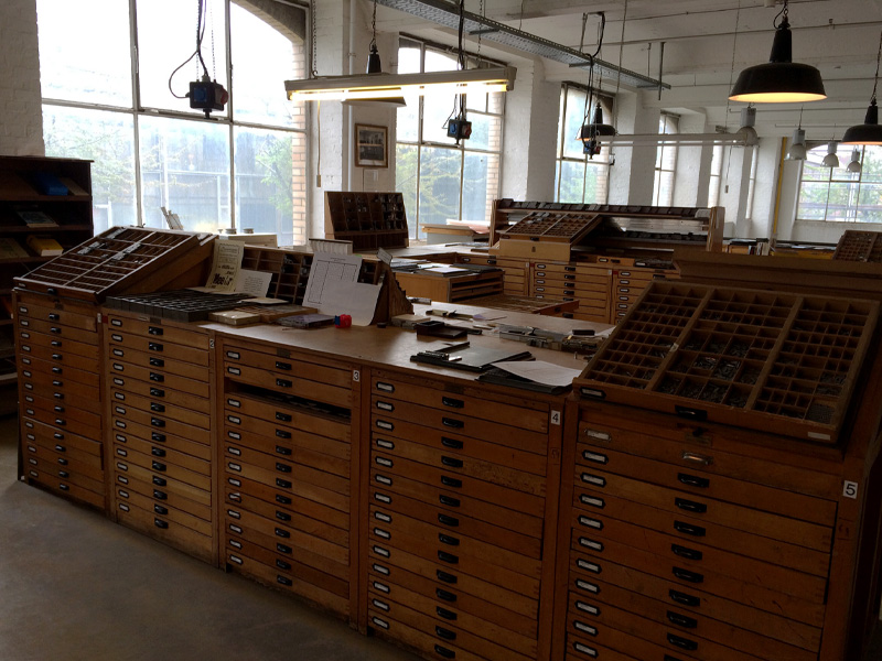
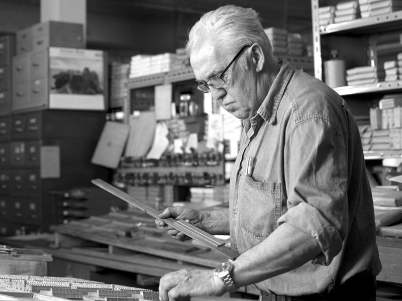
In the working section [3], volunteer typesetters and printers demonstrate the many machines that are still operational, showing the transition from hand work to mechanisation from the beginning of the nineteenth century up to the 1970s. The workshop shows typecasting, hand setting, machine setting, historic printing presses, intaglio and lithography. On the third floor we find Rainer Gerstenberg [4], one of the last surviving European type casters, at work.
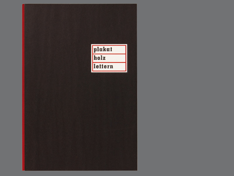
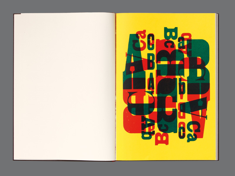
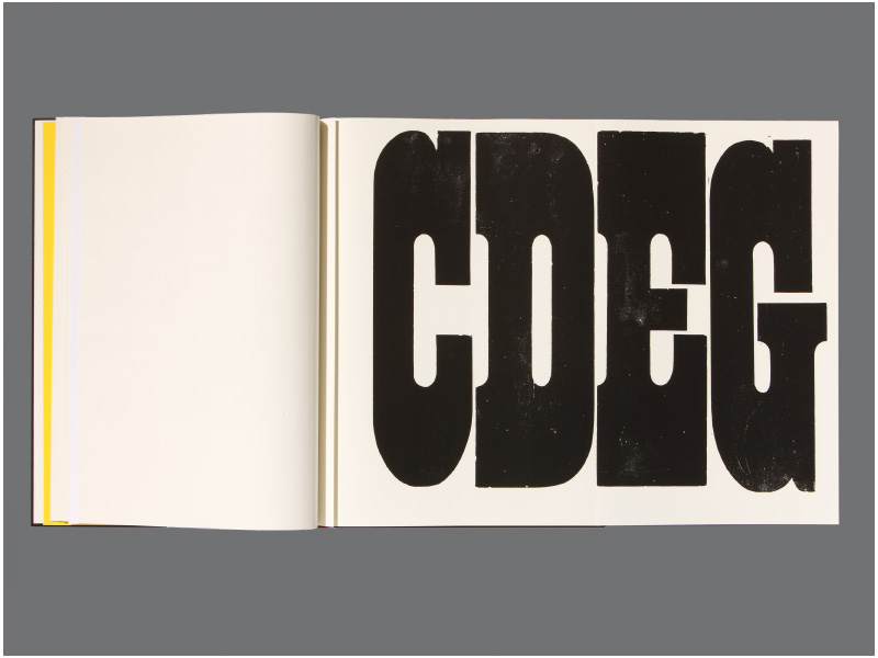
The first book produced by the workshop in 2011 was plakat holz lettern (‘poster wood letters’) [5] in an edition of 60 copies. In it are shown many examples of display letters from the collection, some of them very idiosyncratic, including slab serif and sans serif faces, and also Tuscans, Jugendstil and Art Deco types and brush letters. There are 24 different poster types in the book, displayed on six separate colour pages freely laid out [6]. Shown here [7] is a slab-serif type, with an x-height of 94 lines or 42 cm, the largest size in the workshop. These letters consist of typemetal sheets mounted on wood supports, and in this example their close fit shows the way the non-printing interior and dividing spaces are an important part of the appearance of the type.
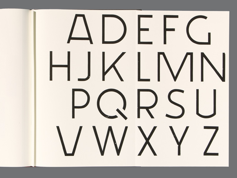
This page [8] shows an unusual sans-serif, made on a very wide body with generous amounts of space each side, so that the unconventional shapes of some of the letters (note especially the Q) have room to breathe.
The publication of plakat holz lettern was a big success, and the book won several prizes. Above all, the team of compositors and pressmen in the workshop were pleased and proud to have taken part in it. And so we began to plan a second book, and to wonder how to give it a new unifying theme. We decided to look into the history of Darmstadt and its culture, and assembled a number of interesting, though often contradictory, quotations on the subject. We went back to the fourteenth century, and ended in the present, and ranged from the composer Weber, who was bored here, to the poet Ferdinand Freiligrath, who thought it a paradise on earth. We found a writer, Hans Erich Nossack, who was critical of Darmstadt’s best known landmark, the Jugendstil Hochzeitsturm, designed by Olbricht to commemorate the wedding of Archduke Ernst Ludwig in 1905. Erich Kästner described the destruction of parts of the city during the Second World War; and we even considered the local culinary product – Liebig stock cubes. Having considered the whole subject, we settled on our texts, a selection of which is shown here.
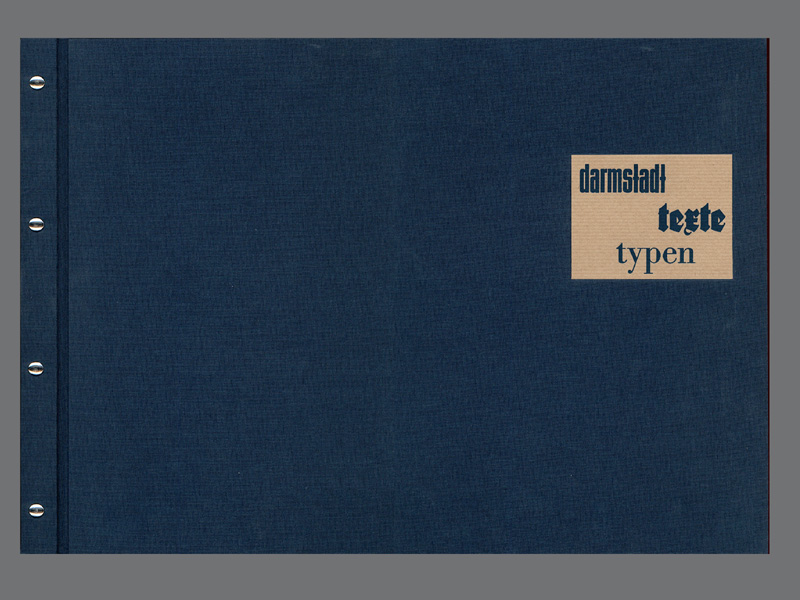
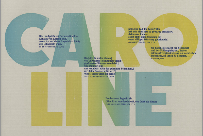
The new book, darmstadt, texte, typen [9] appeared in 2014, in an edition of 100 copies. In the 1770s Darmstadt was a meeting place of Enlightenment intellectuals, Goethe, Wieland and Herder among others, drawn into the circle of Johann Heinrich Merck, the naturalist, essayist and military quartermaster. The circle was supported at first by the Countess Caroline, but unfortunately her husband was not of her mind – he was interested only in soldiering, and so the circle moved on to Weimar. For our page on Caroline, our printer was keen to try out split duct colour printing, so that the colour changes across her name [10]. Testimonies to her virtues are overprinted: the one from Wieland says, ‘The Countess of Darmstadt would be queen of Europe, if I were ruler of our destiny just for a moment.’
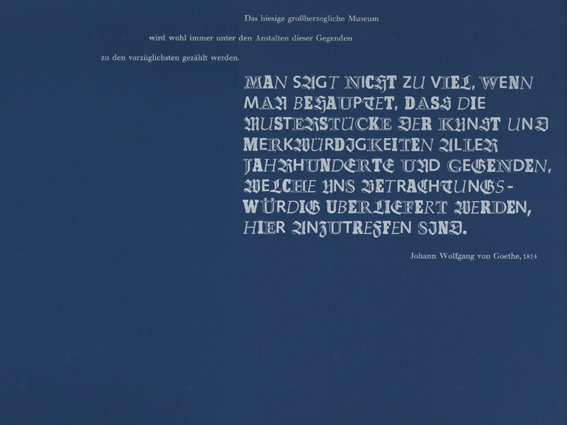
Writing about the examples of works of art in the Darmstadt museum, Goethe wrote, ‘It is not an exaggeration to say that examples of art and curiosities from all centuries and places, handed down to us as worth our attention, can be found here.’ We expressed the variety of the exhibits by mixing types, with Wilhelm-Klingspor-Schrift for the Middle Ages, Trump Gravur for the Renaissance, Beton for the industrial nineteenth century, and Syntax for the present day. Palatino italic did duty for the whole prints and drawings department. Truly, this was a typographical Cabinet of Curiosities [11].
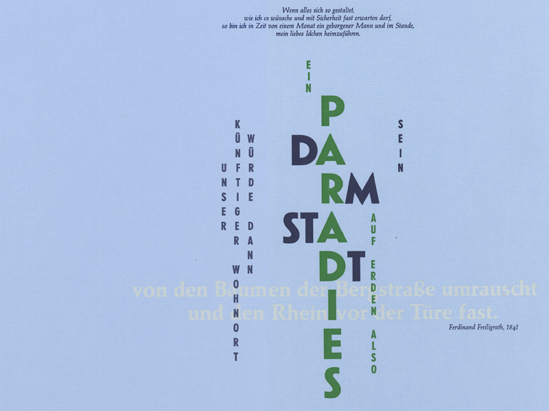
Ferdinand Freiligrath’s praise for the beauty of the city found a simpler graphic expression [12]. He wrote of his ambitions: ‘If everything works out as I hope, and I am almost sure that it will, in a month’s time my position will be secure and I will be able to bring my dear little Ida home with me. Our future home would then be a paradise on earth.’ (His hopes were to be disappointed. Soon afterwards, his political activities in the lead up to the 1848 revolution meant he had to go abroad, to Belgium and then England.)
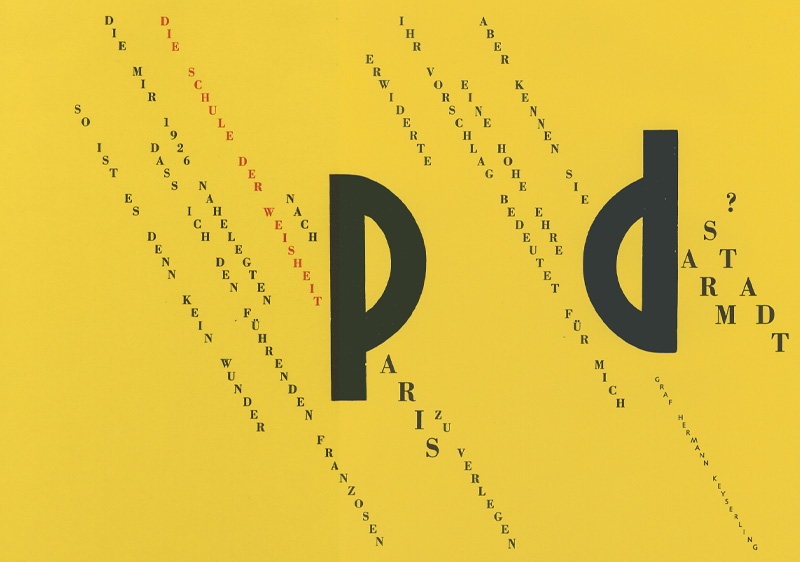
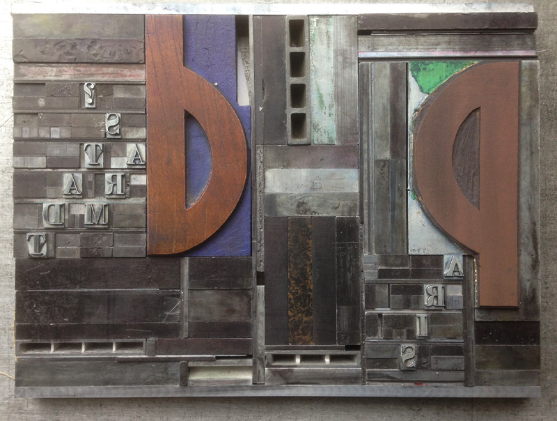
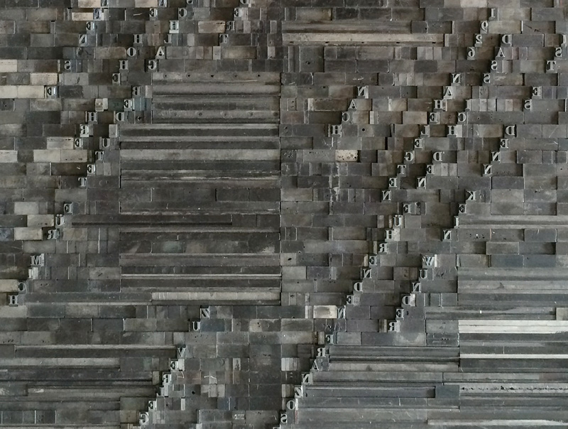
The philosopher Count Hermann von Keyserling founded a School of Wisdom in Darmstadt in the 1920s, and in 1926 was invited to move the School to Paris. He wrote, ‘It is not surprising that when in 1926 some prominent Frenchmen suggested that I move the School of Wisdom to Paris, I replied that such a suggestion was a great honour for me, but did they know Darmstadt?’ This plate [13] shows the confrontation of the two cities – ‘Paris and Darmstadt eye to eye’ – with a visual reference to Apollinaire’s famous calligramme, ‘Il pleut’. It involved a great deal of skill on the compositor’s part to assemble this page [14, 15].
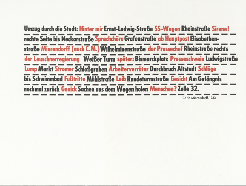
In 1933 the Social Democrat politician Carlo Mierendorff was arrested by the SA and force-marched by a gang of them through Darmstadt. In his diary, he gave a terse itinerary of his ordeal, and in the following entry an impression of the voices, sounds and sensations he heard and felt. In our version [16], the two entries are combined, intensifying the experience of violation and rejection.
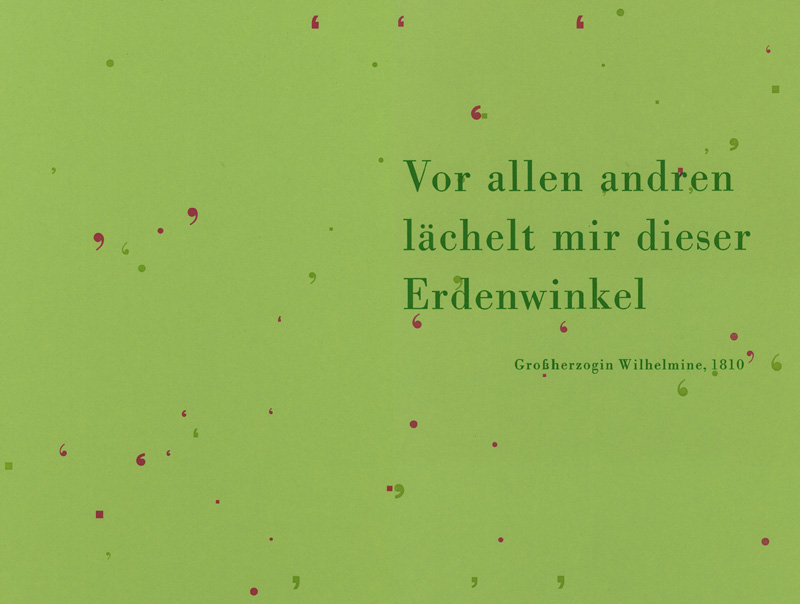
A pastoral interlude [17]: Wilhelmine, the wife of Archduke Ludwig II, laid out the Rosenhöhe landscape park in 1810. Together with the Mathildenhöhe park, the Jugenstil houses and the Hochzeitsturm, the ensemble makes a unified Gesamtkunstwerk. The Duchess wrote, ‘This corner of the earth smiles upon me like no other.’
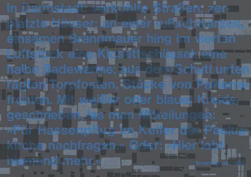
Ernst Kreuder, born in 1903, was a writer who won the Georg-Büchner Prize in 1953, but afterwards was almost forgotten – a condition from which he is now emerging. In 1945 he wrote a vivid description of the ruins of Darmstadt, with streets of burned-out houses and, hanging on a fourth-floor wall, a chamber pot. Using some of the cracked and damaged backs of wood letters, we created a ‘typographische Trümmerlandschaft’, a vista of ruins in type [18].
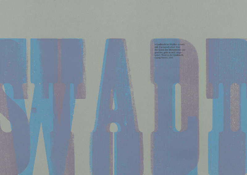
Georg Hensel, a writer with a prescient interest in ecology, in 1951 reversed the description of Darmstadt as a city in the forest, imagining the forest to be in the city. Using the two words ‘stadt’ and ‘wald’ in wood letter, we overprinted the reversed word [19].
And finally we complete the circle with Hermann Zapf, who died in 2015. In 1948 he became the artistic director of the Stempel foundry, and in 1972 he came to live in Darmstadt. He had been invited by the Princess of Hesse to come to start a private press, but this project came to nothing for financial reasons. Zapf stayed on. ‘I had several chances to go to live in the USA,’ he said, ‘but it’s so beautiful here.’ He found the scale of the place sympathetic, and liked its lack of self importance. So, what would a typeface called ‘Darmstadt’ look like? A tricky question. ‘A typeface should really give an impression of something definite, and Darmstadt says too little to me for that.’
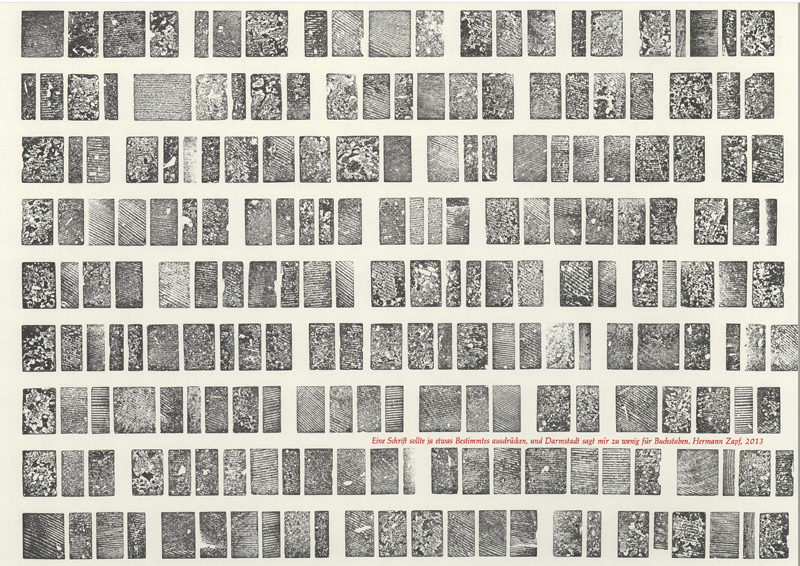
And so we have printed his statement from the undersides of the types [20].