
Though he cringes to hear it, Jim Rimmer has become a legend. Like his boyhood hero, Tom Sawyer, Jim loved to build rafts made of logs tied together with vine sinew, then — to his parents’ horror — take his friends sailing on British Columbia’s Fraser River, a mere hour upstream from the Pacific Ocean. Years later Jim still gives people things to marvel at, though many of the stories you hear about him sound as though they cross the line between fact and fiction. Like the time his press fell from the back of a mover’s truck, knocking the head of one of the crew. Jim, who had been standing by, leapt to rescue the press, stepping over the injured mover in the process. Or the time, in an experimental mood, he forced an inked cedar bough through his Vandercook to print the paper sides of his Poems of Pauline Johnson. Or the time Serif magazine gave him an award for his design of Amethyst but went out of business before it could publish the results.
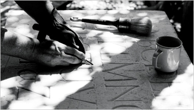
Jim Rimmer carving his Duensing Titling in marble in his New Westminster garden. Photograph by Suzanne Ahearne.
The legend of Jim the craftsman is as amazing as the legend of Jim the character. Among his peers in Canada and abroad he is revered for his artistry, his uncanny ability to solve hard technical problems, and his dedication to the printed word that goes beyond a mere love of printing. All of these qualities are manifest in his most recent work, a limited edition of The Adventures of Tom Sawyer that he is completing at his Pie Tree Press in New Westminster, BC, a short drive from Vancouver. For the book, Jim created a new typeface to be used on the Monotype composition caster. The face is called Hannibal Oldstyle, and the making of it adds yet another story to the Rimmer legend.
This story begins over twenty years ago. At that time Jim was working as a freelance commercial artist doing jobs that, as he admits, paid the bills but left little to show for his enthusiasm for illustration, letterpress printing, and book design. And so Jim resolved to create something enduring, an edition of his favourite book, The Adventures Tom Sawyer, that would include his own illustrations and in which the text would be set in one of his own faces. Twice during the early 1980s he set a portion of the book, and twice paper costs forced him to abandon the project.
Two books did issue from the press in the meantime: Shadow River:The Selected and Illustrated Poems of Pauline Johnson (1997) and the book for which he is best-known, A Christmas Carol (1999). These projects gave Jim such a taste for bookwork that he retired from his long career in commercial graphics to devote his energies to publishing and type design. In his words, ‘For 50 years I did salsa packages. Now it’s my turn.’ Then, on the morning of 31 December 2001, while ‘messing about’ in his workshop, Jim found an old flat mat of Goudy Thirty. He had nothing to do that day and decided to see if he could solder some brass to it and cast it on his Monotype composition caster. The experiment worked. If he could make one sort, he thought, he could make 80 — then he’d have a fount.
It’s worth noting that the Monotype composition caster has not seen a new typeface since Gauthiers Series 811 was cut by Monotype for the Imprimerie Nationale in 1978. Those familiar with Monotype machines and their myriad mechanical limitations will know that a homemade face for the Monotype comp caster is something that has never been attempted. ‘I was astounded when he told me what he was going to do,’ said friend and fellow typefounder Paul Duensing on hearing of Jim’s plans for Hannibal. ‘My feeling was that if it hadn’t been done before, it couldn’t be done.’
Jim, a perennial optimist, took the opposite view of the matter. ‘If you don’t know you can’t do it,’ he says, ‘you’re ahead of the game.’ Shortly thereafter, Jim was looking through his drawings and found a recent letter design that he believed would respond well to the text of Tom Sawyer. He rendered the hand-drawn letters as a digital font before engraving them in metal. This allowed him to dummy the book on his computer and facilitated his cutting of the punches. First he printed out each letter in a large point size, then cut the letters in Bristol board to make master patterns. He traced the master patterns with the stylus of his pantograph to engrave metal working patterns, which were used to scale the patrices to 18 pt. In four months Jim had a fount of Hannibal ready to print. (This is nowhere near his record: Jim engraved the patrices for his Nephi Medieval in eight days.)
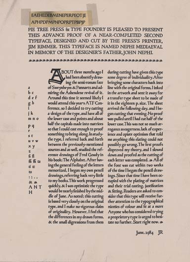
An advance proof of Jim Rimmer’s second typeface, Nephi Mediaeval. Pass your cursor over the above image for a detail.
On seeing proofs of the type, Duensing was forced to revise his earlier opinion. ‘When [Jim] works on a machine, the machine comes alive and does what he wants it to do.’ Punchcutter Stan Nelson of the Smithsonian Museum in Washington, D.C. was amazed at Jim’s accomplishment. ‘There have been no sets of mats justified so carefully and fit into a Monotype diecase with corresponding wedge, stopbars and key bars so that text could be keyed and cast with Monotype casting machines. No one else has tried it and that says something about Jim’s accomplishment.’ Dan Carr, proprietor of the Golgonooza Letter Foundry, was equally impressed. ‘Jim’s success in creating an original design for use on the Monotype is a stroke of genius.’ There can be no mistake that Hannibal is a mechanical tour de force, but this fact will mean little to most collectors, as it is incidental to the finished book. For the non-technical, Hannibal is a soft, friendly type with a good weight to it. ‘It has nothing extraordinary about it. It’s a very plain type,’ Jim says. ‘I was very conscious when I designed it so that it wasn’t exhibitionist or over-the-top or ornamental. It’s only got a few little quirks here and there like the lowercase g.’
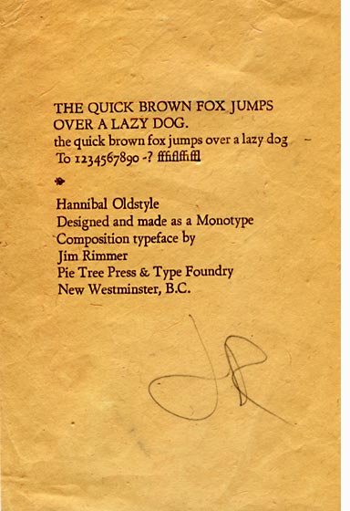
Preliminary proof of Jim Rimmer’s Hannibal Oldstyle.
Carr describes Jim’s type designs, including Hannibal, as ‘personal in every beneficial way and universal enough for wide use by other designers.’ For now, Hannibal – named after Mark Twain’s Missouri birthplace – doesn’t have an italic. Since Hannibal was designed to fit in a Garamond roman die-case, Jim has used Garamond italic where required. The result is an even-paced line of good colour. Hannibal enthusiasts may sleep easy knowing Jim is planning an accompanying italic for an edition of Huckleberry Finn to follow the release of Tom Sawyer. But the question remains, why go to the trouble of creating a new face when he has so many others at his disposal? ‘I could have cast [Tom Sawyer] in Garamont but anybody could do that. I wanted the type to be special because I love the book so much.’
Not only will each letter be a considered part of the book, the layout, illustrations, printing, and binding will all be carried out by Jim as well, making Tom Sawyer one of those rare books in which the soul of the maker is expressed in every detail. Tom Sawyer will be issued as an 11 by 15 inch folio. The text will be printed in 18-point Hannibal Oldstyle and 60-point Duensing Initials on Mohawk Cream in an edition of 120 copies. For the book, Jim has created nine full-page lino-block illustrations – some having as many as 15 colours — and 55 illustrations in the colour of the Mississippi at Hannibal — a milk-chocolate brown. The regular edition of 100 copies will be case-bound with a quarter-linen spine and printed papers over boards. The 20 copies of the deluxe edition will be halfbound in leather and set in a clam-shell box.
As if casting 1000 pounds of type, cutting over 200 linoblocks, and printing the book were not enough to keep Jim busy, he has just completed cutting in metal Carl Dair’s Cartier, a photocomp face issued for Canada’s centennial in 1967. Says Jim, ‘I like to have something to digress on. It doesn’t hold you up. It just keeps you fresh on what you’re doing.’ Will the type be offered for sale? Jim shakes his head. When a founder starts casting type for others, his own cases tend to stand empty. Cutting Cartier was done for the love of the face. Only a few founts will be cast for private distribution.
Jim has also been collaborating with Robert Bringhurst on cutting a fount of Cree syllabics, a set of characters developed in 1841 by James Evans, a Methodist missionary, to evangelize the Cree of northern Manitoba. Evans was the first Canadian to cut type, and he did so with the crudest of tools: he carved the moulds with a knife, cast type from melted musket balls, made ink from chimney soot, and so on. It is easy to see why such a character appeals to Jim, whose invention of useful tools for complicated tasks is legendary. Paul Duensing tells about the time, some years ago, when he learned that Jim had been using a sharpened upholstery needle stuck into a wine cork to engrave his patrices. He was flabbergasted. Soon after, Duensing visited the Stempel Type Foundry and told the engravers there about Jim’s unorthodox engraving tool. ‘They shook their heads in disbelief,’ says Duensing, ‘and gave me a mint-condition set of proper European engraving tools to give Jim.’ A few months later, Duensing called Jim to see how the new tools were working. ‘[Jim] told me he hadn’t the nerve to use them as they were too pretty. They were still in the wooden box in mint condition. He continued to use his needle and cork.’
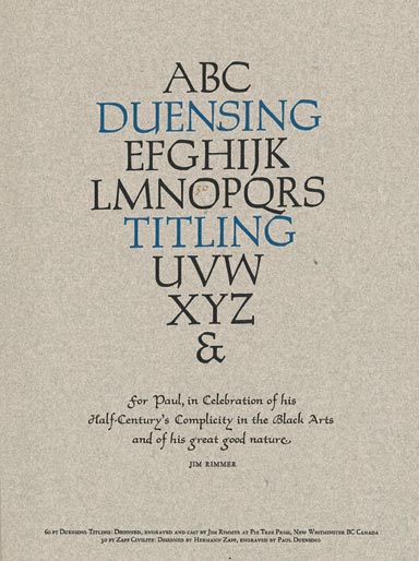
A specimen printed in Duensing Titling.
Jim shrugs off praise as easily as he shrugs off burns from errant squirts from his Thompson caster. In fact, praise unsettles him a little. ‘There has been so much interest in me and my work in the past year that it makes me suspect I’m going to be taken out by a falling tree, or a bus, or a beautiful actress.’ During the past twelve months he has held court at the annual ATypeI Conference; he has given dozens of tours of his pressroom and type-foundry – mostly to graphic designers, students, and emissaries from Special Collections departments. DA, A Journal of the Printing Arts dedicated its spring/summer issue to Jim’s career and includes an article written by Jim dealing with his work on Cartier. Jim has also instructed a young art-school student in the craft of engraving type: the man cut punches for and cast Victor Hammer’s American Uncial in a single semester, the third person in Canada ever to engrave type (the second being Jim himself). Jim has also been promoting, albeit haphazardly, his first catalogue of original and revival digital type designs. On top of this, he has been the ongoing letterpress consultant on the set of a wild-west TV drama, making very real the possibility of a sexagenarian printer’s being taken out by a beautiful actress.
‘All the things you do add up to who you are,’ he likes to say. And in Jim’s case, that makes him something of a legend.
Paul Razzell works assiduously at the Inferno Press, which he founded a few years ago while working as an editor.