
Mervyn Peake. Peake’s Alice: Mervyn Peake’s Drawings. Libanus Press, Marlborough, 2002. 330 x 222mm, 124 pp, illus., h/b.
Lewis Carroll. Through the Looking Glass and What Alice Found There. With fifty-seven illustrations by Franciszka Themerson. With a Foreword about Franciszka Themerson’s drawings by Jasia Reichardt and an Afterword by Graham Ovenden. Inky Parrot Press, Church Hanborough, 2001. 270 x 180 mm, 122 pp, illus., h/b
Lewis Carroll Through the Looking Glass and What Alice Found There. Illustrated by Nicholas Parry. Tern Press, Market Drayton, 2001. 288 x 200 mm, 184 pp, illus., h/b.
‘In both his life and his work Peake was an original — eccentric, unworldly, witty, widely popular, notably attractive to women, and also sturdily independent of the literary and artistic movements of his day . . . throughout life a bohemian.’ Given that Mervyn Peake was such a sensual and political man, we must admit that it is a surprise that his illustrations to the Alice books came out the way that they did.
Zephire Books of Stockholm commissioned him to illustrate Alice’s Adventures in Wonderland and Through the Looking Glass in 1945 and published it in 1946, the same year that his pen and ink drawings for Maurice Collis’s Quest for Sita appeared. Perhaps it is fortunate that his line drawings for this work, unshaded and unembellished with cross-hatching, of naked contortionists and female acrobats did not influence his depiction of Alice. His friend Graham Greene felt that ‘your Alice is a little bit too much of a gamin’. We should be thankful for small mercies.
Mervyn Peake
We should, perhaps, also be grateful that his recent experiences sketching the horrors that he had witnessed in the liberation of Belsen were not reflected in his interpretation of the sometimes sinister aspects of Carroll’s Alice stories. Also in 1946, Peake’s novel Titus Groan, was published after six years’ work.
There is no doubt, though, that the times of rationing and economy had their effects upon the process and production of the book and subsequent editions. Peake did a hundred drawings for the project of which 67 were used for the original Swedish publication. Many of them were on wartime cellulose-based papers: some were stuck down unevenly on boards. Normally, this would not matter: drawing for book illustration allows a different approach from drawing or painting for exhibition. For the latter, the finished work has to be of high quality and with no imperfections: for print, the art-work has simply to provide a clear image for the camera. Hence, the work may be corrected, erased, re-drawn, painted or scraped out, even pasted over — the process will iron out all the discrepancies. As we shall see, though, this left a legacy that was to cause problems later.
Sir John Tenniel
Mervyn Peake
Franciszka Themerson
Post-war austerity and politics also had their effect on subsequent publishing. For copyright reasons, the Swedish edition was not for sale in Britain or America and it was not until 1954 that publisher Allan Wingate got permission to produce the book in London. At that time, 29 of the original drawings were not available and had to be reproduced from the Swedish edition. In addition, some of the illustrations had to be redrawn by Peake in order to accommodate the coarse paper that was used. Later editions simply exacerbated the problems. Peake’s illustrations have never been reproduced in a form worthy of them — until now.
In 2000, Bloomsbury Publications, setting out to publish a two-volume edition of Peake’s version of the Alice stories, called on the expertise of Libanus Press to restore the original illustrations. In the almost fifty years since they had first been completed, Peake’s drawings had deteriorated further. Acid breakdown in the cheap paper had resulted in browning and a loss of contrast between the pen line and the background; Peake’s technique of scraping parts of his work with a scalpel to reduce contrast and tone, particularly in cross-hatched areas, had left scuffed patches where the raised paper fibres had collected dust and debris.
Modern computer technology allowed the drawings to be scanned at very high resolution, and in colour, to obtain as much digital information as possible. The background colour could then be removed, each drawing receiving individual attention and adjustment according to the paper and its degree of discoloration. The information could then be converted back into the black and white that was originally intended.
With constant reference to the original drawings, fine lines that had deteriorated could be restored, and the artist’s own retouching and whitening out maintained. In order to maintain a consistency throughout the whole portfolio, the entire restoration was completed by one person, Heather Oliver. During the course of the work, she became very familiar with Peake’s style and techniques.
The published Bloomsbury volumes, attractive as they are, are a small format and most of the illustrations are reduced from the originals. Libanus Press have done what many of us have been hoping for for some years and reproduced them at their original size. They have been printed with excerpts from the text to act as captions for each drawing. I think I would have liked the book to be complete and it does seem a little cheapskate not to provide the whole text for what is, after all, an expensive book. It does mean, though, that the illustrations have been positioned on the page to show them to their greatest advantage and with plenty of space around them to avoid distraction.
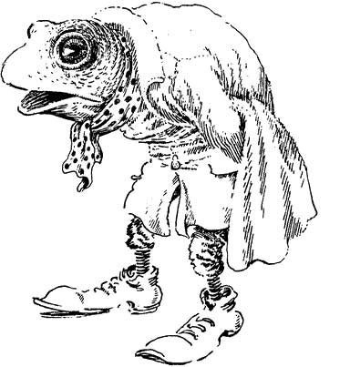
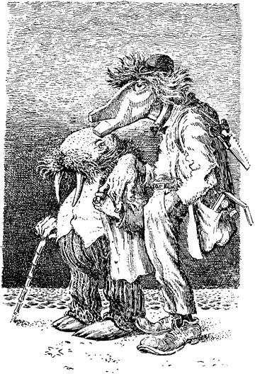
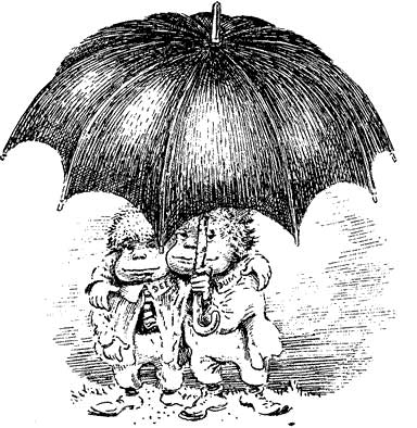
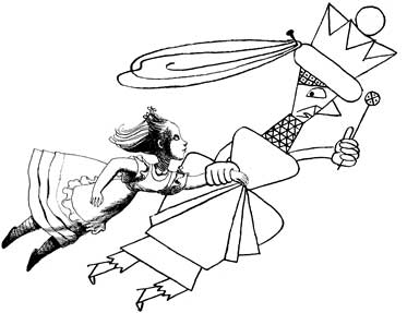
Perhaps for the first time, we are able to enjoy Mervyn Peake’s interpretations of Carroll’s characters. His Cheshire Cat is threatening and sinister, the Tweedles are an awful reminder of the dangers of in-breeding; the White Rabbit scowls down the corridor annoyed at his own lateness; the Lion is more pissed off at having to fight such a scruff of a Unicorn than he is worried about losing, and Haigha’s Anglo-Saxon attitudes are the epitome of high camp. And Alice? I think Graham Greene was right.
Mervyn Peake
Franciszka Themerson
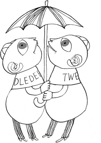
At almost exactly the same time, 1946, Franciszka Themerson was commissioned by Harrap to illustrate Through the Looking-Glass and What Alice Found There, presumably in readiness for when the book fell out of copyright two years later. Even though the blocks had been made, Harrap decided not to go ahead with publication. The explanation, such as it was, was a ‘difficult market situation’, perhaps a fear of an explosion of new illustrated editions as had occurred in 1907, when Alice’s Adventures in Wonderland had emerged from copyright. In the event, the deluge did not take place, possibly as a result of the post-war austerity and rationing that had dogged Mervyn Peake.
Sir John Tenniel
Mervyn Peake
Franciszka Themerson
Franciszka Themerson was born in Warsaw in 1907 into an artistic family. Her father, Jacob Weinles, was a painter of large-scale tragic-heroic scenes from the life of the Jewish community, her mother was a pianist. Her sister also became an artist. Franciszka first studied music at the Warsaw Academy of Music and then, from 1924 to 1931, painting and graphic design at Warsaw Academy of Fine Art.
In 1931, she married Stefan Themerson and began collaborating with him not just on book illustration and production but on experimental film-making. In 1937, they moved to Paris. When war broke out, Franciszka began work as a cartographer for the Polish government, escaping to England in 1940. During the next two years, when she was separated from Stefan, ignorant of his whereabouts and unable to communicate with him directly, she embarked on a series of autobiographical drawings, ‘Unposted Letters’. Even here, her interest in the works of Lewis Carroll revealed itself. One drawing, ‘Alice in Wonderland’, depicts herself as a child, bewildered and solitary, wandering amid the hardware and nonsense of war. Stefan joined her in London in 1942.
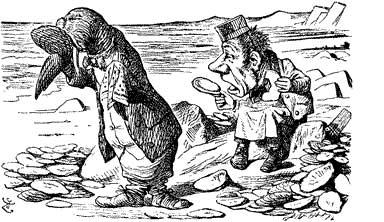
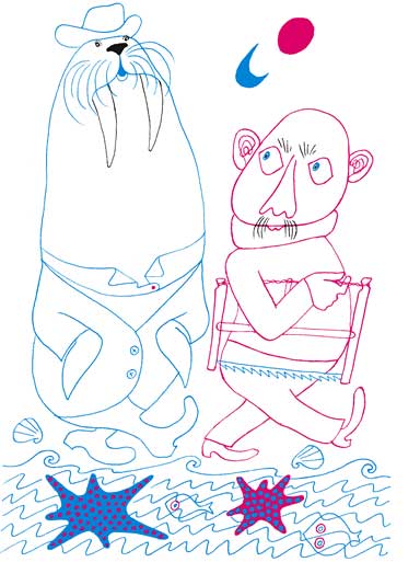
Franciszka’s drawings of the post-war period, the middle to late 1940s, reveal the effect that the hostilities had had on her work. She explored a diverse range of styles while she sought her own personal way of artistic expression. The drawings for her Looking-Glass, for instance, are more controlled and precise than her looser but more biting illustrations for Jarry’s Ubu Roi, first attempted only two years later. Looking-Glass has the studied inventiveness of line that one finds in the work of Paul Klee: Ubu Roi owes more to the political invective of Georg Grosz. Alice is portrayed in black line referring back directly to Tenniel’s engravings, contrasting with the flat, two-dimensionality of the other characters in the story, printed in soft red or blue outline (to depict the red or white of the chess pieces). Unexpectedly, the hard, precise line and cross-hatching of Alice makes her appear softer and more vulnerable against the almost pastel hues of the other cast members. Although the drawings appear childlike, this deceptive simplicity is based on consummate draughtsmanship. The drawings are designed to complement the text, the perspective and viewpoint carefully chosen to fit and extend the page.
Care has been taken in the design of the book and the presentation of the images. Alice climbs through the mirror from one page to emerge onto the next, an indulgence seldom recognised in Tenniel’s early editions and even less often repeated since. The value of space has been recognised. Although avant-garde for their time, the drawings can now be seen as very much of their time.
It does have its good points. The typeface, 14 pt Caslon, is a good choice, clear and comfortably readable, carefully set. Carefully, but not meticulously: the apostrophe at the beginning of ‘Jabberwocky’ is the wrong way round: ‘Twas instead of ‘Twas — you cannot blame the mirror for that. The Whatman paper is also good, bright and substantial, although the uncut fore-edge almost gives it the air of that thick war-time paper used in annuals.
Ultimately, though, the book is let down by the illustrations. We are told that the model for Alice was ‘our Grandaughter [sic] Isabel and the scenes set at Stobhall, Perth’. Well, that may be cosy for the family, but I am not sure that Isabel will thank them for it in future years. The lithographs seem to me to be more about the granddaughter and Stobel Park than about Alice.
Nicholas Parry
Alan White was a librarian and is Chairman of the Lewis Carroll Society.