
The world of pop-up books is smaller than most people imagine. There are only a few dozen artists and paper engineers creating commercial movable books and most of us are on a first-name basis. Noncommercial book artists who work with pop-up formats make up an even smaller circle. Despite the small size of the contemporary movable book arts field, very little information has been compiled for the use of researchers, collectors, or other interested parties outside the profession. As a commercial paper engineer with a background in movable artists’ books and a position teaching paper engineering at Pratt Institute, I have been closely following this field for the last 15 years. What I’m attempting here is an informal (and very personal) survey of some outstanding contemporary pop-up book artists and a discussion of their work. It is my hope that this article can serve as an introduction to the exciting microcosm of movable book art and lead to additional scholarship in the future. In selecting the 11 artists included in this survey, I applied the following criteria: The artist had to be a practicing professional with an exhibition history and new work dated within the last five years. The artist should identify primarily as a book artist and not as a commercial book designer or paper engineer (it should be noted, however, that some of the featured artists have successfully crossed over to commercial production). Each artist’s work had to be handmade, with an edition of 250 or fewer. Printing, cutting and finishing services could be outsourced or part of a collaborative effort, but assembly of the books had to be done largely by the artist. As a result, several excellent self-published pop-up art books mass-produced by outside vendors have been excluded here.
Julie Chen
For more than 25 years, Julie Chen has been producing exquisite limited-edition artists’ books under her Flying Fish Press imprint. Chen has been an art educator throughout this period and is currently an associate professor at Mills College where she teaches five courses on book arts.
I am most impressed by her attention to the craft and construction of her book objects. Chen speaks about her intense focus on the materiality of her pieces as she incorporates traditional techniques of hand bookbinding and letterpress printing on fine paper with modern laser cutting to produce her movable elements. Her pieces are often presented in custom enclosures ranging from classic clamshells to structurally complex geometric cases found in works like Chrysalis. These containers physically embody her interest in creating a world within a world where her bookworks can be fully appreciated. In her artist statement, Chen stresses that, “For me, the physical object itself is of equal importance to the visual and textual ideas expressed within the pages in conveying meaning and presenting the reader/viewer with a compelling experience.”
Beyond the fine craftsmanship of the work is Chen’s ability to incorporate seamlessly various three-dimensional book forms to explore her personal narratives. One is always pleasantly surprised to view her new work, if only to see how her latest themes and concepts have been manifest. I credit this to Chen’s interest in exploring the time-based aspects inherent to the book form. She speaks to the fact that the full content of a piece can only be revealed over time with the full participation of the reader, and it is this personal engagement with the readership that most fascinates her.
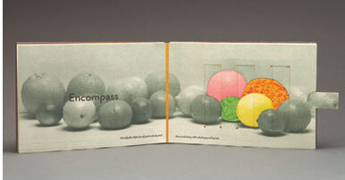
Looking back at her past editions, she appears to investigate a new book format in each of her works, moving fluidly and confidently between countless structures such as carousel books, flap books, decks of cards, and pull-tab mechanisms, the last exemplified in her Praxis (Illustrated). Chen employs these different organizations of content in conjunction with mapping, charting, and numbering to bring order to these expressions of personal experience. This masterful interplay of form and content allows her work to stand out in the growing artists’ book field.
Dorothy A. Yule
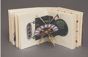
In 2004, I participated in a group exhibition called Stand and Deliver: Engineering sculpture into a book format, which showcased some of the most inventive and engaging movable artists’ books then current. This was the first time that I came across Dorothy A. Yule’s gemlike movable miniatures. Ten years later, I fell in love with her work all over again when I had the honor of presenting her with the 2014 Meggendorfer Prize for Artist Books at the Movable Book Society Conference. This was not the first time that Yule’s Memories of Science claimed an award and one can see why.This petite pop-up book about the artist’s introduction to the worlds of astronomy, chemistry, and biology measures 2.75 inches high by 2.875 inches wide. It features multiple pop-up elements that she alternates with letterpress printed verse in an accordion fold structure that allows the viewer to stretch the book out, evoking the expansion of the universe itself. Yule goes beyond the Mohawk Superfine paper to add delicate materials such as felt embroidery, silk threads, and brass charms, not to mention the tasteful custom box and music CD inspired by the book.
Yule has been creating limited-edition book works under her Left Coast Press imprint since being awarded her Masters in Book Arts from Mills College in 1989. Her themes draw mostly from autobiographical sources with an emphasis on the major milestones that serve as common human experiences. She notes that her imagery and references are influenced by the notion of childhood and “the magical psychology of early fantasy.” She desires for her book structures to transport the reader back in time to those early emotional spaces. She writes, “There is at each book’s core an idea and a structure and both are like the formal gift packages of traditional Japanese culture, wrapped again and again in layers of elaboration and refinement. My books tend to be small to emphasize their personal and intimate nature and to reinforce the intimacy of book and reader; they are best held and explored spatially as well as visually.” In a landscape dominated by proclamations and press releases of the latest technical doodads, it is comforting to learn that a reader can find an intimate space to make a connection with the artwork and printed word. These books, wrapped in Yule’s “layers of elaboration and refinement,” prove that big ideas can come in small packages.
Carol Barton
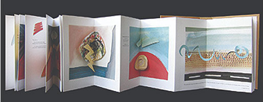
Carol Barton has been publishing limited editions of movable artists’ books since 1983. Over the years she has explored themes of language, travel and architecture through such forms as tunnel books and pop-ups with embedded lights like her ghostly Five Luminous Towers. She often interweaves personal poems carrying the thread of her themes and referencing the pop-up elements. Barton’s latest offering, which she considers her most ambitious work to date, takes the viewer through floating pop-up landscapes in an accordion book that, when unfolded, measures over 12 feet in length. “Land Forms and Air Currents is my most recent artist’s book,” she says, “and it has brought me back to my original artist’s role as a painter…. Of all my books to date, this one probably reflects my sensibilities most fully. I’m happy to be painting again.”
When Barton is not painting or creating artists’ books, she is devoted to her time as a curator and art educator. She holds numerous college faculty positions in the Washington, D.C., area and conducts workshops for adults and children alike. Her three-volume instructional The Pocket Paper Engineer is an excellent how-to manual for learning about paper engineering and has been on the suggested reading list for my Pratt Institute students since the first volume was published in 2005. I appreciate the pedagogical impulse that runs through her work, as she shows readers how to make simple pop-up projects, then publishes thoughtful artists’ books as proof that simple dimensional structures can communicate complex ideas.
Colette Fu
Years ago, I was participating in an event at the wonderful independent bookstore in Manhattan called Books of Wonder. Ellen Rubin, a collector and scholar known to all as “the Popuplady,” came up to me with a quiet young woman carrying a large portfolio under her arm. With a sly grin this recent graduate from Rochester Institute of Technology unfolded an oversized spread depicting a vibrant explosion of pop-up commercial foods. This was the moment that I knew Colette Fu was going places.
Fu is one of the very few artists creating pop-up books based on her own photography. She is also not afraid to go big. She once designed a pop-up in Shanghai that measured 8.2 x 16.4 feet and stood over five feet high. Her Return to the Land of Deities, which is a more modest 17” x 25” open spread, uses photos of glyphs employed by the Naxi people to address themes of reincarnation and human connection with nature. About her process, Fu has written: “Constructing pop-ups allows me to combine intuitive design and technical acuity with my love of traveling as I try to understand the world around me. With pop-up books I want to eliminate the boundaries between book, installation, photography, craft and sculpture.”
Fu is best known for documenting Chinese ethnic minorities and creating elaborate single pop-up spreads that reflect minority cultures as part of her “We Are Tiger Dragon People” series. In her continuing focus on creating books that reflect on how individuals relate to the wider society, Fu developed the “Haunted Philadelphia” series and the Chinatown North Zodiac Project, both addressing local history and community.
Helen Hiebert
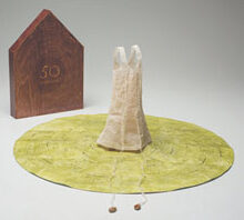
I remember walking into a darkened room at the Pyramid Atlantic Art Center and standing mesmerized by the video installation of Helen Hiebert’s Water Paper Time. We all know that watching paint dry is a boring way to pass your time, but watching Hiebert’s handmade paper come to life as it dries was a study in ethereal motion. It should come to no surprise that the person behind this film would produce equally magical and delicate bookworks such as 50 Revolutions. In a recent statement, Hiebert shared what this new piece means to her: “50 Revolutions represents the fifty revolutions I’ve taken around the sun and my evolving thoughts on motherhood. Both projects stem from the bouts of isolation and inadequacy I feel as a mother, so again I reached out to my community seeking fifty words about mother/motherhood and realized how similar the journey is for all of us.”
While not strictly a pop-up book like her earlier works, the ringed Tyvek book that serves as a platform for the handmade abaca leather paper dress uses a map fold pattern (found in some paper-engineered books) to fit itself into the custom wooden box. In the world of artists’ books, where deviation for the normal codex is a point of pride among creators, this still falls within the realm of movable books.
Hiebert’s deep interest and investigation of papermaking and paper structures pervades all her projects, both artistic and instructional. For those looking for more traditional examples of her pop-up formats I recommend the funky Alpha Blocks set of cards, the playful Pop Up Hand Shadow stage set and the calming Cosmology single sheet book structure.
Paul Johnson
I recall the time Paul Johnson visited the art studio where I worked carrying what appeared to be a stack of intricately hand cut paper sheets dyed in a rainbow of reds, greens, and yellows. Vibrating pen lines delineated figures, landscapes, and houses appearing on the front and back of each piece of paper. With a few deft moves, Johnson presented an array of accordion books, stage set pop-up scenes and miniature pop-up books that fit snugly in the palm of your hand. I was overwhelmed with these whimsical creations.
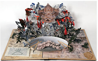
A decade later, I came across his work again when Johnson was the keynote speaker at the 2014 conference of the Movable Book Society.Now he appeared with even larger stacks of more colorful cut paper. To the “oohs and aahs” of attendees, Johnson popped open his large sculptural carousel pop-up book titled Old Mother Hubbard on Wheels with a theatrical flourish. His dimensional artists’ books are special in that they do away with the typical paper folds found in most pop-up books and instead use an assortment of paper dovetails, joints and hinges to join all the sections. These slots and hinges allow for Johnson to quickly create and disassemble his 3-D interpretation of classic folk songs and stories. When asked about his work, Johnson remarked, “My inspiration is 13th century European religious art and the art of South East Asia. My themes are drawn from juxtaposed traditional story characters like Old Mother Hubbard and Jack and the Beanstalk.”
While I do not know of many other British pop-up book artists, the younger designers that I have met appear influenced by his tireless educational work through his Book Art Program and fifteen titles addressing book arts and literacy. I am confident that in the years to come, a new generation of imaginative book artists will emerge, weaned on Johnson’s books, workshops and fanciful pop-up creations.
Emily Martin
Emily Martin has created dozens of movable artists’ books in the past twenty years through her Naughty Dog Press imprint and she has taught numerous book arts courses at the University of Iowa for just as long. Martin’s works include a wide variety of printing, binding and construction techniques, which exemplify her interest in the intersection of the book as an art form with the traditional craft of bookbinding. Much of her work is drawn from autobiographical sources as Martin explores themes of family, language, relationships, and the passage of time with her characteristic playfulness and wit.
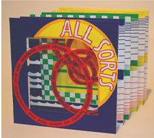
All Sorts is based on Martin’s archival research of thousands of Florida citrus crate labels during an artist residency at the University of Florida, Gainesville.The nine-inch tunnel book structure was chosen to reference both the common label size and the physical fruit crate. Martin learned the subtle language of the citrus labels, noting that the quality of the citrus fruit could be determined by the primary color in the label designs. Design patterns like checkerboard and blatant motifs such as alligators and rings were often used to entice the wholesale fruit buyers at market. Throughout the piece she links a descriptive vocabulary that defines people in a positive, negative or neutral light, in what I interpret as a commentary on how language and labels can be a means of manipulation.
Shawn Sheehy
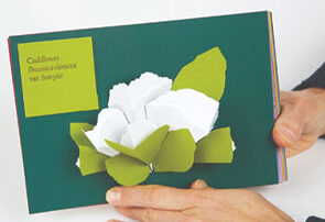
When I first met Shawn Sheehy we were both budding paper engineers eager to share our early creations. We sat down at a table and swapped pop-up books. It was quickly apparent that his playful compositions were constructed out of cereal boxes–an innovative use of a humble material. Since then, he has produced numerous pop-up artists’ books in increasingly sophisticated fashion. Long gone is the cheap cardboard and in its place is handmade, hand-dyed cotton/abaca paper or fine commercial card stock. The hand lettering has given way to thoughtfully set letterpress printing. What has not changed is Sheehy’s message. All of his artist books focus on humans and their interactions with nature and the often-hazardous results that occur. He focuses on the real and imaginary organisms and ecosystems and brings them to life in complex three-dimensional tableaus. In consideration of the pop-up book medium, Sheehy states, “Pop-up books have the power to cultivate unsuspecting audiences. Widely considered a novelty, they attract the attention of adults and children alike, and provide a forum for exploring ideas relevant to all.” Speaking of cultivation, Sheehy’s recent artists’ book titled A Pop-Up Culinary Herbal introduces paper sculptures of commonly grown vegetables that are paired with a blend of accurate and fictitious listings that endeavor to help cure us of our modern day ills. Sheehy tends to let the various dyed papers define his color palette and often reserves ink for the quasi-scientific text. Be warned, his edition sizes tend to be small, like the format of this 6.5” x 4.5” book, so tracking one down can be as hard as spotting an endangered species.
Kevin Steele
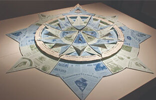
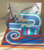
I was first introduced to Steele’s work at the 2010 International Exhibition of Movable Artist Books at 23 Sandy Gallery in Portland, Oregon. His Movable Book of Letterforms garnered the Best of Show prize for unique books. Looking at the exquisitely crafted book, it was no surprise to learn that he was trained as a graphic designer. Steele’s great color sense and strong type skills were matched by purposeful pull-tab and pop-up mechanisms that produced a solid marriage of content and form. I was even more blown away by the product of his MFA Thesis two years later. In Steele’s words, “The Deep is a tribute to maritime folklore and tradition developed over centuries of nautical exploration. The ocean, which remains immense and mysterious in our own time, was all the more enchanting and terrifying to sailors in an era when being at sea meant a profound isolation from civilization in oft uncharted waters and dangerous passages.”
This work can be read as a sort of trapezoidal accordion fold book, but its real form is revealed when the circular pop-up book unfolds to a massive compass rose. At roughly 5.5’ in diameter this artists’ book requires ample space to spread out. Again, Steele showed his masterly command of composition as he designed creative text blocks and illustrations representing the advice and lore passed down from generations of intrepid sailors.
Philippe UG
The New York Antiquarian Book Fair is a great place to go to see examples of amazing historical movable and modern pop-up books. For the past decade, I have been visiting the booth of La Boutique du Livre Animé from Paris. Each year, Thibaut Brunessaux and Jacques Desse parade an endless stream of remarkable French pop-up books. Many are fine examples of commercial antique books by Meggendorfer and Kubašta, but more often it is the bold and charming movable artists’ books from this current generation that catch my eye. My first year visiting the fair I fell in love with Dancing Robots by one of my favorite French book artists, Philippe UG (pronounced “Ooo-Jhay”). His early titles featured vibrant saturated serigraphs that were hand-cut and assembled into compositions that hinted at vintage pop culture references. Cities clad in 8-bit graphic bricks sprouted up from the page while numerous clunky robots traversed across fractured landscapes in multiple books. UG’s later works swapped screen printing for colored cardstock to create more organic subjects such as birds and nature – a move that gave him much critical success. His latest book, Fuk, returns to his roots to take the reader through five pulsating visions of the 2011 Fukushima Daiichi nuclear disaster site. His neon color palette is a perfect match for the chaos of swirling water and toxic waste. Recently, UG has been focusing on bringing his art style to commercial publishing houses, but I hope that the energy and excitement found in his handmade artists’ book continue for a long time to come.
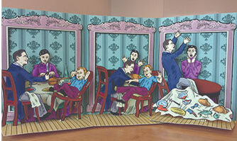
Marianne R. Petit
The charming Struwwelpeter Museum in Frankfurt, Germany, houses examples of Heinrich Hoffmann’s classic cautionary tale and its countless parodies. If you have not been to visit the modest location, I encourage you to go next year when Marianne R. Petit will have a solo exhibition showcasing her multiyear book project that springs Peter and his unfortunate friends off the page. Petit cycles through carousel, accordion, tunnel and stage set book formats to find the best manner to present the gruesome tales, with some of the titles in the series featuring embedded electronics. In 2010, I saw her lovely interpretation of Shockheaded Peter at 23 Sandy Gallery and was impressed with the presentation and attentive considerations of what form would best serve the content. Building off that initial work, her latest artists’ book employs a similar hinged stage set format to provide a frame by frame look at Fidgety Phillip. Like her other titles, this is digitally printed with archival pigment ink on Hahnemühle or Canson papers.
Marianne R. Petit splits her time between the East Coast of the United States and the East Coast of China. For many years she has taught pop-up structures at the Interactive Telecommunications Program (ITP) program at NYU and the Interactive Media Arts (IMA) program at NYU Shanghai. These creative programs serve as a sort of incubator lab where her highly motivated students blend elements of communication, media and emerging technologies to develop projects that exhibit a synergy found in her own work. In her (not so) spare time, Petit also collaborates on pop-up artists’ books like Feud with the mysterious artist duo, Ephraim & Sadie Hatfield.
Final Thoughts
There is little in the way of scholarship and criticism in regard to pop-up and movable books. Part of this is the stigma of being represented as a commercial novelty product or kiddie book by twentieth-century publishers. The explosion of artists’ books in the 1970’s gave rise to a subset of book artists that moved beyond the standard textblock to explore the book form in ways that surpassed commercial novelty publishing efforts. To date there is no consensus within the community on the classification of the types of book formats or even the terminology used when describing pop-up and movable elements in a work. Hopefully this will change when articles about pop-up artists’ books appear with more frequency and more scholarship is undertaken. While this survey is by no means exhaustive, I hope that this article can shine a light on the dazzling achievements of a few very talented and dedicated movable book artists.
Artist Information
Barton, Carol.
Chen, Julie.
Fu, Colette.
Hiebert, Helen.
Johnson, Paul.
Martin, Emily.
Petit, Marianne R.
Sheehy, Shawn.
Steele, Kevin.
UG, Philippe
Yule, Dorothy A.