With an enlargement of Nye Bevin’s left eye from a portrait photo by Karsh of Ottowa, partially obscured by a band of yellow paper containing its title in a combination of decorative Victorian wood types researched by Charles Hasler, The First Spring of Peace, A Contact Book burst upon the post-war world in 1945. This series of hardback reviews of current affairs and arts, poised like many publications of that time on the borderline between book and magazine, was the first publishing venture of George Weidenfeld, who published 11 titles in the series before he created Weidenfeld and Nicolson as a more conventional enterprise.
Contact Books are worth revisiting for several reasons. The content is extraordinarily varied, covering politics, economics, arts and society with many famous names as contributors. Lord Weidenfeld writes in his memoir, Remembering my Good Friends (1995), that he wanted to turn his position as an émigré to wider advantage, ‘being with the English but not of the English … I thought that Britain was the most temperate and tolerant of all societies and that her example could help postwar Europe return to democratic government.’ He was working at the BBC at the time, and his aim for the publication was to ‘emulate the best reportage of the New Yorker with an occasional dash of Fortune’, with hope of international co-editions in Czechoslovakia.

A contact with André Deutsch, another émigré who went on to make his mark in publishing, enabled Weidenfeld to gain access to a paper supply through the printer Duncan Mackintosh. Several other well-known names of the time are mentioned – Philip Toynbee, one of the associate editors, was among the most important for his commissioning network. From the design point of view, the significant introduction was to Hubert de Cronin Hastings, the co-proprietor and advisory editor of the Architectural Review. Weidenfeld knew about him through Frame Smith Hastings, his sister-in-law, ‘a devoted friend from the BBC monitoring days’ who herself joined the staff of Contact.
From the late 1920s, ‘H. de C.’, as he was known to his colleagues, had made his magazine both playful and serious in its content. He created a layout style that encompassed the photographic techniques of the Bauhaus, the most outlandish Victorian display typefaces and a variety of paper stock which, even in the conditions of wartime scarcity, included a rainbow of colours. In addition, he aspired to be a social thinker and philosopher, working for years on an unfinished text called ‘The Unnatural History of Man’, in which he attempted to explain deep links between visual perception and the intuitive understanding of life, qualities that he felt the English, especially, had failed to develop and needed to learn.
After the Labour victory in May 1945, the Attlee government introduced a ban on new magazine titles as a way of further rationing paper. Advised by a barrister, John Foster, Weidenfeld called his series Contact Books and did not aim for regular publication dates, so as to disguise its identity as a magazine. He also used the imprint for other titles on current affairs topics, with the first, New Deal for Coal, written by a future Prime Minister, Harold Wilson, a publication that helped Wilson to become Parliamentary Secretary to the Ministry of Works. Hastings had previously used the word ‘Contact’ for a brief presentation at the 1936 conference of CIAM (Congrès Internationaux de l’Architecture Moderne) called ‘Theory of Contacts’, which was a modification of the functional separation of different parts of cities proposed by Le Corbusier in favour of a greater mixture of activities and pathways to allow random encounters. From this, he went on to develop ‘Townscape’ as a polemical proposal for ‘visual planning’ in the tradition of the English picturesque, offering an alternative to the rational grids of streets then being proposed by progressives and reactionaries alike. Townscape became a major aspect of the Architectural Review’s programme from the 1940s, associated above all with the architect and artist Gordon Cullen. Hastings himself, under his pseudonym Ivor de Wolfe, wrote The Italian Townscape (1963) and Civilia: The end of suburban man (1970) as a further development of this idea.

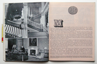
Weidenfeld wrote of Hastings, ‘he shunned human company if he could, hated to look people in the eye, wore Edwardian country clothes and avoided the metropolis as much as possible. … There could not have been two more diverse personalities than the introverted Victorian eccentric and the excitable flamboyant Austrian émigré, but somehow the chemistry worked from the first day. … He saw it as a platform for doing something he could not do in his well-established family journal, and that was to create a new style. He was responsible for the brilliant and bizarre design of the first issues.’ With Contact Books, Hastings was indeed able to exceed even the Architectural Review’s notoriously quirky typography and layouts. In addition to a mixture of pink, blue, cream and coated papers, the typography includes ‘stand-firsts’ set in 18pt Old Style beneath floriated wood type initial letters, with the narrowest of margins, while in other cases 10pt text flows in three or four columns. Victorian decorative borders flourish as if the 1960s were only a few years away. The texts often flow onto the page where the next article begins, inducing the reader to continue. The influence of Picture Post and Liliput appears in some of the picture sequences, such as those showing ITMA comedians at work and ‘Inside the Foreign Office’, showing the workers in the mail room handling diplomatic bags.Hastings’s name appears below Weidenfeld’s as co-editor on the first four issues of what should more properly be called Contact International Series (1946–7), after which he returned to the Architectural Review. Nigel Nicolson joined the magazine as deputy editor at the beginning of 1947. From issue 2, Britain between East and West, F H K Henrion appears as art editor. Among the reviews quoted on the jacket of this second issue, that from the Winnepeg Free Press pays most attention to the physical quality of the book. ‘The layout is interesting, the experiment in combination of type and arrangement succeeds in being both attractive and impressive.’A less impressed observer was George Orwell, whose article ‘Politics and the English Language’ had been turned down by Wiedenfeld and Philip Toynbee, not for any inherent defects, but because they did not think it fitted ‘the purist formula’ of the magazine. In his London Letter for the Partisan Review of Summer 1946, Orwell linked Contact and Future books, describing them as ‘the kind of streamlined, high-powered, slickly got-up, semi-intellectual magazine which you are familiar with in the USA, now beginning to appear here also’. (Future, edited by Marjorie Bruce Milne, was part of an exhibition at the University of Reading in June 2015. It was produced by Adprint and published by Leathley Publications, lasting for four issues 1946–7.) Orwell smeared ‘these new ventures’ with the suggestion that the financial swindler Clarence Hatry was involved in them (categorically denied by Weidenfeld in his autobiography), and suggesting that in the climate of the time, almost any printed reading matter would sell. In his view, the visual emphasis in ‘the kind of magazine in which the letterpress exists round the edges of photographs’ was a sure sign of anti-intellectual popularism, giving ‘the average reader the feeling of being “advanced” without actually forcing him to think’.

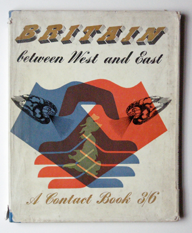
For Britain between East and West, Henrion adapted an Edward Bawden device of the puffing face of a mythological wind among clouds, which also forms the endpapers in blue on the left and red on the right. Bawden also provided a set of line drawings of world cities for short reports at the front and back of the book. In this issue, an article by the sociologists Ruth Glass and Maureen Frenkel on living conditions in Bethnal Green, due for extensive post-war rebuilding, crosses over into the agenda of the Architectural Review, with a striking montage of the Artful Dodger, as depicted by George Cruickshank, and a contemporary photograph, suggesting that Dickens’s character ‘would probably feel quite at home, so little has the district changed in the last hundred years’. In several other articles, there is much tabulation of statistics in the Otto Neurath Isotype style.
As Weidenfeld recounts, Contact had around 3000 subscribers, although even this could not cover the costs, and the business was in perpetual crisis, alleviated by also becoming packagers for the in-house magazines of Unilever and the British Iron and Steel Federation. At the suggestion of Israel Sieff, Weidenfeld diversified into children’s books, with illustrations commissioned through Robert Harling from Mervyn Peake, Charles Mozley, and the Zinkeisen sisters. Weidenfeld adds the name of Ardizzone although, according to Brian Alderson, his memory was at fault here.
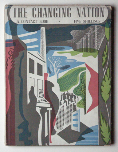
‘In 1948, we decided to formalise our partnership and establish the publishing firm of Weidenfeld & Nicolson’, the memoir concludes. ‘We set out to launch our first list the following autumn. Contact survived until 1951. Then we buried it and became book publishers.’ It was a longer life than might have been anticipated. The last few issues had purely typographic covers, and the visual fireworks inside had dampened down as well. There must be many copies of Contact still on private bookshelves, unless many were discarded, as they are not abundant in the second-hand trade. In libraries, apart from the loss of the important dust jackets, they are poorly represented, presumably owing to the ambiguity over whether they are books or periodicals. Taken as a full set, they are a rich record of their period in word and image.
