
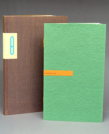
Barbara Henry. Th Playbook. Jersey City, NJ: Harsimus Press, 2014. Printed on Zerkall and Hahnemühle papers, bound by the Campbell-Logan Bindery in full cloth. Designed and illustrated by Barbara Henry. 10.75 x 7.25 inches, 64 pages. Edition of 50 copies. US$400.
Barbara Henry. Th Workbook. Jersey City, NJ: Harsimus Press, 2010. Tacket-stitched pamphlet with handmade paper wrapper. Designed and illustrated by Barbara Henry. 10 x 6 inches, 24 pages. Edition of 47 copies. US$75.
In 2010 Barbara Henry published an unusual book called Th Workbook. In it she postulated that the two letters t and h ought to be combined into a single character, either a ligatured th or a Greek theta. From this description, it is easy to imagine that the book would be an odd Esperanto curiosity, aimed at a few perverse aficionados who really, really like ligatures.
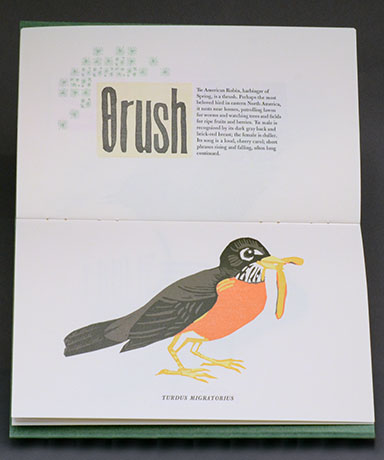
But, as if anticipating the grumblings of more conservative typophiles, Henry begins her book with a text taken from Legros and Grant’s Typographical Printing-Surfaces of 1916, in which the argument for a combined th (as well as the admittedly less useful ng) is laid out in clearly practical terms: from publisher to advertising buyer, compositor to reader, the proposed ligature would result in an enormous savings of both time and money. Draped in this veil of quasi practicality, Henry embarks on a lovely, albeit incomplete, exploration of the book’s generative idea. The short texts in the book are paired with ornamental arrangements and linoleum cuts, two of which are multicolor, full-page birds (both Thrushes as it turns out, or, if Henry has her way, Θrushes).
Despite its charms, though, two elements are notably missing from Th Workbook. The first is a plausible typographic example of what a page would actually look like in this alternate universe. Theo Rehak cobbled together some Th and th ligatures of Bulmer for the project, but they are anorexic and unconvincing. This is a problem in a book whose engine is typographic change, yet somehow it doesn’t diminish the enjoyment of the book. The main problem with Th Workbook is not typography but length—the book ends too soon. It is hard to read it without wanting more.
Enter, Th Playbook. Published in 2014, Th Playbook. is announced in the prospectus as a sequel to Th Workbook, and it immediately presents itself as a more substantial book. This is worth noting because, when the two books are viewed side by side, one learns a little something about their maker—Henry takes play more seriously than she does work. Accordingly, Playbook. is cast in a different light from the outset. As she says in the prospectus: “Setting type by hand, letter by letter, invites reverie, and this book is the result of following the reverie wherever it leads, finding or creating and setting the sorts used for th throughout history, taking an ancient or a new path.” This difference in perspective is echoed in the book’s opening text as well. In contrast to the prattling formulas of Legros and Grant, Playbook. begins with a passage from Jorge Luis Borges’s “Blindness:” “…the Saxons, like the Scandinavians, used two runic letters to signify the two sounds of th, as in thing and the. This conferred an air of mystery to the page…. For that reason … one hears, one sees, each one of the words individually. We think of the beauty, of the power, or simply of the strangeness of them.” These Saxon runes that Borges mentions are introduced into Playbook, increasing the number of Th variants to four: the ligatured th, the Theta (Θ, θ), the thorn (Þ, þ), and the eth (Ð, ð) (though technically the thorn and the eth comprise one variant: the thorn is used for the unvoiced fricative, as in thin; the eth for the voiced, as in the). With her now complete set of alternate characters, Henry sets to play.
From Borges, we proceed to a stanza of the anonymous 14th-century poem, The Pearl, which is set using the thorn and the yogh (Ȝ) (another runic form). This is followed by a brief statement of intent, Θe Case for Θ a setting of Henry’s whimsical poem Dance of Death in three variations, the first using standard typographic usage, the second the thorn and eth, the third the theta (surprisingly I find the thorn/eth combination the most legible); two four color lino/typographic gravestones demonstrating the use of the antiquated ye (a logotype of The from which is derived the antiquey “Ye olde…”); a three-act play titled ΘE WRAT OF ΘOΘ; and, finally, a slanderous review of said play. Throughout these texts are interspersed a delightful array of typefaces, both metal and wooden; multicolor linocut and ornamental fantasies; and a parade of linoleum-cut cats printed in one or more colors. (Although the cats seem arbitrary, the careful reader will discover the logic behind them. Note: this book benefits from reading.)
As if this weren’t enough, these texts are followed by a section titled “Ligatures & Logotypes,” in which Henry displays the fruits of her four year interregnum since Workbook. During this time, she scoured the type specimens and matrix cases of type founders to find as many examples of Th ligatures as possible. She also found the actual type, and this section of the book acts as both type specimen and historical interlude. It is set off from the rest of the book by being printed on cream-colored laid paper, as opposed to the rest of the book’s white wove, and it is printed in a simple two color scheme: black ink for type, yellow for the cats. It is not insignificant that this section is the first in which an image of a woman appears, lovingly holding her cat—if there is anything one can be sure of about Barbara Henry it is that she loves type, and handles it as gingerly as she does her cat.
A second image of a woman appears immediately following the Ligatures section; she is bent over, letting her hair down while standing above a stalking feline. There is a dreamy, sun-drenched-morning quality to this image that is abruptly displaced by what I will call the “Maths & Sciences” section of Playbook. The semiotic message of this pairing is clear: Happy-Dreamy-Cat-Type-Time is over. We’ve passed through the ancient and medieval source materials, reveled in the typographic era, and now we are headed for the stars and the digital ether. In rapid succession Henry traces the theta’s use in algorithms, Big O Notation, trigonometry, statistics, physics, reliability engineering, astronomy, and the Phi Beta Kappa society. From this vertiginous spiral of Wikipedia-esque data we are cast, disoriented and bleary-eyed, into the post-typographic mire: a section of asemic writing printed from photopolymer of Henry’s copperplate (non)calligraphy. After a short introduction about asemic, or nonsemantic, writing and its digital corollaries, the reader is confronted by four pages of the author’s sensitive pen strokes, replete with red titling. This quiet finale, in which the very fabric of our written communication is broken into beautiful but, ultimately, illegible gestures, gives the entire project a sudden weight. It turns out that when serious people play, the outcome is not always lighthearted. Henry’s whimsical experiment with alphabetical adaptation has reached its logical conclusion—the replacement of the alphabet with visual nonsense. There are many lessons and morals that an analog bibliophile might draw from this shattering of meaning, but none are so profound as the silent, elegiac quality of these final spreads. There is nothing to say because the connective thread between meaning and form has been severed. Couched in the odd splendor of Barbara Henry’s book, however, this foray into abstraction is anything but melancholic. It is part of her revery and, happily for us, she has chosen to share it.
There is so much content in the Th books that reviewing them leaves little room for a discussion of craft. Needless to say, Barbara Henry is an exceptional printer. Each page is beautifully inked, and printed with a light, consistent impression throughout. The slightly wonky binding of Workbook was thankfully superseded by the more professional case binding on Playbook, but other than that these books are so uniquely Barbara’s that I wouldn’t change a thing. Between the two books I count no fewer than 132 type and linoleum formes. Together they cost US$475. In other words, Barbara is paying you to take her books from her. Oblige her. Buy them, read them, enjoy them. But hold on to your cats, it’s a wild ride!
Harsimus Press, 104 Grand Street, Jersey City, NJ 07302 USA
harsimuspress@yahoo.com