
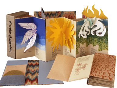
Circle of Wisdom (Circulus Sapientiae), Hildegarde von Bingen (2001).
For a press to survive under a single proprietorship for half a century—and continue to produce amazing books for the whole run—is remarkable. Even more astonishing is when said press makes it to 60. This year—2015—marks the 60th anniversary of Claire Van Vliet’s Janus Press. It’s a special sort of milestone, for while many presses reach 50 (e.g., Allen Press, Bird & Bull, Cummington, Gehenna, Perishable), and some printers under more than one imprint, few ever achieve 60—unless more than one generation runs them, as in the case of Rampant Lions and Stamperia Valdonega.
But while longevity is noteworthy, it is not inherently significant. No one judges the impact of a press solely on the basis of how long it has survived. There are printers who produce books only a short time who have a tremendous impact on fine press printing, and others who publish for decades whose oeuvre is soon forgotten. The books of the Janus Press, however, continue to be lively, innovative, and meticulously crafted and have been so almost from the beginning of its 60-year run.
One of the marks of a successful press is its ability to showcase the work of others besides the press’s proprietor. Van Vliet, a superb artist and craftsperson herself, has an astute eye for collaboration. She has worked with many other artists, resulting in a wide range of subjects and presentations—”artist and impresario” as one curator has described her. (See Mara Williams, “Claire Van Vliet: A Celebration of Paper” on the Brattleboro museum website.) The variety of her collaborations is remarkable, ranging from “marquee” names such as Ted Hughes, Tess Gallagher, Seamus Heaney, and Denise Levertov to Fluxus artists Dieter Roth and Jim McWilliams, to Elka and Peter Schumann of the Bread and Puppet Theater. (The performance aspects of some Janus pieces will be considered below.)
Van Vliet continues to experiment with the physical limits of the book. Something new and structurally challenging is always in progress. Case in point: a current project is The Silences Between (Moeraki Conversations) by Keri Hulme. It has been in the works since 1996 and will be finished this year or next. There are many complex components to it: a glossary of Maori words and sayings, a map, six large relief prints, and a vitreograph frontispiece. While the press has produced many books in the intervening years, Van Vliet takes as much time as is needed on each project. The exquisite results of these long labors are always worth waiting for. Yet despite Van Vliet’s high standards and sometimes virtuoso constructions, she has nonetheless been prolific: Janus has issued some 120 fine press items since 1955.
Van Vliet has been influenced by a striking combination of artists. She closely studied the works of Käthe Kollwitz and other German Expressionists as well as the landscape painters known as the Canadian Group of Seven. (She also cites Fritz Eichenberg’s illustrations for Jane Eyre and Wuthering Heights.) The Fluxus and Cobra movements inspired some of her work at the Philadelphia College of Art. These influences can be seen throughout her work: in pulp paintings, watercolors, prints, and drawings, as in the full range of her color palette. Blacks and grays powerfully inhabit the images in Kafka’s Parables and Paradoxes (1963) and Conversation with the Supplicant (1971), and more recently, blacks and metallics in Greed (2013). Pastels appear in her pulp paintings, such as the paper work from Aura (1977) and Lilac Wind (1983). At other times she uses strong, saturated colors, like the reds, browned oranges, and blacks in Denise Levertov’s Batterers (1996). The work is never imitative, though it sometimes conjures elements from the work of others. For example, her imagery can be as searing as Kollwitz’s (see Van Vliet’s Batterers, also The Dream of the Dirty Woman from 1980), or as pastoral as Frederick Varley’s (her Some Trees and Bushes, “The Apple,” from Galway Kinnell’s Two Poems from 1978). In Van Vliet’s pulp paintings, these influences sometimes coalesce.Book structure is used to strong effect at Janus Press. Van Vliet has worked to master nearly all of the elements of bookmaking: printing, papermaking, bookbinding. Beginning in 1976 with a visit to Twinrocker, she immersed herself in papermaking. In 1978, after three such visits, she set up a small papermaking facility in Vermont, purchasing her pigmented pulps from Twinrocker. Her first paperwork book was Hayden Carruth’s Aura, published in 1977 in an edition of 50. The short text is a small component of the majestic, fold-out structure that Van Vliet produced. The item is in two distinct parts. The first is a poured-pulp, folded paperwork landscape on a multi-paneled sheet with no printed text. The second is on plain, beige, handmade paper that wraps around the paperwork landscape. Carruth’s poem is set in a small typeface. The two panels can be folded around each other and thus we can experience the Aura before or after Carruth’s poem—figuratively and literally—unfolds.She describes the evolution of bookbinding at the press.
Janus’ first multi-signature book, Ein Landarzt/A Country Doctor, was bound disastrously by the William Marley Company, Philadelphia in 1962. This pushed me to do all the binding myself. That kept them in paper and simple.
In the summer of 1971 I took a week-long class in “Bookcraft” from Annette Hollander at the Brookfield Craft Center in Connecticut. Annette is an artist and looked at binding from a problem-solving rather than a “this-is-the-way-it-has-always-been-done” perspective. We were both from out of town so we worked together in the evenings and she taught me how to make boxes. One of the workshop days was decorating paper: marbling, paste, and dyeing.
The Florence flood [November 4, 1966] opened a lot of eyes into old structures of the book and long-stitch was what intrigued me and so I went to Washington, D.C., and had a private lesson from Linda McWilliams who was working on long-stitch in the Conservation Lab at the Library of Congress. Using the long-stitch has allowed me to really bind books without actually being a binder—the strip bindings that I have created are an extension of that approach.
Circle of Wisdom (Circulus Sapientiae), Hildegarde von Bingen (2001).
My next milestone was Hedi Kyle’s presentation in 1982 at the Fine Printing Conference that Terry Belanger organized at Columbia University. No glue! Interlocking paper! Hedi’s talk was a WOW! moment.
Van Vliet wrote me, “The concertina and strip bindings were solutions to stacked bindings that needed to lie flat. The binding structures that I use have all been solutions to particular texts as I don’t play with them for their own sake.”
In fact, Van Vliet values paper and nonadhesive bindings for some of the same reasons that conservators and other artists do: flexibility, lightness, versatility, availability, adaptability, and, when made well, longevity. Adhesives (sometimes acidic) have been used by binders to hold the shape of the bound codex. The curved spine is a result of rounding and backing and adhesives. Easy openability was not a necessary consideration of trade or fine binders. But not all book structures require the use of adhesives. Thus conservators, binders, and book artists will sometimes be drawn to nonadhesive structures. Van Vliet has become a master of them, as can be seen in many of her works, but as especially exemplified in Margaret Kaufman’s Deep in the Territory (1999).
Other important elements of her book structures are performance and reader participation—the aural and the tactile. Janus books invite us in, sometimes through the presentation of the text. For example, The Dream of the Dirty Woman is a play that Van Vliet transformed into a beautifully balanced display of images, text, and materials assembled as a sequential folding piece. In the box are phonographic and photographic records of the play. In a later work, Dido and Aeneas (1989), co-published with the Theodore Press, the book folds out looking more like a stage than does Dream…. It is an accordion-folded landscape collage containing text pamphlets that have been sewn into the openings, one pamphlet per scene. In other words, you can follow the text as you gaze at each scene. The pamphlets are part of the program. To engage fully in the drama, you can listen to the accompanying compact disc of Purcell’s opera. (Van Vliet uses music again in 2001’s Circulus Sapientiae/Circle of Wisdom with music by Hildegard von Bingen in an even more elaborate structure of 7 accordion-folded openings.)We are given a completely different way to participate in the quilting-themed books by Margaret Kaufman: Aunt Sallie’s Lament (1988) and Praise Basted In: A Friendship Quilt for Aunt Sallie (1995). The books have component parts: quilting pieces with letters and cards to open, souvenirs, and so on. We are invited to create our own readings, and thus to participate. We experience the reading of Janus books in ever evolving ways. One light touch with these two volumes is the inclusion of offcuts of exquisite Japanese Chiyogami papers she used in creating the books. The papers were so lovely, Van Vliet did not want to dispose of the snippets left over after the cutting and weaving and joining of the text pages was done. It is a treat to have the snippets, as well as awe-inspiring, for they show how elaborate and complicated the construction of the pages was. The construction of these books is a tour de force in bookmaking.Another device that engages the Janus reader is layering. The books may have several layers: outer and inner boxes, wrappings, a variety of openings. Each layer, like an overture, brings us closer to the theme of the book, preparing the reader-viewer-audience, for the symphony or stage show inside.Sometimes navigating Janus structures becomes part of the experience as the reader opens interlocking pieces or unfolds and refolds the component parts. Boxes and papers make sounds as they’re opened—for example in Batterers—and there is tactility in the smooth or rough papers. Van Vliet’s wonderful books engage us through light, sound, and touch.
Born in 1933 in Ottawa, Canada, Van Vliet spent part of her childhood farther west, in Calgary. (Wide open landscapes have always been important to her, as is reflected in her prints, drawings, and paper works.) Orphaned at 14, she moved to San Diego to live with relatives, and got her B.A. from San Diego State in 1952. She wrote me about the period:
I had a class in wood engraving . . . but mainly studied drawing. My majors were Geography, History, and Art History. And as Art classes met for 6 hours a week and used only 2 credits, I took Applied Art as electives.
Her undergraduate drawing teacher, the painter Everett Gee Jackson, illustrated The Ugly Duckling for the Limited Editions Club volumes. (In 1982 Van Vliet herself produced a book for LEC, and later, in 1984, it became a Janus edition: Charles G. Finney’s The Circus of Doctor Lao.)
In 1954 she received an MFA from Claremont Graduate University. In The Janus Press at Sixty she writes:
At the Claremont Graduate School we had training similar to that in an Academy—in front of the model drawing and modeling 20 hours a week. My MFA thesis was relief printing and while the faculty was aesthetically helpful, they were not printmakers, so [I taught myself] the technical [aspects].
Janus Press “was started in Monterey, CA, in 1954, with the first publication on Valentine’s Day 1955 in San Diego,” she wrote me. In response to my question to Van Vliet about her beautiful drawings of rocks from that period, she told me, “About Monterey: I lived just above Cannery Row, June through October ’54, and the rocks are on the shore there next to The Hopkins Marine Institute.” (The depiction of rocks is a constant in her work. Besides Monterey, she has drawn and painted rocks in the American Southwest, Vermont, Australia, New Zealand, and Ireland.) During this sojourn her thoughts were already on the press. Van Vliet’s first production was a poem by John Theobald, An Oxford Odyssey (1955),which was illustrated with her wood engravings, including Janus on the title page and colophon. It was printed on wood-pulp paper with a blue Strathmore cover; its strong illustrations hinted at great things to come.
She studied typesetting and taught art in Europe from 1955-57, joining her first husband, poet and classicist W.R. (Walter Ralph) Johnson, in Germany. (She has published several of his works, including A Messenger of Satan [1957] and Narcissus [1990].) For one year she was a craft instructor for the U.S. Army in Heidelberg, for another an apprentice compositor at the Taunus Anzeiger in Oberursel (Taunus).
The fine press book world was small when Van Vliet created her first book: a few presses scattered around the United States—and fewer women printers. Leonard Baskin, Harry Duncan, Victor Hammer, and Lewis and Dorothy Allen had been producing books with women as collaborators for some time, but the printing world as a whole was dominated by men. So much so that when Van Vliet returned from Europe in 1957, she writes that “the union blocked employment, so I was very lucky to have a friend of a friend connect me to John Anderson who did not seem to be prejudiced and, rare for that time, a perfect gentleman in the work place.”
For two years (1958-59), she worked for John Anderson (Pickering Press) at Lanston Monotype Company as a compositor. She taught at the Philadelphia College of Art (PCA)—now University of the Arts—and the University of Wisconsin, Madison. At PCA she collaborated with several people, including Dieter Roth and Jim McWilliams, with whom she experimented with new materials. An imaginative Sun, Sky and Earth (1964) contains die-cut acetate and cinemoid gels printed, appropriately, in Futura type. These books reflect the experimental, anticommercial spirit of the Fluxus movement. More recently she has used acrylic, acetate, and different kinds of plastic as part of her binding structures. One example is (Compound Frame): Seven Poems by Emily Dickinson (1998) in which Rowlux and Tyvek are incorporated into the book structure. Rowlux end sheets and transparent machine-made paper create a multi-layered effect. (This book was copublished with Gefn Press, London, and Elizabeth Steiner, Auckland, New Zealand.) Van Vliet has continuously experimented with materials and styles of presentation.
In 1966, having already produced some 20 books, Van Vliet moved to remote and visually arresting Newark, near West Burke, in the Northeast Kingdom of Vermont, where she still lives.
Fine press books can take many forms, such as the classic approach, which exhibits the work and focuses on notable authors, with suitable illustrations and sensitive designs. Or they can be artist’s books in which the art of the book—its design and structure, layout, and materials—seems to speak louder than the text. Elements of all these can be found in Janus books. The press is not defined by its authors and other collaborators, but rather by an amalgam of various ideas, presentations, and techniques. As Van Vliet puts it:
[My] approach to the books has changed as the times have changed. The first thirty years [roughly 1955-85], there was a need to print first-edition poetry—this is less needed now with so many small publishers doing that. The content—word and/or image—determines the form of the [Janus] book.
In 1989 she received a John D. and Catherine T. MacArthur Foundation Prize Fellowship for her already impressive body of work. The MacArthur grant, however, is given only partly for “past performance.” It is mostly awarded to those who, according to the foundation, have great work yet to come. Since Van Vliet has received the award, she has continued to produce one masterpiece after another. The prize also made it possible for her to visit Ireland, Australia, New Zealand, and the southwest. These travels resulted in new landscapes—on paper and on her land. She built a large swimming pond she christened “Lake MacArthur,” complementing Bicentennial Pond, which she constructed in 1976. The images she created in New Zealand, Australia, and the southwest have been exhibited in several museum galleries. And the results of these trips continue to be realized, as in her upcoming book The Silences Between (Moeraki Conversations).
In the fine press world, few can compare with Claire Van Vliet. In 1991 Betty Bright curated an exhibition on the Kelmscott Press centennial. The three printers she selected to exhibit along with Kelmscott were Leonard Baskin, Claire Van Vliet, and Victor Hammer, three of the finest printers of the 20th century. As Bright wrote later, in No Longer Innocent: Book Art in America, 1960-1980 (2005):
Our link between Morris’s books and those issued today is not based on a superficial likeness in appearance. Rather, the link is philosophical, of a holistic, all-embracing view of design based on an understanding of process and materials, and an appreciation of literature and typographical history. Each part then adds to one another to create a work balanced between beauty and practicality. Morris described his approach as building an “architecture of the book.”
The three artists Bright selected have consistently embraced the many elements of design. Only Van Vliet remains, but she, even more than Hammer and Baskin, has become the greatest physical architect of the book. Kelmscott established the precedent. William Morris was one of the founders of the Society for the Protection of Ancient Buildings (SPAB). Architecture was a continuing interest of his, and good architecture depends on rich collaborations. By the time he established the Kelmscott Press, Morris could translate building into bookmaking. He was an architect of the book who assembled a superb group of artists and craftsmen (makers of ink and paper, typographers, printers, artists, and binders) and undertook some of the work himself. This approach to fine book creation took off in the 20th century, and it is clearly exhibited in Janus Press books.
Bright has also conjoins Van Vliet with Walter Hamady and his Perishable Press; from No Longer Innocent again:
In the 1960s some fine printers integrated art-making with bookmaking. Two printers—Claire Van Vliet and Walter Hamady—signaled the changes underway. From the first, their books were distinctive for their assertive typographical and visual personalities, which immersed their readers in whimsy, reflection, and even pathos. Van Vliet and Hamady represent the artist’s increasing involvement with books, on and off campus, as an alternative lifestyle reflective of the 1960’s desire for independence and activism.
Yet the look and feel of books produced by these two presses is markedly dissimilar, and even the press names point to inherently different outlooks. The name Perishable is ironic and humorous while Janus, the god of beginnings and transitions, is a nod to the classical as well as the new. In fact, one of the suggestions of Janus is the future: the god who looks behind and ahead. Van Vliet continues to look forward; seldom does she look back and retrace her work. She is influenced more, in the design and presentation of her current projects, by the needs of those projects rather than by anything she has already done. That is why every new publication from her press is exciting, fresh, and amazingly new. In response to my question “What kind of analysis do you do after you complete each book?” she replied: “Usually, working on the next book, pulp paintings, or prints.”
Every fine press represents a particular perspective, but the best presses are visionary. Sixty years on, the Janus Press still has a lot to teach us about the relationship between text and image, text and its container, and the meaning of a book. There is still a lot to learn. What Van Vliet teaches is that making beautiful books can be enlightening to the maker, and just as finished results are enlightening to the reader. The beauty is not for its own sake. (Aptly, one of her books, by Sandra McPherson, is called Beauty in Use.) The medium serves and enhances the message. Janus books teach and delight. Van Vliet’s visions, as manifest in her final products, are exquisite partners in doing both.
Sources (in chronological order)
Catalogs(Janus Press and Claire Van Vliet). Janus has issued many catalogs of its work. Some of the items appear in more than one catalog. They are an invaluable resource.
Lehrer, Ruth Fine. The Janus Press 1955-75: Catalogue Raisonné. Burlington, VT: Robert Hull Fleming Museum, 1975.
Fine, Ruth E. The Janus Press 1975-80: Catalogue Raisonné. Burlington, Vermont: University of Vermont, Robert Hull Fleming Museum, 1982.
Bright, Betty. William Morris and His Heirs: A Kelmscott Centennial: Leonard Baskin, Claire Van Vliet and Victor Hammer. Minneapolis: Minnesota Center for Book Arts, 1992.
Fine, Ruth E. The Janus Press 1981-90: Catalogue Raisonné, Burlington, VT: University of Vermont Libraries, 1992.
Janus Press Checklist 1990- . West Burke, VT: Janus Press, ca. 1998.
McLean, Genetta. In Black and White: Landscape Prints by Claire Van Vliet. Lewiston, Maine: Bates College Museum of Art, 1999.
Bright, Betty. No Longer Innocent: Book Art in America: 1960-1980. New York: Granary Books, 2005.
Fine, Ruth. The Janus Press—Fifty Years. Burlington: University of Vermont Libraries, 2006.
Janus Press. Newark, VT: Janus Press, ca. 2006. [Selection of books published 1993-2006, ca. 2006].
E-mail correspondence between Claire Van Vliet and the author, December 2014-January 2015.
The Janus Press at Sixty: An Exhibition, February through May 24, 2015. San Francisco: San Francisco Center for the Book, 2015.