
Anonymous, Sir Gawain and the Green Knight
Taller Martin Piscador, 2013
A 2500-line anonymous 14th-century Arthurian romance is not a text one would expect to emerge as a hand-made book from a press in southwestern Mexico. If for no other reason, the type had to come from the United States (Bradley Hutchinson’s shop in Texas, to be precise), and the process of getting it into Mexico was fairly discouraging. Customs agents decided items so heavy and dense must contain something nefarious, so they unwrapped and pied random packages of type, with the result that much of it arrived in “jingling disorder at the bottoms of the cardboard boxes,” according to the colophon. Undaunted, Juan Pascoe and his assistants reset most of the type by hand, and overcame other obstacles, financial and logistical.
Pascoe has explanations for his choice of text and method. To sell enough copies to cover the substantial costs of producing an 88-page folio, printed damp from lead on custom-made paper, a text needs to be in English, the language of most prospective customers. And what he puts in his Anglophone customer’s hands is a counterpoint, at what is likely a time near the end of the private press movement, to the Kelmscott Chaucer. Of course, it is not on the same scale – no private press books today are. Still, as he wrote to me recently, “You know all of this: Canterbury Tales at the beginning, Sir Gawain and the Green Knight at the end. Middle-English in a full round circle…the second one in a style and bearing very different from the first. I am a printer who admires the Renaissance more than the Middle Ages, I am a printer who strives to make books to be read, I am a printer who came down in genealogy from Harry Duncan, who passed through the halls of Victor Hammer. This means a certain conservatism and a certain radicalism – books to be read, books to be sculpted as if in marble, or constructed as if on canvas. With luck each one is different because each one is constructed according to the text, always different.” He expanded on this in another letter: “… notwithstanding my attempt to be invisible in the design of Sir Gawain, I am not invisible, Harry is not invisible, the whole of typographic usage is not invisible, attesting to that which Harry said Victor Hammer said: the glow of human presence in the handmade book.”
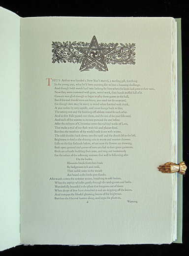
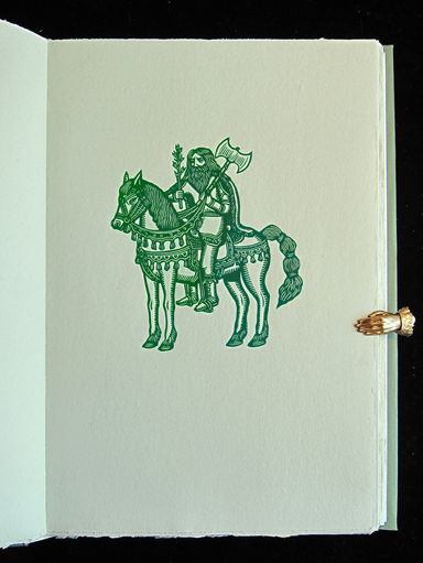
Pascoe has constructed a book to be read, that does indeed glow with the presence of hand craftsmanship. The proportions are pleasing. The binding of stiff paper over slightly flexible boards, with exposed vellum tapes, feels solid, but opens comfortably and flat. The long lines and lengthy stanzas make for poetry that is unusually even in composition, producing full pages of meticulously (re)set type. The typeface is Poliphilus, which Pascoe selected because it doesn’t have too strong a personality: “it becomes what is asked of it.” Printed damp on a heavy and somewhat textured paper, it exhibits the slight unevenness and sparkle that is distinctive to metal type. The linocut illustrations are mostly bold, full-page portraits of the various participants in the narrative, in addition to which there are several images worked into attractive section openings, with red initials in Bembo Titling. Except for these flourishes of red, the palette of the book is completely green, just like the knight in the poem. Dark green cover paper, pale green text paper; you think it might be too much, but it isn’t.
In an afterword, the translator, John Ridland, explains his approach to the text in an imagined conversation between Chaucer and the unknown author of Sir Gawain that takes place in “the Poet’s Corner in Heaven.” Chaucer describes how most translators have labored to maintain the highly alliterative style of the original, but then says to the author of Sir Gawain, “now at last you have been found by a simple-minded translator willing to hark back to the old ballad stanza of nursery rhymes, setting their [the other translators’] four- and three-beat lines into single lines of seven beats …” There is still plenty of random alliteration in Ridland’s version, but the rhythms of the long lines do indeed carry one fairly effortlessly through the story, especially if read aloud. Much of the symbolism of the poem, interesting to scholars, will be lost to a modern reader. But the poem is a pleasure read simply as an enchanting tale, artfully wrought by author and translator, gracefully presented by illustrator and printer.
Translated from Middle English by John Ridland. Tacambaro, Michoacan, Mexico: Taller Martin Piscador, 2013. Linocuts by Artemio Rodriguez. Paper made by Pasquale De Ponte in San Lucas Tepetlaco, Mexico. 200 copies, $450, plus 26 lettered copies bound in quarter vellum by Cloverleaf Studio, $1050. Distributed by Philadelphia Rare Book & Manuscript Company.
Philadelphia Rare Books, 2375 Bridge Street, Philadelphia, PA 19137. www.prbm.com, or Juan Pascoe at: tallermartinpescador@gmail.com