
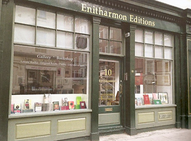
Gallery, bookshop, and offices on Bury Place, London.
In an age of e-books and digital printing, it may seem perverse that a dwindling band of publishers persists in making artists’ books, but as readers of Parenthesis and Matrix will be the first to know, there is great satisfaction in maintaining the highest standards of book production and in marrying text and image through creative partnerships. Miraculously there are still libraries, museums and private collectors eager to buy the modern equivalent of the livre d’artiste, especially if the artist and writer enjoy high reputations and their collaboration results in a beautiful book. As an artistic activity, it satisfies every aesthetic craving; as a commercial enterprise, it makes no sense at all, and trade and print publishers would be aghast at the economics. All the more reason to continue, as evidence not only of the imaginative force of artistic partnerships, but also of the health and excellence of typographic design, letterpress printing, hand binding and papermaking.
By way of background, Enitharmon Editions grew out of the literary publishing house founded in 1967 by the book collector and dealer Alan Clodd. He named it Enitharmon Press after William Blake’s muse of painting and poetry. As a book collector, Clodd created one of the finest private libraries of his time; as a publisher, guided initially by the poet Kathleen Raine, he concentrated on the poetry of the imagination, working with such distinctive typographers and printers as Christopher Skelton to establish a reputation for high quality volumes in attractive and often variant bindings. I did a small amount of editorial work for him in the early 1980s, at a time when he was thinking of retiring from publishing, and to my surprise and delight he asked me to be his successor, which encourage me to leave my secure teaching career for the altogether insecure life of an independent publisher. The list continued (and continues) to have poetry at its core, but has also diversified into literary criticism, memoirs, translations, a small amount of fiction, a series of limited-edition chapbooks and the subject of this article: artists’ books, initially published under the imprint of Enitharmon Press but after 2001 by a separate company, Enitharmon Editions. My first 15 years, meticulously charted by Alan Walker in the bibliography Enitharmon Press: A Checklist 1987 – 2002, saw the publishing work conducted from the traditional environment for a fledgeling enterprise: home, initially in Petersfield, then for a short time in Twickenham before settling on the top floor of my current house in Tufnell Park, London. Getting Arts Council support in 2001 enabled a move to a dedicated office space in Kentish Town, and by great good fortune the twin companies are now newly established in the heart of Bloomsbury, with a gallery, bookshop and offices on Bury Place — an ideal space in which to show a full range of our books and original prints.
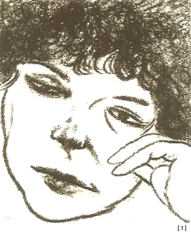
When I took on the running of Enitharmon Press in 1987, there had been a single example of an artist’s book in the backlist, combining a short text by Samuel Beckett with etchings by his old friend Avigdor Arikha. My publishing début, in a now extensive series of artists’ books, was to involve Arikha again, producing prints with his friends R B Kitaj and Henri Cartier-Bresson to accompany poems by Anne Atik, Arikha’s wife [1]. The principal characteristics of the list were established for the future: poems or prose directly or tangentially approached by contemporary artists who would make etchings, lithographs, drawings, photogravures, photographs or even paintings to accompany them. Add to the brew the immaculate and imaginative input of typographers, letterpress printers, printmakers, papermakers and binders, and you have the ingredients for a varied, distinctive and collectable list.
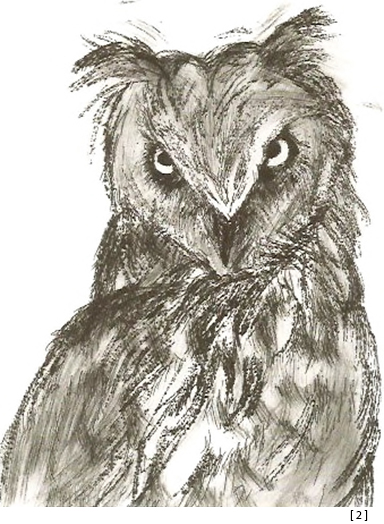
In the 1990s, the list expanded considerably, often with invaluable guidance from my partner, the art historian Marco Livingstone, who could see the possibilities of choosing a particular artist to work with a writer who was either part of the Enitharmon stable or sympathetic to the Press. The young English artist David Austen rose to the challenge in 1992 of illustrating Jeremy Reed’s translations of Cocteau’s poems, entitled Tempest of Stars, by producing 26 delicate watercolours of figures and plants and five etchings to be enclosed in five differently coloured solander boxes containing unbound folded text pages (the French and English on facing pages) and lithographic prints made from the watercolours. A sequence of books was devised by the great American artist and printmaker Jim Dine, the first in 1993 pairing his Glyptothek drawings of Greek and Roman statuary with Neil Curry’s The Bending of the Bow, the poet’s sinewy and colloquial take on the closing books of The Odyssey. Six years later Dine produced Kali, an extraordinarily ambitious jewel of a book pairing 16 of his own poems with the same number of etchings: some of his best-known motifs featured, such as the Ape & Cat, Donald Duck, owls and ravens, Pinocchio and several self-portraits, including a hauntingly effective one laid in loose in a wallet in the slipcase [2]. On this occasion, and for his next project Pictures (2001), a book of lithographs with poems by his friend Robert Creeley, American typographers, printers and binders were used, so that the artist could work closely with the craftspeople who were making the component parts of the book under his direction. Most recently, in Talking about Aldo (2008), Dine has paid tribute to Aldo Crommelynck, the French master printer who worked extensively with Matisse and Picasso, in a book of interviews and pictures charting the 121 prints Dine made with Crommelynck, which represent one of the most impressive and sustained investigations into the possibilities of intaglio printmaking since the death of Picasso. Here are Dine’s iconic hearts and robes, tools and skulls, plants and flowers, and the Venus de Milo, as well as his etched portrait of Crommelynck. [Reviewed in Parenthesis 18]
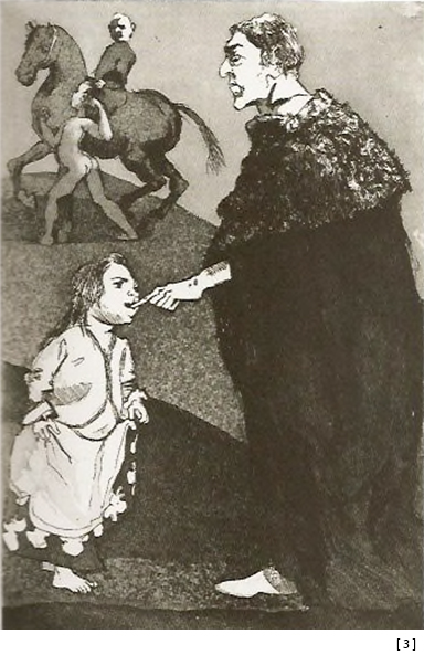
Another artist of the same generation who has worked repeatedly with Enitharmon is Dame Paula Rego, one of the most important of contemporary figurative painters and printmakers. Her initial publication, Pendle Witches (1996), was inspired by poems by Blake Morrison, which prompted Rego to make a suite of etchings depicting women in a variety of ages and guises—brutal yet delicate, disturbing but also tender. The culmination, in the four images of the narrative poem ‘Mist’, is haunting and ambiguous, as only Rego’s work can be. Subsequently she was to make The Children’s Crusade (1999), based on an enigmatic historical episode in the Middle Ages: it was a story steeped in imaginative possibilities and contemporary relevance, touching not only on children’s love of adventure but also on darker issues including fear of the unknown, incipient sexuality and exploitation. Hand-coloured etchings were reproduced throughout the text as tip-ins, and Rego also made an etching entitled ‘Bait’ to accompany the de luxe edition [3]. She found equally stimulating subject matter in Jane Eyre (2003), prompting her first major suite of lithographs, 25 in all, which demonstrated a renewed sense of vitality in mark-making and a clear mastery of the material. Marina Warner, in her eloquent introduction, points to the fact that ‘Charlotte Brontë and Paula Rego share an imaginative ardour that abolishes the veil between what takes place in fact or in fantasy. As storytellers, they really are kith and kin: Rego reproduces the psychological drama in the book through subjective distortion of scale, cruel expressiveness of gesture and frown, and disturbingly stark contrasts of light and welling shadows.’ Rego went on to make O Vinho (2007), featuring lithographs alongside a short story by the Portuguese novelist João de Melo, and she is now immersed in creating a book based on the traditional folk tale Stone Soup, which reproduces a sequence of watercolours to accompany a retelling of the story by her daughter Cas Willing.
In his ninth decade, the eminent English artist Victor Pasmore, who in the 1940s had famously abandoned figuration in favour of abstraction, contributed two books to the series, Burning Waters (1995) and, shortly before his death, The Man Within (1997). Like Dine’s Kali, these contained the artist’s poems as well as integrated colour drawings. Each was accompanied by signed original etchings. Similar projects containing texts by the artists have been Duane Michals’s poignant and profound The House I once called Home (2003), containing the veteran American photographer’s first photogravure, and two publications by Gilbert and George: he World of Gilbert and George (2001) and a reissue of their book Side by Side (2012). The first reproduces the 900 drawings and associated texts from the storyboard of their celebrated film of the same name, and for the de luxe version Gilbert and George made 150 unique ink-wash drawings — an undertaking almost as laborious for them as making by hand the 2000 marbled linens used to clad each copy of Side by Side.
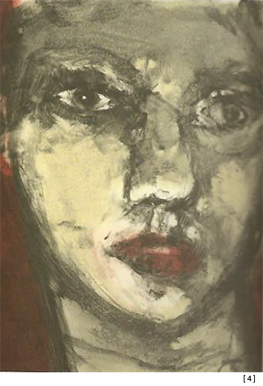
Limitation, as this indicates, varies considerably from project to project, though the norm is for a signed limited edition of up to 75 copies, justifying its de luxe status by the elaborateness of the production, the binding and the original artwork included in or with the book. Classics of the series include four beautiful examples of the designer and letterpress printer’s art: Ted Hughes’s Shakespeare’s Ovid (1995), with drawings and an etching by Christopher Le Brun—Hughes’s vigorous and colourful translations of Ovid’s Venus and Adonis and Salmacis and Hermaphroditus; Thom Gunn’s poem sequence In the Twilight Slot (1995), with an editioned portrait of the author by the American photographer Arthur Tress; Harold Pinter’s The Disappeared and Other Poems (2002), with colour tip-ins and an original etching by Tony Bevan; and Seamus Heaney’s The Testament of Cresseid, his vivid retelling of the most celebrated poem by the Scottish Chaucerian Robert Henryson, with images and an original etching by Hughie O’Donoghue [4], of whom Heaney writes in his introduction: ‘this artist has a mastery and gravitas, a combination of detachment and answerability, of intimacy and bigness, that are reminiscent of Henryson’.
In a similar spirit and form, the 1994 publication Monotypes and Tracings (printed by letterpress, slipcased with a single gravure etching) brought together the American poet Thomas Meyer’s ‘tracings’ of German Romantic poets such as Goethe, Hölderlin, Heine and Nietzsche, with 14 black-and-white monotypes by the American artist Sandra Fisher, a collaboration enthusiastically welcomed by the poet and critic John Ashbery in his introduction. This book, like many of its successors, had not only a de luxe edition but also a regular cloth-bound hardback edition to bring it within the pockets of a wider audience. In the following year the Japanese artist Shinro Ohtake produced an entirely Japanese-made artist’s book entitled X+Y = Love, an endlessly inventive, nostalgic and playful fusing of the lyrics from Japanese popular songs with 10 etchings placed on pages facing the lithographed bilingual text. Ohtake conceived the whole thing, choosing Japanese Gampi paper to enhance the effect the etchings would have had when printed on a traditional Arches paper. He then clad the 10 loose sheets in a colourful and cheeky lithographic jacket, before housing all the inner layers in a robust solander box clad in black-and-red miniskirt fabric, and completing the box-within-a-box effect with a card slipcase. It would be hard to think of a more imaginative and elaborate approach to the making of a book; it even exceeded the expectations of a publisher who is usually so much more hands-on, right from the point at which a book is conceived to the achievement of its final form.
The mid-1990s seem now to have been a time of experimentation, for in 1996 a publication that was remarkable in a different way came into being. The Scottish artist Callum Innes is famously a perfectionist who discards and even destroys a large number of the paintings he makes. How appropriate then that he should be invited to provide the cladding for a newly commissioned translation by Leon Livingstone of Balzac’s story The Unknown Masterpiece, and how convenient that, in the spirit of recycling, fragments of original paintings should be used to bind each of the 50 copies of the book, so that each was truly unique. Of course it provided a nightmare for the binders: brittle and in some cases still slightly wet painted canvases are not the easiest of materials to affix to boards and, after a prototype showed the canvas cracking when placed over the spine, a small compromise was made to allow for a thin strip of conventional cloth to marry up the fragment of painting on the front cover with its neighbouring length on the back. Innes’s sumptuous colours and delicate touch made for a beautiful object—one that was even more arresting because of the strong smell of the oil, and perhaps a whiff of turpentine too. The moment you opened the solander box housing the book, the intoxication of the senses was complete.
Moving closer to the present, the printmaker Norman Ackroyd and the poet Kevin Crossley-Holland combined forces in 2006 to create a visually and poetically arresting volume inspired by north Norfolk—for Ackroyd the magic of its shifting and atmospherically varied coastline, and for Crossley-Holland the stimulation for a sequence of storytelling poems featuring the shape-changing, passionate and dangerous figure of Moored Man, who moulds dykes, sorts gravel, infills creeks, drowns the innocent, howls and dances, and worries away at his own contradictory identity and relationship to human beings. Ackroyd’s etchings and watercolours provide the backdrop to what Ronald Blythe in his preface calls ‘that ultimate geography which separates land from water’.
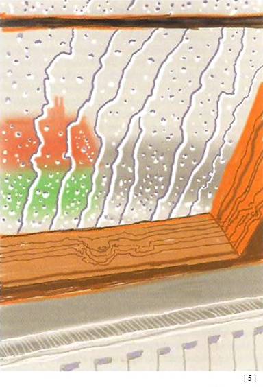
The last five years have seen a close working relationship with friends of long standing, Peter Blake and David Hockney. In purely visual terms (apart from its other many attractions, such as two extensive and fascinating interviews with Marco Livingstone), David Hockney’s My Yorkshire (2011) made the same sort of immediate impact as his hugely successful exhibition of landscape paintings, drawings, prints and films at the Royal Academy in 2011–12. The book had an extended genesis, for it grew out of repeated trips I made with Marco to visit Hockney in and around his Yorkshire home when he was making his astonishing sequence of pictures. In the text, he speaks with great clarity and candour of the complex personal and artistic motivations that drew him back to his roots in Yorkshire, leading to one of the crowning achievements of his life in art. The interviews are reflective moments set beside the exquisitely reproduced full-page spreads of his Yorkshire paintings and digital drawings. In this case, the book in its de luxe edition is housed in a trough within a monumental green-cloth solander box. Laid over the book, in a card wallet, is ‘Rain on the Studio Window’, the first editioned print Hockney had produced since 1998 [5].
“All these books have stories. Paul said he told Joel about this very strict poetic form, the Sirventes, which has certain meters and things you have to mention in this very tight form, and Joel turned around and wrote the best god-damned Sirventes ever, & I got to publish it. The text was set in Palatino because that was all I had at the time. But I got some founts of Michaelangelo titling and started out the title-page with this huge block of giant caps. Joel was rather stunned. For years he had been working on a typewriter that only had lowercase because the shift key was broken, and he had created all these ways to work without caps, and so his reaction to the book was, he liked it, once he got past the title-page!”
In the case of Peter Blake, each of his three Enitharmon books has been based on one of his favourite mediums: collage. In Venice Fantasies (2010) and Paris Escapades (2011), the artist demonstrates his special gift for visual storytelling, using his characteristically wry humour and unerring sense of the absurd to pay tribute to each city as reconfigured in his imagination. Blake’s collages are introduced by his own written commentaries, which explain his fascination with the cities and the reasons for him peopling them with an extraordinary cast of characters. Venice, for example, is invaded by penguins and engulfed in icebergs, used as a stage set for dance troupes and as a camp site for local Scout groups; its canal-side tranquillity is shattered by plane crashes, madly overcrowded regattas, fishermen, motorboat racers, citizens from ancient times and those quintessential American tourists Mickey and Minnie Mouse. Paris is equally embellished, its familiar monuments, landmarks and sights transformed into startlingly collaged phantasms. Both editions appear in de luxe and regular form, Venice accompanied by a signed and numbered screenprint and Paris by an ink-jet print.
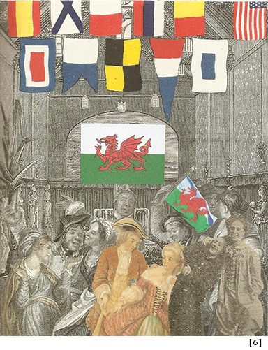
Most recently, Blake’s 28-year obsession with illustrating Dylan Thomas’s evergreen Under Milk Wood with watercolours, collages, pencil portraits and prints has reached fruition, not only as a vast touring exhibition but also as the exhibition’s more portable accompaniment: a large-format paperback book, and also, for those with deeper pockets, a de luxe edition with an original print of the occupants of one of Llareggub’s watering holes, ‘The Sailors’ Arms’ [6]. With this project, for the first time since the Enitharmon artists’ books series was devised, we have also published a sequence of signed original prints, in editions of 50, which are being exhibited at galleries throughout England and Wales in Dylan’s centenary year.
Any survey of this kind can only scratch the surface and shows how difficult it is to give an impression in words of such a wide variety of artists’ books. It would have been good to write at length about the only anthology in the series—I Have Found a Song—which in 2010 brought together five artists and 12 poets in a volume on the theme of enslavement to mark the bicentenary of the Abolition of the Slave Trade Act. In its sumptuously produced and housed de luxe edition, the book was accompanied by a portfolio of signed original prints, with each artist also contributing personal statements and additional sequences of images reflecting on enslavement in its many forms.
That may be the perfect cue to reflect that in some respects this type of publishing, and the literary publishing of the associate company Enitharmon Press, for all its aesthetic and cultural rewards involves a different type of constraint—a life ruled by deadlines, by the need to diversify, expand, reinvent and in every respect balance the books; a stubborn devotion to an artistic form that is struggling to survive in a digital age; an obligation to exist within a commercial system whose leading players—bookshop chains, wholesalers and internet traders—are far more interested in profit then in the aesthetics of the book or in providing some sort of support structure for writers and artists, still less designers, printers and publishers. (In contrast, it is worth repeating how blessed we are to be so strongly supported by museums, galleries, serious independent bookshops and deeply loyal collectors.) But consider the advantages of a career in this rarified area: what incredible creative imaginations publishers encounter, encourage and in some cases foster; what friendships we form with astonishing people whose skills far exceed our own; what satisfaction we can derive from getting so close to creating something honest and perfect and enduring; something that shows the artists and writers at their finest.