
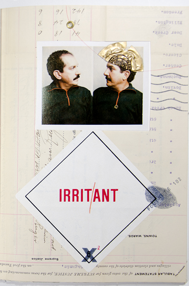
Page from Travelling: Gabberjabb number seven, 1996. Letterpress, collage with photo, grommets, winecap, thumbprint, number stamp over page from 1909 electoral roll.
The notion of a private press — the vision of an individual — has continued to thrive in the United States because of one man: Walter Hamady of Perishable Press Ltd. He developed an original approach to the creation of books. Not only was he the typographer and art director, but he often made the paper and even engineered the structure to form a total concept for each book. In fifty years at the hand-press and hand-crank 1969-vintage Vandercook proof press, he produced over 130 titles. They all bear the Hamady stamp, yet no two are alike. Of the press name, Hamady has written, “The Perishable Press Limited, so-named to reflect the human condition, is the private addiction (&) affliction of Walter Samuel Haãtoum Hamady.”
But a press needs more than a visionary at the helm: it needs input from other sources — artists and writers — if it is going to be vital. Some presses stumble along with repackaged chestnuts, but the most worthwhile approach is to discover good writers of the current generation and help their careers by giving their work the attention it deserves. Hamady has collaborated with other artists (Warrington Colescott, John Wilde, and Henrik Drescher), and with some of the major poets of his generation (Robert Duncan, Robert Creeley, Paul Blackburn, and other members of the Black Mountain School among them). Hamady’s series of experimental works called the Gabberjabbs are his most personal statements, once referred to as his “autobiography written in secret code.” In them he explores “the most ignored geographical locations in books … the gutter and fore-edge.” The results are mind-boggling creative artworks manifest as endless turning vistas of wonder, gathered into books. They create a new visual-verbal vocabulary, something Umberto Eco referred to as “synonymy.” They are books about books in a very literal way and often their content simply exploits this fact.
Hamady began to deconstruct the book form, creating works that “bare the device” and point out their own reason for being. Gabberjabb volume 4, 1975, has a wrapper that is only half the width of the book; the Canson-paper embossed logos are lined up to be highly conspicuous in the lower corners. The verso has a vertical line in green reading “iNside fRont wraPPer rhymes witH(*.” The colors of ink match the carefully chosen palette of colored papers, some of them most printers would consider too dark to print text on. But Hamady delights in the swatch-book approach to a sequence of pages, and why should printers just use black ink with red as a second color? Here, even blank versos have the printed caption “Blank verso.” Footnotes begin at number 72. Then we have the grandly announced 100% BASTARD TITLE PAGE with the explanation “Mr. Larry Brown often used to say to me, right in front of my mother, ‘Walter, you are a bastard!’ and my dear sweet old mother would puff up bigger than life-size and, with huffy indignance blurt, ‘He is NOT a Bastard! I know who his father was and we were married at the time!'” (Hamady’s mother, a pediatrician, raised him alone after divorcing his father. It was from her he got his love of books, but his cultural ties are strongly rooted in his Lebanese Druze heritage. His humor is very American, though the Marx Brothers and S. J. Perelman, among other obvious influences on Hamady, were also children of immigrants.)
Title page spread from Paul Blackburn, The Selection of Heaven, 1980.
1981 brought Gabberjabb number 5. It is a small format (7 x 5.5″) set in Bifur and Gill Sans. The Bifur (designed by A. M. Cassandre in 1929) arrived “yesterday,” he notes. The book is an extended poem with footnotes, puzzles, and collages rollicking in the joy of the sizes and shapes of the two typefaces. The cover is bare boards with an old railway ticket glued on the front (on my copy); the cords on which the signatures were sewn wrap around the front and vanish into a second board glued to the outer one. The first signature is comprised of different sizes of Shadwell that go from dark to light grey. (Shadwell is the name of Jefferson’s birthplace, and also the name of Hamady’s papermill, which is in the barn behind his farmhouse.) There’s die-cutting, perforation, embossing, collage, rubberstamping, and penciling before you even get to the title page. A Table of Contents has the footnote: “It has remained an Editorial Tradition in this venerated Gabberjabb series to maintain our naïveté to allow the possibility of adventure and surprise. So, we must confess that the above Tables & Lists are not fully known at this time (may third, year on title page) night of a new moon.” The next recto is the dedication page, which also has large blind-stamped footnote numbers. The work is “Dedicated to the one I love & the Shirelles but not to Detroit…” The book has an extra title page “for librarians to do their special graffito” (i.e. pencilled ticks and surname underlinings); it also has a library pocket in the back, grommeted in place, with a die-cut self-portrait in profile; the pocket contains a smaller book of footnotes.
The next Gabberjabb, Neopostmodrinism, which appeared in 1989, is one of the most spectacular. The German subtitle translates as “This lawn is not a dog’s toilet,” which is a yard sign from Germany. As the sign was embossed tin, he was able to print from it (and create a reversed image) which he had his dog paw-print in testimony and then had the page notarized (each copy is signed and embossed with the notary’s seal). The book includes a long sequence of rubber-stamped art and another of landscape-like paper sculpture. Two of the many innovations are the accordion fore-edge span and the fact the book was sewn and bound at both edges, so in order to read it you have to cut the cords on the front edge. This takes the notion of a mint unopened uncut copy to new heights. The cover boards are old worn die-cut and collaged Tax Roll covers from the 1870s salvaged from the dumpster behind the Wisconsin State Historical Society. There are some journal extracts, a poem shown in manuscript, typescript, and set in type (with revisions) and then a sideways spread, with an old advertising zinc for Hamady Hardware, a family business in Flint, Michigan, and below it a thousand words in a tiny, hard-to-read 6 point Clarendon type. The point is that if “a picture is worth a thousand words,” Hamady should try out the theory. But as usual he derails into the here and now, commenting on the act of setting the type, and notes that he accidentally overset 5 lines on a slightly wider measure, but that it took him over an hour to set them, so they remain. He doesn’t really comment on the hardware store, except obliquely, but after a couple of accented ‘o’s creep in he asks parenthetically “(Who the hell laid in this Çäßé?)” We know the answer and we see him in the act of concocting and setting the thousand words slowly and laboriously in the stick, like a kid on a bicycle riding it slowly to see how slow he can go without falling off. In the preface to Two Decades of Hamady & the Perishable Press Ltd (U. Missouri, 1984), Hamady posited the idea that “The book as a structure is the Trojan horse of art — it is not feared by average people.” Books are so familiar that anyone is a willing participant, giving access that might be denied to a painter whose work is shown in an art gallery. An article in Visible Language 25:2 (Providence, 1991), by Mary Lydon, explores his theory. As she explained, “He sees the book as a reflective vehicle in its ability to break and intersect narrative lines, play with syntax, integrate found materials, and convey enigma, paradox and information all at once.” Above all the Gabberjabbs ask what a book is: they have unusual structures, sometimes their only point seems to be to frame a single poem or make an elaborate visual pun. The works are iconoclastic yet they are always impeccably crafted and that is the real point. To break the rules you must know them.
While he was still an undergraduate, at Wayne State University, Hamady met Rob Runser and was able to use his Washington hand-press to produce half a dozen titles. He had met Harry Duncan in Iowa City and was impressed that his handicraft could produce something that looked so much “like real books.” (Lydon, p. 160) Hamady admits his first effort was pretty awful: he set type which was badly cast Caslon from a local foundry, and tipped in etchings, drawings and photos taken on the Staten Island ferry, using rubber cement. But his next efforts were Creeley’s Words (35 copies, 1965) and Duncan’s Six Prose Pieces (70 copies, 1966). Clearly he was a young man with a plan, and a vision. An MFA from Cranbrook in 1966 was followed by a long academic career in the Art Department at the University of Wisconsin in Madison with the usual struggles with those academics in power. He has combined the roles of printer, poet, and teacher unusually well. In the tranquility of his 160-acre farm 35 miles southwest of Madison he has made his own Shadwell paper, handset type, and printed an impressive shelf of work. In addition more than two dozen of his former students have gone on to start their own presses; from Michael Myers (Zephyrus Image) to Amos Kennedy Jr, they have produced an array of creative work, brightening the small press movement of the last forty years. Numbered among them are also Jim Escalante (Hamady’s successor in the UWM Art Department), Katherine Kuehn (Salient Seedling Press), Barb Tetenbaum (book arts professor in Oregon), Jim Lee (Blue Moon Press), Margaret Sunday, Walter Tisdale, Charles Alexander (Chax Press), Ruth Lingen (Pooté Press and Pace Papermill) and Steve Miller of Red Ozier Press (and now director of the book arts program at the University of Alabama).
Jim Dast, who co-taught book structures and bookbinding with Hamady at Wisconsin, remarked, on seeing the show of Hamady’s students’ work at Columbia College in Chicago, that the reason the Wisconsin students’ work was so superior was the students collaborated so much. They all knew how to bind books, they moved freely between lithography studios, the type lab, and other classes in the art department. Also Hamady generously allowed the students into his own press. “It’s a two-way street,” he says, “We learn together.” The success of Perishable Press, according to Dast, is in the great diversity of structures, for not only has Hamady created his own, he has employed the best — Cockerell in England as well as Elizabeth Kner and Bill Anthony in Chicago — to bind his books. I have interviewed Walter a couple of times, but he decided to write me and tell me the answer to a question no one asks: What is your favorite book? To answer it he sent me an annotated list of his books. Of his early work only Paul Blackburn’s Reardon Poems and his own Plumfoot Poems made the cut. It’s not a sentimental list. His first book to be accepted in the AIGA Fifty Books of the Year show (Spider Poems, 1967) is not included, though the second, The Brown Wasps, three essays from the Atlantic Monthly by Loren Eiseley, from 1969, is. It’s not until 1971, seven years into the life of Perishable Press, that Hamady is really thrilled with one of his books: Khatchik Minasian’s Five Poems, handset in Palatino with art by John Wilde. Hamady produced 8 books that year and three of them are among his favorites. Paul Blackburn’s last book published in his lifetime, The Journals: Blue Mounds Entries, which Hamady illustrated himself, is among them.
Because these books were produced in small runs, it is hard to track them down today. A third AIGA selection, from 1976, was produced in an edition of 165 (large by Hamady’s standards): Guillem de Poitou, His Eleven Extant Poems, translated by Paul Blackburn, illustrated by Roland Ginzel. It has the notes in a separate booklet inserted in a pocket in the back of the book; 135 copies were printed on Frankfurt Cream and thirty on white Shadwell.
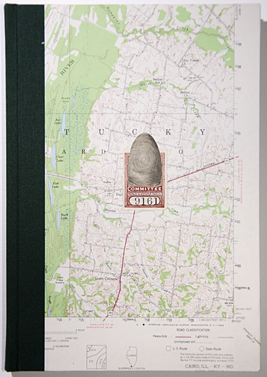
Cover of Travelling: Gabberjabb number seven, 1996. Map, collage.
I asked Walter why he only prints 125 copies of most titles. You get tired of feeding the press after that, he said, which is a good point. Furthermore, many of his pages are printed in multiple colors.
Let’s look at some other poets Hamady has worked with:
“Galway Kinnell was the first poet I heard read a poem aloud. My mother would take me to readings. He was a great reader and knocked my socks off. So some of those poets, I wanted to pay homage to them for opening doors for me. “I was reading Choice magazine, out of Chicago; it had reviews and poetry, and I read these two poems by Paul Blackburn, so I wrote him care of the magazine and heard back. I sent him some stuff I had printed and he sent me the Reardon Poems. I got to Joel Oppenheimer through Blackburn and Denise Levertov and Duncan through Creeley.
“All these books have stories. Paul said he told Joel about this very strict poetic form, the Sirventes, which has certain meters and things you have to mention in this very tight form, and Joel turned around and wrote the best god-damned Sirventes ever, & I got to publish it. The text was set in Palatino because that was all I had at the time. But I got some founts of Michaelangelo titling and started out the title-page with this huge block of giant caps. Joel was rather stunned. For years he had been working on a typewriter that only had lowercase because the shift key was broken, and he had created all these ways to work without caps, and so his reaction to the book was, he liked it, once he got past the title-page!”
The Quartz Crystal History of Perry Township from 1979 is one of Hamady’s favorites, and one of mine too. It is a miniature book, and also an alphabet book. It was printed on dampened (for once) Shadwell paper of a warm grey tone and a nice thick toothy weight. The type is teeny: six point Didot-size Sabon (“hand and tweezer set”) and the work includes tiny symbols and glyphs from a fount that includes fish, flags, pickaxes and astrological signs cast by Paul Duensing in Kalamazoo. Each paragraph begins with a different letter of the alphabet set in a nineteenth-century Engravers’ Modern called Initiales Gravure by Deberny & Peignot. The text is a children’s story (written in the stick) explaining the prehistoric formation of the vicinity through glacial and oceanic activity.
Hamady hit his stride in the 1980s, producing two to four books a year. Del Quien lo Tomó by Joel Oppenheimer is a characteristically lovely book from 1982 that shows off the Sabon type, an elegant binding, and a range of Shadwell papers. The cover has the title JOEL punched out across the back with a cow ear-tattooing tool, otherwise it is a plain pink with sparkling elements of glitter added in. There’s a whole unprinted signature of pink paper in various states at the front and back of the book. The next signature is green and leads up to the title-page, incorporating a page of three-dimensional paper sculpture by Hamady by way of a frontispiece. It has a library pocket grommeted onto the page with a shapely woman cut out of a map rising from the pocket. The typography is clean and straightforward, respectful of the author’s manuscript, and all in lowercase, but there is one other point. The acute accent on the “o” in the title is printed in dark red. It’s almost imperceptible. I asked Walter why he had done this. “If you are going to run the page through the press 228 times just to put on an accent you may as well let the reader known you’ve done it,” he explains. Multiple colors may also explain why Hamady prefers to print dry.
In 1982 Hamady also wrote and printed Hand Papermaking: Being a Book of Qualified Suspicions Gathered Unwittingly as Aftereffects of Those Years So Swiftly Elapsed Between 1964 and 1981. It sums up his thinking on the complex process of papermaking. Clearly he is a leader in this field also, and has done some very creative work, from the idea of using discarded hospital gowns to make blue and green paper to the notion of making “onionskin” paper using actual onion skins. Hand Papermaking has images from Diderot’s Encyclopedie and linocuts by Jim Lee. There are no hyphens in the text, which was hand-set in Palatino: he revised in the stick to keep his line ends clean. (Hamady brings this up pridefully in the colophon.) 200 copies were made using 13 different shades of Shadwell paper, as well as Roma and Perugia papers from Fabriano, Barcham Green’s Canterbury paper, paper from HMP in Woodstock, Banana-Sisal paper from Carriage House in Brookline, and sheets from the Clarks’ Twinrocker mill. Hamady also had Hermann Zapf calligraph a title-page, but Zapf got the title wrong. “You can’t tell the world’s greatest calligrapher he screwed up,” says Hamady, so there is a second typographic title-page, spelled out as above. It’s a monumental work, up there with Dard Hunter’s Papermaking by Hand in America (1950).
So often Hamady has used the binding to extend the meaning of the book — such as Auster’s Reflections on a Cardboard Box (illustrated by Henrik Drescher, 2004), Perishable’s 129th title. It has an entirely calligraphed title-page by Drescher printed in six colors, which has a cover stamped with the kind of seal you see on actual cardboard boxes (the Container Corp in this case is a container of art and ideas), or Parking Lots by Clarence Major, which has actual maps from the beginning (Frankford, PA) and end (San Diego, CA) of the trip in the story on the front and back covers. “I thought it would be fun to have a parking lot ticket in each work,” explains Hamady. “So I saved a few tickets, and then decided to go to the source. I called Arcus Ticket in Brooklyn and they sent me some samples — I made a sketch for them to produce real parking tickets with the title of the book and the number of the book, and they are incorporated into each copy. It’s not creative so much as pragmatic. It’s not clever, it’s obvious: use something real!”
By the 1990s Hamady’s books all seemed to have aspects of Gabberjabbery about them, they began to comment on their own material presence. A good example is John’s Apples: 13 paintings by John Wilde, 12 poems by Reeve Lindbergh, 1995. It’s ostensibly a book of poetry with paintings of apples, but more than that, it is a book that shows the stages by which it was put together. Like the Neopostmodrinism Gabberjabb, the cover is unfinished, leaving bare boards and a partially attached front cover, inside which we can read penciled comments on the failings of this copy which would be covered up if someone were to paste down an endpaper. The book starts by explaining how it came about: the choice of type is discussed and we are shown a selection of types, and then printed-up samples of the chosen typeface, Stempel Syntax Antiqua halbfett. The poems are set run-on as blocks of prose, then spaced out properly and printed, and then at the back of the book allowed to decompose and pie on the press (a pretty neat trick from a technical point of view). The paintings are shown as a folded signature from the offset-printer complete with color bars and trim marks. Six books in a row from 1999 to 2006 were selected for the AIGA Fifty Books show. Among these, Nullity, by Kenneth Bernard (2000), is again a book about the making of itself, which Hamady terms “admission of structure.” The front cover has beautiful marbled paper but the endpaper is not glued down. The back cover is bare board with two grommet holes and a typewriter key sticking up out of it like a periscope/bookmark. We see the manuscript and the typescript, run sideways, and then the work is reconfigured and Hamady has decided to use typewriter type. The headings cling precariously close to the edges of the paper.
The inadvertent “series” of Gabberjabbs came to an end in 2006 with number 8: Hunkering in Wisconsin. The repertoire of Hamadryad tricks is there, as well as a panoply of new surprises. Any spread or opening is a marvel and there’s no real reason to read it sequentially. Hamady doesn’t do email and we sense his mistrust of the world wide web in the caption to the title-page illustration which is cunningly repeated at the end of the signature:
“This David McLimans illustration was provisioned for a poem The Asshole & the Earthworm (We no longer use this vulgar term preferring the Shakespearean ‘Nether throat’) originally published as a folded broadside on Shadwell by PS.3558A 42 in 1985. The patient reader will have to consult or gaggle the non-existent web sights for the text in its entirety.”
This partial transcription of the caption does not include the nine footnotes which seem to be assigned in random order. However the notes themselves are in orderly numerical fashion at the back of the work, where you would expect to find them. PS.3558 is a Library of Congress cataloguing number, though a quick search of their website brings up the World War I forces’ paper The Stars & Stripes. But his disorderly enumeration means you cannot reverse-read the footnotes and find their referent in the text. Footnote 201 reads “Beaver Suckle Press” clearly a takeoff on Silver Buckle Press, but where is the citation?
As in the other Gabberjabbs there are chunks of philosophy and autobiography. There is also a rant re being curated to death in a long diatribe anent the Grolier Club show in Spring 2003 which was done without his knowledge. He has a signature describing his mother’s photo album and reproduces many childhood photos which elicit further memories, as he writes, “the mind dreams life mocks those dreams.”
When you think of Nature poets would you add Hamady? In his letters he is urbane and jocular, but in his journals, which he keeps diligently, he writes about the minutiae of everyday farm life. Sawing up a hollow log he sees a spray of blood and entrails and stops to discover a skunk has retreated inside and is now mortally wounded. Hamady puts the critter out of its misery and renames the spot Skunk Hollow. That’s the short version, the full account is a moving poem in the book Journal Liftings, 8 prose poems, published in May 1987. It is printed on handmade paper and set in ten point Palatino which has substituted small caps for regular caps: an affectation seen in Hamady’s own work that slows down the reader. But the imprint on this work is Salient Seedling Press, for it was produced by Hamady’s students Katherine Kuehn, Walter Tisdale and Barb Tetenbaum, with a dramatic cover linocut by Pati Scobey that depicts the skunk incident. It almost passes for a Perishable Press book though it’s not quite as exquisite in minor details. However one can see that it is hard for Hamady’s students to escape his impress and create their own style. But while those four students were under Walter’s wing they were part of the class that produced the remarkable “Breaking the Bindings: American Book Art Now” show. This was an exhibit mounted at the Elvehjem Museum of Art in Summer 1983 which only showed work produced in the last 3 years. So it was as current as possible. The student-curators ended up with over 800 works, which were whittled down to 135 for the show. There was a concentration of book arts from around the Great Lakes but New York (with 19) and California (30) dominated. So the students got some hands-on experience of what was going on in the larger world. There were scrapbooks (Joni Mabe), book objects (Keith Smith), destroyed books (Buzz Spector), even offset works (Paul Zelavansky).
But getting back to the day Skunk Hollow was baptized in blood: everyday farm life is full of such drama. Hamady is king of all he surveys and buys adjacent parcels of land so that he can tear down barbed-wire fences and remove alien plants to create a more genuine natural landscape as far as he can see. His dictatorial rule extends to killing birds and animals that do not fit in his vision, but he wants his acreage to be a sanctuary for wild life. Once, when I was visiting him, it was the first day of hunting season. It was an ominous time. Late in the evening we heard gunshots, ran outside and saw lights and heard a commotion. We jumped in the truck and drove up into the trees where some young hunters in neon vests (so they wouldn’t shoot one another) had shot a deer and were pursuing it. Hamady ordered them off his property. We have the right to pursue it, they insisted. And I have the right to shoot trespassers, replied Hamady with steely earnestness. They retreated and we got out of the truck and walked around following the broken branches until we found the wounded beast laying it its sweat and blood. There was nothing for it but to put it out of its misery, but Walter was determined to not let the hunters have the satisfaction of killing the poor creature. It was a grim evening and reinforced the animosity between Hamady and the “sportsmen.”
It’s a massive job keeping up the property immaculately groomed, but there are long days when it is too hot or too cold to be outside riding the tractor and Hamady works diligently in his former parlor-turned-studio, sticking or distributing type, folding paper or sewing signatures.
Over the decades he has assembled a shelf of over 130 titles. There are wonderful original works by Paul Blackburn, Joel Oppenheimer, Paul Auster, and other writers who will come to be seen as important voices of our time. Few libraries, beyond Madison and Stony Brook, have a complete run of Perishable Press titles, but having them out in the world means they will continue to delight and surprise readers into the future. Hamady’s gallery, Corbett vs Dempsey of Chicago, mounted a large exhibit of books, boxes and collages in Summer 2014 in which they tried to tell the story of his 50-year career. As for his life’s work Hamady comments, “Of course he has repeatedly said (508), ‘It is the journey not the destination’ but has never specified a mode of transport.”