
John Sutcliffe, The Colours of Rome
Leslie Gerry, Stockholm Reflections
Old School Press, 2013
‘If you know our books you will know we love colour, so this was a project that appealed from the outset’, states the Old School Press prospectus for John Sutcliffe’s The Colours of Rome (2013), winner of a Judges’ Choice Award at the 2013 Oxford Fine Press Book Fair. Earlier books published by Martyn and Angela Ould, notably The Bricks of Venice (2005) and Palladio’s Homes (2009), attest to their interest in architecture, particularly Italian. Sutcliffe’s book is an intriguing addition to the list. Its inclusion of hand-painted colour samples, and (in the de luxe edition) bottled samples of powdered pigments, expands our notions of the form a fine press book can assume and how to stimulate and educate readers.
Understanding how colour is experienced aesthetically was achieved via scientific investigations of optics, human physiology and perception. It is a huge field. Kenneth E Burchett’s Bibliographic History of the Study and Use of Color from Aristotle to Kandinsky (Edwin Mellen Press, 2005), for example, has 200 pages listing writings on the subject from antiquity to the present. Sutcliffe’s examination of contemporary use of colour on Roman façades, with historical and other notes, is a succinct 32 pages. He cites a single precedent for his work, Bente Lange’s identically titled The Colours of Rome (Danish Architectural Press, 1995), acknowledging that ‘it has all the facts but sadly no real examples of the colours’. The wallet at the rear of Sutcliffe’s book, containing a swatch card and hand-painted sheets of hues, shades and tones numbered I–XX, which he selected and copied directly from Roman buildings within a single week in 2012, rectifies Lange’s omission. The de luxe copies, presented in a solander box, include bottled, powdered samples of nine basic pigments, mostly earths. Used in formulating other colours, their names provide a catechism for artists, architects and aficionados: white, yellow ochre, raw sienna, raw umber, burnt sienna, burnt umber, red ochre, lamp-black and French ultramarine.
Colours copied on site by Sutcliffe can be examined in variant combinations, as they appear on Roman buildings, by juxtaposing the hand-painted sheets, enabling readers to illustrate points argued in his text. A table top is helpful in exploiting the de luxe edition’s ingenious design fully. Standing the solander box vertically, after removing the book and wallet, creates a chromatic reliquary of bottled samples of nine powdered pigments, evoking Joseph Cornell’s assemblage, Untitled (1947), comprising 20 glass-stoppered apothecary bottles.
Sutcliffe, a decorative painter and a former National Trust regional curator, is an expert in the architectural use of colour. His interest in investigating its use in Rome’s centro storico was piqued in 2010, when he noticed the colour scheme of the Chiesa della Santissima Trinità dei Pellegrini. Two distinctive, darkly atmospheric colours captured his attention; one of which he describes as ‘reddish-brown’ and the other as ‘brownish-red’. The range of Farrow and Ball paint colours, which Sutcliffe assisted in developing, has been lampooned as middle class pretension, but Sutcliffe’s unpretentious prose champions the need for considered choice in architectural colours. His careful distinction between reddish-brown and brownish-red is self-evident, when examining sheet XVII (‘A very lively timber colour’) and sheet XIX (‘The colour of old bricks’).
Plastered walls, the most common wall finish throughout the Mediterranean region, must be protected from the elements by applying a coat of paint. As paint weathers and degrades, it needs to be renewed. Evidence for the paler colours that were once commonly used in Rome is obtained by scraping walls to reveal earlier, concealed coats of paint or by examining paintings by vedutisti, the artists who specialised in painting street scenes. Lange had first challenged the perception of an ochre-coloured Rome as an authentic picture of the city’s past. Sutcliffe explains that, following Italy’s unification in 1861, the ‘staunchly ochre city’ of Turin provided most of the country’s bureaucrats. This meant that, when Rome’s population expanded from 200,000 inhabitants to 520,000 between 1870 and 1900, ‘ochre in its many forms’ became the favoured palette for the new buildings required to house them.
‘So it was that in 2012, fifty years after my first visit, Rome stunned me with its extraordinarily rich selection of reds, browns, and yellows, with its serious greys and the gravitas of the whole palette’, concludes Sutcliffe. In his 21 ‘Moments in the making of The Colours of Rome’ website posts, Martyn Ould documents the attention to detail and care lavished on the book’s production. The text is printed in 14D Dante on 160 gsm vergata avorio hand-made paper from Cartiera Magnani, with a burnt umber linocut by Sutcliffe, showing a pail of paint and a dripping brush, used three times to demarcate sections. The colour patches are printed on 200 gsm machine-made paper, also from Cartiera Magnani. The binding is full burnt umber cloth with a photograph of a typical section of a wall of one of Rome’s buildings printed on the inner front board. Standard copies come in a robust wrap in the same cloth. In addition to the standard edition of 99 numbered copies there are 25 de luxe copies lettered A–Y, in a burnt sienna cloth-covered solander box with the sets of jars.
Books from private presses often resemble London buses when, after waiting patiently for an overdue title to appear, several suddenly appear at once. At the Oxford Fair, the Old School Press also exhibited Stockholm Reflections (2013), with strikingly colourful images by Leslie Gerry, drawn on an electronic tablet and printed digitally. By cutting directly to the pictorial chase, using an electronic stylus rather than a steel blade, Gerry produces images which share their verve and deceptive simplicity with Brian Cook’s cover designs for a series of books on the towns and landscape of British counties, published by Batsford in the mid-twentieth century. Like Cook, Gerry uses a distinctive palette of vibrant flat colours to capture the essence of a location, as in his earlier book Portmeirion (Whittington Press, 2009), which illustrated the extraordinary Italianate village on a remote peninsula in North Wales designed by the eccentric architect Clough Williams-Ellis. Gerry’s interest in depicting Stockholm resonated with the Oulds, who had lived in the city’s Old Town (Gamla Stan) for several years and appreciated its waterside location and the architecture of its buildings.
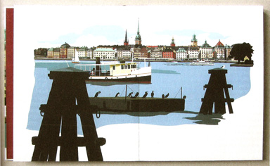
Gerry’s eleven images are printed on landscape sheets (37 x 56 cm, about 14.5 x 22 inches) of 310 gsm Woodstock felt finish acid free paper, which are assembled as a concertina-fold book. There is a further illustration on the title page and two more on the front and back covers of the book (130 gsm HP heavyweight coated paper). Bound in dark red quarter-cloth, the book is presented in a solander box bound in dark blue-grey cloth.
The artist is familiar with the city, having visited it often and designed goods sold in the Royal Palace. His distinctive illustrations reflect his personal response to the city’s vibrancy and beauty. Summery compositions focus on the water surrounding the islands on which the city is built, busy with ferries and other boats, with the sun shining from an azure sky. Djurgården 7 ferries, patriotically bedecked with Swedish flags, bustle to and from the former royal hunting ground. Views from waterfronts, across to neighbouring islands, are carefully framed by ships’ rigging. Landlocked scenes include Stortorget in Gamla Stan, a large square surrounded by stone or stuccoed brick buildings painted in a spectrum of earth colours derived from Italian precedents. Glimpses into mansion courtyards show the more intimate spaces found behind their imposing façades.
Gerry’s visual response to Stockholm is complemented by the book’s brief text, consisting of extracts from five eighteenth-century travellers’ published accounts of their first impressions of the city. ‘During the course of my travels, I have seen no town with whose situation I was so much struck as with that of Stockholm’, wrote William Coxe, in Travels into Poland, Russia, Sweden, and Denmark (Dublin, 1784). The travellers’ writings fill an eight-page section printed by letterpress on a pale blue hand-made paper (Velké Losiny Mill, Czech Republic). The choice of typefaces is novel for the Press: Eric Gill’s Joanna in 14pt, with headings in variations of Gill Sans. The Press is gaining a reputation for combining letterpress text with giclée digital images. ‘I have no doubt that Caxton would have preferred giclée to woodcuts if he could have!’ says Martyn Ould. ‘It is far beyond the power of words, or of the pencil, to delineate these singular views’, wrote Coxe. The twenty-first century technology available to Gerry would doubtless surprise the eighteenth-century travellers, but the lively clarity of his images of Stockholm would delight them.
The Colours of Rome: numbered copies £185, de luxe edition £350.
Stockholm Reflections: £295.
Old School Press
www.theoldschoolpress.com