
The three presses described here by their owners are operated in three different European cities, Zûrich, Hamburg and Paris, by British-born printers. We are pleased that our typographical ambassadors are working in such varied and vigorous styles.
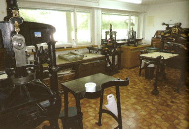
The array of hand presses in the Zûrich facility of The Iron Press
The Iron Press
Charles Whitehouse
It all started – as in a good many other cases, I suspect – with the copy of Printing for Pleasure I found in the library of the production department of Methuen, back in the 1970s. Having digested this, I trotted off to the Adana shop in the Gray’s Inn Road, and bought a brand new hand quarto press, as recommended by John Ryder. One of our printers – Anthony Mackay Miller, of Mackay’s in Chatham – kindly cast me a couple of cases of Van Dijck for a fairly nominal sum, and I was in business with inky fingers. On one occasion I was sent home early by the production manager to print some visiting cards, to be ready at 9.00 the following morning, for the chairman, who was receiving an important deputation from Japan, and had run out. This was also in the days when you could walk into Stephenson Blake’s branch office under Holborn Viaduct and buy a small fount of Union Pearl off the shelf, which I’m very glad I did.
We moved to Switzerland in 1978, where I worked for a while for McGraw-Hill, designing coffee-table books. I then worked for a small publisher of manuscript facsimiles, to whom I suggested that some letterpress limited editions might also be attractive. This led to the acquisition of a demy Imperial press and quite a lot of Romanée, which I continued to print with semi-commercially after we ceased working together. The Imperial, a very pretty press, with a powerful and easy action, has since been joined by three Albions, and this collection gave the Press its name. The demy Albion is a standard mid-nineteenth-century Hopkinson & Cope press, though it seems to have been extensively restored some time in the twentieth century. This means that it has a non-original but nice, stable, rectangular tympan frame, unlike the Imperial, whose original, tapered frame is none of those things. The other Hopkinson & Cope Albion is an early foolscap folio press, with ‘late R. W. Cope’ on the staple. It still stands on its original wooden stand. Lastly, I have one of the baby Albions (about A4 sheet size) made by Frederick Ullmer (aka the Excelsior Printers Supply Co.) in the 1980s. It is really a bit small for serious printing, with a very short drop and not much power, but will print visiting cards and the like well enough. Iron presses are wonderfully simple and versatile; not really machines at all, rather tools. They do nothing by themselves, but enable you to print as well as you can. Runs do tend to be short, though; I seldom go over 200.
Most of the type at the Iron Press is founders’, from continental foundries, including Enschedé, Bauer, Stempel and Deberny & Peignot, but also from Stephenson Blake and Stevens Shanks, plus a bit of Monotype. Differing type heights are no problem with an iron press, but Didot and pica spaces, leads and so on do need to be kept carefully separate. The Brotschriften, or text types, are Romanée, Janson and Baskerville (D&P), of all of which there is enough to set around ten pages, usually 14pt or 16pt, so as to be able to print a quarto sheet.
What I print tends to be related to type and type history and design. A recent project was a broadside specimen sheet showing an alphabet by Joseph Molé le Jeune. This was actually printed not from type, but from the original hand-cut brass pattern letters, about 3 cm high. How they came to be in Switzerland is a mystery, but Max Caflisch rescued them years ago from a Swiss printer and let me have them. The printer had mounted a couple type-high, so it was possible to proof them; comparison with Molé’s great 1819 specimen made it very clear where they came from. However, getting the whole specimen printed was one of those jobs where you end up wondering why you ever started. The individual letters had to be mounted (and the mounting had to be reversible) on aluminium blocks to get them type-high (the backs of the letters were at least finished, but not necessarily parallel to the faces). The double-sided tape used for mounting proved to be very susceptible to solvent, as I found out when one letter appeared to have moved slightly between proofing sessions. The forme was built on the bed of the press, with a lot of bodging to get the letters of varying heights properly aligned and spaced. The less said about the make-ready the better, other than that I began to wonder if it would ever be finished. Then there was the inking. The letters turned out not to be entirely plane; it took inking with three rollers of different sizes for each impression – and as for the spoilage…But in the end, the alphabet is a terrific early nineteenth-century extravaganza, with razor-sharp hairlines and big black strokes embellished with neo-classical ornament.
Sources of inspiration have been many and varied over the years. Tschichold and Van Krimpen, for their eye for spacing. (I do have a small, but essential, supply of quarter point spaces; there are limits though: Wolfgang Tiessen once explained to me at some length that if I wanted to set English with Janson, I would need a generous supply of undercut lower-case r, y and w, in order to get the commas and full points properly spaced. Well, no, actually, Janson is far too rough and ready for such niceties.) Francis Meynell for the wit and inventiveness of his typography. Giovanni Mardersteig’s press-men, for showing what printing on an iron press can look like. And, very happily, not long before he died, John Ryder wrote asking for a copy of something I had printed, so I was able to acknowledge my debt to him too.
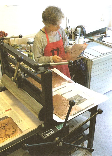
Caroline Saltzwedel at work.
Hirundo Press
Caroline Saltzwedel
The press arrived dismembered in a large wooden crate and was deposited on the pavement in front of the house. From there to our flat on the first floor were around 20 steps. It was a cold February afternoon in 1997, and I was alone. What to do? First lesson in self-sufficiency for printmakers faced with an immovable obstacle: Know how to wield a crowbar. I broke open the box on the street, which caused some amusement, not to say amazement, among passers by. The frame was made of hollow steel, which meant our century-old wooden floor would not suffer, but each of the two rollers is solid and weighs as much as I do. Second lesson: Know your neighbours. I had a small but powerful greengrocer round the corner whose help I enlisted for ten minutes. With him at one end of a roller we managed to carry both these monsters inside.
Once assembled, the 100 x 60 cm etching press can be moved within the room but not out of it. So my husband Johannes and I built it that evening in situ, in one half of a room we shared to work in. The cramped (and distracting) conditions this produced — when a large printmaking job was in progress, the whole of our flat turned into a construction site — became, ten years later, one of the most urgent reasons to move to somewhere larger.
But that was only the physical beginning of the Hirundo Press. The idea had germinated in 1980s Oxford, during Krishna Reddy’s weekend seminar held under the aegis of my printmaking tutor Jean Lodge at the Ruskin School. Both he and Jean had worked with the painter and printmaker Stanley William Hayter in Paris during the late 1960s, where Hayter’s legendary Atelier 17 attracted printmakers from far and wide. Reddy brought two artist’s books with him and talked about them before conducting his printmaking workshop on Hayter’s innovative technique of ‘simultaneous colour printing’, a combination of relief and intaglio printing that allows three inks of varying viscosity to be overlaid on a single plate. Two things struck me at that time. One was the flexibility of Hayter’s technique, which meant it could suit utterly different styles of depiction. The other was that such works often develop organically, as they express a dialogue between artist and poet. For a student of literature who had sidestepped into printmaking, this was an ideal challenge.
Typesetting came later. Hamburg’s Museum der Arbeit (museum of work) opened in 1997 with a large area devoted to typesetting and printing. Whole typesetting galleys are preserved here. I took lessons from a knotty-faced, dry-humoured East Prussian, Karl-Heinz Plewa, who like many of his colleagues had ceased working professionally in the early 1980s. Proofs are taken in the print area which contains hand presses of various kinds, among them my favourite, the recently donated Grafix. There is also a fully equipped printing room containing a Heidelberg cylinder and platen presses.
The first book was surprisingly swift in taking shape. I had set myself the task of printing new poetry: verse by a living writer so far unpublished in book form. The edition was to include etchings, which meant limiting the number of copies to 25: this is still an ideal maximum for my editions. Robert Crawford, a friend from Oxford days, offered the first piece, Impossibility (1998), on the extraordinary and tragic life of Margaret Oliphant. Crawford was so moved by her biography, describing her writing of over 100 books in the course of her life to support the whole family, that he placed the action of the poem under the surface of the sea. The poem is long (360 lines in 60 stanzas) and playfully prolix. It is also a rarity: one of the few feminist poems written by a man that I know of, and moreover one that completely avoids sententiousness.
The poem was divided into 12 double sheets, each with five six-line stanzas on the left and an etching on the right — which had to be printed first to preserve the imprint of the type (a risky test of good proofreading). Instead of calling these etchings illustrations, which strictly speaking they are, I coined the term ‘rhyming pictures’. I started typesetting the poem by hand and soon encountered my first problem. The typefaces in the museum were limited in scope and in quality; to set such a long poem would have meant using a face unsuited to the text. So to ensure pristine impressions, the texts of my first artist’s books were made using Monotype castings from the Offizin Haag-Drugulin in Leipzig, and printed in the workshop of Klaus Raasch, Schwarze Kunst, in Hamburg, where I assisted Klaus but did not print. Impossibility was set in 14pt Dante, a satisfyingly round typeface with a lovely italic, but without a bold face. This posed a slight problem for one of the stanzas; Robert had sent me a computer printout with one stanza in bold type, a publisher’s advertisement: ‘Read Mrs Oliphant’s The Chronicles of Carlingford! / “An assured success” “A work of great delight” …’ To highlight the stanza, we printed it in a blue mixed to match the top right-hand corner of the etching.
With the first book came the naming of the press. ‘Hirundo? Is that Japanese?’ asks a friend, and is rather put out when I tell him it is Latin; but not many Latinists are ornithologists to boot. The Hirundo rustica, the barn-swallow, became the emblem of the press partly as it is one of my favourite birds, partly for the melody of the name, and of course because the swallow is a bird of passage. A Swiss friend revealed the last aspect as the true meaning: actually, he said, the word is Swiss German, ‘hier und do’ (here and there). But only if spoken in a Swiss accent.
Since Impossibility, several other poets have collaborated with me on small editions of new work. With Kathleen Jamie I produced a bound book in an edition of 30, The Green Woman (1999). Kevin Perryman, William Radice, Michael Rothenberg and Robert Bringhurst followed in the course of the next 13 years. The editions have varied in size according to the preferences of the poets, which meant, for example, that I produced a simple edition (of 160) and an artist’s book edition (of 20) of Perryman’s cycle Daidalos. The agreement was always that the poet received ten per cent of the whole edition and an option to buy more at a reduced price. That was also the case with the first prose piece: in 2012, an essay by Martin Mosebach was set on the recently restored Monotype machine, finished by hand and printed on the Heidelberg cylinder in an edition of 130; this inaugurated the ‘Little Series’, named partly for the format, and partly because the number of books in this series, as yet unknown, will probably not exceed 12.
However, not all the books are editions of previously unpublished work. Others have been inspired by Joyce, Homer and Goethe; in the case of Joyce, two works were one-of-a-kind commissions that did not involve letterpress, so they were excluded from the Hirundo Press imprint. The first Joyce work, Ulysses in Hamburg (which prompted the commissions), was made for the centenary of Bloomsday in 2004, and consists of 18 colour etchings, one for each chapter of the novel. Below each main image is a small visual footnote referring to the Odyssey. The etchings are accompanied by a quirky commentary to each chapter printed by letterpress in a concertina cover; at the time of printing, Ulysses was still in copyright, so quotations were mostly avoided. This suite, also an edition of 25, has proved to be one of the most sought after Hirundo Press titles.
Other books are unconnected to literature. One of these is Eis, a ‘winter documentary in 25 collographs’, which records the astonishing winter of early 2010, when the Alster lake in Hamburg froze over for almost four weeks, so solid that one could cross it on foot. Collagraphs are fragile, so this was an edition of only 15. The relatively small amount of text was hand set in the museum’s house typeface, Futura, and printed on the Grafix.
The Hirundo Press is now in its sixteenth year. It continues to operate within a small space, but now has a printmaking room of its own. There is more space on its website, which is sporadically updated. It is a regular exhibitor at fine press fairs ‘here and there’ — in Germany, England and the United States. It remains gently independent, not taking commissions or starting a new project unless a real dialogue with the work in question begins. Each book is a new adventure.
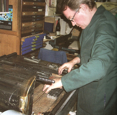
Michael Caine at work on the press at Editions Petropolis
Editions Petropolis
Michael Caine
I have been making books under different imprint names over the past 33 years, working with modern European poetry and illustrating texts with my own original prints. My first Paris publications came out under the name Editions Rosbif, a reference to the French slang word for the English. Editions Petropolis was called after a famous Russian publisher, and I first used the name for an edition of Akhmatova’s poems in 1997. Starting out as an illustrator with a deep love of poetry and literature, learning the book arts at the London College of Printing (1979–82), I gradually got more involved with type and the letterpress medium. I had a two-year spell at the Royal College of Art (1987–9) doing an MA in Printmaking that almost exclusively involved screen printing. Over the years I have also made lithographs, woodcuts, etchings, linocuts and monotypes for my books, but my latest editions are all illustrated with engravings on wood or plastic. I have a distinct preference for large formats: two of my major works (Lament by García Lorca and 11 Poèmes by René Crevel) are both Imperial folio editions. Colours — lots of them — are ever present in most of my work. I put my love of them down to my upbringing in grey, rainy Leeds.
Moving to France in 1990 seemed to be a logical step to me. I had always wanted to move there, for the same reasons as most people: climate, food, wine, culture, maybe perhaps le genre feminine; but the success of selling my work in Paris in the late 1980s to a wide range of book dealers was all the flimsy pretext I required to emigrate there. I had been in contact with Jean-Luc Lerebourg, a publisher/printer in Paris, before leaving the UK, and he accepted me as a part-time assistant in his letterpress studio, the Atelier de la Cerisaie, in the rue de la Cerisaie near the Bastille in Paris. He had acquired most of his collection of metal types from a closed down repro house called Tygra, that used to supply all Paris with couchés and célos. [translate please] I also found work teaching typography at the Académie Charpentier at Montparnasse within a month.
The historic date of my move to Paris was 7 October 1990, a dull rainy day, at the tender age of 31. I was fatally drawn to the French capital because of its reputation as the world centre of the book arts. Here was the ‘mother ship’ — the nation that had actually created the ‘livre d’artiste’. There was a freedom and boldness about the French artist’s book: the approach seemed unbridled, more artistic and not so hidebound by tradition as the average English private press book. In many ways, all the things that English designers found execrable in the French book art tradition, I found laudable.
In 1994, I bought out Lerebourg (for 6000 francs key money) when he moved away to Brittany, leaving behind his FAG proofing press and largeish collection of types on a long loan. I lived on these borrowed types, also buying the odd very expensive fount — from Haas’s office in Paris and Stephenson Blake in the UK — until 2000, when Lerebourg finally wanted all his type back. I then acquired a massive amount of diverse bin-end founts, many incomplete, from Stempel in Frankfurt: quite by chance I was showing work at the Book Fair at precisely that moment. I had already bought Janson from Stempel for an edition of a Jacques Brel song I printed in 1994. At that time I was looking for a roman fount that would become my main studio type, and Janson seemed to retain the most authentic traits of its original drawing. (Essentially I had to choose between the four Stempel classic romans, so I finally excluded their Garamond, Caslon and Baskerville.) Three years on, I acquired the types of the prestigious printer André Derue from Sarlat in the Dordogne, thus completing collections of two of my favourite founts, Garaldus and Paganini, both from the Nebiolo foundry.
Paris felt like a cultural crossroads to me because of the diversity of type foundries represented there, from within France and elsewhere. There were French faces from Deberny & Peignot and the Fonderie Typographique Française; and in the south the Fonderie Olive in Marseille had its own very particular style of largely illegible and kitsch creations. Neighbouring countries had also made significant inroads into the French design world: there was Neufville/Bauer with its Germanic types, and I found myself suddenly working with unknown types from Holland (Typefoundry Amsterdam), Italy (Nebiolo), Germany (Stempel, Berthold, Weber, etc.) and relishing the newness and unfamiliarity.
My own personal aim is to design and print with metal type in a way that looks of its time, fresh and original. I try to build in little details that are my own personal innovations, admittedly quite subtle, unnoticeable to all but fellow practitioners. I have always knowingly mimicked aspects of fashionable advertising typography. We are all influenced subliminally and directly by what see around us, so if we maintain that the texts we are publishing are of their time, and worthy of attention today, even if written decades back, then giving the text a contemporary feel is a way of saying it is as relevant today as it was back then. There is also a playfulness and humour in my experimentation with type, and hopefully a lightness. In terms of composition, I am always looking for that perfect optimal space between letters (even if these are paper spaces), words and elements.
This jolly spirituel approach is most evident in my most complete bookwork, Zaoumni. This consists of texts by the Russian Futurist writer and poet Velimir Khlebnikov (1885–1922) in French. He spent his life calculating that all great historical events are divisible by the number 3172. Each spread of Zaoumni (‘Zaum’ is the transrational language Khlebnikov created) is an independent typographical idea and like a small poster. I thought that the author would have enjoyed how I divided up the book into eighteen parts and printed the grid system in matt silver across the pages on the most exquisite bright jade green Japanese hand made paper. I likened it to the idea of exposing the workings of a building in the Russian architects’ modernist concept of architectonic integration. I wanted to have the text floating uncoupled on the page, the texts in perpetual slow motion drifting up and down, but beneath the apparent anarchy I had created — structure and coherence. Khlebnikov believed that one day a universal language made up entirely of numbers would exist and unite all civilisations in peace and harmony — and this was back in 1919! I put the book together using founts exclusively from Nebiolo (apart from one spread in Verona). I seemed to have collected a lot of these over the years and there was a pleasant quirkiness to them that seemed to fit the subject. They were also of the period, especially founts like the delightful Trieste (Kleukens Antiqua, 1910) which I employed in the limited and limiting sizes I had available. I mix and match the founts freely throughout, especially in titles, on the basis that Athenaeum, Manuzio and Eurostile were drawn by Aldo Novarese and Alessandro Butti, the designers at Nebiolo, and that there is an underlying similarity somewhere. What type can make a bridge to go from a bizarre art nouveau pseudo-Oriental letter like Babylonienne to a classical Elzevir titling like Manuzio? The French talk of types as being connotés, and founts like Babylonienne (a favourite of Hector Guimard) are originally Samoan, yet are used to evoke art nouveau Japonisant themes, while a modern type like Codex looks both Celtic and Oriental at the same time. These ‘correspondances’ (Baudelaire’s word) are the stuff of real fascination for me. For the last text of the book, ‘Infinity is my chamber pot’, I changed fount styles dramatically line by line, but unified the text block by making the colour of the type a graduating tint within a shape that mirrored my frontispiece engraving. Aristotle said ‘The greatest thing by far is to be a master of metaphor; it is the one thing that cannot be learnt from others … since a good metaphor implies an intuitive perception of the similarity in the dissimilar.’ You could call it ‘messing around with type’.
The colophon I made was a clear pastiche of ‘ferro-concrete poetry’, a creation of Russian Futurist typographers. These designs look like crackpot scientific formulae, and I spent three whole days recreating their style, just for one page, full of angled bits of metal spacing. I took my colour chart system from a catalogue of Armenian tapestries, oranges, blues, purples, browns. I have an undying appreciation of wonderful pigments.
My folly was to end up printing Zaoumni as five different editions on five different papers, because I wanted to accentuate the fine line work of my engravings on a paper that would be more amoureux. As well as a homage to Nebiolo, the book shows my debt to Naum Gabo for the style of the images: my first ever job after leaving the London College of Printing was in 1984 as an apprentice at his daughter’s house in Kent, the home of Graham Williams’s Florin Press. Beginning work on my Khlebnikov illustrations in 1999, I remained mesmerised by Gabo’s colour wood engravings from all those years ago.
I have now produced over 130 editions in Paris since 1991, for a whole host of clients, some quite famous — Roman Polanski, Claude Pieplu, Christian Lacroix, Sophie Calle, the Tour d’Argent restaurant, the Musée de vie romantique, the Maison de la poésie and the Cento Amici del Libro.