
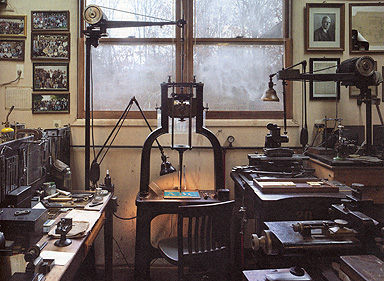
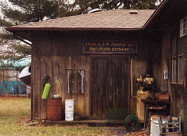
The Dale Guild Type Foundry is housed in a nondescript wooden building wedged between big box retailers and a fire station in suburban New Jersey. Situated on a small plot of land, the building is surrounded by a low perimeter fence that seems to set it apart in both time and space from its rather bleak environs. Once inside the foundry, the impersonal suburban sprawl quickly melts away and you find yourself immersed in a well-ordered (and well-oiled) craft haven. Everything is different: the quality of the air and light, the reason for working, and the expected rewards. Affixed to the building are three signs that sum up the aspirations and current activity of the Guild: ‘The Dale Guild of Medieval Arts,’ ‘The William Morris Society,’ and ‘American Type Founders Co. Employee Entrance.’
When it was formed in the 1970s, the Dale Guild was intended to be a wide-ranging organization that covered everything from women’s rights and secession from the Union to bell founding and mosaic making. They chose to name the Guild after the town of Dale where the craftsmen of JRR Tolkien’s universe lived and, as Theo Rehak tells it, the leap from Tolkien to William Morris was a natural one for them to make. Of the Guild’s early members, Rehak was tasked with learning the ‘onerous’ craft of printing (‘Nobody wanted to do it—they were all calligraphers’). Early on in his studies Theo’s attention was diverted by the type specimen books he came across and his focus turned from printing from type to making it.
In an effort to into the American Type Founders Co. to learn more about type founding, Theo showed a matrix he had made to the man in charge at ATF, George Gasparik. Gasparik was having trouble getting work out of his matrix engraver, William Gregan, and in a political power-play Gasparik told Gregan to train Theo to engrave matrices. Luckily for Theo, Gregan was ‘the only member of the ATF staff who didn’t suffer from antisocial behavior.’ He took Theo under his wing and taught him how to use Benton’s engraving machine. By the time ATF closed in 1993, Theo had worked his way through every department in the foundry, learning enough about each to have some sense of how to preserve it.
At the notorious equipment auction that quickly followed ATF’s closing, Theo and the other members of the Guild worked together to rig the lots and the bidding in what can only be described as an act of guerilla preservationism. (Knowing, for instance, that Stan Nelson wanted the Oxford matrices for the Smithsonian, no one else offered a single bid, frustrating the auctioneer and ensuring that the matrices were kept together and preserved.) In the spirit of this initial conspiracy the Guild members have continued to share resources, lending each other matrices, and working to keep the affiliated crafts of typefounding a living trade. As with any craft tradition, of course, the act of preserving typefounding requires more than skill and enthusiasm. It requires indoctrinating new, younger practitioners into the field.
My first encounter with the Dale Guild was in the autumn of 2000. Peter Koch had stopped by my studio with the exciting news that the Guild had re-cut, and would imminently issue fonts of, Frederic Warde’s Vicenza typeface. Peter and I had both had the opportunity to use Warde’s original type at the Press in Tuscany Alley and the prospect of having our own fonts of Vicenza was thrilling. After talking ourselves into a frenzy, Peter gave the Guild a call and told Theo Rehak that we would both place large orders for the type. When the call was finished, Peter related that there were just a few final fitting details to be worked out and that the Vicenza would be ready at some point in the coming year. Over the years that followed, I would place the occasional (unanswered) call to the Dale Guild to check on the type’s status, visit their web page to gaze longingly at a drawing of the font’s corsiva “f” (Vicenza is fitted with corsiva and formata finals), and fantasize about the books that I might set when — and if — the type was completed. It never was.
As with any large, unrealized project, there are many reasons why the Guild’s Vicenza typeface was not finished but the reason most often cited is the B42 typeface. In 1999, Theo and Alan Waring were approached by the Toppan Printing Museum in Tokyo, Japan to create a ‘genetic’ facsimile of the type that Gutenberg used to print the 42-line Bible. The museum, which was hastily founded to celebrate the ‘Man of the Millennium’ (Gutenberg) gave Theo and Alan five months to complete the project. Comprised of 292 different characters, including kerning characters that push the outer limits of what is considered possible, the B42 was a Herculean undertaking that has no equivalent in twenty-first century typefounding (and few equivalents in the typefounding in other centuries). It is the kind of project with which one ends a career. By the time the B42 was completed, much of the energy that would have been required to finish the Vicenza had been spent. In the year that followed, two thirds of the Guild’s customer base mysteriously evaporated and the forward momentum to publish a new typeface was lost.
During this period, my typographic interests shifted from classically-inspired twentieth-century typefaces to designing new typefaces of my own. Although the Dale Guild remained in the back of my mind as a place where metal typefaces could potentially be made, I never seriously considered them as an option for producing my type. Word had gotten around that Theo was not interested in type founding anymore and, like many people, I wrote the Dale Guild off. Setting type on the computer and printing it from photopolymer plates appeared to be the only realistic means by which I could print from my own typefaces.
In 2010, ten years after Peter’s and my inquiry about the Vicenza type, I heard that Dan Morris and Micah Currier had purchased the Dale Guild and were apprenticing to Theo. I suppose it did not occur to me at the time that if two young men with the names Morris and Currier were getting involved in type founding, I should pay close attention. Instead, I assumed that Micah and Dan did not warrant much faith. I was not terribly interested in the ATF catalogue of typefaces and I assumed that fonting pre-existing typefaces was going to be their focus. Gradually, though, I began to notice that I was thinking about metal type again in a way that I hadn’t done for years. In January of 2011, while discussing my new type specimen book with my wife Annie, it occurred to us that although we were happy that Micah and Dan were learning typecasting, the unique knowledge that Theo possessed was how to cut and fit matrices to make new typefaces. Having spent our lives as freelancers, Annie and I understood that for Micah and Dan to devote the necessary time to learn matrix engraving, they would need to have a job that would pay them for their time. The next day I emailed the Dale Guild and within a couple of weeks Micah and I were at work preparing the patterns for a titling type for my book, Specimens of Diverse Characters. By mid-March I was setting and printing from the first trial casting of my new metal type, Iohann Titling.
The day that Micah began work on Iohann, I visited the Guild to observe the process and to be on hand in case any questions came up. Before that day, Micah had experimented with the Guild’s Benton engraving machine but he had never produced a completely satisfactory matrix. As he began work, Theo sat behind him, giving him pointers, calmly reminding him to exhale, talking him through the process. The first step was to trace the capital ‘H’ onto a brass planchet in order to check the height parallel and confirm that the pantograph was reducing the image to the correct size and proportion. Achieving the correct height parallel can be a tedious task and over the ensuing hours Micah traced the ‘H’ seven or eight times, making miniscule adjustments along the way. With each successive tracing Micah and Theo would consult about the practice and theory of the pantograph, perform a few complex mathematical equations then get back to work. As the day progressed, Micah became noticeably more confident in his movements. By the fifth or sixth tracing, Theo began playing his trumpet in the background, on hand if needed but letting Micah work out his next adjustment on his own. Within eight months of that first work day, Micah had engraved, fit, and cast from more than seventy different matrices for me, comprising two titling faces and a complex set of ornaments.
When thinking of Micah Currier and Dan Morris, it is not difficult to imagine that we are at a turning point, that through their work there will be typographic options for the twenty-first century private press that were unthinkable just a few years ago. Between them, Micah and Dan are already having an impact on a future generation of letterpress printers. In addition to teaching letterpress at the Cooper Union and Pratt Institute (the Pratt classes are held in his Brooklyn studio, The Arm), Dan manages an open letterpress workshop at The Arm that offers workshops and studio rentals for new printers. Micah, meanwhile, has been filming and editing a documentary about the typefounding process from matrix engraving to typecasting. Next year he is planning to take a pivotal typecaster on the road to teach type founding at the Penland School of Crafts. In over twenty years of printing there has not been a time in which I thought that the craft of type founding was doing anything other than dying. To the young and aspiring printers who encounter Micah and Dan, the world of letterpress is one in which the craft of type founding is very much alive. As a community it is in our interest to support them.