
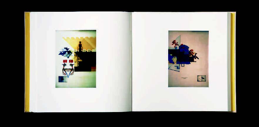
In 2009 Ken Campbell spoke at a comprehensive display of his work at the Library of Congress, holding an invited audience in rapt attention for several hours as he moved from book to book. Each title seemed to provoke a recollection, whether it was of a poetic turn of phrase or a peculiar moment at the press or an odd flash of inspiration. He was there ostensibly to celebrate his twenty-third and most recent work, Wall (2008), but the passion and charm of his storytelling suggested that he was taking stock of a life’s work. Wall was a book five years in the making, a project that represented a radical departure from Campbell’s earlier press work, and one that had carried him through a period of severe illness. The book was a revelation. His move from direct letterpress to digital inkjet printing softened the feel and palette of his work. The dark, thick stamping of tones found in his previous works gave way to a lighter page, as if somehow suddenly the digital production of a letterpress image had lifted some of the solemnity from Campbell’s hand. The texts spoke of the simple joy of experiencing his granddaughter’s birthday and of a dream of liberation and rebirth. Despite the barricades and constraints of life, of the city, and of the press, Campbell seems to have broken through the wall, free to celebrate young life and regeneration. Of all the complex themes that run through his work—death, violence, freedom, loss, spirit, and faith—Wall speaks of a triumphant recognition of life.
1. Wall (2008).
For those in the audience who had not yet met Campbell, they soon discovered that he was as remarkable as his books—unique, individual, and impishly perverse. He has a rough look about him; the kind of book artist that just might ask you to step outside to settle a disagreement. His work in some small measure mimics this rough and tough character. Like the printer himself, however, beneath the gruffness lies poetry and a penchant for asking big questions. Conversation with Campbell is fuelled by a quick dark humour, animated ideas, and the intimacy of experience. To carry through the full run of a conversation with Campbell mirrors the experience of viewing his books. We find heaviness and lightness, profundity and whimsy, and realism and romanticism. Behind the physicality of the artist and his work there is a thoughtful heart.
Born in London in 1939 (and ‘still crawling from the wreckage’), Ken Campbell left his father’s world of the docks behind, was apprenticed as a printer, and subsequently trained at the London College of Printing as a designer. Finding the conventions and expectations of the formal art world confining, he soon broke off to pursue his own work and began to teach typography and graphic design in art schools in Britain, Canada and the United States. His work also encompasses painting, drawing and sculpture, but his life’s work has focused on letterpress printing and artists’ books since the mid-1970s. Over the past four decades Campbell has created a body of work that is unchained, free of affiliation and beholden to nothing other than the strike force of the creative vision of this poet and printer. With each book it is undeniably clear that his art bursts out on the press, concocted when poetry and vision collide on the page. It is an art that belongs to the poet and the printer. It is unmistakably the art of the book and uniquely Ken Campbell’s.
It is important when viewing the whole of Campbell’s work to cut away to the core and the impetus behind his books. Stuck deep beneath the thick, sophisticated layers of texture and colour are words, text, fable and story. From his very first work, A Few Ways through the Window (1975), Campbell has hammered at the fusion of words and illustration, moving away from depicting them as parallel functions and instead forging them into a single entity. With his earlier works, the refashioning of text and illustration comes gradually. For the most part Window sets a series of poems in a traditional text/image response, and yet even within the confines of this approach, Campbell begins to explore how abstraction and photographic imagery interact with text. Two years later, with Terror,Terror (1977), the vision is already layered. Poetry is depicted as a sequence of accumulated words, taped to a wall and presented to us through filters, several frames back. The page becomes the frame that presents a lithograph of a photograph of letterpress printed words on a wall. Here Campbell is eschewing traditional design forms and combining photography and lithography as an ‘act of positive aggression’. At the same time, the artist is struggling to reconcile his father’s illness, pulling together words and fragments to make a poetic whole.
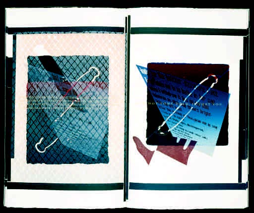
2. Broken Rules and Double- Crosses (1984).
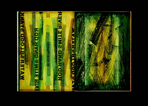
Much of Campbell’s work in the 1980s experimented with the visual presentation of verse and text. AbaB (1984) runs three parallel strains of a poetic conversation between ‘A’ and ‘B’ across the length of the concertina fold. The substance of the dialogue flows at the centre; the remaining two lines enhance or interrupt the conversation, assisted by the colour and placement of the screened type forms. The conversation asks us to think of ‘an ocean made of paper, upon which sits an open book’. The dual meaning of Broken Rules and Double-Crosses (1984) is examined by positioning Jewish and Muslim texts against the articulation of a Christian cross, which is constructed and overprinted using printing rules. Horse (1985), perhaps Campbell’s most open and text-oriented work, pairs a Sanskrit poem about the body of a horse to corresponding elements of the universe. Words such as ‘Days, Feet’ are coupled with ‘Food, Sand’ to create a concrete poem in which the words gallop across the page. In Night Feet on Earth (1986), a poem reacting to the modern sighting of Halley’s Comet is played across the universe of the page in woodletter capitals, scanning light or dark against the alternating shade of day and night.
3. A Knife Romance (1988).
4. Father’s Garden (1989).
By the time A Knife Romance is completed in 1988, Campbell’s visualisation of text has taken hold. The whole page is now as if a frame for a liquid mass, a molten flow of image, texture, objects and words. Campbell photographs at an angle a large woodletter printing of his poem; the resulting wedge-shaped images of the text are then photo-etched and printed against a pale ground, the text appearing to rise up from the depths of the page. The book surrounds the poem with images of a knife and with references to pain and loss that literally overlap with a poem on his mother’s death. The visual experience is one of depth and flow. Campbell later recalled that ‘A Knife Romance was the first book to deploy graphic and verbal elements at its beginning to give tongue to a drama found in their articulation.’ In Father’s Garden (1989) the poem is overprinted on itself, as if the lines were rows in a carefully tended garden, with new phrases emerging as the previous lines become obscured. Skute Awabo (1992) presents us finally with the full force of his sense of the page. Here image and text blend into a vibrant singular vision (Skute Awabo means Fire Water in Odjibway). His work from this point forward expounds upon this volatile blend, perhaps most profoundly in The Word Returned (1996).
5. Skute Awabo (1992).
6. The Word Returned (1996).
Campbell’s visual vocabulary includes a curious cluster of physical objects that dart in and around his text throughout his works. Figures such as an articulated toy pony, a puppet-like figure of Shiva, his sheath knife from childhood, a metal ruler, and a computer’s error message screen populate and interact with text and fall impromptu onto the page. The ordinarily unseen objects of printing such as rules, blocks and furniture are built into the bed, inked and printed, sometimes with ferocious intensity. Screens, staples, brads, nails and other found objects are pounded into the impression, creating a texture and a visual cacophony that is layered and embedded. Although weighted with symbol and theme, these images land on the surface as if they had been chucked by some casual gesture. It represents Campbell’s commitment to the spontaneous, taking risks and embracing the results of breaking the rules. It is part of Campbell’s mastery and artistry of the press.
7. Execution (1990).
In his catalogue The Maker’s Hand (2001), Campbell references a famous Miles Davis dictum to introduce one of his works: ‘Don’t play what you know—play what you don’t know.’ By the 1990s, this call for courageous improvisation is evident in Campbell’s total embrace of the press. These are physical books, composed at the press and jazz-like in their dimensional theme and variation. The immediacy of the act is sensed, the decisive moment to ink and move ahead is understood, and the impact of great physical effort is felt. In Execution (1990), a steel plate is progressively ground and cut to prompt a sense of decay when printed. Campbell laid retired type on its side and set it type high in Firedogs(1991), and surrounded this with printing plates nailed to their mounts. Commenting on the process, he revealed that ‘I tried to marry our world order of waste with an aesthetic of decay and lost form.’ In Skute Awabo woodletter and metal type are combined with ‘composing-room materials’ to create an all-over painterly effect.
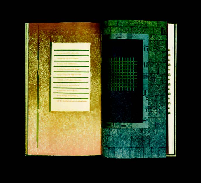
8. Ten Years of Uzbekistan (1994).
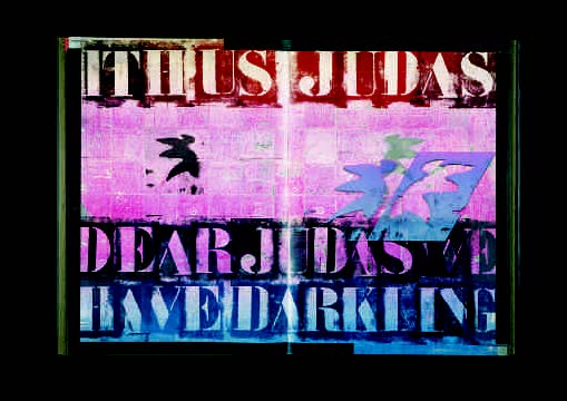
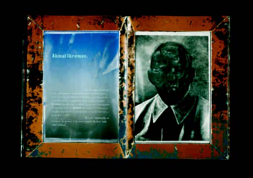
Ten Years of Uzbekistan (1994) takes the aggressive physical gesture to the level of metaphor, as the faces of people who vanished during the Stalinist sweeps are obliterated in Alexander Rodchenko’s album. Here layers of overprinting obscure and censor the faces of the missing victims, each of them bordered by a zinc frame. The framing device proved recalcitrant as printing progressed; the zinc plates consistently popped and lifted. Campbell attacked them with a barrage of staples, leaving the frame with a menacing texture that translated to the page. In The Word Returned, perhaps Campbell’s most visually arresting work, several texts are presented in a dos-à-dos format, including the poem ‘Dear Judas,’ which is ‘dedicated to my family, those people who jump out of rocks’. Amidst references to Adam and the golem and with images of wings and cascading computer screen type, Campbell has set the Judas poem in letterforms culled from zinc stencils. To space the letters properly, each had to be printed individually to allow for the overlap of the stencil’s frame. With an edition of 50, in dos-à-dos format, the entire poem required 66,000 crankings of Campbell’s recently acquired FAG proofer. With a technique that Campbell employed in earlier works, he initially set the makeup of the page by printing with a raised baseboard made of hardwood blocks. This darkened grid-like structure determines the reading of the page and reveals to the viewer the intensity of layer after repeated layer of Campbell’s driven press work.
Although The Word Returned is the most direct example, contemplation of the double emerges in several of Campbell’s works. Opening phrases reappear in reverse at the close of a text. Positives are given counterpoint by a negative. Images flip, rotate and respond to each other as they move across the page. Phrases repeat, disassemble, and then reunite. Woven throughout all of this, his own struggles are made evident. His personal losses, his quiet joys, and his struggle with the finite are ever present.
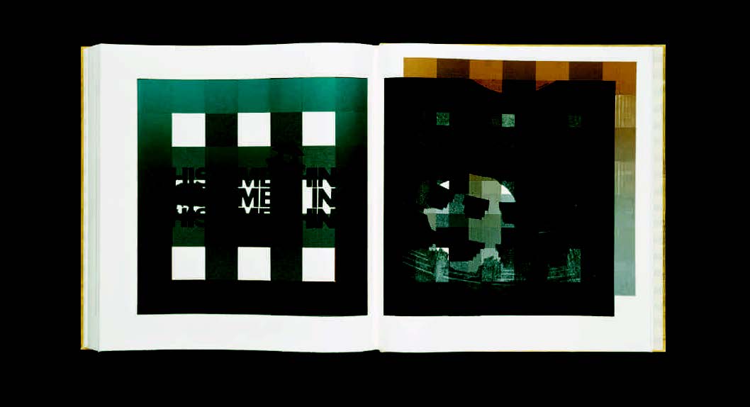
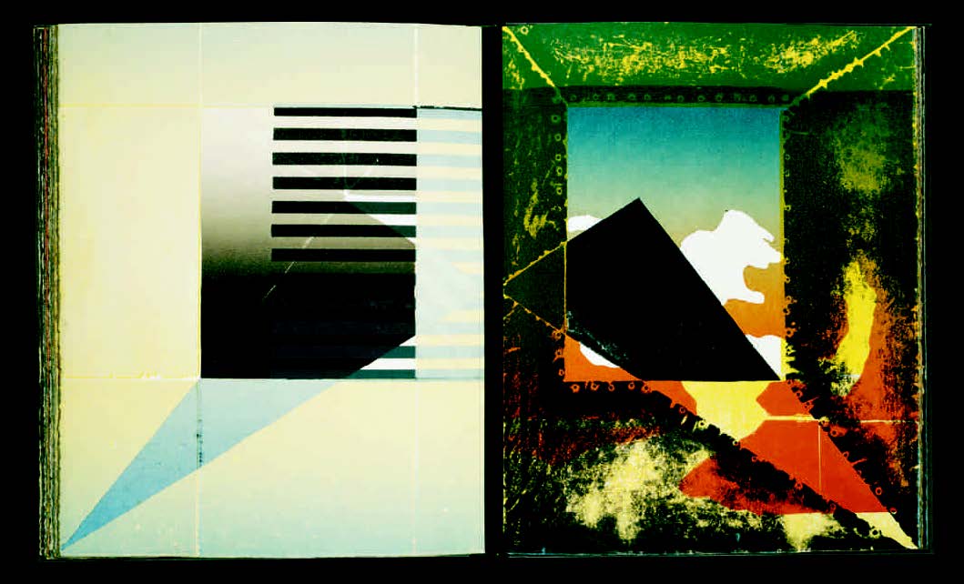
9. Pantheon (2000).
In Pantheon (2000), Campbell moves past the mere reference of self as he introduces his own likeness into the work. A photographic image of the dome and oculus of the Pantheon (‘a nigh perfect building’) is juxtaposed with an image of his own head, his skull mirroring the Pantheon’s dome. The shaft of light that pierces the dome is likened to the illuminating light of thought and recognition. A grid of wooden squares mimics the pattern of the ceiling, but the insistent black blocks also frame the image, creating a structure through which his face is either exposed or obscured. From inside this building constructed for every god, a detailed image of the ceiling’s coffering suggests emptiness, as if ‘the gods have fled’. Against the dark recesses of the dome and across the persistent black grid, the phrase ‘This Time Thing’ is printed, ghostly and grey. Light from the outside exposes the surface, but it is the light from within that illuminates the man, his thoughts and his recognition of his own time. Finally, after decades of making books, Campbell emphatically interjects himself into the frame. It is the perfect gesture, the spontaneous moment in which the press and the poet interact to shine bright with this unique vision.
Notes
Books shown above were printed letterpress, with occasional etching, computer manipulation and hand work. Wall was digitally printed using some images gained from letterpress materials.
Full descriptions and further illustrations of all Campbell’s books are available at www.brokenrules.co.uk