
Hendrik D.L. Vervliet, French Renaissance Printing Types: A Conspectus. (Oak Knoll, DE: Oak Knoll Press, 2010). US $120.
For typographers and type designers who have neither the means nor the constitution for extensive travel, illustrated reference books about type are more than an entertainment for a long winter’s evening; they provide an invaluable portal to otherwise inaccessible typographic material. Given that a personal visit to the Plantin-Moretus Museum in Antwerp is not likely in the near future, I received Vervliet’s exhaustive survey of the sixteenth-century French types with an attitude I can only describe as gratitude.
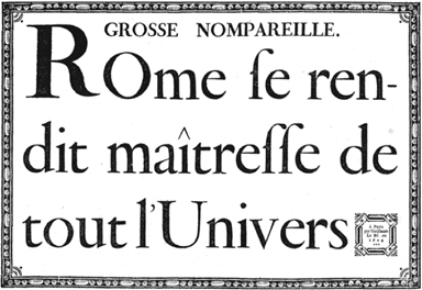
That anticipation did not go unrewarded, for French Renaissance Printing Types may in time prove to be among the most useful typographic reference books in my library. The book opens with Vervliet’s thoughtful, well-written description of the evolution of the craft of typecasting and punchcutting and detailed biographical sketches for the seventeen punchcutters identified in his survey. Then, after some discussion of methodology, it proceeds by way of at-size reproductions of 409 unique types, all skillfully described. The types are grouped by roman, italic, Greek, Hebrew, and Arabic and presented in order of size, ranging from nonpareils to ten-line picas.
To some extent we are accustomed to looking at the best work from any age, for this is what survives and is imitated and revived. Looking at the purity of the letter shapes produced by masters like Garamont and Granjon, it is easy to understand why they have endured even into the digital age. The sample of Garamont’s Two-line Double Pica (no. 208) depicts letters as close to their ideal form as one might ever hope to write, engrave, draw, or describe with points and control arms. Yet one of the great benefits of a comprehensive survey like Vervliet’s is that it also presents us with the largely ignored though no less skillful specialists like Haultin, who explored the smallest limits of letterforms cut in steel, as well as countless clumsy efforts by less gifted punchcutters. This wide scope is, I feel, where the book’s true success lies.
Where this book sometimes falls short is in its own typographic design. For a publisher that has the clarity of vision to champion so many important books about books and type history—books that might otherwise go unpublished—Oak Knoll’s attention to production and design is often lax. In this book, problems range from disproportionate pages and crashing glyphs to a disastrously crammed index. Am I mistaken in thinking that Vervliet, his readers, and the punchcutters he honours in this work deserve better? Ironically, the book itself reproduces countless historical examples of exemplary page design—composed with much cruder technology—that could have pointed the way. I raise this point because I believe Oak Knoll’s publishing program is so vitally important and know that these problems could be so easily rectified.
Oak Knoll Press
310 Delaware St.
New Castle, DE 19720
Tel: 302 328 7232
Email: oakknoll@oakknoll.com
www.oakknoll.com