
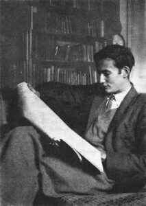
Which work of graphic art is owned by the largest number of people in Britain? Not a dancing couple on the beach by Jack Vettriano, I would suggest, nor a green Siamese girl, but the royal arms that appears on the British passport. How many moderately well-informed art lovers would know the name of its designer, Reynolds Stone, whose centenary falls in 2009? Not very many, probably. Since Stone’s death in 1979, his work has not enjoyed the sort of posthumous fame enjoyed by his contemporaries Edward Bawden and Eric Ravilious. It has different qualities, admittedly, and yet in its varied manifestations, it has a timeless appeal. The royal arms, dating from 1955, shows no sign of going out of date, and it is impossible to think of any artist working today who could challenge its appropriateness and authority if it had to be replaced. It is a good exercise to work out what are the characteristics that give it staying power without pomposity. There is nothing unusual about the icono-graphy, or ‘style’, and yet it has ‘style’ in the colloquial meaning. It has just the right balance of light and dark, between naturalistic animation and formalism, and the whole thing ‘hangs together’ with remarkable ease.

Reynolds Stone had no formal design training and did not attend an art school, although his mother was an amateur painter and his boyhood hobby of making wooden model ships based on the real ones he saw in Bridport harbour was carried to perfectionist lengths. After taking a modest degree at Cambridge, he was recruited to work on apprenticeship terms at Cambridge University Press in 1930, distantly under Walter Lewis, but more immediately under the overseer of the com- posing rooms, F G Nobbs, who set him to designing title pages. Stanley Morison was the typographical adviser, a post created some years earlier for Bruce Rogers, so that Cambridge probably excelled Oxford in typographic literacy. Morison later became a personal friend who ‘thought the world’ of Stone, and on whom Stone wrote a perceptive and admiring memorial article in The Listener in 1972.
During his time at Cambridge University Press, Stone had an accidental meeting with Eric Gill on the train from London to Cambridge. Not surprisingly, they had much to discuss, and the following day Stone went to the newly-built Mond Laboratory where Gill was carving a crocodile directly into the brickwork as a symbol of unleashed energy, and was able to try his hand with the chisel and bolster. This was followed by a visit to Gill’s artistic colony at Pigotts near High Wycombe, where Stone gained more experience in letter design and cut-zting. He instinctively knew he should not stay too long at Pigotts, but he left with enough knowledge and experience to set him on course for a small but distinguished body of work in this field, including the monument to Winston Churchill in Westminster Abbey, and the headstone for Benjamin Britten. He liked classic roman capitals, tending to rather compressed M and W forms. He then began to find the work too much of a distraction from wood engraving and in 1953 hired Michael Harvey, who launched his own career from the workshop at Stone’s Dorset home.
Stone also started engraving for printing, on metal and on wood, while at Cambridge, and he discovered Bewick. His interest in pictorial engraving developed further when he went to work for a printer in Taunton, Barnicott and Pearce, having failed to find a position at the Gregynog Press. This move was typical of his modesty and lack of pretension, but as Myfanwy Piper commented in her 1951 book on Stone, ‘it was much nearer the right place for him to be than the Gregynog Press would have been at that time’, explaining that Stone not only got down to earth with this unremarkable country firm, but he was free to explore the countryside on a bicycle, and to dig out some boxes of old wood blocks which he studied in detail, thus learning from the example of old trade engravers rather than sophisticated moderns.
This story of Stone’s formation exists in many versions, several in his own words. Much of the detail has been omitted here, but it is worthy of study as a way of understanding his position among his contemporaries. He is a figure spanning the pre-war and post-war periods, and his work did not change substantially between the two eras. In fact, one could put some of Stone’s earliest pictorial work next to his last, and be pushed to tell which was which. Some artists make personal development the story of their life, but Stone preferred to stand still and let the world go on its way. He did so literally, by finding a house to live and work in at Litton Cheney in Dorset, buried deep in the country and within sound of the sea, where he preferred to remain, while his wife, Janet, and his family enjoyed giving hospitality to a remarkable range of artistic and literary people who were entranced by the idyllic atmosphere. The library shelves were particularly well stocked, and Stone was a connoisseur of the engravers of the 1860s, who managed to push their heads above the tide of Victorian literalism and breathe an air of freedom.
He was able to reserve his energies for a considerable output of work, which in its variety of responses to commissions resembles the output of the Bewick workshop in Newcastle, but was something rare in the 1950s and 60s, although more commonly found since the craft revival of the 1970s. In addition, he was a pioneer in realising the threat of modernity to the natural world brought about by changing practices of farming and land management, and did his best to stem the tide.
‘Ruralist’ and ‘nostalgic’ are words that might be shaping on the lips of some unsympathetic critics. From a verbal description, Stone might be deemed guilty, but the work arguably evades such condemnation. In the same way that Bewick depicted the world that he saw around him, so did Stone. He was passionate about Samuel Palmer and Edward Calvert, but he did not attempt their levels of symbolic transfiguration. Stone’s own words about Bewick’s tailpieces, taken from the book about the artist he compiled for Rupert Hart-Davis in 1953, seem applicable to himself:
. . . a quality that has more to it than good drawing and good engraving happily combined, more than pattern-making and a technique that will always be of interest to engravers and collectors. For behind these skills was that strong love of the object, whether bird or rock or verdure, which was implanted in his childhood and which all his life he was struggling to express.
Stone did not aim for Bewick’s naturalism, but, in a typically mid-twentieth-century spirit, he pulled the white line technique in the direction of greater abstraction, although nothing like so far as Paul Nash or Eric Ravilious. Bewick knew by practice and observation what would print successfully with the available machinery and skills. By starting his career in the composing room, Stone was also well versed in the limitations of presses and pressmen, and his method of cutting a wood block allowed for a delicate gradation of tone without strokes that were so fine that they might get clogged up, or large solid blacks that might break up. It was a skill shared by many others, including a fellow Bewick enthusiast, Gwen Raverat, whose work his own most closely resembles, and about whom he wrote in an appreciative introduction in 1959:
She was not interested in lines for their own sake, or in decorative textures. Nor was it her business like Bewick’s to describe the feel and accurate appearance of a bird’s plumage or a mammal’s fur. She was concerned with lightness and darkness. It is wonderful to watch her apparently effortless control of light in print after print. It is fatally easy to cut away what cannot be replaced and this inhibits freedom and makes for a timid or careless approach. Fortified by her sound drawing she did not jab about on the block nor did she attempt eye-straining neatness.
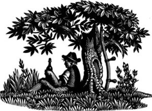
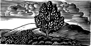
Like Raverat, Reynolds Stone illustrated a number of books. He was faithful to the texts, but able to make images that stand well on their own, and indeed are now most often found in isolation from their original setting, as in Myfanwy Piper’s book, or the much-enlarged collection published by John Murray in 1977. The general effect of the imagery might be compared to the more thoughtful strain of ‘Georgian Poetry’, that refined pastoral revival that included Walter de la Mare and Edward Thomas, with the former’s sense of the other-worldly lurking in lonely and abandoned places, and the latter’s ability to see natural beauty without sentimentality. Stone was exceptionally skilled in rendering the pattern of leaves, the texture of a wall, the light of a cloud or a mountainside, as a series of graver strokes. He had a good sense of design and composition that creates spatial depth without breaking the unity of the printed image. So brilliant was his control of black and white that, when he tried the same subjects with line and wash in the watercolours he did for his private pleasure, the enlarged means at his disposal could produce a diminished intensity.
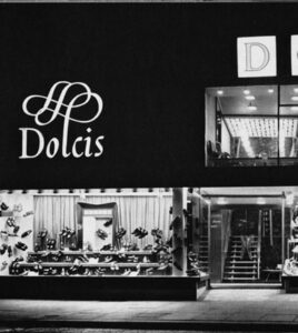
The type of engraving in which Stone especially excelled was white line lettering. His skill with letterforms was traceable to the sea of typographical revival in which he was fortunate to swim from an early age, drinking from The Fleuron and from original sources. ‘Craftsmen and artists should thank God for scholars’, he wrote in his appreciation of Morison in 1972. In this piece, he complained of modern trends, in which ‘layouts are often confusing with vast areas of white space in the gutters and type slithering off the page with no margins to speak of at the bottom or the sides, like architecture with upstairs windows level with the floor’. The engraved lettering, comprising about half his total output, varied from formal inscriptions and title pages to book labels, for which he preferred italic script with flourishes to fill the empty spaces. Early on, these may have threatened an uncontrolled exuberance, but they found a natural rhythm, not only for the private delectation of bibliophiles, but also for the Dolcis shoe company on high streets across the country. It was right that wood-engraved lettering should have become the common property of the revived craft, and practised in other skilled hands such as Diana Bloomfield’s and Leo Wyatt’s.
The various parts of Stone’s achievement have now been briefly described. How do they stand as a whole? To say they are timeless is a compliment, but not an analysis. In fact, the desire to achieve perfect poise through the balance of nature and art is not a cultural constant, but a manifestation of the tendency we identify as classicism. In this sense, the period of Stone’s working life was a strongly classical one, even, in many ways, when it aspired to be modern. The origins of this impulse can be traced back into the nineteenth century, but in the twentieth it seems to have taken on a new character, enjoying some new freedoms, including access to a wider range of historical sources, but also new self-imposed limitations of propriety and taste. Among the intentions of this movement that we may wish to commend are the desire to achieve universal communication in a legible language, and to suppress the ego of the individual artist. These intentions were driven by a desire that art should not be reserved for the privileged few, but become widely available without any compromise of standards. Typography was a brilliant means to achieve them, because it flowed through all areas of life, and fulfilled an unquestionably functional purpose. Stanley Morison’s redesign of The Times, apparently achieved overnight in 1932, was probably the most dramatic coup. The universality of Times New Roman in the digital age, when its designer’s name has been forgotten by almost all, is a vindication of the whole principle of doing good by stealth. I have written of this and other examples of austere but quietly romantic classical design from the period as the ‘George VI style’, because the years 1936–52 seem to be its peak period, when a complete makeover of the national identity took place, equally by stealth, of which Stone’s royal arms on the passport is one aspect. It was a truce with modernism, meeting it on common ground of utility and functionality, while reserving the possibility of representation and historical reference.
The war years were important because the social disruption and expansion of the state’s role during the period accelerated the process of transformation. Much design work was produced during this period that has not improved with time, but one could list, as part of a ‘cluster’ of more or less like-minded artists around Reynolds Stone, such names as Edward Ardizzone, Joan Hassall, Lynton Lamb, George Mackley, John Nash, John Piper and Laurence and Rex Whistler. One can find their equivalents in music, and Stone was a friend of the composers Gerald Finzi and Benjamin Britten. His literary friends included Iris Murdoch and Sylvia Townsend Warner.
This was a generation with a consistent outlook, all born a little before or after the turn of the century, and mostly retaining memories of the world before the Great War, which they tended to view as the great divide of their time. Not long ago, most of these figures were living contemporaries, but a generation later, the work of finding appropriate historical frames through which to see them is only beginning.
Alan Powers is a Professor in Architecture and Cultural History at the University of Greenwich in East London. He is also Chairman of Pollock’s Toy Museum in London.