
While cited at the time for its revolutionary typography, Stichting de Roos’s tercentenary fine-press edition of Vondel’s Lucifer (1954) has several spreads that emphatically recall title pages of the Dutch and German Mannerist and Baroque writing manuals. What was revolutionary about the typography was the gestural arrangement of the text blocks, folios, running heads, and subheads; but what recalls these manuals — and the work of writing masters such as Johann Neudörffer the Elder, Felix van Sambix, and Jan van den Velde — are the extravagant multi-stroked raffia-esque initials leading into the adjacent blocks of text.
The text is set in Hermann Zapf’s Sistina and Palatino types. Six act-opening typographic spreads follow six richly illustrated facing pages. The illustrations show rows of angels and fallen angels engaged in combat, conversation, call and response. The illustrated spreads are dense with line-work set against a tinted ground printed from wood grain. The initials are reproduced from hand-lettered masters.
In the colophon we find the now almost forgotten name Henk Krijger. We discover that the typography is his and that the initials and illustrations are also of his making. So here three tightly knit Henk Krijgers meet: Henk Krijger the illustrator, Henk Krijger the type designer, and Henk Krijger the book designer. The book is an early and definitive statement of Henk Krijger’s mature typographic approach, the illustrations perhaps pivotal in his oeuvre, and the initials the inaugural display of his one and only published type: the Raffia Initials.
Henk Krijger was a prominent member of the generation of typographers and graphic designers that included Dick Elffers, Dick Dooijes, Henri Friedlaender, Willem Sandberg, Jan van Keulen, and the German expatriate Helmut Salden. It was a generation that did not enjoy the notoriety of the one that had come before, which included Piet Zwart, Piet Schuitema, Hendrik Wijdeveld, Sjoerd de Roos, and Jan van Krimpen, or the celebrity of the generation that rose to prominence after. In Krijger’s generation, the lines between classical and modern were less easily drawn. Where Jan van Krimpen practiced transparency, symmetry, and restraint, and Piet Zwart a dynamic assertiveness and asymmetrical balance, Henk Krijger sought a gestural orchestration and flow of components. He designed or illustrated four Stichting De Roos titles and his designs appeared seventeen times in the Dutch Fifty Best Books award, for which he designed the 1956 edition.
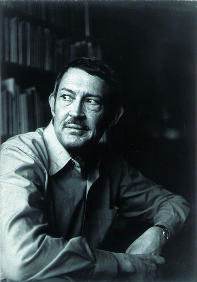
Henk Krijger, illustrator, type designer, and book designer, 1914–1979.
Hendrik Cornelis Krijger was born on Sumba in 1914 in the Dutch East Indies, the son of Dutch Protestant-reformed missionaries. After a difficult preparatory school experience in downtown Amsterdam, Henk immersed himself in interbellum Arts and Crafts, Symbolism, Late Medieval Netherlandic art, and Magic Realism; and he acquired experience as an illustrator, typographer, and book designer. As he matured, his closest interpersonal and collegial ties were members of the Protestant literary scene. During and after the war he made a break for a distinctive brand of Dutch-Flemish expressionism.
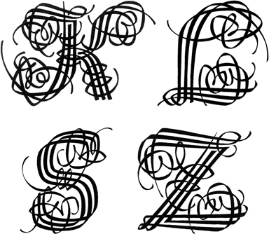
The Raffia Initials are not easily or effectively captured in conventional type-classification schemes but they do have several recognizable affiliations. These include the exquisite lyrical lettering of Helmut Salden, Henk’s own lettering, the chancery Latin majuscule, the idiosyncratic kinking behaviour of dried raffia fibers, and large versals.
’s 1950s designs for the van Oorschot editions of Dutch editions of Russian classics in the way Henk modifies the contrast where strokes change direction, bend, or curve. The Initials also show a resemblance to the “L” on the cover of the Stols edition of Rilke’s Les Roses (1948). Moreover, they are direct descendants of Henk’s own work for a self-promotional edition of Zalig Kerstfeest (Blessed Christmas) by the then popular Danish religious figure Kaj Munk (Daamen Press, 1950). In fact, it might have been this work that prompted Lettergiterij Amsterdam to commission Henk to design the Raffia Initials.
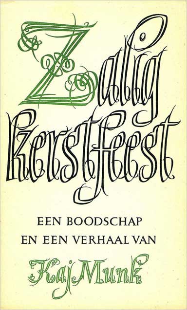
Kaj Munk. Zalig Kerstfeest (Blessed Christmas). Daamen Press, 1950. An example of Henk’s hand-lettering that may have prompted Lettergiterij Amsterdam to commission him to design the Raffia Initials.
The Initials formalize raffiating behaviour in calligraphic ways. Their basic forms relate to the swash italic capitals of the Italian mannerist tradition
but their structure relates to that of medieval versals, which scribes wrote with the same pen as the text by building them up with parallel strokes. While this practice may have been a matter of convenience, Gerrit Noordzij suggests this was done for aesthetic reasons as well: “Separate strokes maintain the connection between big versals and a small text hand.” Writing masters and Baroque or Mannerist printing firms produced entire alphabets of these cadels, or lettres cadeaux.
The Raffia Initials deviate from the construction of conventional lettres cadeaux in the way the main strokes interweave and how the extensions “raphiate.” Henk’s elaborations on the lettres cadeaux are lavished on the swash italic rather than the traditional fraktura or textura form. The Raffia Initials also use a different style of cross-component binding and only three strokes are ever used to create the stems and bowls. The cursivity, sudden accentuated turns, swashes, slight slope, and the move toward angularity in the bowls of the southern-European Mannerist swash italic reappear, but are inflected in a Saldenesque and Krijgerian way. We find these and related features in other Krijger forms as well. Examples are a mid-1950s printer’s mark for N.V. Samsoms, Alphen aan Rijn, an exquisitely fragile monogram for Sonnets from the Portuguese (Stichting de Roos, 1957), and a “JMR” monogram for a friend, circa 1972. All of these letterforms represent a particular strand in Henk’s broader letter-oriented work.
In their dual incarnations as metal sorts and phototypes, the letters have been used in sometimes notable but often in predictable and less distinguished ways — both by Henk Krijger and a score of others. The phototypes suffered a serious generation loss. The Initials were and are admired by the likes of Carl Dair, Will Rueter, Kay Amert, and Harry Duncan of the TypeLab in the University of Iowa. Joseph Ishill used them in his design for Frederic W. Goudy’s Evening at Deepdene (Oriole Press, 1964) as did Ben Feydherbe and Wout de Vringer in their commercially produced posters for De Haagse Zomer (1889 and 1990). In all incarnations they remain an incomparably “convincing demonstration,” in Robert Bringhurst’s terms, “of the identity — at some level — of calligraphic and vegetable form.” They find “the root at which expression and abstraction and representation and tradition are all one. And out of this root produce an alphabet that can only be used antialphabetically: one letter at a time.”
Fortunately the hand-drawn masters of these wonderful letters now exist in the typographical library of the University of Amsterdam.
Peter Enneson is a publication designer and art director in Toronto, Ontario.