
This adventure began when my wife, Susan Filter, began pressing me to consider printing Watermark, a series of essays in memoir form, by the poet and Nobel laureate Joseph Brodsky. Watermark is a series of lyrical meditations woven from the fabric of late twentieth-century Venice, and a meditation on time and beauty and love — a looking glass romance of a Russian poet-in-exile with a city that beguiled his eye.
Venice — where it is said the mirror was perfected — is a city in which one contemplates beauty by merely opening one’s eyes. . . .
Susan met Joseph in Venice in the mid-1980s while he was writing Watermark and she was studying paper conservation. She and Brodsky became great friends and remained so until his death in 1996. Susan and I met in 2001, and by 2005, she was determined to see a work from his hand fall under the imprint I had established to publish works of art and literature in hand-made editions.
Early on in our planning we invited Susan’s friend Robert Morgan, a painter and longtime friend of Brodsky’s, to illustrate the work with his photographs. (Brodsky dedicated Watermark to Morgan in 1986). The real challenge that confronted Susan was how to persuade me to print it in Venice. Admittedly, I was pre-disposed to the idea. I had already dedicated a considerable portion of my life to re-inventing the renaissance ideal of the scholar-artist-printer in a post-modern context. I could imagine printing in Venice but I certainly could not afford to print in Venice. Venetian real estate was top-out-of-sight, the dollar was down, and we had no press to print on, no studio to print in, and no house to call home.
Once she had convinced me that I should design and print an illustrated fine art limited edition of Watermark, however, I was continually surprised by circumstances beyond my control. Susan clearly was playing with a full deck of cards. I could see only the top card.
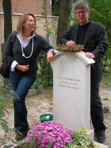
“Because we go and beauty stays.” Susan Filter and Peter Koch visit the grave of friend and poet Joseph Brodsky.
On our next visit to Venice, in the Fall of 2005, having just made the decision to print Watermark (in Berkeley), we made an appointment to visit the Tipoteca Italiana, a printing museum in the Veneto. The museum’s co-coordinating director, Mr. Sandro Berra, introduced himself by saying that he was already familiar with my work. When he heard that I wouldn’t mind printing a book in Venice (wishful thinking only, please) he surprised us with a most generous offer to collaborate and enthusiastically offered to lend us any press in the museum and bring it to Venice for us! What a generous introduction to an impossible dream.
Two days later, Matilde Dolcetti, a cousin of a friend and owner of the renowned Scuola Internazionale di Grafica di Venezia, hearing that I was interested in printing in Venice, invited me to be an artist-in-residence and occupy a comfortable studiolo with a view of the Grand Canal behind their printmaking workshops on the Rio San Marcuola. Then, finally, as if to make it impossible for me to say no, that very evening we were invited by the newly created Emily Harvey Foundation to occupy a spacious apartment near the Tre-Ponti Bridge until we (and our band of visiting artists, artisans, and printers) completed our work at the Scuola. All of these offers came in a single week!
In the face of such an overwhelming welcome from the citizens of Venice I could find no objection and it would, in fact, have seemed ungrateful if I declined such generous offers. Thus the project was decided — all on a handshake and a smile! Viva Italia!
We returned home to make preparations.
The five months immediately preceding our arrival in Venice were spent making meticulous designs and inviting the collaborators to join in the work ahead. From the outset I was determined to design a contemporary book with a distinctly fifteenth-century Venetian ancestry.
First we ordered 2000 sheets of Da Vinci hand-made paper from the Twinrocker mill. At the same time we ordered 1000 pounds of lead type to be cast at the legendary Oliviere typefoundry in Milan. I chose Monotype Dante, designed by Giovanni Mardersteig and originally cut in steel by Charles Malin — a Venetian typeface with dignity and an illustrious history. The Oliviere foundry was in possession of a fine set of matrices that Mardersteig himself had refined after the Monotype Corporation had issued it for the trade.
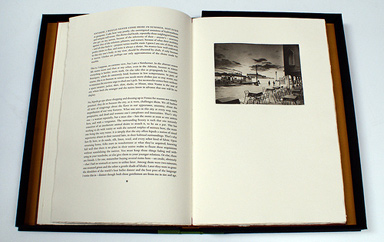
Morgan visited Berkeley in June and worked with us at Magnolia Editions to prepare images to make photogravure plates from his original photographs. Donald Farnsworth conceived and performed the digital magic that created the theatrical movement of the gravures you can see in the book. It took the printers at Magnolia Editions three months to complete the printing of the fourteen photogravures in an edition of fifty copies each. They were shipped in time to arrive just after we were to set up at the Scuola Grafica.
We arrived in Venice on the afternoon of Friday the first of September, 2006, dropped our bags in the Rialto apartment and caught the number one vaporetto to Harry’s Bar for an ice cold martini.
On Monday, joined by a group of journalists who were writing about our exploits for the German periodical MADAME-DE, we traveled out to Cornuda to inspect the type and presses that were being prepared for us at the Tipoteca.
At dawn on Wednesday the presses arrived at the Tronchetto, the Venetian freight dock and loading zone just near the Piazalle Roma. The boatmen loaded two presses, 1000 pounds of Monotype Dante, and our borrowed galleys, composing sticks, spacing materials, press furniture, tympan paper, and solvent rags into a bright orange barge with bold black lettering all down the side proclaiming the address, phone number, home-port, and the company name, Gianni. Christopher Stinehour, Susan, and I quickly jumped aboard the barge and we sailed down the Grand Canal under the Rialto Bridge to unload the equipment at the Fondamenta San Marcuola and manhandle it down a long alley into the Scuola Grafica, where I would set up our studio for the following months. We were accompanied by a riot of friends and paparazzi who followed along in a boat piloted by the Venetian poet, Franco Ferarri. The journalistic team from Germany, the Stinehour family, and the Accinelli family were all furiously taking notes, photographs, mini-movies, and generally enjoying a lark on the Grand Canal on a brilliant sunny fall morning.
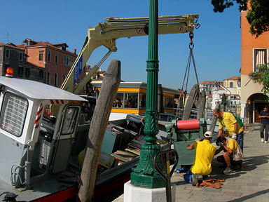
The Tipoteca Italiana’s press comes ashore near the Piazalle Roma. Aldus’s presses were delivered not far from here over 500 years earlier.
Joseph Brodsky tells us in Watermark that as a young man, still in his native city of St. Petersburg, he often imagined visiting Venice. As a young printer from Montana, I too imagined Venice. I was fascinated by the books and the typography of Johannes da Spira, Nicolas Jensen, Erhardt Ratdolt, and Aldus Manutius — the great printers who had come to Venice in the fifteenth century and between them created some of the world’s most splendid and enduring typefaces and printed books. Robert Morgan also must have imagined Venice before he arrived, but unlike myself, Robert has made Venice his home for the past thirty years. The beauty of Venice inspires the poet to write, the painter to paint, and in my case, the printer to print.
Watermark and the city in which it was printed are both works accomplished by hands at joyful work — always the work of the hand guided by the eye.
About Venice and the eye, Brodsky says, “The eye in this city acquires an autonomy similar to that of a tear. The only difference is that it doesn’t sever itself from the body but subordinates it totally. After a while — on the third or fourth day here — the body starts to regard itself as merely the eye’s carrier. . . .”
Of course the Watermark we have conceived and printed is more than eye work — it is a lyrical and deeply poetic essay, written by a Russian poet about a city that he loved.
As a work of art in the hand, a book is sensual in its intimacy, a living symphony of materials and structure. The papers of Watermark were all handmade by artisans devoted to their craft. A special watermark, designed by Susan Filter for the title spread of the book, derived from a particular set of Byzantine Gothic windows in the Cortile del Milion in Venice where Marco Polo is reported to have lived: the courtyard of the million stories — or as told to me by a Venetian — the million lies! A bronze medallion, with the original title of the book, Fondamenta degli Incurabili, was designed by Christopher Stinehour and cast at the famed Valese Foundry in the Canareggio district of Venice to grace the cover of the deluxe copies. The hand-printed photogravures employed four printers over a period of three months. The sheets of DaVinci handmade paper were dampened and the text printed by hand at the Scuola di Grafica during the sunny and warm days of fall, and each night the sheets were carried to our Tre-Ponti apartment and loft-dried and then returned to the studio before we turned them over and re-dampened them to print on the other side.
The craftwork of the hand-made book has not changed much in the 560 years that have passed since printing was invented. The hand-setting of each page, the damping, printing, and then the drying of the paper each day sets up a slow temporal rhythm that accumulates into a narrative structure, punctuated in our case with numerous lunches on the Fondamenta Miseracordia, visits to John Philimore’s antiquarian bookstore in the Ghetto Vecchio for a glass of prosecco, and spritz time on one campo or another with our friends.
Among the collaborators we were fortunate to work with I should name those who joined us in Venice and worked closely with me on a daily basis at the press. Christopher Stinehour, Jan and Crispin Elsted, Karen Bleitz, Russell Maret, and Jonathan Gerken were the printers and typesetters who in team-fashion accomplished much of the work while I joined in when I could, given the fact that I took a huge slice out of my left index finger on the third day of typesetting and proofing and had to be rushed to the emergency hospital across town. I was able to read proofs and by the end of the first month to print but I was unable to do the fine work of hand typesetting. The upside was that for a while I could beg off dishwashing chores.
Crispin Elsted, one of Peter and Susan’s many collaborators, sets the type for Watermark in a Venice studio.
The printers came at two-week intervals and we were able to house them in shifts at various friends’ apartments and in our own two-bedroom loft. Every day, Susan shopped at the Rialto market and would cook a splendid meal night after night. In addition to shopping and cooking, she acted as translator, organized our dozens of visitors, and even conducted a bibliophiles’ tour of Venice for the Codex Foundation.
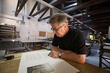
Peter proofing sheets in the printshop.
We returned home to Berkeley in early November and began the binding and housing stages of production (interrupted by the Codex Foundation events). We consulted Tom Conroy, the noted Berkeley scholar/bookbinder, about fifteenth-century publisher’s bindings, and commissioned him to sew the books. Forwarding was to be finished in-house by my full-time assistant, Jonathan Gerken. Five deluxe copies were planned and the vellum bindings were contracted to Nicholas Yeager. Woodworker and artisan Max Hunter was engaged to construct the dovetail ebony boxes that house both the book and the accompanying suite of prints. Christopher Stinehour completed the bronze medallions that were then set into the ebony box. We are binding the last of the books at this writing in early 2008.
What a dream come true this project has been! For over thirty years I have carried in my mind’s eye the exemplar of fifteenth-century Venetian typographic design, ever since I first opened the first printed copy of Euclid’s Geometry in the Rare Book Department of the San Francisco Public Library in 1974, and all the while having no idea that I would one day print a book in the shadow of the greatest of all the humanist printers, Aldus Manutius. I am deeply moved and honored to have been able to learn from the masters and work with such great collaborators and patrons.
We returned to Venice in March of 2007 to inaugurate the book at the Ateneo Veneto di Scienze Lettere ed Arti on Campo San Fantin near San Marco where the book had first been presented in 1989. I had been invited by the organizers of The Society for the History of Authorship, Reading, and Publishing (SHARP) to participate in their Convegno at the Istituto Veneto di Scienze, Lettere, ed Arte titled Il Libro Veneziano and give a workshop in printing by hand at the Scuola Grafica. That evening, the scholars were invited to the sala Tommaseo at the Ateneo Veneto (heavily adorned with sixteenth-century frescoes) for a celebratory presentation of our work, with talks by the Veronese printer/scholar Alessandro Corubolo speaking on foreign printers in Italy (Giovanni Mardersteig, Victor Hammer, Gabriel Rummonds, and myself). Poet and writer Maria Gasparinni spoke eloquently about Joseph Brodsky and Venice, and Sandro Berra spoke about the role of the Tipoteca Italiana in our collaboration. I thanked all who helped make the work in Venice possible and presented the book to a standing-room-only crowd of Venetians and scholars in the august quattrocento quarters. Later that evening we were invited to the palazzo Grimani for drinks and a bit of food by the Countess Ludovica Grimani, mother of our hostess, Donata Grimani. A perfect end to a perfect day, and a long way from Missoula, you bet!
The center of our collaborative adventure is (of course) the city of Venice itself — a city that has drawn to itself a procession of dreamers, writers, artists, and artisans — to inhabit, to build, to work, and to love her with their hands. Venice is a work of art built by hand upon the principles of a sacred and human geometry that infuses the very soul of this city.
Peter Koch’s edition of Joseph Brodsky’s Watermark set in a hand-painted wooden enclosure.
All of which leads me to contemplate that most exquisite last paragraph of Watermark where Brodsky reaches out for the essence of one of the greatest cities on Earth. . . .
“Let me reiterate: water equals time and provides beauty with its double. Part water, we serve beauty in the same fashion. By rubbing water, this city improves time’s looks, beautifies the future. That’s what the role of this city in the universe is. Because the city is static while we are moving. The tear is proof of that. Because we go and beauty stays. Because we are headed for the future, while beauty is the eternal present. The tear is an attempt to remain, to stay behind, to merge with the city. But that’s against the rules. The tear is a throwback, a tribute of the future to the past. Or else it is the result of subtracting the greater from the lesser: beauty from man. The same goes for love, because one’s love, too, is greater than oneself.”
Peter Koch is the proprietor of Koch Editions in Berkeley, California.