
I have known a few people, but not many, for whom a visit to the art gallery, the concert hall, or the library could be a kind of love-making, something passionate and profound. Kay Amert was such a person. There was no boundary, for her, between the life of the mind and the life of the body, nor between the life of language and ideas and the life of material objects.
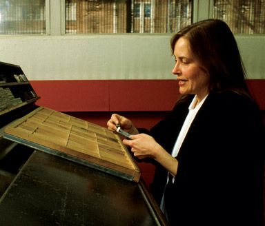
Kay was a master typographer, a master printer, a superlative teacher of her art, and a meticulous, in-sightful scholar of French Renaissance printing and publishing. She was born in South Dakota in 1947 and spent the whole of her career as director of the Typo-graphy Laboratory at the University of Iowa. She died of cancer in Iowa City on 5 September 2008, a few weeks shy of her 61st birthday.
The Iowa Type Lab was created in 1945 by the enlightened head of the Iowa School of Journalism, Wilbur Schramm. In the English Department a decade earlier, Schramm had also founded the Iowa Writers’ Workshop. He was an able, creative administrator, uncommonly willing to invent things and give them room to grow, but his departure from Iowa in 1947 left the Type Lab unprotected from people with smaller minds and narrower views. The Lab’s first director, Carroll Coleman, proprietor of the Prairie Press, had a hard and humiliating ride. Harry Duncan (like Coleman, an Iowa native) took over the job in 1956, moving his legendary Cummington Press from Massachusetts. Conditions had scarcely improved – but Duncan was not to be diverted from a view he knew to be correct. The idea of the Type Lab, he declared, was
that a great university might properly include apparatus for studying what is still, after five hundred years, the chief technic for propagating knowledge: typo-graphy. Naturally, the finest practice of this ‘art preservative of all arts’ would be the only end worthy of such apparatus so dedicated . . . Clearly it was intended, as befitted its situation in a College of Liberal Arts, to offer students some direct knowledge of typography unencumbered by pecuniary or utilitarian considerations and ‘directed to general enlargement of mind.’ Theoretically, this challenge was stimulating, not baffling: studies of how the manner of communication affects matter are not less interesting for being in their infancy, and typography’s creative potential is apparently undiminished as other techniques contest its preeminence.
Duncan had been shaping and nurturing the Type Lab in this way for a decade when Kay arrived at Iowa as a freshman in 1966. Like Duncan, she had a literary intelligence, the eyes and hands of a visual artist, and a scho-lar’s passion for luminous detail. None of these aptitudes was especially developed when she arrived, but Duncan saw her potential. She was arguably the finest student he ever had, and without doubt he was her most influential teacher. When Duncan moved on to Omaha in 1972, he recommended Kay to the University of Iowa as his successor. She remained director of the Type Lab until her retirement, shortly after the Lab’s 60th birthday, in 2006.
Initially, the university viewed her as ‘just an inky girl’ and ranked her as the lowest form of instructor, but by slow degrees it recognised her merits: by 1994 she was a full professor. Administrative enthusiasm naturally waxed and waned, but successive heads of the School of Journalism remained remarkably tolerant of the Lab’s, and Kay’s, dedication to foundry type, letterpress, and ‘general enlargement of mind’. Even when the School reconceived itself, in 1980, as the School of Journalism and Mass Communication, and even in the later 1980s, as Kay’s central interests shifted closer and closer to art history, the School never did worse than turn a blind eye to her unpopulist activities.
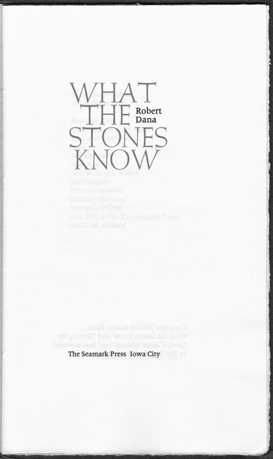
Kay established her own imprint, the Seamark Press, in 1967, while she was still an undergraduate. It published its first, somewhat tentative, book in 1969. In all she printed 14 books over a space of 16 years. She planned a 15th – an edition of Book IV of the Aeneid (Dido’s death scene) – and for more than a decade sketched and tested the form that this might take. She considered, among other things, printing it in Latin, with a parallel translation, and gave much thought to using Henry Howard’s sixteenth-century version. It would, if she had printed it, have been the first and only Seamark book with an historically sanctioned author. After 1985, however, nearly all of her energy went into scholarship and teaching. During those years, she spent far more time in the Réserve des livres rares of the Bibliothèque Nationale (in both its old and new locations) than she did in her own pressroom. After the turn of the millennium, even the most sedentary forms of labour required steadily greater determination. The image of Dido’s self-immolation was, I believe, never far from her mind in those years, yet she herself was setting a different example: putting more and more effort into the task of staying productively alive.
All the Seamark books are editions of poetry, but many are substantial, running to 60 pages or more, and several were beautifully bound, by hand, in mould-made paper over featherweight boards. Kay’s colophons (where they are present at all) are laconic, and the size of the edition is often unstated. Where a number is given, it is usually between 200 and 300 copies. It appears, however, that the number of copies bound was often much smaller than the number printed. In some instances, part of the edition was cased by hand and part was sewn into soft covers – a fact never mentioned in the colophons.
The first Seamark book, The Holding Action, is plainly student work – handset in Weiss to a less-than-professional standard and printed with inconsistent inking and impression on a squarish page of Andorra (not a paper Kay would ever use again). In this book, but in no others, 24-point Mistral is used for the Seamark imprint on the title page. The second book, issued in 1971, is an aberration rather than an exercise – one provoked, I think, by youthful generosity rather than indirection. It is the one Seamark book published jointly with the author, the one that is typographically undistinguished, and the one that was printed on an offset press. Only the cover was printed by letterpress.
By the third book (The Easy Wreckage, also dated 1971), Kay had learned more of her craft, though she had not yet found her own extraordinarily spare and sensuous typographic voice. The Easy Wreckage is unique among her productions in two contradictory respects: it is set in a Baroque type, Van Dijck, and like many of Harry Duncan’s books, it mixes upright capitals with italic lower case (a Renaissance but not Baroque convention).
The fourth Seamark book (Cargo, 1972) is set in Emerson, a type Kay would continue to use. This, you could say, is the first sign of her mature style. But Cargo represents yet another experiment that Kay would not repeat: it is the one and only book issued jointly by the Seamark Press and Kim Merker’s Stonewall Press. Merker was some 15 years older than Kay and had come to Iowa to study with Harry Duncan about a decade earlier than she. He was also then, like Kay, a junior member of the faculty of the University of Iowa, where he too would stay for the rest of his life – but Kay and Kim were of radically different temperaments and grew steadily further apart. In later years, the University’s Center for the Book, directed by Merker, and the Type Lab, directed by Kay, maintained efficient, polite, but rather chilly professional relations, while students moved freely and easily between them.
Soon after coming to Iowa, Kay had met and fallen in love with an Iowa native by the name of Howard Zimmon. He lacked her brilliant eye, but he matured into a capable pressman with an insatiable hunger for poetry and a verdant imagination. He was born nine years earlier than she (in 1938) and died nine years earlier (in 1999). They lived together from 1967 until 1979 – the period in which she did most of her serious printing. The Seamark Press has therefore sometimes been described as a partnership between the two, and in some respects no doubt it was. The colophons of four of the 14 books record that both of them did the printing, while the colophons of the other ten say nothing either way. Kay, however, described herself as director of the Press, and it was she who supplied most of the typographic vision. As time went on it was also she who supplied the equipment and the pressroom, which, in its last incarnation, occupied the basement of her fine old house on Dodge Street, high above the Iowa River flood plain. Around 1978, Seamark issued a chatty catalogue, clearly written by Zimmon, which portrays the Press as a thoroughly shared venture, but soon thereafter, Kay and Howard went their separate ways, and everything, down to the last composing stick, and all the unbound sheets of the first twelve books, remained with her.
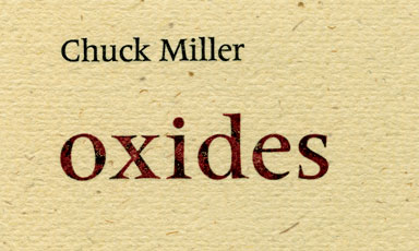
Random, the book of Zimmon’s poems which the two of them printed in 1975, is the first book to employ Kay’s nautilus (seashell) pressmark. The shell is not, however, present in all subsequent Seamark publications. Some, like some of Brunelleschi’s buildings, were just too spare and resolute to carry so organic and subtle an emblem. This is the case with Odd Weather and Oxides (both dated 1976). Creosote (also 1976) lacks a nautilus because it contains six drawings by Nana Burford in a style incompatible with the shell.
The poet Ken McCullough, who lived with her throughout the 1980s, also knew something about printing but was never fully welcome in the pressroom, even when she was printing his long poem, Elegy for Old Anna. Kay, as he recalled, ‘would often spend hours poised in front of a page, holding her cigarette as a duchess might, thinking about her next step. If I entered and offered an unsolicited suggestion, trying to make small talk, I was usually met with a glare and a stream of exhaled smoke.’
After 1971, Kay used only two text types for all her books: Joseph Blumenthal’s Emerson and Adrian Frutiger’s Méridien. She loved other types, to be sure. She used titling faces by Frederic Goudy, Eric Gill and Victor Hammer, as well as by Emil Rudolf Weiss. Nearly everything that came from her computer was set in digital Bembo, and there is a broadside called Abece-darium which she printed for a Typocrafters meeting in 1997 using 26 different fonts. But for printing modern poetry, Méridien served her better than anything else. It was a twentieth-century type, humanist in structure but clearly born of its own time, not a historical revival. And it was designed just as the foundry which had commissioned it, Deberny & Peignot, was abandoning metal altogether. Méridien’s superb companion italic was therefore issued only in phototype form, while small caps were not issued at all. Working with Méridien in metal therefore means abandoning the entrenched editorial custom of inflecting proper, upright roman text with a subservient italic. This enforces a level of typographic asceticism which suited both Kay and the texts she was printing.
Now and then, of course, the ascetic allowed herself a holiday. An example: the vivid and sensuous rusted-out titles (printed with incompletely mixed rust-coloured inks) on the spine, front cover and title page of Oxides (1976).
As a typographer, Kay had been taught by one of the best there ever was, and she knew that this was so. As a scholar, she was essentially self-taught, and therefore a little more hesitant in stating what she knew. Yet she was self-taught thoroughly and well. She was guided in this by others who had learned in the same school: Updike, Morison, Carter, Mardersteig, Dreyfus. The truth is, there are no type historians who are other than self-taught. Book history is another matter. It is practised mostly by people with PhDs – in almost any subject other than book history – and rarely with any leaven of experience in the actual making of books. Kay’s only university degree was a BGS (Bachelor of General Studies), and like many who do without grander credentials, she had nice, old-fashioned ideas about what they should mean. Over and over again she was scandalised by assistant and associate professors, with their doctorates in order, who appeared at learned conferences with papers barely good enough, in Kay’s eyes (or Kay’s classroom), to earn an undergraduate a passing grade. One of the pleasures of life, for those who knew her well, was to hear how scathing she could be when disappointed in this way.
She was also, however, a very private, reserved human being. The scathing judgments – served full strength and with lightning brevity among those whom she could trust to understand – were expressed very diplomatically and patiently in public, or not expressed at all. Her aristocratic manner was quite real and not a pose, yet it was private too. At moments, during academic conferences, when she was hectored by people with twice her formal education and half her knowledge and expertise, that regal bearing could desert her, returning once the crowd had thinned.
In other words, she was indeed a duchess – in a world where dukes and duchesses can have no public role. The nearest thing to a duchess in Iowa is a school teacher, and that was her public guise. At the same time, she remained in many respects a keen-eyed girl from the Dakotas, vividly alert to the deer in the ravine behind her house, the spiders lurking in her houseplants, the chickadees and nuthatches feeding in the branches just outside her kitchen window, the hawks snatching mice from her back yard. She had a similar sense of living, breathing minds lurking in letterforms, ink and paper. That is what made her a superior typographer and scholar.
Her own research centred on the greatest printer and punchcutter of 16th-century Paris, Simon de Colines. It therefore naturally reached out to the whole Estienne dynasty, of which Colines was a non-member and a central figure both at the same time. She wrote slowly, carefully, gracefully, and did not live to finish her book on the subject, but the notes she amassed are legible and voluminous. I hope that this resource will someday fall into the hands of another scholar no less brilliant and no less devoted than she. In the meantime, there are six important essays, published in periodicals, and other writings, finished but unpublished, which I would like to see collected into a volume. Colines’s art, like Kay’s, was intellectual yet physical, and simultaneously ascetic, subtle, sensuous, and serene.
*
Kay and I were publishing side by side in Sandra Kirshenbaum’s Fine Print back in 1986, and her reviews were among the most literate and intelligent things that journal ever printed. No one was more interested than Kay in the conjunction of the verbal, the corporeal, the material and the visual – and no one saw into their integrity more clearly. I met her myself only in 1993. We lived together intermittently in Paris over the next several years, and in some respects I knew her well. I came to know how sensitive she was to literature, sculpture, music, architecture and painting, as well as typography. I also grew familiar with her expertise in cooking and photography. Her press, however, was back in Iowa City, and printing was in any case by then an art she practised only in an incidental way. Between 1985 and 2000 she printed very little apart from some brilliant posters and broadsides. After 2000, so far as I know, she printed nothing, but printing was certainly still on her mind. In the bed of her Vandercook when she died was Horace’s ode 2.10, a celebration of the golden mean. She was going to print the Latin text as verse, with William Cowper’s loose and lovely tail-rhymed English version rearranged as a prose gloss. Cowper’s version closes with these lines:
If hindrances obstruct thy way,
Thy magnanimity display,
And let thy strength be seen;
But, oh! if Fortune fill thy sail
With more than a propitious gale,
Take half thy canvass in.
Robert Bringhurst is a Canadian poet, typographer, linguist and author.