
John Sparrow, trans. Raymond Shaw-Smith, The Collected Lapidaria. Stone Trough Books, 2006. 370 pp, £70.
Books of inscriptions are apt to feel mournful, and John Sparrow’s slim volumes of Lapidaria were no exception. They marked many a passing. Gathering material from long centuries and from countries across Europe and beyond, they were a lament for the demise of Latin as a means of communication. The game is clearly up and the classics have become archaeology when the Dearing Languages Review tells the government to discourage teaching of Greek and Latin because they contribute nothing to ‘international understanding’ and ‘could actually undermine our attempts to build up national capacity in languages’.
Yet even those of us who hated Latin at school can see that with it has passed a particular magnificence. Invited to write an epitaph for Dr Johnson, the Rev Samuel Parr at first demurred: ‘The variety and splendour of Johnson’s attainments, the peculiarities of his character, his private virtues and his literary publications fill me with confusion and dismay, when I reflect upon the confined and difficult species of composition, in which alone they can be expressed, with propriety, upon his monument.’ What he finally wrote is shorter than that sentence and does the job beautifully, commemorating a writer whose English was halfway to Latin in Latin that is halfway to English.
Even so, Parr’s style perhaps was cramped by the space, and Sparrow saw how relineating on the page could improve it. In so doing he created the lines
POETAE
LVMINIBVS SENTENTIARVM ET PONDERIBVS VERBORVM
ADMIRABILI
The perfect balance and rotund pomp need no translation. Indeed he was.
Or consider this in the Botanic Gardens, Calcutta, commemorating the death of a landscape-gardener:
CONSERVAT CINEREM PATRIA
HIC VIGET INGENIVM
‘His ashes are laid in his native land, but it is here that his talent can be seen.’ Yet how far short that is of the insistent paradox of CONSERVAT CINEREM where conservation and incineration bring the facts of death to life. There’s no flesh on this language, so the skull is in your face. The ameliorating conjunction (‘but it is here’) finds no place — the lineation does the work, as well as that of punctuation — and whether it’s genius or just ingenuity, something less flaccid than ‘talent’ is marked by INGENIVM.
Stoical and dignified, these inscriptions are the opposite of decorative, and Sparrow’s eight volumes were as spare as could be. There was nothing to them, except the conviction that less is more. Over nearly 40 years they matched, like graves in a war cemetery, in a way that university press series rarely quite manage. The covers were simple cream wrappers (vellum-coloured, perhaps?), printed with nothing but the title, from LAPIDARIA to LAPIDARIA OCTAVA, in the same type (Perpetua Titling) at the same size, at the same height. The title pages consisted solely of these words again, engraved into a lozenge or square by Reynolds Stone and printed always in a rust red. No imprint, copyright, ISBN, cataloguing information or barcode. A grudging preface told you to take it or leave it, and then there were some XVIII or XX inscriptions, printed one per recto, with details on the pages facing of where they could be found. No translations, no concessions.
Each colophon was another engraving by Stone, recording that the printing was done at Cambridge University Press. The last two volumes, though, were undertaken instead by the Rampant Lions Press, letterpress printing itself having died out at the University Press. Dying too was the appreciation of letters as physical things given life by their regimentation — whether in lead type or carved in stone or wood — but at the Rampant Lions, the Carters were miraculously able to match the type, the arrangement, the shade of red and the satisfying feel in the hand.
The heavy paper was untrimmed, so every second inscription could be read only by cutting the pages or peering carefully between them. Bibliographical connoisseurship was implicitly deemed to be on a higher plane than mere reading.
The Lapidaria fascicles were printed in editions of fewer than 200 copies, and it is sobering to imagine what a modern research funding body would think of the Warden of All Souls lavishing so much time, care and money on getting them right. . . . But their very reticence — the lack of any explanation was a defiant final hurrah from a world with a very different idea of what it was to be educated.
The last inscription of all, composed for a Cambridge don, must have been chosen by Sparrow as the sort of epitaph he would himself have liked:
FACETIIS ABVNDANS
AMICIS FIDELIS
OFFENSARVM RARO NON MEMOR
MVLTOS PER ANNOS
PARI ARDORE
COLLEGIVM COLEBAT
STVDIIS HISTORICIS INSTABAT
AMICITIAS INIMICITIASQVE
EXERCEBAT
NVLLI NON
TERRORIS AVCTOR GAVDIIQVE
For most of us of course it needs translating: ‘Rich in wit, loyal to his friends, seldom forgetful of affronts, for many years he supported the College and pursued his historical studies with equal enthusiasm. He made friends and enemies, and was to all a source of fear and delight.’
To help us share these rarified pleasures, Stone Trough Books — that unfailingly interesting Yorkshire imprint — has published The Collected Lapidaria with translations by Raymond Shaw-Smith (300 copies printed by Smith Settle). Why the title is not Lapidaria Collecta as Sparrow proposed is unexplained.
The translations are not only from Latin into English, but from the form of presentation that is an inscription (the subject of Sparrow’s book Visible Words) into prose. And in the transition to the prosaic, the prosy, a hundred tiny dramas have fallen through the cracks.
HIC REQVIESCVNT
DISPENSATORES
MYSTERIORVM DEI
for instance, becomes ‘Here rest the stewards of God’s mysteries.’ But stewards are merely servants, whereas DISPENSATORES can not only give but withhold. And to convey a sense of why Sparrow might have chosen to print this undated Venetian floor tablet, the translation needs the accumulative force that comes from ending with GOD.
It may have been impossible to retain the self-importance which saw to it that a gift of trees to Stowe School was commemorated by an inscription ending with the word ETONIENSES (Sparrow the Wykehamist would have enjoyed wincing at that). It may have been impossible to reproduce the ambiguous Latin syntax which suggests (as Sparrow hints) that not only was William Myers an Etonian, but probably God is too. But it would not have been difficult to come closer to the Roman dignity that designated Robert Walpole SENATVS BRITANNICI PRINCEPS. The epigraphist’s point is that he was not just ‘Prime Minister of the British Parliament’, but First Minister — recognized as historically the first MP to be PM.
Apparently unknown to the publishers, a score of the inscriptions have previously been translated, presumably by Sparrow, for the ‘crib’ that went with his Cambridge Christmas Book Line Upon Line. Some of the new translations are shorter or more felicitous, but more often the older versions are preferable for their more exacting, sometimes Biblical vocabulary. A monument is ‘raised’ rather than ‘set up’, a life devoted to ‘the public weal’ rather than ‘the public good’. ‘O nimble water, come back to this shore in haste and restore at last my darling love to his distraught mother’ is an affecting lament for a son drowned in a submarine in 1942, but it has none of the gravitational pull of ‘O gentle tide that returnest ever to this shore, restore at last that dearly loved one to me his prostrated mother’.
Ambiguity and nuance are not the only losses. As Christopher Ricks has pointed out in a Tennysonian context, the Latin term ‘aetatis’ is liable to translate into factual error. Christopher Wren was not 91 when he died, but in his 91st year; Sir William Herschel was not 84, but 83; and so on.
Well, we may no longer have leisure for Sparrovian scholarship, but it is startling, at this rarefied level (and price) to find misprints such as ‘Clasical’, ‘neice’ and ‘misssion’. Even private publishing may have had to give up letterpress printing, but surely we can still tell the difference between 0 and O, or between 11 and II? Isn’t the audience for such a book exactly the pedantic sort that wants the convention for signalling a continuation to be the same on page 130 as on page 46, and that doesn’t like to see an index listing ‘scotland’ in contradistinction to ‘Britain’? (Not yet at least.) The sort, even, that reads closely enough to see that something must be missing from the last sentence on page 225?
In its way, this is a handsome book, and it is good to have. It’s just that, like most private press books now, let alone commercial books, it doesn’t quite go to the enormous trouble of getting things right. Perhaps because they are not set in stone. Perhaps because of something that all of us now have lost.
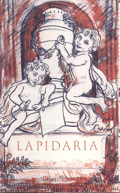
Mark Hearld’s florid drawing for the dustwrapper epitomizes the romantic idea of creativity as the spontaneous flow of woolly feelings. It is thus the very opposite of the severe, controlled precision that the original Lapidaria celebrated and sought if not to instil then at least to salute.
Jim McCue is a writer and journalist, currently working with Christopher Ricks on the T S Eliot edition.