
In 2003 the enterprising Amsterdam graphic arts publisher De Buitenkant produced an elegant book celebrating the work of the Dutch designer and printer Bram de Does, in anticipation of his seventieth birthday the following year. It contained an admirably thorough biographical and critical study (on which I have leant heavily in this article) by Mathieu Lommen, curator of the typography collections at Amsterdam University Library, and an essay by John Lane on De Does’s type designs, which is one of the best accounts I have read of the process of making fonts in the period of transition from first-generation photosetters to digital character storage.
I reviewed this book for the Times Literary Supplement and for Matrix, and a correspondence developed with Bram de Does which led to a visit to his workshop in April 2007 and this article, which concentrates on his own printing. The two authors already mentioned have dealt authoritatively and well with his design work for Joh. Enschedé en Zonen, which has occupied most of his official working life, and his two superlative type designs, the beautiful Trinité, and the sturdy and handsome Lexicon, in which this number of Parenthesis is set.
Bram has also printed a contribution to the special edition of this number, which is very sadly the last piece of printing he completed before failing eyesight forced him to close his press; and some of his ornament designs using his own Kaba units are reproduced as tailpieces throughout. Two of his grander pieces grace the front and back covers. Finally, he compiled the list of his printed works which appears at the end of this article. [Please see Parenthesis 14 pages 16 – 18.]
*
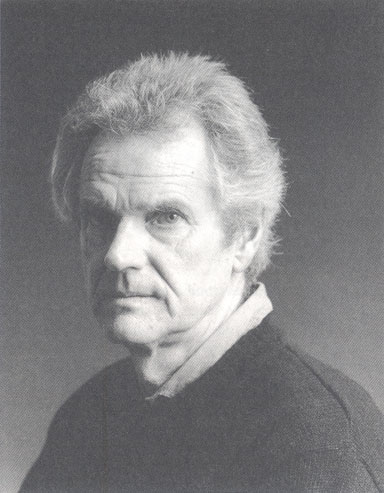
Bram de Does was born in Amsterdam on 19 July 1934 into a typographical family. His grandfather had started a small general printing business, Systema, based in a street running east from the Oosterpark — one of their customers was the Royal Tropical Institute in the park — and it was carried on by Bram’s father, Abraham. Bram went to the neighbourhood school on the Mauritskade, on the south bank of the Singel canal.
During the 1939–45 war the printing business had to close: Bram senior could not get a work permit from the Germans, and his Linotype was confiscated to be melted down for the metal. Bram remembers bicycling out into the country during the ‘hungry winter’ of 1944–5 to scrounge food from farms, and having it impounded at a German roadblock on the way back. His father survived by passing his customers on to other firms in return for a percentage, and managed to rebuild Systema after the war.
At school Bram excelled in mathematics, and began his long love affair with music — but with baroque and folk music rather than the classical and romantic repertoire which then filled the syllabuses at music colleges, so that he did not want to pursue a musical career. After leaving school he tried to find work making musical instruments, but there were no openings, so he went to help in his father’s print shop, in which he had previously shown little interest.
The following year, at the age of eighteen, he designed Systema’s type specimen book, and began to interest himself seriously in type. Most of the faces were Typefoundry Amsterdam ones, but for a customer they had put in some Romanée, Jan van Krimpen’s beautiful design for the Enschedé foundry, which became a lifelong favourite of Bram’s. He was able to use the library of the Dutch equivalent of the Federation of Master Printers, and consult works on typography. Remarkably, he was even able to take home on loan a copy of Enschedé’s 1768 Proef van Letteren, which was a key document in the cataloguing of the firm’s rich historical type holdings.
After some months at his father’s workshop, he decided to enrol in the three-year management course at the Amsterdamse Grafische School, which included enough practical work at the type case and the press to satisfy an aspirant printer. The director of the school was M H Groenendaal, whose book on typefaces Bram had already bought for himself. Although as a self-confessed member of the awkward squad Bram resisted the version of New Typography taught at the school, preferring instead a thoroughly: thought-out classical style, Groenendaal was broad-minded enough to support him and encourage his printing experiments. One of the things which had most struck Bram in the Enschedé specimen book he had borrowed was the music type, cut with miraculous precision in the eighteenth century by Fleischman. (This had proved so difficult to emulate that it was used for primitive security printing, which in turn had led to the firm’s supremacy in banknote and stamp printing.) In the Amsterdam school, Bram located some dusty cases of music type, and used them to print his first two works listed below.
His own way of working did him no harm at the school, since he won an award as the outstanding student of his year; and after a brief unhappy spell in the sales office of an Amsterdam printer he was offered a design job at Enschedé in Haarlem.
Enschedé were the largest printers in the Netherlands, and had recently celebrated their two hundred and fiftieth anniversary. In the twentieth century they had achieved added lustre with the appointment as head of typography of Jan van Krimpen, who designed books for them as well as typefaces, which were cast in the firm’s own foundry, often from punches hand-cut by their resident craftsman Paul Radisch. Several of them, of course, were also issued by Monotype in Britain, notably Lutetia, Romulus and Spectrum. Van Krimpen had set the Enschedé style, which was nevertheless flexible enough for his two successors, Sem Hartz and De Does, to use in their own ways.
Van Krimpen died in the year De Does arrived in Haarlem, 1958, and the two men never met. Bram worked with Sem Hartz, who himself had worked with Van Krimpen, and the two relationships proved not dissimilar, with a mixture of admiration and resentment. Hartz, who had trained as an intaglio engraver, felt that Van Krimpen did not sufficiently appreciate his typographical skills, although his one commercially-released face, Linotype Juliana, was a considerable success in Britain. He also designed a privately cut foundry type, Emergo, which Bram greatly admires, and used in the book of Hartz’s Essays printed at his own press, the Spectatorpers, in 1992, and also in a book of essays on the closure of the Enschedé foundry, produced the following year. It still rankles with Bram that Hartz resisted giving him Emergo for further use at Spectatorpers, but instead gave it to another printer.
Bram also worked extensively in collaboration with Hendrik Clewits in the composing room, whose skill with Monotype machines had been acknowledged by the Mono- type technical experts George Westover and R C Elliott. Clewits had been responsible for seeing many of Van Krimpen’s books into print.
Bram confesses that he was a bit of a misfit at Enschedé, a traditional firm where senior staff were expected to wear jacket and ties: Sem Hartz was always a snappy dresser, while Bram was happier in a sweater. Further, while his design skills were acknowledged and praised, it was felt that he lacked managerial drive. His high standards led to his nickname among the compositors, ‘puntje in, puntje uit’, from his frequent instructions to insert or remove a half-point space (making him comparable with ‘Half-point Schmoller’ at Penguin), but they were indulged to the extent of allowing him to reject as too two-sided the first making of 7000 kilos of paper for Harry Carter’s English translation of Typefoundries in the Netherlands, his masterpiece among works produced at Enschedé, which came out in 1978. Bram tells me the book was planned to be a partner to Stanley Morison and Harry Carter’s book on the Fell types, with the same format, but, he hopes, superior production values. He was also able to insist that a single pressman work on the whole book. With a back-up pressman needed for security reasons, and two hand compositors, four employees were tied up by the book for a year.
Nevertheless, Bram made several attempts to escape from corporate life. Four years after he first joined, by which time he was married with two young daughters, he was persuaded to move to the small literary publisher Querido by the director, Reinhold Kuipers, who had seen An English Alphabet, the first book Bram had printed himself at his own press. Van Krimpen too had done a good deal of work for Querido. But for Bram it did not work out: he was mostly involved with the insides of books, while the jackets were farmed out to Harry Sierman and other designers. He also felt too remote from the printers who were carrying out his specifications. He resigned after only four months, and went through a difficult period of reassessment.
The following year he was back at Enschedé with an increase in salary, and was soon closely involved with the firm’s move into photocomposition. Enschedé first invested in the Mark 3 Monophoto, but like many designers Bram was dissatisfied with the look of early Monophoto faces, especially Bembo, and for many years much of Enschedé’s better quality work was still printed by letterpress. Nevertheless, he experimented with making his own photographic matrices of special sorts for the Monophoto, and even made a version of Van Krimpen’s Cancelleresca Bastarda for the system, as well as some ornaments.
Hendrik Clewits retired in 1968 and Bram was made chief typographic designer, although he continued to resist the pressures of managerial responsibility. Two years later he made another bid for freedom, and developed his parallel career in biodynamic market gardening, first in Badhoevedorp nearby, then in 1972 in Aartswoud, not far from Alkmaar in North Holland. Commercial growing proved hard work, especially the harvesting, though he worked with his wife, and later his daughters. The venture lasted about three years, although he and his wife still live on home-grown produce to a considerable degree.
He continued working two or three days a week for Enschedé. From the early 1970s there was Typefoundries in the Netherlands to supervise, and in 1979 Just Enschedé, a great nephew of the chairman Maurits Enschedé, was brought in to publish fine editions. Just commented on Bram’s way of working that, in spite of an impressive output, he was virtually immune to routine.
In 1978 came the commission to design his first typeface, Trinité. Enschedé were replacing their Monophotos with machines made by the Swiss firm Bobst, and wanted to make a film version of Romanée. Bram’s advice was sought, and, based on his unhappiness with faces such as Monophoto Bembo (and the Bobst version), the advice was that what would probably result would be a travesty of the original. He proposed that Enschedé get a new face designed and, to his surprise, ended up with the job.
Trinité, which came out in 1982, is a remarkable achievement for a first-time type designer. The beauty of its drawing, though striking, never interferes with its serviceability or its rhythmic flow. It was a succes d’estime, but its wider acceptance was hampered by the rapid rate of development in the photosetting industry. Bobst were taken over by the American firm Autologic, and the machine equipped with Trinité was superseded. Enschedé had to keep one going just to be able to set the face. It was only later that Trinité was digitised under Bram’s supervision by Peter Matthias Noordzij of the Enschede Font Foundry.
Bram finally retired from Enschedé in 1988, to concentrate on his other interests, including the design of his second type. The Dutch publisher Van Dale was producing a new edition of its definitive three-volume dictionary, and its designer enquired of the Enschedé Font Foundry, then at work on the digitised Trinité, if a medium condensed version could be made for the purpose. De Does felt that the subtleties of Trinité (it has a one per cent lean from the vertical, for example) would not survive in the small sizes needed, and at the coarser resolution of the dictionary’s typesetters. Rather, as he had done before, he suggested a new design. As the publishers hesitated over the development costs, Bram and Noordzij decided to produce the face at their own risk, and succeeded triumphantly. Although specifically designed as a workhorse type, economic of space, and legible in small sizes at coarse resolutions, Lexicon, in which you are reading these words, is an instant classic. It works so well that its beauty of drawing does not jump out at you, and you only become aware of it when studying the drawings.
*
For much of the time that he was working for Enschedé, Bram had dreamed of a rival establishment at home. The Spectatorpers began with a cultural monthly journal, to be called De Spectator, which he planned with his school friend Gerard van Beusekom. A prospectus dated April 1961 was printed, but then the scale of the enterprise dawned on the partners, and they abandoned it. The name, however, survived in Bram’s press. The same year he issued his first book, An English Alphabet, which so impressed the people at Querido. But it was only as he neared retirement that he was able to give the Spectatorpers enough time and attention, and produced in the space of a few years a number of beautiful books.
He obviously threw himself into printing with great energy, as there was a flood of titles between 1986 and 1994, many for other publishers, chiefly the small literary publisher AMO. Then there was a gap, caused by the move from Aartswoud, via two brief stays in Heemstede and Bruchterveld, to the present De Does house in Orvelte, where they arrived in 1999.
Orvelte is in the Drenthe province south of Groningen, a pretty village where visiting cars are not allowed into the centre, and some farm buildings have been moved from else- where and rebuilt. Bram and his wife Nora live a couple of miles out in the country, in a pleasant landscape of meadows and woods. Their house is a classic farm building, with the living quarters at the front end and a large barn at the back under a single shared roof. His printing shop, consisting of two large rooms, was built inside the barn space, where the cows used to be kept, and occupied only a small part of the available area. When I went to visit I remarked that he could have got a six-station Heidelberg Speedmaster in there, but he did not seem tempted. The car was garaged there, and there was a large ping-pong table, and still acres of room. Up a flight of stairs above the workshop was Bram’s light and airy timber-walled study, built across the end of the barn and looking out over fields, with the vegetable patch in the foreground.
Given his strongly principled views on typography and organic gardening, I was expecting Bram to be seriously serious. But I found him very friendly, drily humorous, and on occasions self-deprecating. When we were talking about the phoenix Bindery in Amsterdam which had bound some of Bram’s special editions, as well as the specials of my publication Vegetable Gardening, he pricked up his ears at hearing the book’s title. I nervously admitted I hadn’t brought a copy with me because of the author John Carey’s advocacy of toxic pesticides (especially for deterring local cats from crapping in his seed beds). Bram then admitted he was now using weedkiller on his gravel drive, after decades of hand grubbing.
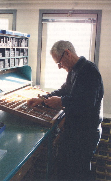
The print shop was as orderly as one might expect from his work. In the first room was the composition area, with the type cases labelled in his beautiful handwriting, many pages of standing type neatly packaged, and furniture and leads impeccably graded. A table-top hand-press on loan from Enschedé stood in one corner. Next door there was a Vandercook-type proofing press and Victoria platen, on which the books are printed, together with stacks of paper, most prominently a big pile of Zerkall, used for most of the more recent books. Bram has almost always printed dry: only a book printed on hard bank-note paper and one other have been on damped paper.
After we had looked through type drawings upstairs in the study, Bram sat me in front of a row of Spectatorpers books, neatly arranged in chronological order. Rather ruefully, he said the extent was not large for so much work, and indeed they are slim volumes, but the quality is more significant than the quantity. They are listed below in his catalogue, and all share his characteristic combination of typographic purity and sensuousness. They are mostly simply but exquisitely bound in paper-covered boards, with neat square backs. Most of the binding of the regulars has been done by the trade binders Van Waarden, and the specials, which usually have parchment spines and patterned paper boards, by Erik Schots. I will confine myself to describing what I see as the highlights.
Paul Hefting’s Een Zwierige Eenvoud is a favourite among collectors. It is a study of Van Krimpen’s stamp designs, illustrated with actual stamps tipped in by the author from his own collection. In a film about Bram’s work made in 2003 Gerard Unger described this book as ‘like a jewel’. The title means roughly ‘simplicity with flair’, which sums up Bram’s work as well as Van Krimpen’s.
Bram’s own treatise on type design, Romanée en Trinité, came five years later in 1991. It was subtitled Historisch origineel en systematisch slordig, which Gerrit Noordzij, in the translation he made which Bram kindly sent me along with the book, renders as ‘systematically slovenly and traditionally original’. These two paradoxes illuminate Bram’s working philosophy: he works towards a classical style from first principles, but does not confine himself to centred layouts: three of the books described below, the Tin Soldier, Fleischman, and Kaba, are asymmetric, although the page margins follow traditional proportions. The concept of slovenliness is harder to define, since his work is so carefully worked out, but a clue comes in a wonderful moment in the film about his work, which also has as its title Systematisch slordig. Talking about the design of Trinité, Bram explained that he had given the classic letterforms a slight off-the-beat lilt, and picking up his violin demonstrated the difference between a theme played straight, and then again with a ‘slovenly’ swing.
The book is in two halves. The first, printed by Bram, consists of his text set in Romanée, and examples of the types he discusses, Bembo and most of Van Krimpen’s Enschedé faces. The second part is printed on the same paper by offset, at the workshop of Jan de Jong, the printer and publisher of De Buitenkant. It shows examples of Trinité from the original positives made at Enschedé in 1982, and at the end some samples of the digitised font. De Jong has said that when Bram is happy with offset he says ‘My mother would like that: it looks like letterpress!’ — and here it does.
There followed two important monographs on typographical history, in English, which justified their means of production by being set in the actual historic types from the Enschedé collection that were their subject.
The Steadfast Tin Soldier of Joh. Enschedé en Zonen was based on a lecture given by the historian Ernst Braches at the retirement of the type designer Chris Brand from his teaching post in Breda in 1986. After the lecture Bram got Braches’s permission to print it, but it took a number of years to persuade Enschedé to allow him to use the type which was the subject of the lecture. This was the so-called Schefferletter, English-bodied No.6. According to Charles Enschedé writing in the Les Fonderies in 1908, in August 1768, the year of the proef van Letteren, Johannes Enschedé was given sixty matrices of a roman type by a ‘s-Hertogenbosch printer called Jacob Scheffer, which was believed to have been in his family for over 250 years. With it came a fragment of a book printed in it by his supposed ancestor Peter Schoeffer, the son-in-law of Gutenberg’s backer Johann Fust and the beneficiary of Gutenberg’s business. It was supposed the type dated back to this period. Johannes Enschedé had tried some casting from the matrices but, Charles wrote, he ‘had many types more beautiful, and he regarded the ancient matrices as a curiosity’; moreover, the character set was incomplete. For the Fonderies, Charles Enschedé had electrotype matrices made from the sorts which Johannes has been able to cast, and had extra punches cut to complete the set. (The original punches had disappeared.) He showed a page of the reconstituted fount in his book, and the firm used it for some bibliophile editions.
Ernst Braches’s text revised the legend and brought the story up to date, listing the books printed in the type by Enschedé. He considered it improbable that Scheffer had given the punches, but only lent them. In 1939, A F Johnson, writing in the Gutenberg Jahrbuch, had reattributed the type to the Cologne printer Peter Quentell, and found no use of it before 1527. Even so, in 1943, a few years after Johnson’s article, Enschedé printed a book in it, Van Ulenspieghels Leven, and made a point of the type’s historic pedigree, which enraged a leading type historian of the day, Dr M E Kronenberg, and an acrimonious dispute followed about the degree to which Charles Enschedé’s reconstruction could be called original. It is good to see the Dutch, in the darkest days of the war, still arguing about such matters.
It was this 1943 book which Bram had to distribute to fill his cases for the new publication. The text, including the title-page, is all set in the one size of type, but the openings have four-line initials, also from the Enschedé collection, printed in grey-blue, as are the quoted passages throughout. Section heads and paragraph marks before sub-headings are in rust-red, so that on most spreads there are two colours, and three on many. This book won the Felice Feliciano prize, given in Verona in memory of Giovanni Mardersteig.
Two years later came Fleischman on punchcutting, an adapted reprint of an article in the bibliographical journal Quaerendo. It consisted of a text edited by the typographical scholar Frans A Janssens. An Amsterdam antiquarian bookseller had given him a manuscript of a short description of punchcutting, which had come from an auction of Enschedé’s library materials in 1867. It turned out to be datable to 1766, and was a draft of the continuation of a treatise on typefounding and printing planned by the Ploos van Amstel foundry, of which only the first forty pages had been printed. It mentions in particularly glowing terms the work of Johann Michael Fleischman, the German punchcutter who had worked for one of the foundries the Ploos van Amstels had taken over, and also for Enschedé. (In 1799 Enschedé absorbed the Ploos foundry.) As well as the laudatory references to Fleischman, there is a vigorous defence of the use of counter-punches in punchcutting, and a good deal of derogatory sniping at his Parisian rival Fournier. From handwriting and stylistic evidence, Janssens is sure that it was actually written by Fleischman.
Bram set the book in a 12-point Fleischman roman dating from 1738, from the Enschedé collection. It had been cast in the Charles Enschedé period from the original materials, and as with the previous book he had to distribute standing type to get what he needed.
Both these books used decorated papers made by Bram, either as endpapers or covering the boards in the specials. He describes them as ‘marbled’, but they are actually paste-papers: the Dutch word for these is ‘stijfselmarmer’.
In between these two titles, Bram produced a collection of twenty-six essays on the closure of the Enschedé foundry, Adieu Lettergieterij Enschedi. Each essay was ‘numbered’ with a letter of the alphabet, in Rosart open capitals, which also surrounded the title page.
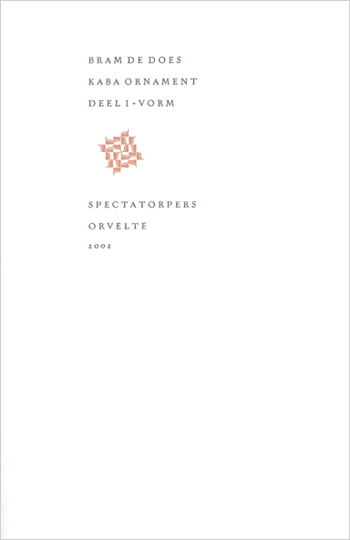
The last, and in many ways the most remarkable, of the Spectatorpers books was devoted to Bram’s Kaba ornaments. This handsome large octavo, printed on Zerkall, is bound in thin boards covered with Nepalese hand-made paper blind-embossed with a construction of the ornaments. It is set in the Schefferletter, with the substitution, noted in the colophon, of a z from Monotype Veronese, cast specially to align, replacing the antique ‘figure-three’ character which was part of the original fount. The text is set on a relatively narrow measure, leaving wide margins for the settings of the ornaments, ranging from small nuclei of units in different combinations, to extraordinary full-page flowerings. These are printed in pale Venetian red, grey-blue, or grey-green. The diagrams showing the construction of the nuclei are printed in dark grey. No spread has fewer than two colours, many have three, and a few have four.
In his introduction Bram recalls his early disapproval of the routine use of fleuron borders for advertisements by the compositors in his father’s printing shop, but when he was at printing college and learning to hand-feed a platen press, the instructor used to make the students print a row of short rules as register marks. After about a hundred copies, the rules would be moved along a notch in the chase and the sheets fed through again. By checking the alignment, the instructor could see how accurate the feeding was. While acknowledging the practical purpose of this, Bram tried to work out ways of staggering the rules to make interesting patterns. He says, ‘I was engaged in ornament without realising it.’
He also remembers being interested in some articles in the Monotype Recorder concerned with the manipulation of simple border units. In the Spring 1960 number, there was an article by Sarah Clutton, who had designed many of Monotype’s border broadsides, analysing the principles behind such manipulation, and there was also an insert produced by the Northern Polytechnic printing department showing excercises using only a simple triangle unit. This influenced Bram’s later constructions in his Kaba book.
Later, at Enschedé he made some experiments in the multiple printing of filmset ornaments for security purposes, which did not come to anything, but over the years, even though the Enschedé style was averse to borders, he continued to worry away at the problem. In 1976 he got a quote from the foundry for casting some ornaments for his own press, and in 1983, emboldened by the royalties from Trinité, he put in an order. This meant waiting in a considerable queue, and the sorts were not ready until 1987.
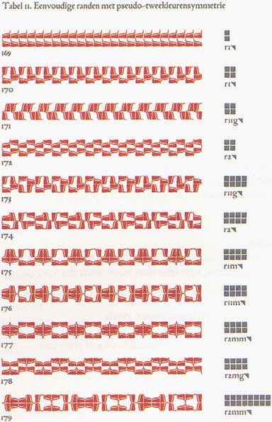
Originally the plan had been for six units, three pairs of mirror images. They were all based on a 10-pt square: the name Kaba is derived from the Arabic word for a square. One pair was the full square, one was a double curve joining the two opposite corners of the square, filled in to cover half the area of the square, with a fine line edging the solid, and the third was a thinner version of the second. When trial matrices were engraved, Henk Drost of the foundry tried to overcome the slight slope of the sides of the sorts by casting them with an overhang to the body which Bram would have to remove with a file to get the sorts to fit together snugly. This proved impractical, so the units were redesigned to have a slight irregular line of white between them.
In the event, Bram decided to use only the second pair of units, although castings were made of the other two, and he embarked on an epic voyage of discovery to see what could be done with these deceptively simple elements. He reflected that he could have used a computer, but preferred the hands-on experience of drawing and setting as more human. Much of this work was done by drawing on sheets of squared paper. He showed me some pages of designs which explored possible combinations even before the Kaba design was finalised. He often did this before breakfast, and found it a therapeutic and calming exercise.
Setting, and especially distribution, was made easier since the sorts had been cast with a single nick in the shank for one-way-reading units, and two for the mirror image. Bram demonstrated to me how he planned patterns numerically on squared paper, with each orientation of the two units given a number from one to eight, enabling him to set patterns straight into the composing stick.
In the exploration of possibilities both his mathematical and musical talents came into play. He found that his numerical schemes for particular clusters, arrived at by experimentation, agreed with theories of symmetry formulated by various scientists. At the same time, the more elaborate patterns remind one of the way composers build large and wonderful structures from tiny musical ideas.
After many months of this work, Bram began the first book devoted to his studies. He started in 2001, and planned to get the finished sheets, 175 copies in a variety of colours, to Erik Schots before the new planting season in April the following year. The intense work aggravated his eye problems, and he was forced drastically to reduce his plans for a series of volumes to just one: the original scheme had been for a possible nine, three showing vignettes, borders and patterns, then another series in combination with full ‘tiles’ (the full square unit), and a third in two colours. So it seemed that we would have to be content with just the riches of Volume 1, but De Buitenkant have heroically stepped into the breach, and in 2006 produced a substantial book of offset reproductions of Bram’s drawings for further combinations, reduced to 75% of the five-millimetre squares of the original, making them equivalent to the 10-pt cast units. There is also a very welcome English parallel translation of the Dutch text of the Specatorpers edition, although I have to admit the intricacies of symmetry theory are still hard for the layman to understand fully.
One title for another publisher deserves special mention, and is the favourite of several people I’ve talked with. This is the first canto of Ariosto’s Orlando Furioso, printed in 1994 for the Stichting De Roos of Utrecht, with the Dutch translation above in black, and the Italian below in rust red. The cover paper has an all-over printing of two irregular fields of type ornaments, and in its quiet classical way the book is another jewel-like design.
But in all Bram’s work I can’t find any duds. Even the more run-of-the-mill literary titles have distinction. I hope that this celebration of his achievements will help his work to become better known in the English-speaking world.
Sebastian Carter is a typographic historian, the European editor of Parenthesis, and runs the Rampant Lions Press.