
San Francisco, CA: Arion Press, 2025 • Written by Virginia Woolf • Designed, typeset, printed, and bound by Arion Press • Artwork by Clare Rojas • Deluxe edition housed in a clamshell box that includes a vial of perfume custom-created by Zee Boudreaux and accompanied by a limited-edition print • Deluxe edition of 40 (fine press edition of 210) • www.arionpress.com
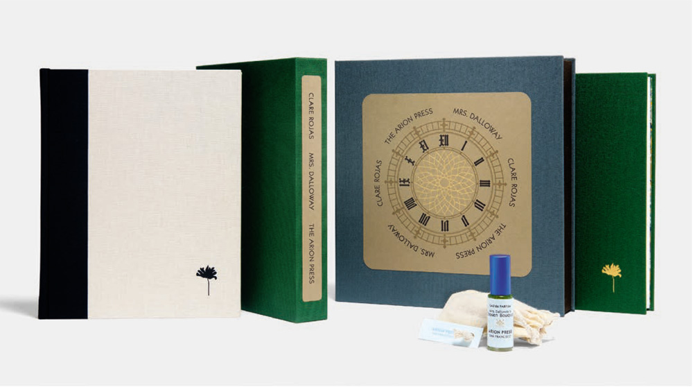
Photo by Arion Press
In the early 1920s, Virginia Woolf was in the midst of writing a manuscript with the working title of The Hours. Ultimately published in 1925 as Mrs. Dalloway, the novel is set over the course of a single day in June 1923 as the titular character, a London socialite, prepares for and hosts a party that evening. To mark its centennial, Arion Press released an exquisite, handcrafted tome featuring thirteen works by multidisciplinary artist Clare Rojas, the San Francisco-based publisher’s second King Artist in Residence. Mrs. Dalloway is the latest in its long line of collaborations that pair contemporary artists with classic literature, culminating in books that expand the boundaries of the art form.
The deluxe edition consists of an approximately 10 × 9 in. clamshell box, clad in gray and brown Cialux cloth. Inside, the book itself is presented alongside a first for the 51-year-old press: a vial of perfume, tucked into a gray felt channel that has been die-cut. The bespoke element—conceived during Rojas’s weeklong residency with Arion earlier this year—draws on the novel’s famous opening line: “Mrs. Dalloway said she would buy the flowers herself.” Developed by perfumer Zee Boudreaux, founder of small-batch fragrance studio Vivat, the scent fuses florals such as delphiniums, lilacs, carnations, and roses—which, in Woolf’s tale, comprise Clarissa Dalloway’s arrangements. The same blooms, bursting from a green vase, appear in the frontispiece.
Rojas, whose studio is in Ohio, completed her oil paintings—encompassing abstractions and figurations—on canvas or paper in three different sizes. Arion employed four-color offset printing to reproduce the works, which are interspersed in the book. With the exception of the frontispiece, each is revealed as the reader opens a gatefold with the art and an excerpt from the novel—the passage that inspired Rojas’s subject. “The Wind,” for instance, depicts a solitary Peter Walsh, Clarissa’s former flame, on a bench beneath a tree in Regent’s Park. Amid its branches and leaves, Rojas inscribed “ee um fah um so” and “foo swee too eem oo”—the sounds of a nearby singer that interrupt the character’s thoughts.
Woolf’s stream-of-consciousness narrative posed a particular design challenge: There are no chapters around which to neatly organize the art. Hence, the dozen gatefolds that integrate the works at even intervals. The number of gatefolds is especially fitting given the significance of time in the novel. Consider that a clock face has twelve segments and, in Mrs. Dalloway, Big Ben is ever present, chiming throughout the day. One of Rojas’s paintings for the book—a rare piece void of florals or foliage—is a graphic abstraction of the London landmark’s hands with a bird perched on the minute hand. A limited-edition print of the image, “Time,” accompanies the deluxe edition and can also be purchased individually from Arion.
Arion describes itself as “the only printer in the United States to make books entirely by hand, from comma to cover, under one roof.” Most of its volumes contain metal types that are cast on-site as well as types from its historic collection, amassed over the past century, many from European foundries. For Mrs. Dalloway, the printing was done on a Heidelberg press. Apropos of the novel’s era, the Art Deco-style sans serif typeface was originally designed in 1927 by Rudolf Koch and called Kabel. In addition to being an elegant choice, there is an ease of readability to the 12-point black text on the 9¼ × 73⁄8 in. pages. Mohawk Superfine paper in white, with an eggshell finish, allows for a neutral background for Rojas’s works while lending subtle texture too.
The book was bound on the premises, with the gatefolds sewn into the structure. The endpapers are a digitized version of hand-marbled paper by UK studio Jemma Lewis Marbling & Design. Its swirls of green, gray, and ochre perfectly complement the green cloth cover. Meanwhile, the cover’s gold accents—a flower embossed on the lower right-hand corner and the title foil-stamped on the spine—provide a striking contrast to the green. Lifting the book from the box exposes a beautiful lining: paper by French mill Richard De Bas, with pressed petals and leaves that recall Mrs. Dalloway’s natural motifs. Arion possessed just enough of the handmade botanical sheets in its archives to use for the 40 copies of the deluxe edition. (The fine press edition has its own distinct design.)
Over its five-decade history, Arion has become revered for its singular creations. The 1979 masterpiece Moby-Dick combines Herman Melville’s words with 100 engravings by Barry Moser. Recently, the press began exploring historical material: In 2023, Poe’s Phantasia not only included drawings by Natalie Frank, but a cameo bas-relief on the cover is composed of pulp paper that incorporated bricks from Edgar Allen Poe’s New York City residence. In the case of Mrs. Dalloway, Woolf’s classic is made all the more powerful by Arion’s reimagining that engages the senses magnificently. Much like her prose, the edition packs quite a punch within a relatively small package.