
Given 20th-century shifts in commercial printing it is a curiosity that letterpress persists. It is a persistence that today feels at least as vigorous and perhaps more so, than it did back in 2008 when, in recognition of a renewed wave of enthusiasm, I helped coordinate a day at the St Bride Library in London to draw together different communities of old and new users. It was simply called ‘Letterpress: a celebration’. I remember the astonished joy of an older publisher at being in a hall full of younger printers and designers and the collective excitement at the possibilities their new energy and optimism might bring.
Since then, many more people have set up their own presses and established small imprints. Yet, while there remains no shortage of enthusiasm, as the years go by a sense of dislocation of current letterpress contexts from past publishing practices and a widening gap in trade printing knowledge is surfacing, raising questions about the future. As someone invested in letterpress both in terms of the teaching of typography and through my own design and research practice, I reflect here on some of these questions using the idea of surface as a focus.
Relief printing
Routes to letterpress vary, though access to the process via an education in Art & Design seems common. As David Jury observes of the situation in the UK, the facilities established by printing departments for their trade printing apprentices were often inherited by an art school’s graphic design department when those apprentice schemes collapsed in the 1960s.(1) Subsequent centralisation of previously distinct departmental resources and open access arrangements now mean that an even broader range of arts students have access to letterpress. Any sense of an exclusive association between letterpress and typography, and even graphics, is shifting. Within my own teaching context of Central Saint Martins (CSM), the location of letterpress is adjacent to the more general printmaking spaces covering processes such as stone lithography and etching. Freed from the functional constraints of exact and neutral mass-reproduction now carried by offset litho or digital printing, letterpress becomes one of a suite of relief printing techniques available to students across disciplines who can explore experimental printmaking practices in ways which allow them to integrate letterforms.
My experience of the cross-disciplinary potential of letterpress has been evident further afield too. Illustrator Jaqueline Ford’s work for the 2009 exhibition The Changing Face of Letterpress at the London College of Communication embodied the essential modularity of letterpress while also pointing beyond graphic design towards ascii art and knitting patterns. The patternmaking potential of letterpress is also clear in the early fabric designs, and the later ceramics, of Brazilian designer Heloisa Etelvina, who first started collecting type ornaments as a student.
Extending beyond the Art & Design issue, in 2018 I toured a letterpress studio in the basement of the English Department at Leeds University, set up thanks to the pedagogical vision of someone many years ago who snapped up the machinery of a local printer as their business dried up. Hearing so unexpectedly about the possibilities of a curriculum that aligns letterpress with creative writing caused me reassess the broader educational value of letterpress and who it might benefit.
None of which is to overlook the importance of letterpress in a typographic education. The value in handling type to an understanding of how typography functions as a modular system for communication has long been understood. At the Central School the experimental letterpress classes of Edward Wright in the 1950s foregrounded a material understanding of what it was to handle type that I argue elsewhere was transformative in approaches to typographic teaching for generations that followed.(2) To bring that forward into the digital era, Stephen Barrett, current Typography tutor at CSM, has written: ‘One could argue that letterpress is perhaps a luxury and not vital to the study of typography, but it provides us with a form by which we can explore and understand the subject and its origins, a process that we can see and smell and touch. It is something to hold on to.’(3)
Given these widening educational contexts for letterpress and the underscoring of these, and other, very hands-on material approaches to teaching and learning, it is perhaps no surprise that there is a strong surface emphasis in much contemporary letterpress printing. Decontextualised from trade, some of the supposed ‘tells’ of letterpress have become increasingly exaggerated and even an end-in-themselves. As readers of Parenthesis know, the goal of the trade printer was the ‘kiss’ impression which would betray no signs of the relief process on the printed page. The print aficionado could run their fingertips across the printed surface without being able to detect evidence of impression.
In contrast, more recent practice has often leaned into a look which equates to a heavy impression that shouts letterpress on sight, let alone touch. Those commissioning letterpress jobs regularly insist on this deeply ridged effect identifying it as an essential characteristic of a traditional process and crucially of being a visual indication of a bespoke analogue product. It is an exaggeration that has even gone so far as to become entirely abstracted from the process of hand-setting actual printing type, with designers generating polymer plates to introduce a relief printing surface to digitally generated content.
This need to evidence process and ramp up the charm of the handmade is manifest in another exaggeration of surface, that is the inking. The grainy printing of the worn wood letter has become something of a trope, albeit a shifting one. Richard Hollis notes the lifting of the aesthetic of Dutch typographer Willem Sandberg in the ‘roughness’ adopted by left-wing designer Robin Fior in the 1960s. This adoption of poor technical standards to generate an ‘image of amateurishness, implying solid conviction’ in contrast to ‘a more polished result [that] might suggest power, money, authority’ was, as Hollis continues, common internationally.(4) Now, rather ironically, a coarse graphic impression is regularly used to enhance commercial value in a marketplace where letterpress offers a mechanism for charging more for something that could just as easily be printed by other means.
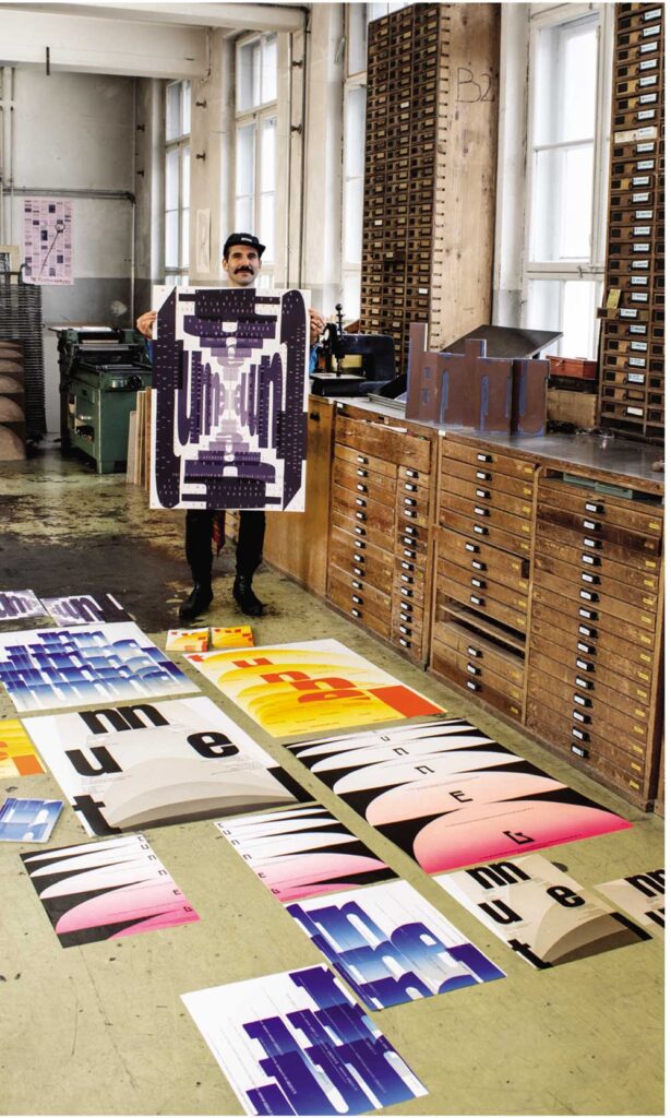
Dafi Kühne in babyinktwice, his studio in Näfels, Switzerland. (Photographer: Peter Hauser, Zürich)
To take a less cynical view, this use of type as image, can, in the hands of an accomplished practitioner, be an effective means of typographic illustration if applied to a carefully defined communication issue. An overly inky aesthetic offers a distinctive visual hook to catch commissions in a competitive pond. Yet, when that same ‘look’ is imitated out of context or irrespective of text, the outcomes may offer more surface than substance. There is also the troubling pull of nostalgia. While it is true that much wood type has its origins in the 19th century, are we bound to speak the visual languages of that era when using it? Yet, those more interested in looking backwards than forwards, continue to extract style from past contexts, resulting in a retro-letterpress groove that is proving hard to disrupt. The superficiality of such traits is further compounded by a lack of original content and an over-reliance on comforting homilies – contempory equivilents to ‘home sweet home’. Regularly featured in lifestyle magazines, such practice fulfils Norman Potter‘s predictions of the designer as an artisan producing, ‘peasant revival knick-knacks for middle-class weekenders’.(5)
That is not to say, however, that any of the above is ‘wrong’. People can print how, and what, and for whatever reasons they choose. The freedom of the press is to be taken seriously at every level. Furthermore, what in one era might have been considered as technically poor printing, in another may represent a wholly different set of values.
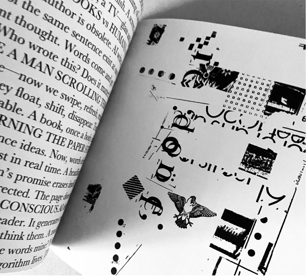
In 2007 Juliet Shen wrote of, ‘the [awakened] enthusiasm for letterpress printing among designers these days’ as stemming, ‘at least in part from a rediscovery of the pleasure of working with one’s hands to create an object that bears all the indelible traces of its making.’(6)
Shen then attributed the rise in popularity of her letterpress classes to the burst of the local dot-com economy, not for reasons of considered career change but, as she put it, ‘something to do with satisfying the soul’.7 For we are sensory beings, and the experience of one’s words mirroring back to you in permanent form as you take time to think about what you are saying is powerful. So too, is the tactility of an object, adding layers of sensory information to our words edited out by the computer screen. In a new era of machine-learning and social fragmentation the value of such indelible traces of making arguably take on still greater significance. The exaggerations of surface that betray the human offer a starting point for a satisfaction of the soul through connection with another person. While badly printed from a traditional perspective, it might just be that those traces of human connections are what the world needs more of in its communications right now.
For all the buzz, however, letterpress remains vulnerable, and especially in an educational setting. Increasing rents in the UK are prompting large institutions to review their use of space. In the face of ongoing precarity we need an engagement with letterpress that offers a rationale more substantial than trends, one that digs beneath the surface of things and questions how we might move things forward and grow.
Relief that people are printing
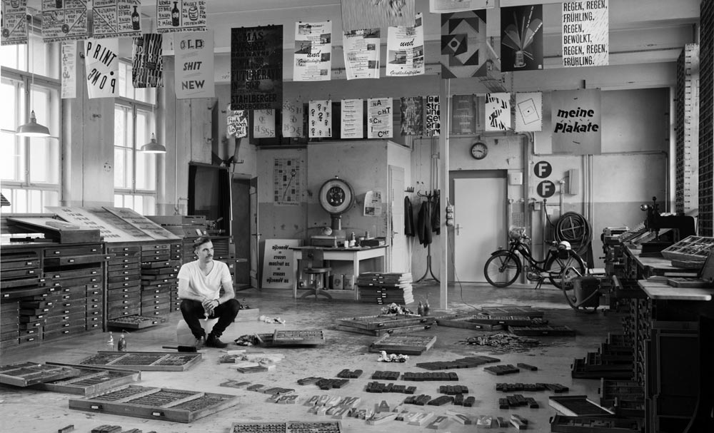
That more, and younger, people want to print is one of the most positive hopes for such future growth. It has been interesting to observe the ‘newness’ of letterpress technology for current generations of students for whom the computer has been omnipresent in their learning to a point of banality; not only as a place of work, but of rest and play too, through social media and online-streaming. In our college workshops students are keen to engage and to find new synergies between the analogue and the digital, with the output of role model designers such as Dafi Kühne offering inspiration to work across technologies of every kind. In these hybrid spaces a certain amount of reverse-engineering is playing its part, as older machine processes are combined and cross-fertilised with inventive design thinking in a form of ‘hacking’ that author and critic Bruce Sterling characterises as a ‘culture of the mashup’.(8)
It is an evaluation echoed by designer and writer David Crow, who describes the ‘reprocessing’ of materials and tools as an inevitable part of the design cycle in which ‘new wave’ approaches challenge existing values.(9) In a thesis which explores the remit of experimental letterpress in contemporary practice, lecturer and printer Becky Howson argues that Crow’s concept of ‘reprocessing’ is key to how things move forward. For Howson, ‘It is this re-appropriation of traditional artefacts and the repositioning of analogue processes that can provoke new ideas.’(10) Provocations are rarely comfortable. Though, as philosopher and cultural critic Matthew Crawford similarly argues, ‘rebellion’ is as important as ‘reverence’ in the interrogation of tradition, if the progressive possibilities of a practice are to flourish.(11)
Becky Howson, The Printing Types
Re/Done, 2025.
Yet, there is a balance to be struck. For Crawford, ‘rebellion’ is most effective when anchored by ‘reverence’ and vice versa. Not that ‘reverence’ is a word I feel especially comfortable with, but I understand his point. There exists a set of practices and conventions established for good reasons, that are there to be learned from and benefited from as a part of an ongoing process of reinterpretation for the needs of each new age. Too much unanchored rebellion feels like a waste of existing knowledge, while too much reverence leads to rules being slavishly followed irrespective of context.
Here lies, perhaps, the biggest challenge of all, certainly in an educational context. Students need little support in their wholesale re-imagination of older technologies. That seems to be something that curious students just make happen. The obstacle, rather, lies in finding ways to establish connections for them to a sense of an ongoing tradition. How do we help younger generations, enthusiastic to engage with letterpress, learn how to use the equipment for the purposes for which it was intended? How do we support them, develop a sense of craft, and offer opportunities for formal innovation through a deep and slow-burn engagement with skilled practice? Given the pace, breadth and structural exactitude of the design curriculum nowadays it can be hard to find spaces for learning through a consistency of making. It is harder still to find letterpress mentors. We face the very pressing problem of a disappearing knowledge of presswork. While letterpress equipment was built to last, this is sadly not true of its former operators, those trained in getting the machinery to perform to its best and whose numbers are diminishing.
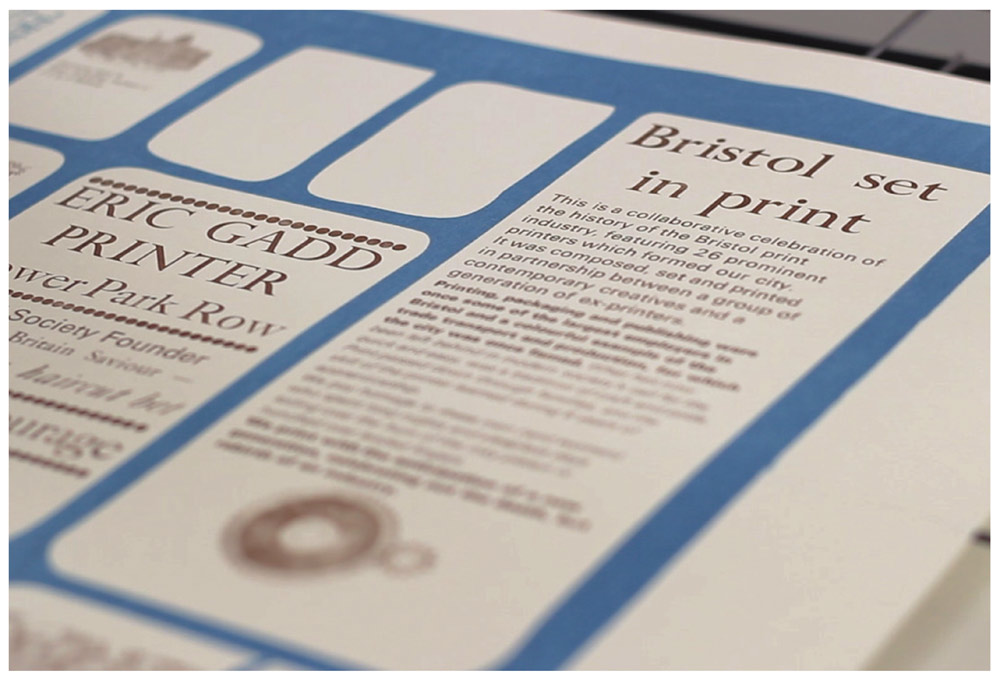
A generous project in the city of Bristol initiated by printmaker Charlotte Biszewski in 2015 offers imaginative inspiration for possible approaches to the problem. A chance meeting led to her discovery that printing had been one of the city’s major industries. With the promise of tea and biscuits she sought out former print workers to interview and invite to them help support local letterpress workshops. Her ambition to, ‘remember Bristol’s printing heritage and promote the education of this practice amongst younger and enthusiastic printmakers’ resulted in a rich exchange of energies and knowledges across generations.(12) Younger printers were better equipped to operate the machinery they were working with, and, crucially, connected to that sense of letterpress as an ongoing and evolving practice anchored in, but not limited by, history. (See photograph on the jacket.)
To be clear, this call for more opportunities for printers to enhance their technical learning is not an argument for learning how to do things ‘properly’ for the sake of it. Intentionality is key. To quote Potter again, ‘An assumption that must never go unexamined – that the required tools of method and technique are more essential than spirit or attitude. This snake offers a sterility that reduces the most “correct” procedures to a pretentious emptiness, whether in education or in professional practice.’(13)
And, while technical skills may be growing harder to access, thankfully there is plentiful evidence of spirit, especially in communication practices intentionally aligned to the history of the press as an instrument for social change and community-building. The work of Amos Paul Kennedy Jr. comes to mind here as being exemplary in the intentionality of alignment of message and visual form. His purposeful use of letterpress as a site for cultural disruption and for questioning the absence of black representation within the printing canon is manifest in poster designs, in which he explores relevant ways of representing often marginalised voices using alternative aesthetics that make for powerfully emotive pieces of communication.(14) The work is thus anchored by history, while simultaneously being a rejection of values embodied within it. As such, it represents a dislocation from past publishing practices that is to be welcomed.
The work of Ane Thon Knutsen similarly draws attention to the structural and disciplinary systems of power informing exclusionary histories by championing heritages in printing in operation beyond conventional trade practices. Her focus is on women in modernist publishing, such as author Virginia Woolf, who were refused entry to formal training and dismissed as amateurs when they showed the audacity to teach themselves to print in the pursuit of freedom of expression.
Ane Thon Knutsen, Anti-Type, 2018.
To dig beneath the surface of things is then as much about seeing what is not there, as much as it is about what is there. It is also to resist the temptation to judge on a superficial basis. There are plenty of keen practitioners with plenty to say making the most of what they have access to, no matter that their type is worn, or that magnets replace furniture. There is a sincerity in making do with the immediacy of the materials at hand. To recognise that sincerity is to acknowledge one’s own technical privilege and knowledge with humility. For it can be easy to forget how intimidating an encounter with expert practice can be for those finding their feet in a discipline. As anthropologist Daniel Miller concedes, the ‘accompanying amazement and enchantment’ lead to feeling ‘awed, but also excluded’ from what is understood as the territory of ‘only very special people.’ (15)
To conclude then, this reflection is, above all else, a call for encouragement. Engagement, on whatever terms, is the crucial element in the future survival of letterpress, as from there everything else can follow, if encouraged. It is a call for the nurturing of all forms of enthusiasm for letterpress through a generosity of community knowledge-sharing and porosities in ways of practising. We need to stay open to learning across our differences to foster a genuine sense of inclusivity and avoid exclusionary critical practices. In what has become one of my favourite quotes on criticality, philosopher and anthropologist Bruno Latour says, ‘The critic is not the one who debunks, but the one who assembles. The critic is not the one who lifts the rugs from under the feet of the naïve believers, but the one who offers the participants arenas in which to gather.’(16)
What might we do to assemble – as different communities did at St Bride back in 2008 – and learn from each other? What are we offering that might help build new understandings of letterpress by making possible the gathering of new pluralities of voices?
Footnotes
1 David Jury. 2018. Reinventing Print, London: Bloomsbury Arts, p.169.
2 Catherine Dixon. 2023. ‘Designers in the composing room: a progressive tale of typographic transgression’ in Letterpress printing, past, present, future (editors Caroline Archer-Parré and James Mussell), Printing History & Culture series, vol.4, Oxford: Peter Lang, pp.19–48.
3 Stephen Barrett. 2014. ‘Learning from L’Automàtica’ for Eye magazine blog, 24 July 2014. https://www.eyemagazine.com/blog/post/learning-from-lautomatica
4 Richard Hollis. 1999. ‘Revolutionary language’, Eye, no.32, vol. 8, p.70.
5 Norman Potter. 1969. What is a designer (4th ed. 2003), London: Hyphen Press, p.67.
6 Juliet Shen. 2007. Resurrection of a reliance, Seattle (WA): Artcraft Printing and the School of Visual Concepts, p.2.
7 Ibid.
8 Bruce Sterling. 2011. ‘The future of making’ in The power of making (ed. Daniel Charry), London: V&A, p.68.
9 David Crow. 2006. Left to right: the cultural shift from words to pictures, Lausanne: ava Academia, p.102.
10 Rebecca Howson. 2022. The printing types, A practice-based study of design principles in experimental letterpress (PhD thesis), Birmingham City University, p.220.
11 Matthew Crawford. 2015. The world beyond your head, London: Penguin/Viking, p.210.
12 Charlotte Biszewski. 2015. ‘Printing Bristol’s heritage’, wordpress, 19 October 2015. https://charlottebiszewski.wordpress.com/2015/10/19/printing-bristols-heritage/.
13 Norman Potter. 1969. What is a designer (4th ed. 2003), London: Hyphen Press, p.95.
14 Amos Paul Kennedy Jr. 2024. Citizen printer, San Francisco (CA): Letterform Archive, p.13. Also: Aaron Cohick, 2022, ‘I am just this odd thing that likes to print’, Parenthesis 43, p.4.
15 Daniel Miller. 2011’. ‘The power of making’ in The power of making (ed. Daniel Charny), London: V&A, p.19.
16 Bruno Latour. 2004. ‘Why has critique run out of steam? From matter of fact to matters of concern’, Critical Inquiry, no.30, University of Chicago, p.246.