
On Good Friday, 2009, we received a telephone call from Ian Mortimer in London. I had met Ian a couple of years earlier, when I had been invited to speak to the Double Crown Club about my wife Jan’s and my work at the Barbarian Press, and afterwards he and I had a conversation about various things – one of which was typographic ornaments. This telephone call stemmed from that conversation. Ian was having to make some space in his pressroom, and he wondered if we might be interested in buying the Curwen Press’s holdings of Monotype ornaments and ‘some other things’. I have always held that curiosity is the greatest tool of the tutored mind. ‘What other things?’ I asked. So Ian told me.
In 1984, when the Curwen Press’s letterpress shop was being sold up, Ian and several other people who understood its importance had gone there to save what they could. Like most fine press printers I had heard stories of that day – it ranks only slightly behind the ATF debacle of 1993 – and since 2009 I have heard others, some of them heartbreaking. I was told of one desperate ruse where some trolls (almost certainly), about to leave for the dump with a truck heavily loaded with Curwen pattern papers, were delayed by various ruses while several thousand sheets of the papers were hurriedly offloaded from the truck and spirited away for later division. It was all rather reminiscent of escape stories from prison camps during the war.
As I understood it, there was a very limited amount of time on that day in which things could be saved, but Ian came away with considerable treasure. Among much else there were many cases of type, including unique typefaces and ornaments which had been commissioned by Curwen. What I do know is that he saved the Press’s complete holdings of Monotype ornaments, many hundreds of proofs of various jobs done by the Press, nearly a hundred unopened packets of new ornaments from the foundry, and over two hundred tied-up and wrapped composed pages of ornamental borders, because it was these that he was dangling under my twitching nose from a distance of some 5000 miles.
Printers of our sort are not usually encumbered by sacks of chump change – especially when the sums involved run well into five figures – and to further complicate matters they are often encumbered by a large mortgage. We are exemplars of both traditions. We knew that any enquiry about a bank loan would be greeted either by a constipated smile or raucous laughter, probably accompanied by unseemly reflections on the unworldliness of the artistic temperament. But Ian needed an answer, and we needed funds. We had three days. All we had to do was find the money, and our only recourse was to our subscribers.
We have had regular subscribers to the Press for nearly the full 40 years of its existence, and many of them have become friends. We exchange letters, e-mails and Christmas cards, we sometimes visit, and in most cases our relationships go beyond simply buying and selling our books. Although we thought it a slim chance, given the sums involved, and certainly had no sense whatever of entitlement, we crossed our fingers and wrote an e-mail to all our subscribers setting out the nature of what was offered and its cost.
Within an hour of the conversation with Ian, I had sketched out a rough plan for a book centred around the ornamental borders, which we would reprint from the standing pages as prodigious examples of the possibilities printer’s ornaments could offer to a designer–compositor with an eye to their properties. Jan and I had discussed the plan, so we already knew what we intended to do if we could manage to buy what Ian was offering. I had always admired the work of the Curwen Press, and had several books printed by them on various subjects. Although I had never acquired any of their work with ornaments (which appeared more often in job work than in book printing), I was aware of it, and had once or twice seen examples in shops in London, or reproduced in books. Compositors collect ornaments as fishermen collect flies, and over the years I have amassed a catholic collection and spent time with them. The ornamental borders were the hook. We asked our subscribers for a loan of whatever amount anyone could afford, and offered repayment with five percent simple interest whenever the book was finished – which we made clear might be some years off. We also offered a copy of the cheapest state of the book. In 18 hours, to our astonished joy, we had pledges of over one and a half times the amount we needed.
These funds not only allowed us to buy the borders and ornaments Ian offered, but to seek out several necessary books for research and inspiration that would otherwise have been beyond our budget. These included The Curwen Press Miscellany (1931), A Specimen Book of Types and Ornaments in Use at the Curwen Press (1928), the 1923 Pelican Press specimen book, Frederic Warde’s Printers Ornaments (1928), a partial run of Signature, selected Monotype Recorders, and a complete run of the Curwen Press Newsletters.
The logistics of having the materials packed and shipped from the UK to British Columbia are the stuff of another saga. Fortunately the money also covered the shipping, and Ian engaged shippers who were both reasonable in price and skilled in packing. For our part, in a fit of practicality we bought a large crowbar, a good pair of tin snips, and a sturdy hand-cart with a 600-pound capacity. With the help of neighbours and friends we unpacked the three large crates (gross weight nearly two and a half tons) and trundled everything along the winding gravel path from our carport to the pressroom, 100 feet away.
Pressrooms come in all shapes and sizes. Ours is a converted barn, and big enough, one would have thought. Certainly we always had. We had already disposed of an old press which we had rescued for sentimental reasons but had never used. That provided us with enough room for the two type frames of ornaments and a new work table for working with them. The wrapped borders arrived packed in many large, bright yellow, heavy plastic crates, and these we disposed in every available nook and cranny. Several of them are tucked in around our large Albion, giving it the appearance of a broody hen with chicks; others line the staircases and landings, sit under the guillotine, and form a low wall in front of several bins of old type metal.
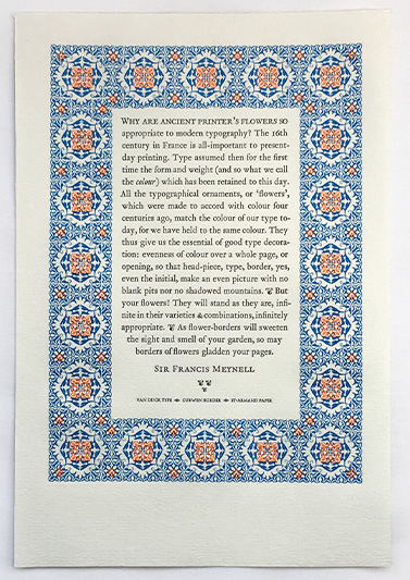
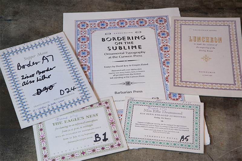
First, we unwrapped and proofed all the borders, checking them for damage which would need to be repaired from the cases of ornaments. Then we organised them. Chiefly this meant putting matched pairs of pages of two-colour borders together and arranging the single-colour borders roughly in order of size. The packets had already been coded at Curwen with their own system, which was fortunate. With one or two exceptions, the largest two-colour borders were those designed for the British Rail Hotel menus, dating from the 1950s; the smallest were used for business cards, book labels, dance cards and various hospitality notices. Among the more than 1000 proofs which accompanied the type were many examples of these borders used for various purposes and printed in a range of colours; this was a stroke of luck, since with few exceptions the borders had no type included with them: they were borders waiting to be filled.
More than seven years have passed since the archive arrived here, and only now are we about to get the book into the press. The delay, which to a great extent we had anticipated and allowed for, has been somewhat stretched by the trammels of life. When we bought the archive we already had several books planned and in differing stages of preparation, not least our edition of The Play of Pericles Prince of Tyre, which after eight years of preparation was going into the press just as the Curwen archive arrived. We also had a survey of Simon Brett’s engravings on the way and soon to be launched, and we had accepted an offer from the Fisher Library of the University of Toronto of the loan of some wood engravings by the Brothers Dalziel, circa 1870, intended for an edition of The Ingoldsby Legends which never appeared. This also involved research and editorial work – notes and an Afterword – which occupied me for some time.
The delays in starting the Curwen book – which we had decided to call Bordering on the Sublime: Ornamental typography at the Curwen Press – are in a broader sense a matter of cash flow. Jan and I operate the Barbarian Press ourselves, with no employees. I design the books and the bindings, do any editorial work, and hand set the type (although we do buy in composition of sections of larger texts), and Jan is entirely responsible for the presswork which, especially in the case of books with engravings, has gained the Press much of its reputation. With only two pairs of hands, production is slow and, while large projects like Pericles, and now Bordering on the Sublime, are in the press, other smaller books must be designed, set, printed and published so that we have funds coming in to live on. This juggling act has become habitual over the years: seven smaller books, two portfolios, and our twenty-fifth anniversary bibliography, Hoi Barbaroi, were published while we were working on Pericles; since the Curwen archive arrived in 2009 we have published, as well as Pericles, seven other books, with an eighth in process as I write.
I began to map out the shape of Bordering on the Sublime even before the materials were here. I knew we would need to have a general introduction to the Curwen Press, offering both a historical and a stylistic overview. We were blessed at once when David Jury agreed to write this for us, and within a few months he had produced a brilliantly insightful, articulate and substantial piece. Since the main element of visual display in the book would be the borders, I had also planned from the beginning to have a following text discussing the Curwen Press’s use of ornamental typography. This I intended to write myself, and here I encountered a number of problems.
It is generally acknowledged that most of the borders which are among the glories of Curwen’s job work were designed and executed by Bert E Smith, a compositor at the Press from 1924 to 1964. While others are known to have designed some of the borders – Raymond Roberts, who was an executive at Curwen in the early 1950s, certainly did – most were Smith’s work, and he probably set those designed by others: Roberts, for example, might provide a design, but would never have left his office to join the compositors in the composing room. But while Bert Smith’s legacy of borders has now gained some retrospective fame, at the time he was simply a comp doing a job. So far at least, I’ve been unable to discover anything more about him. Raymond Roberts, in an interview I conducted with him in London in 2009, offered a few anecdotes about Smith – he was quiet, industrious, rather shy – but he admitted that he did not know him, and there would at that time have been little socialising between management and workers. Class was much more clearly defined in the 1950s, and in any case unions would have provided something of a barrier.
When Bert Smith retired from Curwen in 1964 there was a ‘do’ to see him off. Some photographs have survived. Bert Tubb, Father of the Chapel, is presenting Smith with what looks like a camera. Herbert Simon is in one photograph, and he provided a very fine encomium on Bert Smith for the occasion. From that we learn that he apprenticed with George W Jones at the Sign of the Dolphin in Gough Square before coming to Curwen in 1924. Of all the many thousands of men who had worked as comps and pressmen in the printing industry in Britain, Bert Smith was one of the very few who was remembered by name by people other than those who worked with him. Simon remarks that even in the simplest jobs Smith ‘brought some special quality which lifted it above the commonplace’. But for the present he is visible only at the type case and the composing stone. I still hope to find more information about him: I feel rather like the critic who remarked that, given the choice between another play by Shakespeare or a family letter of his, he would choose the letter.
Of course there is much else to write about: the style and aesthetics of the borders, for example, and the intricacy and inventiveness of their construction. The range of expression possible with only a few border pieces needs to be discussed. For example, there are more varied uses of David Bethel’s two Glint ornaments in the borders than might have been thought possible: Beatrice Warde and her assistant, Sarah Clutton, invented ‘the Glint Game’, challenging others to find new combinations of the ornament: they found 78. There were even Glint Clubs. I want to touch on the history of ornament in typography, remembering that to many, perhaps most, of the people who read our book, such things will be new territory. I should like to discover some record of Monotype’s decisions about issuing ornaments. I intend to provide a visual index of the ornaments used in each border, so that printers wanting to try their hands can see just how things fit – where one unit ends and another begins. We are also planning to include, in facsimile, a fascinating discussion of the principles of ornamental arrangement called ‘A Grammar of Type Ornament’ by Sarah Clutton, who I have discovered also designed the five extraordinary broadsheets of ornaments issued by Monotype in the 1950s. So the book is coming together. We have one completed text and another in process. We have a sense of the critical apparatus of the book. And of course we have the borders. And thereby hang a couple of other interesting questions.
I have mentioned that, with few exceptions, there are no texts within the standing borders. Fortunately the 1000-plus proofs offer many things we can reproduce. Better than that, by good luck one of the largest collections of Curwen ephemera anywhere is held at the Bruce Peel Library of the University of Alberta in Edmonton. I have spent some time there, and that has provided us with many more possible texts, including some going back into the war years, and even earlier. We assume that the finished borders we have were all created after the war; there are some in the Peel collection which we don’t have, but with the ornaments included in the archive we bought I will be able to reproduce some of them, and their texts provide some interesting bits of social history. (From 1944, in a notice of a luncheon meeting: ‘The austerity fare will be the best available on the day of the meeting.’)
The other difficulty is that there are many borders, most of them two-colour, and we will want to show all of them. There is a danger of visual glut, a sense of ‘one damn thing after another’ which we want to avoid. One obvious solution is to include a number of them in an avowed gallery section. But it makes sense to have some borders present for immediate reference on or facing the page where they are being discussed. This will work well enough in my section of the book, but David Jury’s earlier historical piece makes few direct references to the borders, so I am planning to have brief pertinent quotations from David’s text set into single-colour small borders with the text flowing around them.
While all of this was being pondered and worked on, and we were publishing more books, we realised that we would have to come up with a sizeable sum for paper and type. Our daughter Apollonia, who lives in this century, suggested a crowd-funding campaign, and after I had finished spluttering and put down the poker, it seemed a fair idea. With her guidance, we launched it in 2015, explaining the project in hand and what we needed the money for, and managed to exceed what we asked for by some distance. The paper, Biblio, was ordered: we now have 16,000 sheets of it stacked on every available flat surface in the pressroom and the bindery. The type, several hundred pounds of 16pt Bembo with Fairbank italic, including all the accents and incidentals, duly arrived from the invaluable Bixler type foundry: the first half of David’s essay is set in composition, ragged right, and we also ordered very large founts – about 400 lbs worth – of both the roman and italic to be laid in case to supplement the type already set. I shall put everything through the stick to right-justify the type and flow it around the borders and initials, and once the pages we have already set are printed, we will distribute that type and set the rest of the book by hand. People regularly tell me I’m mad. I say they don’t know what they’re missing.
And so the visible work begins. We are excited, and a little cowed. But we have started books before which have seemed somewhat insurmountable – Endgrain in the 1990s, and Pericles – and having completed them we wondered why we worried. Enthusiasm and interest create their own momentum. I am 70, and Jan is not too far behind. The only books we are planning beyond this are rather more modest: Ovid’s Metamorphoses, with Peter Lazarov, for instance.
But that’s another story.