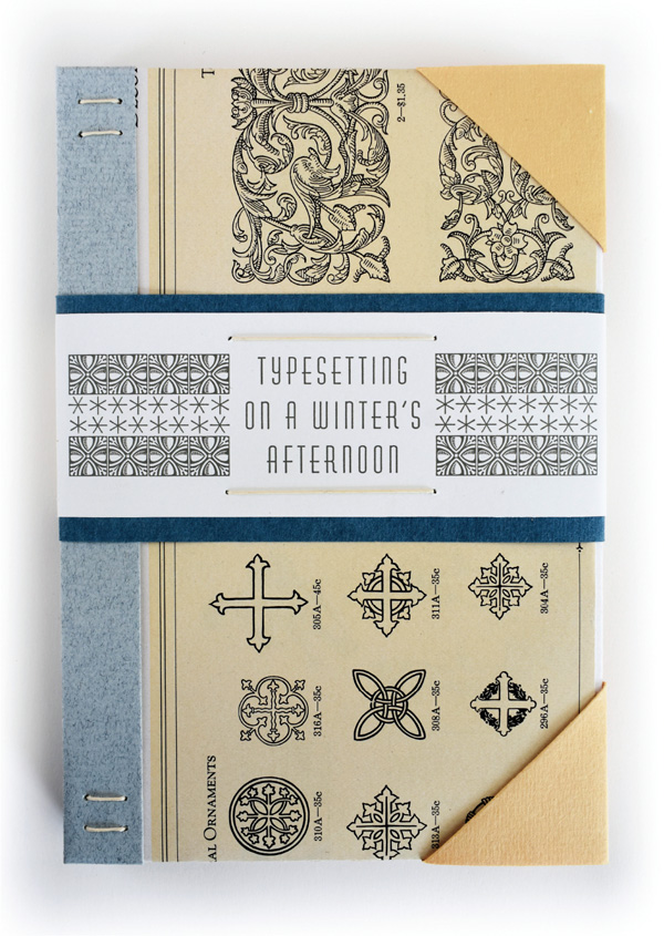
Typesetting on a Winter’s Afternoon by Raymond Stanley Nelson, Jr. (Liberty, Wisconsin: Heavy Duty Press, 2018). 26 copies. US$525.
It has been quite some time since the last letterpress-printed book was cranked out from Michael Koppa’s Heavy Duty Press. That last book was the structurally complex and beautifully printed Becoming Flight: The Heavy Duty Guide to Ornithology, with poems by Paul Zarzyski and illustrations by Tom Stack, printed in St. Francis, Wisconsin, in an edition of 125 copies in 2004.
I was so impressed by its intricacy and craftsmanship that I eagerly awaited the next fine-press production from the press. But, alas, I would have to wait 15 years for that expectation to be fulfilled. In the meantime, Mike Koppa started a family, moved to Viroqua in western Wisconsin, worked for a while as a graphic designer and then as a stonecutter, and produced a number of artists’ books, mainly using digital output, along with a few letterpress broadsides, CD covers, and liner notes.

Then, in the spring of 2019, the wait was over and, man, was it worth the wait. In the late winter of 2018, after a three-year effort, Michael Koppa completed printing the text of letterpress printer, type founder, and type and printing historian Raymond Stanley Nelson, Jr.’s lyrical essay, “Typesetting on a Winter’s Afternoon.” Koppa himself set the type, I’m sure, on many a winter’s afternoon. The essay was originally published in Parenthesis 3 (May 1999), but Koppa had received a copy of the text in a letter from Nelson in 1998, when Nelson was Curator of the Print and Graphic Arts Collection at the Smithsonian Institution. Nearly 20 years later, Koppa edited the text with Nelson’s permission, setting it in 10-point Century Oldstyle (designed by the prolific Morris Fuller Benton, a Milwaukee native, and one of Koppa’s favorites), with 4-point leading, and titling in 18- and 36-point Huxley Vertical.
Using a Vandercook SP15, the text was printed on Zerkall Laid paper and a translucent Neenah Classic Crest UV/Ultra II. The use of the translucent paper is mesmerizing, creating a text block that cascades dimensionally through the book’s pages, and mandating a particular cadence to the reading.
The book also features subtle typographic prints representing recurring elements in the story: a window, a clock, and winter depicted as persistently falling snow using six-pointed asterisks printed strategically in ultra-ultra-light translucent blue on the verso of every page. The book also includes three not-so-subtle vintage cuts where certain emphases are required: “They were BOLD and vigorous;” “Bad letters, over-inking and poor design;” “Attention requested.” In an afterword, Koppa includes a reduced facsimile of the 1998 letter from Nelson. The signatures were Coptic-sewn and, in the early months of 2019, Koppa created the 26 one-of-a-kind, non-adhesive covers that the books slip into. Each unique cover is made of pages from the 1923 Specimen Book and Catalogue of the American Type Founders Company, which included a specimen of the Century Oldstyle used in this Heavy Duty Press printing.
The whole, signed by both Nelson and Koppa, is subtle, precise, exquisite, and as physically lyrical as Nelson’s story. The covers are intricate and deeply engaging, and they open soothingly flat in an open palm. It is, like the very best of fine-press endeavors, a work one returns to over and over again. Nevertheless, Mr. Koppa, please don’t make me wait another 15 years. heavydutypress.com
