
The printed model or pattern book, once a source for design ideas, is now a valuable resource for historical research. Model books were essential in the classroom, the workshop, and the studio to design interiors, furniture, or fashion. Textile pattern books, for instance, were already around in the early 16th century. The most famous and successful model book must be The Grammar of Ornament (1856), compiled by the English architect and designer Owen Jones. Reprints of this work are still published today. It was very common in this genre to borrow right and left from predecessors, which makes it difficult to trace the original source of a design. Apart from that, model books are often in poor condition and incomplete, as they were actually meant to be used by the profession.
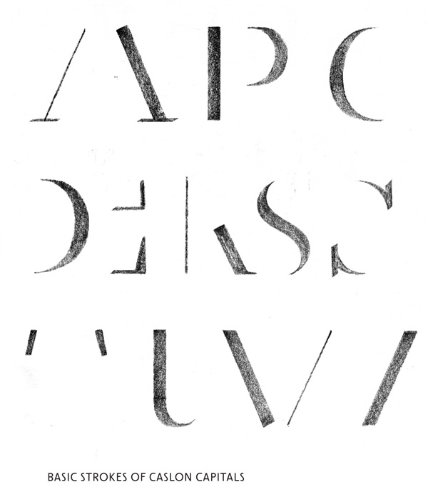
Lettering model books form an interesting category that also reflects new trends in art and design. Obviously, letterers were always in need of suitable models, even before the invention of printing. The medieval artists who produced initials put together sample sheets to be used in their own scriptoriums and to present to clients. A flood of primarily lithographic lettering model books and portfolios were published from the early 1830s, though they are often not to be found in traditional repositories and hardly any research has been done on them. The exemplars of a longer tradition of writing books going back to the 16th century, however—often luxury publications directed at a commercial and culturally elite user—are a little more common in leading international special collections libraries and far better documented bibliographically. This particular tradition of writing books originated in Italy, with Ludovico degli Arrighi’s La operina (c. 1524) being probably the most famous example. Not long after, a very fine writing book was published by the writing master Giovanni Tagliente who, in 1527, would compile a textile pattern book. The invention of lithography (1798), i.e. the method of printing on stone, made it easier technically to produce illustrated publications and created its own market. Lithographers not only had to transfer images to stone but also text, and so they, too, required models. A spectacular example from this early period, in letterform and color printing, is the lithographic work by the Swiss graphic artist Jean Midolle. Sign painters, stonemasons, and others professionally involved in lettering also had an interest in this type of publication. Lettering in the public domain was craft-made, from lithographic posters to inscriptions on shop windows and façades. Soon there were specialized letter and script lithographers who were able to transfer text to stone based on several techniques.
The most common one was to write or draw directly, in mirror image, on the printing form using pen or brush. Letter and script lithographers—like copper engravers before them—were highly skilled at this technique. The most basic technique was that of the transfer, whereby the text was simply written from left to right on a specially prepared sheet of paper. Although there was the risk of finer details being lost as the text was transferred to stone, this was hardly a problem for ordinary commercial printing. The most cumbersome—but also most beautiful and sharpest—method to produce lithographic lettering was undoubtedly engraving on stone. In the course of the second half of the 19th century photolithography widened the scope of the medium.
One of my personal favorites is Stefan Schlesinger’s spiral-bound lettering model book Voorbeelden van moderne opschriften voor schilders en teekenaars (1939). Coil bindings, and plastic ring bindings later on in the century, are cheap binding options that made the book lie flat easily. They were therefore widely used internationally for lettering model books into the 1980s. Schlesinger’s Voorbeelden does not include alphabets but is limited to practical examples. Example texts like “Cinema,” “Christmas Gifts,” and “Tea House” were used to cover a wide variety of styles. Schlesinger (1896–1944) was an Austrian-born advertising artist who settled in Amsterdam in the mid-1920s. He had trained in Vienna as a graphic designer under Julius Klinger, a poster designer he greatly admired. Schlesinger was one of the most virtuoso lettering artists in the Netherlands in his time. His work attracted prestigious clients, such as an exclusive department store for fashion and interior design, a well-known chocolate factory, and Typefoundry Amsterdam.
Although Schlesinger also practiced calligraphy, his specialty was drawn lettering for reproduction. The work he produced in this field was greatly varied, reflecting a high degree of technical perfection coupled with a distinctly personal style. Whereas the advertising world spent money to have lettering specially designed, the printing trade lagged behind in this respect, and so foundries responded by producing contemporary script types from the late 1920s. Schlesinger designed the informal Rondo for Typefoundry Amsterdam, a typeface that would only be released posthumously after the war. It became very popular among Dutch sign painters.
In the 1960s, the stream of lettering books began to dry up and new titles appeared only occasionally. By that time there were already various alternatives for manual lettering available to the retail trade—such as changeable letter boards, screen printing, and the Printasign, an American card-printing machine. From 1961, window dressers but certainly also designers were able to use the dry transfer letters produced by Letraset. The graphic industry was served with special typesetting machines for display applications, such as the Photo Typositor, which also made it possible to competently typeset texts as lettered scripts. Sign painters were facing increasing competition from the introduction of self-adhesive letters, while a little later, computer-controlled cutting plotters were able to cut designs in self-adhesive vinyl for the majority of applications.
Nowadays, historical lettering books are being collected by young professionals and enthusiastically shared on social media. Letters originally designed in the 19th and 20th centuries are once more a relevant source of inspiration. This is obvious from the models in the numerous new manuals that have been published in recent years, including those by Jessica Hische, Ivan Castro, and Martina Flor.