
Venice Reflections, paintings by Leslie Gerry, text by Jan Morris, Leslie Gerry Editions, 2019.
How many books are there about Venice? Many, many. How does this one compare?
Let’s start with physicality. Leslie Gerry warned me that if our copy was taken in by our neighbours, they would probably think we had had a flat-pack shed delivered. Yes, it is big. But then I like big books, in this case 62 x 41 cm (24½ x 16 ins) in its carmine, cloth-covered solander box. Just the word ‘Venice’ in an elongated type in gold on the front. No need for a spine label – you won’t have any other books like this to confuse it with – though the full title is Venice Reflections. Open the lid and on the front board of the book we are greeted by a large fero da prorà (perhaps life-size), the prow-head of a gondola. Turn the pages, and we find a combination of creamy Zerkall for Jan Morris’s text and a heavy, book-white Moulin du Gué Arches for Gerry’s illustrations. The two different papers – of slightly different sizes – either give texture to the binding or irritate, depending on your taste. And the book must have been a challenge to the binders, Ludlow Bookbinders: most of the images are double-page spreads, requiring folds and sewing at the precise positions where a section is formed from more than one sheet.
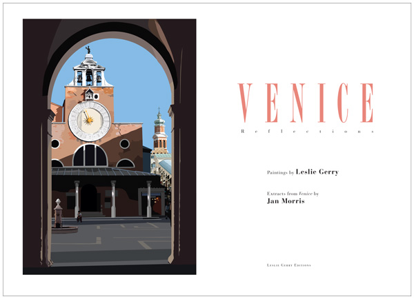
But what illustrations! One’s first reaction is, ‘I can’t believe they’re not posterised photographs.’ Yet they clearly aren’t. More of Gerry’s technique later. The art in them is cunning. So much detail here and so little there. Tiny detailed sculptures on the tops of the buttresses on the Salute, away in the distance, yet only five colours broadly summarising the water of the Grand Canal immediately before us (the view from the Accademia bridge). We are focussed onto what counts, or what counted for Gerry, in a way that a photograph cannot.
I remember reading a book on travel photography that had what I thought was a terrible piece of advice: that one should not start photographing a new place immediately, but should instead wait a while. Gerry agrees with me: your immediate reactions/reflections are those that are the most important and that will linger: capture them immediately, and one can all too quickly become accustomed to a new place. Yet, although we have been to Venice perhaps a dozen times, it is a place that delights afresh each time. Its architecture and topology and light fill these pages, but the place is also alive with people, and their presence in the city – locals and visitors – is central to Gerry’s images; I examine their expressions and their postures, as, almost without exception, I find the city forming a back-drop to the people: a fisherman sitting with his back to us on Isola di San Giorgio, looking across the lagoon to the dazzling background of the Palazzo Ducale and the Campanile; the Asian tourists in their hired gondola; the locals crossing the Grand Canal on a traghetto, one reading a newspaper standing, another with his bulldog. These are real people who, I’ve no doubt, would recognise themselves.
Perhaps we should judge Gerry’s images only from an artistic point of view. But it’s hard not to assess them also from a technical one. I should have said by now that they are digitally drawn with stylus and tablet and digitally printed. He has used the best of current digital presses and the colours are fabulous and crisp. But how is it possible to achieve the effects I alluded to above? He works with flat areas of colour, cutting out coloured shapes, arranging them on different layers – perhaps as many as 60 – thereby creating a digital collage that can be printed at any scale on a paper as worthy as even a letterpress printer could desire. Photographs and field notes guide his work, starting with a sketched composition in blocks of colour, like painting in oils, the photos as reference only, the painting gradually built up, generally with darker areas first and then lighter shades and highlights. So many small observations – the dog standing on the shoulders of the man at the tiller of a barge, the solitary figure sitting in the shadows, the resting gondolier eating pasta from a bowl, the subtle asymmetry of a gondola – bring it all to life. These are very rich images. And a helpful key at the back locates them all.
And now to the text. Unless you have a cathedral lectern on which to mount the book, you must open it on a settee and read the text below you, standing up. This is not a bad thing: it promotes concentration. Gerry’s images needed something strong to go with them. Edited extracts from Jan Morris’s Venice (1960) fill the bill. They are set in 19pt Bodoni, well leaded and with generous margins – all so necessary on a page this big. (Mr Picky spotted a handful of typographical blemishes, but this is the work of man and they must be put aside.) For some reason, for me a ragged-right setting always makes the text read more conversationally. And Morris’s writing has that strength of addressing the reader. We are treated to her edited thoughts on the city’s structure, the canals, the boats, the services – and, even if you have not been to Venice, those thoughts will mean so much more once you have studied the images that precede them. Although the text is in fact much extracted and edited from the original, it reads well and entertainingly enough, though in one place a missed-out sentence leaves one having to mentally replace it in order to make sense of the sentence that follows.
In summary, this is a fine combination of good words and good images. Each tells us so much more than photographs of the same scenes could. The coupling more than doubles the pleasure. And it’s a big book.
Hardback, £2,800.