
A growing interest in German book arts in general and private presses in particular brought me into contact with two important German periodicals, almost at the same time. The first discovery, in 1978, was Philobiblon, published from 1957 by the Maximilian-Gesellschaft in Hamburg. It was not just very interesting, it was also finely printed. The covers of each of the four issues a year were made by a different graphic designer. Moreover, subscribers received a Jahresgabe, a yearly gift, often a book of great beauty, by the best of German artists. Sadly, it ceased publication in 2000.
A year later Illustration 63 came my way: a splendid periodical published in Memmingen by Curt Visel, beginning in 1963. Its subtitle, Zeitschrift für die Buchillustration, emphasised that book illustration was the most important topic covered, but it also included articles on private presses and graphic artists. There were three issues a year, and each had four or more original graphic works presented loose in a folder pasted on the inside of the cover. The last issue appeared in 2003.
The demise of these two companions left me with a serious void, but I had the good fortune that in all these years I had got to know a good number of private presses and graphic artists. Among them, in Hamburg alone, there was Otto Rohse (1925–2016) and the subject of this article, Jürgen Meyer Jurkowski. Why this city is so important as a centre for typography and graphic arts is an interesting question, and I wish I knew the answer. I am just grateful for it.
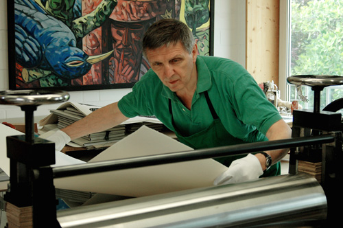
Jürgen Meyer Jurkowski was born in Hamburg as Jürgen Meyer in 1947. Jurkowski, his mother’s surname, was added in order to distinguish himself from his many German namesakes. After three years’ apprenticeship in typesetting, he studied graphic arts, typography and graphic design at the Fachhochschule (technical university) in Bielefeld, south west of Hannover. For many years he has been active as a graphic designer, and in the mid 1960s he started painting and drawing, making pen drawings for his own interest on texts from his favourite authors, Lenz, Böll, Biermann, Villon and Pushkin.
In 1998 Jürgen Meyer started his private press Edition M&M.
Edition M&M
In a 1999 issue of Illustration 63, I read an article about the founding of Edition M&M, with the title ‘Ein Neuling, aber kein Anfänger’, which can be translated as ‘A novice, but not a beginner’. I was struck by the illustrations that accompanied the article, which I found strange and unique. I wrote a letter to Meyer, ordering the second book of the press, Pushkin’s Der Sargmacher (‘The coffin-maker’). Apparently I was the first to react to the article and, from then on, we started a correspondence which continues to this day.
The story of Der Sargmacher relates how during a get-together of craftsmen, where drink is plentiful, toasts are made to the various professions. Vexed by a remark about his clients, the undertaker Adrian Prochorov boasts that he will invite them to his house. The gathering of the dead ends in a nightmarish situation. The next morning it appears that he has slept all day.
Pushkin mixes humour and satire in this story, and Meyer’s striking, passionate, almost harsh woodcuts in black and red convey the atmosphere of Moscow and its inhabitants, here mainly German craftsmen. It is a large book (38.5 x 28 cm), bound in black linen with a woodcut of Prochorov, the coffin-maker with a coffin, hot-pressed in black foil on the front cover. The large format allows for a generous layout, with the text printed by letterpress in 13pt Monotype Bodoni. The woodcuts have the same format as the text block and when there is only text, the red second colour of the woodcuts is echoed in a thick rule above the pagination.
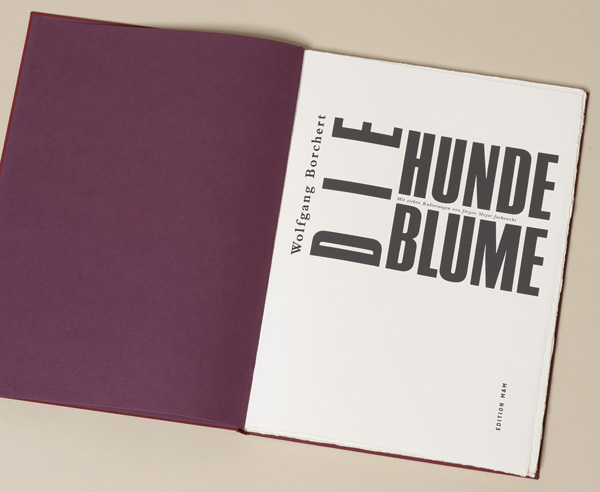
The format of Die Hundeblume (‘The dandelion’), by Wolfgang Borchert (1921–47), published in 1998, is even larger (40 x 29 cm). It has a violet linen binding with an abstract design printed blind on the front cover. Written in 1946, a year before his death, the story about a young man in a solitary prison cell made Borchert suddenly famous. Each day the prisoners have to march along a square while the goalers are yelling at them. One day he discovers a dandelion on the grass patch in the middle of the square and after endless days he finds an opportunity to pick the flower without being seen and to smuggle it into his cell. The seven etchings by Meyer have the same format as the text column printed in 14pt Bembo semi-bold on 350 gsm Hahnemühle copperplate printing paper. The etchings show us a different aspect of his graphic art. They convey in a masterly way the sinister and brutal atmosphere of prisoners in the hands of Nazi gaolers, a situation Borchert had to endure several times.
Goodbye to letterpress printing
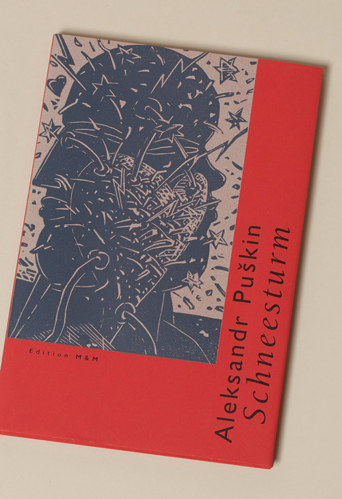
Frustrated by the slowness and unreliability of letterpress when preparing his next book Schneesturm (‘Snowstorm’) by Alexander Pushkin, Jürgen Meyer decided to say goodbye to the ‘Bleisatzexoten’ (‘the exotics of lead printing’) as he called them. He composed the text by QuarkXPress and printed it by offset. The book finally appeared in 2007.
Schneesturm is a love story about the daughter of rich landowners, with a romantic disposition. She falls in love with a soldier, far below the rank wished for by her parents. The lovers plan an elopement which goes wrong because of a bad snowstorm. When later on the soldiers come home triumphantly after the battle with Napoleon at Borodino, an unexpected end brings the lovers together again.
In comparison with the previous books, you immediately sense that offset gave Meyer the freedom to experiment with layout and format. What first strikes you is the elegant oblong format (31 x 21 cm) and the red linen binding with the title in black on the front cover, printed sideways. The dust jacket, in the same red colour, has a woodcut in black of the two lovers with a heart in between that seems to burst with passion. The binding is easily recognisable as coming from the famous binding firm of Christian Zwang.
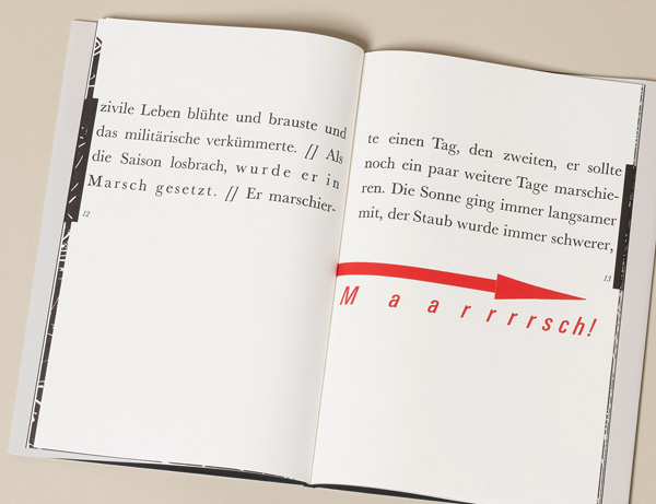
Jürgen Meyer’s striking full page black woodcuts precede or follow the text and even the title page, in groups. They depict snowscapes, the two lovers, the wounded soldier … but as they appear in groups of five or more, rather than next to the text itself, the reader is forced to read the text and to interpret the woodcuts at intervals. The texts are printed in ragged right alignment. Each page has a large letter in Bodoni italic forming the word Schneesturm. Moreover the letters of the names of the three protagonists, Marja, Vladimir and Burmin, seem to be hanging on a black line at the edges of the page.
Farewell to the classics
The French expression ‘avoir (or reçevoir) son bâton de maréchal’ means to be successful or to be in for a big promotion. Napoleon is supposed to have said that everyone should have such a baton in his rucksack. In Der Marschallstab (‘The marshal’s baton’), the Polish author Henryk Bardijewski, born in 1932, turns this saying into a bitter satire about man’s search for success ending in failure and downfall. A soldier marching with his rucksack filled with civil and military objects is getting tired. While marching along he gets rid of one object after the other. Completely exhausted, he throws away the rucksack and continues his march leaning on the baton. In the end, the soldier breaks down and the baton continues the march alone.
This book of only 32 pages was published in 2002. It has a Japanese style binding of black linen with a baton printed blind in black and an arrow in red on the front cover. The dust jacket repeats these two images, combined with one of Jürgen Meyer’s masterly title pages. The text printed letterpress in 36pt Baskerville, has four lines a page and ends in one solitary line, a reference to the marshal’s baton. The illustrations can be unfolded and reveal three large woodcuts (31 x 39 cm) in Jürgen Meyer’s characteristic dense style.
A children’s book
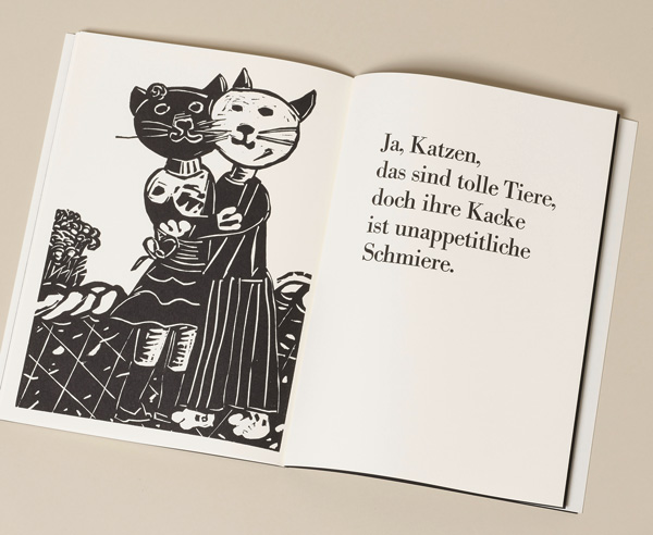
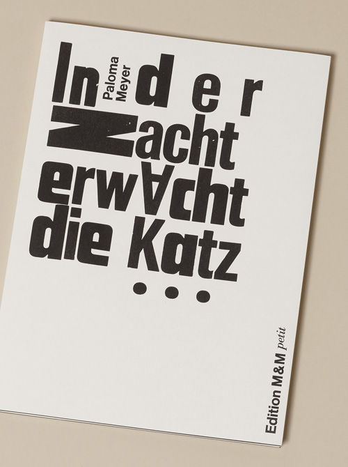
You might expect many colourful drawings in a children’s book. This is not the case in In der Nacht erwacht die Katz (‘In the night the cat awakes’) where everything is black and white. A few years ago Jürgen Meyer discovered that his 11-year-old granddaughter Paloma had written a very witty text about the activities of cats at night. He was astonished by the plot, the rhyme and the humour. Moreover, he later found out that she had made little drawings for the story. In his mind he saw the possibility of making an adult book out of it. He would enlarge the drawings and interpret them in another medium, in woodcut. The book (32 x 23 cm) appeared in 2017. It has a white paper cover with the title composed in a variety of wood types on the front. Each full-page woodcut has the text in hand printed 48pt Bodoni on the right-hand page. Only 20 copies were printed. In the colophon Jürgen Meyer explains that it is a collaboration between Typo-Opa (Typo-Grandad) and grand-daughter Paloma.
Here I must confess that my Edition M&M collection is not complete. I have not got its third book, Die Heimath by Johann Peter Eckermann (1792–1854). It was printed in 2000 and soon went out of print. The author was an intimate friend and confident of Goethe who compiled Gespräche mit Goethe (‘Conversations with Goethe’), a famous book in German literature. In Die Heimath, a long poem written in Weimar, Eckermann expresses his nostalgia for his northern German homeland. The modern German word ‘Heimat’ means a home. No less than 30 of the 51 stanzas are a homage to the Hanseatic city of Hamburg. For this book Meyer Jurkowsky made seven two-colour woodcuts, three of which are unfoldable and four single page woodcuts. The text is set in Monotype Baskerville 14pt and 11pt and printed by letterpress by Klaus Raasch in his workshop Schwarze Kunst (‘black art’). He is an artist, photographer and publisher (Edition Klaus Raasch) who organises the yearly book fair BuchDruckKunst. As a printer he works for many artists.
Projects
In the pipeline is a story by Ernest Hemingway, An Alpine Idyll, which at the time of writing was ready for printing. It is in German and English and is illustrated with ten beautiful woodcuts. At present Jürgen Meyer is working on an erotic poem by Frank Schulz, a well known German novelist.
Conclusion
Jürgen Meyer’s literary interests are reflected in his choice of authors. In his illustrations he tries to come as near as possible to what the author wants to convey to the reader. He carefully probes the motives of the characters and translates them into his own unmistakable imagery. He calls himself lucky that through Edition M&M he is able to combine free and applied arts as well as literature.
Collectors often have to wait for a long time before a next book comes from the press, but they know that their endurance will be satisfied in the end with yet another marvel of typography and book illustration. Most of the books are printed in an edition of 50 copies at most.
Regular customers of Edition M&M are rewarded with a New Year’s greeting, in the form of a woodcut, accompanied by an appropriate, often hilarious text. But patience is required, as Jürgen Meyer’s New Year can extend from January until April.
For a complete list of the titles or more information, you can email: jmj.meyer@gmx.de