
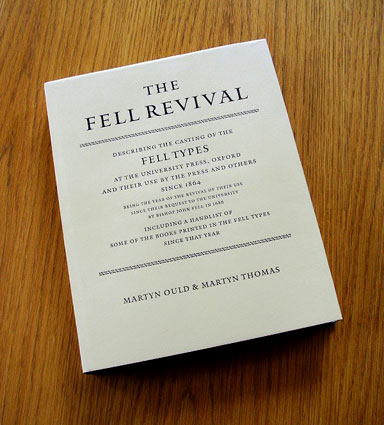
Martyn Ould & Martyn Thomas. Bath, The Old School Press, 2000.
One may well ask, ‘Why another book on the Fell types now?’ In the modern printing era there have already been three major books on the types procured for Oxford University by Bishop Fell in 1686, beginning with Horace Hart’s ground-breaking work in 1900 (Notes on a Century of Tyography at the University Press, Oxford), followed by the carefully selected and reprinted Specimens of Books Printed at Oxford with the Types Given to the University by John Fell (selected by R. W Chapman in 1925) and then the definitive John Fell: the University Press and the Fell Types by Stanley Morison (1967). In addition, there have been numerous smaller publications on these types (all of the aforementioned books are folios of more than a 100 pages), including a handsome Typophile chapbook; to say nothing of the dozens of books printed as specimens of the Fell types in use, most notably The Rime of the Ancient Mariner in an edition planned by Bruce Rogers at the request of the Oxford University Press, for which John Johnson (printer to the University) asked Rogers to produce a book that would ‘for the first time exhibit the truest value of the faces.’
Despite all these significant publications, there is indeed a very good reason for yet another book on the Fell types. The current volume covers an aspect of the myriad series of types lumped under the term ‘Fell’ not yet adequately surveyed: Ould & Thomas’s work covers the revival of these founts from 1864 until the present. 1864 was a pivotal date, for it was then that the first new founts were cast from the Fell matrices, which had remained untouched for more than three-quarters of a century. Old style faces went out of favor in the late 19th century, in deference to the so-called ‘modern’ or neo-classical types of Bodoni, Didot, Walbaum, and their followers, so the types of the Fell bequest languished unused (but thankfully also unabused) in the large storehouse of type-making material at the Oxford University Press. The Press has jealously guarded their typographic resources since inception, even casting type to a unique height to paper (actually two unique heights: .931 in. for the ‘Bible’ or liturgical printing side of Oxford’s printing works, and .9396 for the ‘Learned’ or scholarly side, neither matching the height to paper of either Didot or pica types). Special eminence was given to the types about a decade later, through their use by the Reverend Charles Henry Oliver Daniel (1836–1919) for most of the books printed at his Daniel Press in Oxford. A fitting tribute to Dr. Daniel’s printing, and a beautiful use of the Fell types in its own right, is F. Madan’s Memorials of C.H.O. Daniel with a Bibliography of the Press, printed in 1924 on Daniel’s own press set up in Oxford’s Bodleian Library: that publication is itself a very handsome specimen of printing in the revived Fell founts, and is referred to by Ould and Thomas.
Daniel used the types effectively in 50 books over a period of three decades until 1906. The first decades of the 20th century saw a proliferation of use of the types, with a veritable ‘who’s who’ of printers employing the founts in finely printed books. Included among those using the types in the first half of the 20th century are St. John Hornby at his Ashendene Press, Sir Francis Meynell at his Romney Street and Nonesuch Presses, Robert Bridges, George Macy, Stanley Morison, and Bruce Rogers, as well as David Godine and the Whittington Press later in the century. Surprisingly, Hornby printed ten of his Ashendene Press books in Fell, ceasing to use the types only when his own proprietary Subiaco fount was made. By comparison, only seven of Nonesuch’s more than 100 titles were printed in Fell, but somehow they are more associated with the Nonesuch style (or, more accurately, styles). Not to be forgotten is the handsome use made of the founts by the Oxford University Press themselves, initially as revived by Horace Hart, and then by Frederick Hall, John Johnson, Charles Batey, and Vivian Ridler.
All of these are discussed in Ould and Thomas’s text. The authors can be forgiven for overlooking the digitized version of one of the sizes (warts and all) made by Jonathan Hoefler a few years ago. The Fell Revival covers the use of the actual metal cast types themselves, as the sub-title of the volume ‘describing the casting of the Fell Types’ points out. Not to be forgotten is the use of the Fell founts for more mundane work at Oxford, even though the University warned Meynell against using the types for ‘any and every job that came along.’ The Oxford University Press itself used the types for a variety of purposes — not all fine printing by any means — including children’s books and ephemera such as book plates and invitations.
These aspects and more of the modern revival of the Fell founts are thoroughly covered in this important publication. The authors are remarkably exhaustive in their analysis of the subject. Their work is so good that it is hard to understand how they could mistake the three-line pica Fell initials used in the beautiful Bruce Rogers edition of Aesops Fables — printed in the Fell types — for Caslon. The Aesop of 1933 was the first of several books in the Fell types printed for George Macy’s Limited Editions Club in New York. More curious is the reference made on page 53: ‘In 1923 Johnson had used The Love Poems of John Donne as an illustration in his first number of The Fleuron.’ The Fleuron was edited by Oliver Simon and Stanley Morison, and the article in which the Donne illustration (a page designed by Meynell) appears is by Simon; it appears they may have meant ‘Morison’ instead of ‘Johnson’.
Still, the scholarship is more than sound, and the book is thorough and virtually complete. No mention is made of the style pages made at Oxford in the Fell types for Morgan’s competition to design the deluxe issue of the standard edition of The Book of Common Prayer in 1928 (a book that was eventually printed by D.B. Updike in the related Janson/Kis types), but that, of course, was an unrealized project for the Fell letters.
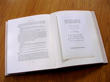
It is unfortunate that there is no index, but there are copious end notes, and the quite complete handlist of books printed in the Fell types from 1867 to 1998 is extremely useful. The book itself is a very handsome production, though the authors are understandably apologetic about not setting it in the Fell types themselves, and printing it by letterpress — a task that would prove daunting today. The Galliard font with Mantinia display is a fine substitute, and the more astute reader might appreciate the connection those types have to Oxford and Fell: both of these digital fonts were designed by Matthew Carter, son of Harry Carter, who for years worked at the Oxford University Press as archivist — a position which occasionally directly involved work with the Fell types.
The special binding of The Fell Revival
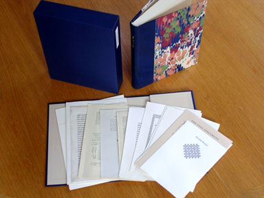
As one who works with digital typesetting and offset printing, I can appreciate the care and skill that Bob Elliott (designer) and Charles Hall (typesetter) put into this fine volume. Partially making up for the lack of a letterpress volume printed from handset Fell types are the tipped-in specimens of the Fell founts, printed by letterpress at The Old School Press on handmade paper from Oxford’s stock. An interesting compromise between the letterpress tip-ins from metal Fell types and the offset text in Galliard is the dust jacket, printed by letterpress from plates of Galliard and Mantinia types.
The Fell Revival is a very well-written and well-made book, and one that every student of modern fine printing will want to read and own.
The Old School Press. The Green, Hinton, Charterhouse, Bath, BA7 7TJ; England. Tel +44 (0) I225 723822.
Jerry Kelly is an award-winning designer, calligrapher, and printer who has designed for The Stinehour Press and The Press of A. Colish. More than twenty of his designs have been chosen for the AIGA ’50 Best Books”. Since 1978 he has been co-proprietor of the Kell-Winterton Press.