
The anniversary, in 2009, of the refounding of the Society of Wood Engravers (SWE) was an opportunity to consider how and if wood engraving itself had changed over twenty-five years; for the annual shows of an artists’ exhibiting society tend to appear much the same year by year, whether the society is based on a medium or on an aesthetic agenda. Wood engraving, the concern of the Society, is today, however, part of the accepted range of printmaking media where in the early 1980s it was not; it was neglected, indeed actively scorned. This change has come about in part due to the changing times, but partly, we may hope, to the Society’s own presence. But what of the art itself?
In 1984, the modern in wood engraving, as represented by its surviving, reassembled artists, smacked almost of the 1950s because the 1960s and 1970s had been so thoroughly denied to it. The first exhibition of the new Society included work by Michael Renton and Monica Poole, both now dead; Richard Shirley Smith, who has stopped engraving; and George Tute, who does very little of it these days — distinguished artists all.
Among those still practising, Hilary Paynter showed images of rocks and sea both in 1984 and in 2009; but where La Coupee, Sark rendered those rocks with grizzled textures, her new Marsden Rock (part of her Newcastle Metro commission) and her image of social defiance, Holding On, are notable for calm areas of tone, one grey ringing against the next in a deep but glittering harmony. In 1984, Sarah van Niekerk showed Genesis, a study for the Reader’s Digest Bible—a linear graphic swirl; in 2009, her work manifests a breathing atmospheric tone: there is a calming of the pressure for graphic effect. Modernism in 1984 looked like the scratchy, torn line of Kenneth Lindley or Ray Hedger. Now, a surrender to nature seems to be the case, rather than the need to impose your own urgent handwriting on it. And this is now being done with what I would call smartness—something I would distinguish from ‘style’ in the usual sense of the word. The Pearl Necklace by Harry Brockway is ‘stylised’ in that the forms of this portrait head are sculpturally simplified and removed a degree or so from naturalism; but it is smartly contemporary (‘stylish’, if you like) in its clean lines, clear tones, and eschewing of any engraved white outlines to define its shapes.
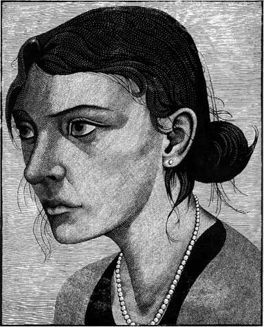
‘The Pearl Necklace’ by Harry Brockway. The forms of this portrait head are sculpturally simplified and removed a degree or so from naturalism; but it is smartly contemporary in its clean lines, clear tones, and eschewing of any engraved white outlines to define its shapes.
Turning to the cultural background in both eras, wood engraving, while finding its own methods, scale and subjectmatter, seems more in tune with the times than is sometimes thought. The imitation of pen or brush drawing in wood, which characterised the earlier era, derived in print from Imre Reiner but related directly to the textural fumble of John Piper or Henry Moore and to gestural painting. The smartness of contemporary work relates to an era characterised by Damien Hirst’s clinical vitrines and factory-like production.
Significant new artists have appeared since 1984. Paul Kershaw’s craftsmanship equals that of Monica Poole but is deployed as much in printing as in cutting, which itself often involves multiple tools, fretting the surface like a mezzotint. His tiny print Isleornsay is printed on coloured paper—thin, Japanese gampi—which gives it a denser look. One of the blocks is printed onto this in white. In other blocks, ink fades are used to modulate tones beyond what the cutting has already done. The print is then laminated onto white paper with no border of the gampi showing. Kershaw seeks to provoke a sense of ‘in/near/out’: making one draw forwards to study the print’s miniature world and then, through it, open out in the mind the huge vistas of remote places. Here is none of the style or mannerism of Poole; it comes across as devoted naturalism, attained by perfectionist means. Kershaw’s more ‘stylish’ two-block Urchin is effectively the chiaroscuro woodcut as used by Nicholson or the Mannerists; but I have never seen a second (here, coffee-coloured) block used to induce such cold and chalky white from the paper itself, as appears on the top of the urchin shell.
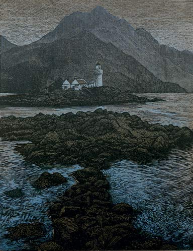
‘Isleornsay’ by Paul Kershaw. Here is none of the style or mannerism of Monica Poole; here we see devoted naturalism, attained by perfectionist means.
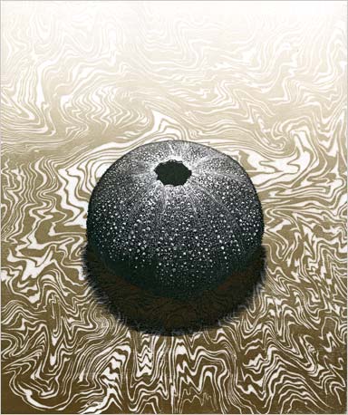
‘Urchin’ by Paul Kershaw. This stylish two-block image is effectively the chiaroscuro woodcut as used by Nicholson or the Mannerists; the second (here, coffee-coloured) block, however, is used to induce a cold and chalky white from the paper itself, as appears on the top of the urchin shell.
There are others equally significant: Richard Wagener, Jane Lydbury, James Todd, Judith Jaidinger, David Moyer, Stanislav Filipov, Barry Moser, Taeko Makino, Peter Lazarov, and more. None of their engravings, each utterly different from the others’, looks remotely like engraving looked in 1984. Peter Lawrence’s collages of pop, post-cubist, and naturalistic imagery; Louise Hayward’s images of high-rise housing, and Neil Bousfield’s pages from his latest novel in woodcuts on working-class themes, represent, along with Lydbury, the British contribution to the global submission to the Society’s exhibitions.
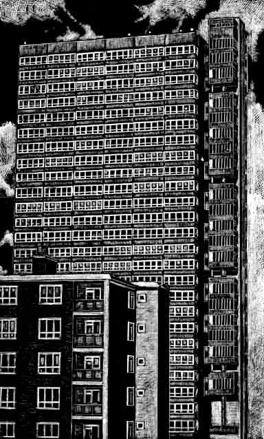
‘Low Rise, High Rise’ by Louise Hayward.
Of course, there is still work which might confirm the ‘conservative’ image that wood engraving has for some. But even looking at prints by Howard Phipps, deeply committed to a ‘timeless’ vision of the English landscape, one can ask: what do they look like? Bewick? No. Reynolds Stone doing Bewick? No. Phipps has his own visual vocabulary for trees and hills; the work could only have been done today. Comparing Sue Scullard’s recent illustrations to Lark Rise to Candleford with Joan Hassell’s in Portrait of a Village (from an earlier era still, 1937), one sees that where Hassall worked out of the black in a dark, chiaroscuro world, Scullard’s is a contemporary approach in which the internal modelling of forms is so perfectly judged that there is no threat to the overall firm, delicate patterning that defines the image. Poussin would recognise this dance between deep space and pictorial surface.
All this, whether presented as printmaking or as applied to the making of books, represents change. A new feeling has characterised recent shows of the Society of Wood Engravers. Wood engraving is in step with the wider world with a visual language that is unique to its medium and—perhaps this is the most important thing—confident to be so.
This article is based on part of a talk given by Peter Lawrence and Simon Brett at the UK Fine Press Book Fair held in Oxford in November 2009.