
It ought be an easy enough task to note down what one ‘does’; however, I must admit in this case it has proved a tough assignment. Perhaps I should start by stating what my Typographic Design Unit (TDU) is not. It is not a private press in the traditional sense; nor is it a commercial letterpress printing shop, typesetting house or design studio with an agenda for some form of cultural change.
When I am asked ‘What do you do?’ the reply, ‘Oh, I’m a typographer’, seems inadequate, as it is open to a number of interpretations depending on the questioner’s experience. I like to think of myself as a ‘designer’, one with a preference for working with letters, words and type – whether metal, wood, photo, digital or drawn – in fact, type or lettering in any shape or form. Add in paper and ink, and we can narrow things down to someone who enjoys orchestrating the production of printed material. I would describe myself as someone with an eclectic personality who enjoys dabbling in this, that and the other.
Based on these ideals, TDU has developed into a tripartite entity that supports my three main areas of activity. Firstly, working in a studio environment as a designer with clients on commissioned projects to solve visual problems involving the arrangement of texts. Secondly, in education, teaching typography and letterpress printing on the BA (Hons) Graphic Design Programme at Northumbria University. Thirdly, in my own letterpress workshop where I can experiment and explore personal pieces through the use of metal and wood.
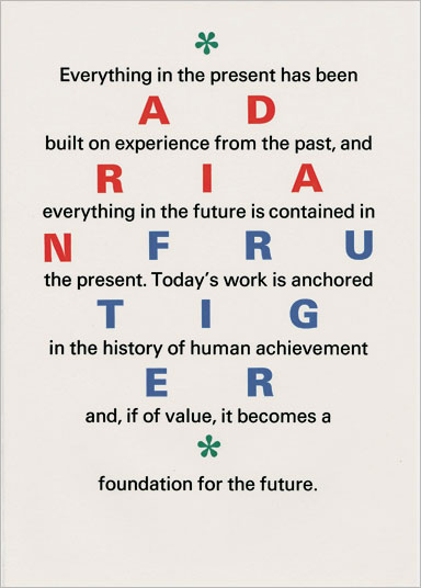
The design activity is centred around the design and typesetting of textbooks, in particular, academic works. These invariably require quite detailed thinking as the texts can be varied in both style and presentation. They frequently contain lots of tables, charts, diagrams, statistics, mathematical and chemical formulae. Illustrated books for arts and humanities come along from time to time and are a welcome relief. Other projects I undertake range from reports and journals to visual identities and general graphic communications.I prefer to work my ideas out on paper, sketching, thinking and observing. Once something starts to emerge, I make calculations and then switch on the computer. The approach is essentially the same for my letterpress work, where the computer is used to visualise the use of type, colour and general arrangement. It gives a fair approximation and, more usefully, I can quickly try out options, make changes to the layout and have a laser proof for use as a working guide.I have no hang-ups over the use of digital technology so long as it is used appropriately and intelligently. Our current typographic software, married to good quality typefaces, can allow us to produce work to a staggering level of sophistication in a fraction of the time it might have taken just ten years ago. I am no techno-junkie; indeed, some might say I a Luddite as, with most other things, I am something of a minimalist, using only the digital tools I need to get the job done. I would rather know a couple of tools inside out than have an outline knowledge of a dozen. Although there are tens of thousands of typefaces now available, I seldom use more than a core of about a ten. These tend to echo my preference for what might be termed modern types, by which I mean faces that have been designed within living memory. As a great admirer of Adrian Frutiger, I am particularly fond of Univers and Meridien. Other favourites include Sabon, Formata, Minion, Akzidenz Grotesk, Aldus-Buch schrift and Walbaum.The teaching part of my week occupies a couple of days. Despite the pressures, the part-time post forms an ideal bridge between the other activities, keeping me firmly rooted in contemporary practice with an eye on the future directions of typographical thinking. Add to this, the enthusiasm and raw talent many of our students possess, and you have what can be a mentally stimulating environment. It also helps avoid the cabin fever that can strike the independent freelance worker without warning!
My own design education began in 1981 at Harrogate College of Art and Design, where I was instantly drawn to the printing workshops. I still have a vivid mental picture of my first sight of the Albion hand presses, the rolling presses for etching and engraving, the screen-printing benches, the Farley proof presses … lino, wood, metal, ink and paper; the aroma … I just knew this is what I wanted to do. I spent two years at Harrogate followed by a further year at the Falmouth School of Art, experimenting with various printmaking techniques before finally deciding to study typography at Trent Polytechnic, Nottingham. This came about after my experiments with geometry, grids and colour led to the discovery of the graphic work of Swiss designers such as Adrian Frutiger, Emil Ruder, Karl Gerstner, Richard Lohse and Carlo Vivarelli. It was at Trent that Professor Duncan Munro Glen fostered my passion for printing type and written language. He introduced me to the work of Morison, Gill, Tschichold, Spencer and Froshaug. After graduating in 1987, I moved to London and worked as a typographer for the Conran Design Group, Michael Peters Literature and Addison. During this time I cut my teeth designing financial, corporate and technical literature. I learned not only to design with type, but to specify it, direct others to produce it and, on occasion, to produce it for myself. I believe I was fortunate to come to the Apple Macintosh with some know ledge of Berthold and Compugraphic composition systems as well as a composing stick and detail paper.
In 1992 I became a partner in a typography studio based in south-west London, New Leaf Associates, founded by myself and a rather maverick character, Ian Roberts. Using Berthold M Series and Apple Macintosh equipment we quickly established a decent reputation for good work among the London design-consulting community. We did some great work and had more than a little fun, but the arrival of affordable technology rapidly made resourcing design work in-house a genuine possibility for our customers and gave us a relatively short life.
It was around this time that I acquired an Adana 8 × 5 table-top press, and began collecting what came along, picking up with my printing experiments where I had stopped after leaving design school. As the 1990s came to a close, I decided to return north and set up shop as an independent designer cum typographer/printer.
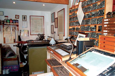
My own letterpress workshop is a modest affair measuring roughly 1100 × 600 picas. I view the limited space as something of a positive factor as it demands I keep things to a reasonable minimum. That said, I have acquired more than enough paraphernalia. Paper storage can be a problem and I often have to move this or that to get at the other. A large workbench along one wall doubles up as a cutting and finishing surface as well as a design and computer desk. I can recommend a portable computer rather than a large desk-top machine here. Three type cabinets are stored under this multi-purpose bench and the tops of the other two type racks serve as workable homes for a stone, furniture and leading racks. There is plenty of shelving around the walls for books, paper samples, cans of ink, pencil pots and the rest. A good friend of mine and former submariner is impressed by the imaginative use of storage and space.
As for presses, I personally prefer a platen to the cylinder presses of the kind we use at the University. Other than the Adana, for the past 10 to 12 years all my printing has been done using a Cropper treadle press that takes a sheet of about 8 × 13 inches, though I have printed much larger sheets. The beast does seem to have a mind of its own at times, and can be rather frustrating, but knowing it rather intimately does allow me to fix most problems as they occur. A few years back I bought a German-built Victoria from about 1930, and have recently completed its restoration. I plan to make a little more space and have the thing installed before the close of 2009. A small Adana paper-cutter, lead-cutter and a Victory galley proof press complete the orchestra of equipment.
Like most people with similar workshops, I have collected more type than would ever be useful, and a rationalisation programme has left me with the faces that reflect the ones I use in their all-too-often sad digital incarnations. These include good quantities of Optima, Palatino, Sabon and Walbaum. There are also a number of odd founts in a more limited range such as Memphis Light, S&B Grotesques, Times, Univers, Garamond and Nord Italic (which, along with the Palatino, came from the Rampant Lions Press). Looking at the list, these faces display a distinctly Continental post-war flavour, which suits my aim of making pieces that are contemporary rather than historical, although I do dabble with the latter. In that sense, I stand with Emil Ruder and his notion that typography is a child of its time. The work of postwar humanist German typographers, especially Hermann Zapf, Richard von Sichowsky, Gotthard de Beauclair and Otto Rohse, has greatly influenced me. I would like to think that I am not driven by any particular kind of dogma, be it symmetry versus asymmetry, or some other championed ideology. I would say that I am searching for a more blended approach, somewhere between the discipline of, say, Ruder and, the cheeky fun of Robert Massin.
Colour is, and always has been, an important element in my work, since I first discovered Gerstner, Vivarelli, Albers and others. Although I do use black, I frequently use colour as a means of expressing feeling or emotion: for me, it brings a certain lightness or freshness to printed language, and can enforce meaning and make words sparkle. Kandinsky believed colour had a direct influence on the soul and that its hue could be likened to the sound of a musical instrument: ‘Orange sounds like a medium-sized church bell, like an alto voice … .’ The French poet Arthur Rimbaud expressed vowels through colour. All of this is starting to form the basis of an ongoing experiment into the relationship between colour and words. Where it will eventually lead, I have no idea at present: that is the beauty of working for oneself on such projects.
I like colour in paper form, too. However, a good white paper suits my eye best for printing type in colour rather than those that are distinctly yellow in tone. I like my type to print crisp, sharp and not furry, so I always damp the paper before printing; I see no advantage in using the stuff dry. Damping allows you to use less ink and nestle the type into the paper. As I rarely print more than 80 or so of anything, it presents a negligible time hurdle. Once the sheets are printed and dry, they are pressed between boards under some heavy trays of leads for a few days, which takes out most of the indent and any cockles around the edges. Damping can bring problems with registration but these can be solved or ‘designed out’ to start with. I favour a hard packing on the platen, and now use a plastic material on the top with the make-ready buried down at the bottom. All of this gives me the kind of sculptured image in the paper that I am searching for: firmly bitten in but not hammered home.
Although I design and print the usual assortment of ephemeral pieces for family and friends, my workshop is primarily a place for personal work, experimentation, learning and discovery. It feeds directly into my design work for clients and into my teaching; it gives a mental space for reflection and opens pathways to new discoveries. It is also a fabulous resource through which to promote my commercial work.
With a young family – two boys under five – finding time to do all the things I would like to do can be difficult. However, there is always time to plan more ambitious projects for the future journey, wherever that might lead.
Christopher Wakeling is a senior lecturer in typography at Northumbria University and runs his own studio, Typographic Design Unit.