
Editions Koch
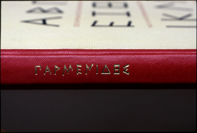
The Fragments of Parmenides, translated by Robert Bringhurst, is accompanied by a fascinating 138-page paperback entitled Carving the Elements: A Companion to The Fragments of Parmenides. This companion volume (which one might consider an elaborate colophon and notes to the book itself) is beautifully designed and digitally typeset by Bringhurst, who also contributes three pieces to it: an Introduction, an essay on ‘Finding the Form of an Ancient Text’ which discusses the various forms of Greek writing which led to the designs of the types used for the Greek texts in this edition, and ‘Raven’s Wine Cup,’ which discusses the position of Parmenides as a poet and metaphysician in Greek literature, in Western culture, and in world thought. In addition to these, there are essays by all the other contributors to the project about their particular areas: Peter Koch on the decision to publish Parmenides and the steps leading toward it; an interview with Christopher Stinehour about designing Diogenes, the digital type which is the titling face used in the edition — and a text version of which will be used in a later trade edition; an essay by Dan Carr about designing the Greek text face, Parmenides, and cutting the punches for it by hand; another by Richard Wagener about the impulses which led to his wood engravings for the book; and essays by the two binders involved, Daniel Kelm and Peggy Gotthold. Carving the Elements is available separately at US$30, and is a remarkable account of an extraordinary collaboration of master-craftsmen. The Fragments of Parmenides is reviewed in this issue.
As a means of letting our readers look over the shoulders of some of those involved in this project — by any standard a major publication which will take a place among the great press books — Robert Bringhurst has kindly excerpted some passages from Carving the Elements which we print here.
Robert Bringhurst
Ten years ago, a thoughtful fisherman, printer and friend named Peter Koch asked me to translate the fragments of Parmenides. It was not an invitation to take lightly. Peter is one of the few living masters of the art of letterpress and the only one I know of who is seriously interested in the philosopher-poets of presocratic Greece. He had already printed the fragments of Herakleitos — the complete Greek text with Guy Davenport’s deft and lean translation — in a form that I greatly admired. So the bar was set at a difficult height, and shying away was out of the question. Though time and language link the major Presocratics to each other, they remain distinctly different creatures, each with his own take on the universe and each with his own voice. A good translation of one makes it that much more important, but also that much harder, to retranslate the next.
Discovering an honest typographic form for such pre-typographic texts is not a simple matter either. Peter commissioned two Greek types for the project — a digital face designed by the Berkeley stonecutter Christopher Stinehour and a foundry face which Dan Carr cut by hand in steel at Ashuelot, New Hampshire. To give the ancient text some youthful company, he also commissioned a series of brilliantly coloured abstract wood engravings from Richard Wagener in Los Angeles.
The type was set by almost all the methods known. Richard Seibert and I set the ancient Greek by hand in Dan Carr’s new foundry type. Dan and his partner Julia Ferrari set the new translation in hot metal on their ancient (relatively speaking) Monotype machine. I set the afterword on a laptop, using specially tooled Latin, Greek and Cyrillic digital fonts. Seibert translated the digital type into three dimensions by photoengraving it into polymer. Wagener, meanwhile, was cutting all his images by hand in endgrain wood and dreaming up their colours. These components came together in Peter’s hands in the bed of the press, where foundry metal, Monotype metal, polymer and wood could all be inked and printed by hand, deep into paper made by hand at the Zerkall mill. Then there were the bindings. Daniel Kelm bound twenty-six copies in full leather at his studio in Easthampton, Massachusetts. Peggy Gotthold bound another hundred and twenty in quarter leather, and boxed them all in silk, at the Foolscap Press in Santa Cruz. The bindings, like everything else, were of course constructed one by one, by hand. It was an exercise in carving steel, stone and wood and air — and in carving hexadecimals and hydrocarbon polymer as well. But mostly it remains what it first was: an exercise in carving thought — primarily by hand.
Why tell the story at all if it is actually incarnate in the artefact? Isn’t the silent eloquence of the thing itself enough? It is, of course — but objects tell their stories only at first hand, to those who get to know them. Books made the way The Fragments of Parmenides was made are inevitably costly and inevitably scarce. They honour the text, but they restrict its circulation. Because of the craftsmanship they embody, they also honour the humanity of humans — yet only a few humans will ever be able to handle them long enough and look at them closely enough to soak that silent knowledge up again.
Peter Koch
As a child I could be transported to a happiness nearly beyond endurance by the powerful surge of a mature cutthroat trout shooting up out of the dark waters of Rattlesnake Creek. The symbolic structures buried in consciousness were never so clearly revealed in any textbook. Later in my life, to create a book or write a poem, to work out intricate design decisions and the imperfections of printing, like that silver trout in dark water, brings imagination to light. Printing, like fly fishing, is an art built on knowledge, a revealing of the hidden nature of things: a Herakleitian pursuit.
Printing and the pursuit of ideas — the constant return to the stone — the sound of metal type hitting the pan of the composing stick in the quiet meditation of work — the familiar feel of the stick and the reach of the job case — slowly assembling the fixed text by the fleeting motions of hand composition, that is the true meaning of festina lente, slow haste, the symbolic anchor and dolphin. Speed and constancy. To print by hand, to design a structure that transmits the text, is to ask fundamental questions about reading, about the enduring qualities of our literacy — how we feel about the work. By questioning, by asking fundamental questions of ourselves, of our acts and of our arts, we rescue for our thoroughly accelerated civilization the simplicity of working with our hands in the vineyard of the text.
Diogenes, that quintessential cynic, asks us to question our habits and our superficial comforts — to recover the original impulses, the fundamental needs of our condition. You can see him still on Telegraph Avenue, jeering and cajoling. To study the presocratics is akin to producing the hand-composed book: it is a return to origins, a journey upstream toward the sources of literacy and the defining birth of the Mediterranean civilization.
Dan Carr
My own part in the project started when Peter Koch asked me in the fall of 1997 if I could cut a new archaic Greek type in metal. My role expanded when he asked me to make substantial changes to preliminary prototype work that had been done, and in response I prepared a completely new set of drawings of my own design, based on substantial additional research. In 1998, I had an informative conversation with Christopher Stinehour over drawings he had made for the prototype face, called Diogenes, followed by additional conversations with Peter outlining the new direction he was seeking. Peter’s instincts for what was needed were excellent. In a letter responding to a smoke proof of the first punch, Peter related that he was looking for an irregularity in the design instead of a perfect monoline geometry — and that, as we shall see, is exactly the direction in which my research was leading me.
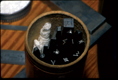
Dan Carr’s punches for Christopher Stinehour’s Digonenes type.
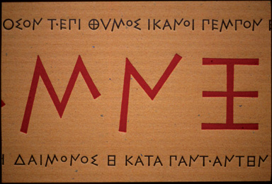
A number of Greek inscriptions survive from the seventh century BC and a collection large enough for useful study survives from the sixth century. Often inscriptions from before the fifth century are regarded as primitive or carelessly written because they do not fit the ideal monoline, symmetrical geometry of the fourth century. The sixth-century letterforms, for example, tend to be more complex, asymmetrical and irregularly aligned. When they are monoline, they are not inflexibly monoline. Modeling of the strokes in letters often appears to be simply the result of the idea of a letter inscribed in a given material with a given tool, but there are examples of intentional modeling. The monoline character varies between inscribed letters in rough stone, letters brush-written on a vase and letters engraved in dies for coins. In addition the geometry of archaic letterforms is implicit, not explicit, as it becomes later in the fourth century. A few writers have raised the question of whether this difference is cultural, but most writers see it as developmental. Historically, the difference can be seen clearly after the traumatic invasions of the Persian Empire. Graphically, the difference in geometry coincides with the final abandonment of the boustrophedon style of writing (writing and reading script in alternate directions in successive lines of text, e.g., left to right followed by right to left). Culturally, these changes come at a time when literature has (for some part of society at least) replaced the oral culture for several generations and oral culture lives on mostly in memory or in the newly evolved public theater. Perhaps the difference between a certain fluidity in the letterforms of the sixth and seventh century and the perfect symmetry of the letterforms of the fourth and fifth century is part of a wider concern in the orthography of a culture, revealing a contest of ideas such as the dialectic between diversity and homogeneity. . . .
A proof of Christopher Stinehour’s Diognenes type.
In addition, in the sixth and seventh centuries the letterforms float on a midline like Chinese ideograms, as Robert remarked to me both in conversation and in a letter. The letterforms are asymmetrical vertically as well as horizontally. Many letters either end partially at a midpoint or are balanced around the midpoint, some extending above or below the average height or depth more than others. In some inscriptions there is enough emphasis on letters that end partially at the midpoint that they create the effect in a mass of a half-height counterpoint of space and letterform. In many inscriptions the lines are closely integrated. This is not necessarily for the compact use of space, which is often left empty below the inscription. This density is used for the same effect as boustrophedon: to express a continuity of thought, perhaps as if in the measure of a hand’s breadth. In fact, in many inscriptions the movement of the hand can be seen as the measure of the archaic Greek letterforms. The design language of archaic Greek is a language of gesture; while the words carry thought, they also seem to be active partners in the dialogue of reading and expression. The emphasis is on interrelationship while at the same time the letterforms have a freedom to dance away from both the vertical and horizontal axis.’ In contrast, the style of the fourth-century letterforms is more concerned with the display of thought or words in fixed order that sometimes includes vertical alignment as well as horizontal alignment. The interesting point about the sixth-century letterforms is that in sum they constitute a different system of design than the ideals of twentieth-century type design. While the geometric ideas expressed by Greek letterforms are readable in archaic letters, the exact geometry is not measurable from the letters themselves. The sixth- and seventh-century letterforms are not abstract; they are proportioned to the hand that made them; they bring to mind the words of the presocratic philosopher Anaxagoras, sometimes summarized as: we think because we have hands. This fluid geometry of design in the letterforms is expansive, speculative and interrelated: ideas that were all challenged in the culture after the Persian invasions. Archaic Greek inscriptions express a great deal of freedom and diversity of thought. The archaic Greek letterforms are a study in the balance of chaos and order.
A little more than a week before the meeting with Koch and Bringhurst, I took Julia to meet a bus for a museum and gallery day in New York. Coming back in dawn twilight I could see ice was still on the trails and roads in the woods; no one would be out there. As I came up to one of my favorite trails I pulled in and took a walk. I began to think of the comparison Robert had made between archaic Greek letters and Chinese characters. The balanced asymmetry of order and chaos that I had come to admire in the archaic letters was all around me in the limbs and trunks of the trees. Shifting rays of light were glancing through the spaces in between, and spring was already visible in the chill air. As soon as I got back to my drawing table I sat down to draw a design for the type. It had formed so clearly in my mind’s eye that although I did not yet see every detail I knew it would all be resolved from the elements I could already see. I drew the letters about five-eighths of an inch high in a loosely sketched style, filling the strokes to their edges rather than starting with outlines. The design in my mind’s eye was composed of objects with thickness and body, not the tracings of a concept. The design was completed to the stage of a loose sketch in one sitting. Reductions showed it would work, so I left the development of the final form to the sculpture of the punch in steel at size. . .
Richard Wagener
Printmaking was frowned upon during my graduate school years. The prevailing doctrine held that real artists paint and sculpt, lesser artists print. This was largely a response to the celebrity presses flooding the market with inexpensive works by established name artists. In many cases these works were perceived to be simple reproductions of paintings rather than a serious inquiry into a printmaking medium.
For me this precept dissolved upon pulling the first print of a linocut. I sensed a real potential for expression — but it wasn’t until I saw a wood engraving that I immediately felt I had found the medium I wanted to explore. After acquiring the basic tools and materials, I set out to find my way with engraving. Ten years passed before I had the opportunity to meet and talk with another engraver. My isolation during this period allowed me to develop artistically outside the history and conventions of the British engraving tradition.
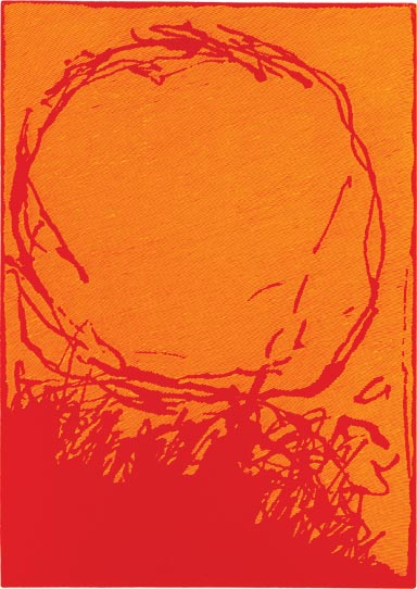
Untitled wood engraving by Richard Wagener from The Fragments of Parmenides.
I approach each block as the abstract painter confronts an empty canvas, thinking about how to use this space to make a statement. Ideas are worked out in drawings using whatever materials are at hand, frequently trying to subvert the process in order to achieve greater freedom. Many times there are ideas floating about that prompt me to draw. There are other times when a quick succession of drawings suggests possibilities. My process is to do as much planning as possible before committing the graver to the wood, so that by the time I reach for the block I have a pretty clear sense of where I am headed. The ideas are then drawn on the block, allowing the engraving process to be fairly straightforward while affording an opportunity to do a certain amount of editing. . . .
I had a dream where I was solving a problem with abstract imagery. The first image was so clear that it was indelibly fixed in memory — an incendiary red blazing against a brilliant yellow — colors as rich as a Mewar miniature. This was a clear departure from my previous work where the engraving has been nearly exclusively printed in black. In a similar fashion the other images embodied a sensibility possessed of a discrete presence of insistent drawing that was as up front as possible: singularity of purpose in a field of western light. The clarity was so rich the resultant drawing and engraving flowed with the kindness of Eugen Herrigel’s archery.
Peter instantly sensed the connection to the book that he was working on, The Fragments of Parmenides, and encouraged me to go further. The images in the dream were abstract associations of feelings: distance, closeness, weight, gravity, valence, bridges, barriers, magnetism, attraction, falling away, smoldering, extinguished, passionate, fervent, vespers. The pursuit of these ideas within the context of the writings of Parmenides and the lineage of the presocratic philosophers involved going beyond the accidental characteristics, to peel back the layers in order to arrive at a sense of the essentials and to find a propriety in the quality and organization of the markings. In the end there were ten images determined in their own way to assert a unifying feeling.