
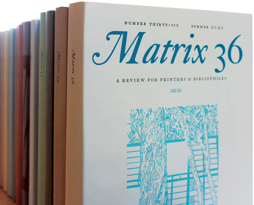
For nearly four decades, almost exactly spanning the new millennium, many observers of the fine press printing world, the collectors of the books, and the printers themselves waited impatiently at the end of each year for a substantial volume to thump through their letterboxes. This was Matrix, the Whittington Press’s annual ‘Review for printers and bibliophiles’, edited by the Press’s owners John and Rosalind Randle.
Since the first number came out in 1981, it is easy to date most subsequent issues: so Matrix 11 came out in 1991, and so on. Just the last few numbers trailed somewhat, so that the final one, Matrix 36, appeared in 2020. This article is a brief survey of the journal’s achievements, inevitably from a personal viewpoint, since I was in contact with the Randles from the start, contributing to a high proportion of the numbers as a writer of articles, reviewer or printer of inserts.
The first number consisted, as John wrote, of ‘a few short pieces which would not in themselves justify the production of individual titles’, and it rather looked as if Matrix was going to be the parish magazine of the English private press community, even though the first article in it was a brief memoir by Edward Gordon Craig’s son Teddy about his early life working for his father in Italy. But in Matrix 2 an article on Russian wood engravers, two others on Chinese wood block printing, and a review of a type specimen book from India, showed the rapidly expanding horizons of the journal. It was not that the original focus on British presses and the rural tradition of wood engravers was abandoned, but many other themes were added.
In his introduction to the second Whittington Bibliography, 1982–93, John quoted a comment from a German publication: ‘Here there are no dull technical histories or dry-as-dust works of bibliography, but articles which are the result of enthusiasm for the beautiful business of making books …all spiced with the English sense of humour.’ John added a comment from Gerald Lange in the usa: ‘I have never understood the phenomenal appeal of Matrix’, wryly endorsing it.
Matrix’s commitment to letterpress remained unwavering. In 2003, John wrote: Why do we still do it all by letterpress? The simple answer is that we have always done it that way, and that we enjoy doing it that way, and that letterpress is singularly appropriate for a journal that concerns itself with fine printing. It will probably be the last typographic journal to be printed from type by letterpress, so perhaps we should make the most of it while we can.
Nevertheless, that ‘all’ disguised the fact that a large number of inserts and illustrations, both tipped in and interleaved, were printed by outsourced offset – but often on attractive papers and by excellent offset printers like Adrian Lack at Senecio Press. It would not have been such a visual and sensory experience without them. And there were a few cases of dense and complicated bibliographical matter, usually by David Butcher, such as the Matrix Index for the first ten numbers, and the books of J G Lubbock, which were computer-set from David’s files, printed elsewhere and bound in. But the main text pages were always set in hot metal. John and Rose had their own Monotype typesetting plant, getting their first keyboard and caster in time for the first number of Matrix.
Although Caslon was the Matrix text face, over the years individual articles were increasingly frequently set in other types from the enviable Whittington Monotype collection. This was greatly augmented in 1986 after Oxford University Press closed its hot-metal department and the Randles inherited the diecases and other material. Some articles that were printed on the ordinary text paper, not as separate inserts, were set in Bembo, Bodoni, Centaur, Cochin, Gill Sans, Goudy Modern, Grotesque 215, Modern 1, Neo Didot, Octavian, Old Style 2, Perpetua, Poliphilus, Romulus, Scotch Roman, Times, Van Dijck, Univers, Walbaum and Wittenberger Fraktur. I may have missed a few. The last number included an insert with the first showing of Russell Maret’s face Hungry Dutch, Monotype series 923, cut at the Type Archive in London, the first new Monotype hot-metal face for over 40 years. And besides the composition faces, there was also the wide range of foundry type for handsetting used for the display, and the types used in letterpress inserts printed by other workshops.
As an example of one of these inserts focusing on typefaces, showing how collaborative the process of putting them together was, there was one I printed for Matrix 19 to accompany John Dreyfus’s review of a book edited by David Pankow and published by the American Printing History Association in 1998 on American Proprietary Typefaces. John suggested a four-page folder covering the book’s range of faces. At the Rampant Lions Press my father Will and I had a fount of the foundry version of Arrighi, for which the punchcutting in Paris was supervised by the American Frederic Warde. Whittington already had the Oxford Lectern Bible size of Bruce Rogers’s Centaur – 22pt shrunk down to fit on a 19pt body. But there remained a dozen other faces, represented by a few lines each in the insert, where John managed to cajole designers, punchcutters and owners to lend us the actual type: the Montallegro type from the Merrymount Press, Joseph Blumenthal’s Emerson, two less well-known faces by Goudy, Village and Kaatskill, three uncials by Victor Hammer, and some newer creations by Stan Nelson, Dan Carr and Michael Bixler. Most of these printed well, but there were two types from Dard Hunter’s Mountain House Press which were so amateurishly cast (‘cruddy’ was the word I used in a letter to John) that I doubted if the second could be used, but we managed to get a tolerable result. The folder was sewn in near the middle of Dreyfus’s article.
I subscribed to the first number of Matrix. Getting in early was a wise move: the print run was only 350, and demand was so great Whittington were forced to produce a second printing a few years later, to meet the demand of collectors trying to build up a full set. Nowadays, single copies of the first printing rarely come up for sale; there are usually only full or nearly full sets at enormous prices.
Acknowledging my order, which included a suggestion that the next number should celebrate the Eric Gill centenary, John wrote, ‘Your idea for something about Gill and the Golden Cockerel type sounds intriguing. I will write to James Mosley and ask if he would like to do something along those lines, in which case we would very much like to take you up on your kind offer to print an insert. That is, if Matrix survives a second issue, but at the moment we have had a terrific response, both from contributors and subscribers.’
James Mosley’s article on the Golden Cockerel type duly appeared in the second number, accompanied by my printed insert of the text of Shakespeare’s ‘The Phoenix and Turtle’ set in the 18pt size, which the Rampant Lions Press had in the workshop. Matrix 2 was the only other number reprinted, and differed from the reprint of the first in having a substantial amount of new material in the form of a few postscripts to the earlier articles, and a new article, making it even more interesting but something of a bibliographer’s nightmare.
In a letter of 27 December 1985 I thanked John for Matrix 5 and said how much I liked it. In the same letter there is the first mention of the correspondence between Stanley Morison and the Dutch typographer Jan van Krimpen which I edited from the archival sources in Cambridge University Library, together with the text of Van Krimpen’s scathing memorandum on the Monotype type programme and the work of the Salfords Type Drawing Office: this was its first appearance in print. In 1985 I clearly thought I could do the survey of the letters in two parts, but it was eventually spread over four numbers, 8–11. Luckily, John was an outstandingly supportive editor, never complaining when the survey grew so much longer or, in the first instalment, when a newly-discovered letter had to be included at proof stage, with adjustments to the commentary – in Monotype hot-metal setting. His enthusiasm, wide range of interests, and willingness to adapt were evident in all our dealings. There was an extra part in Matrix 12 with my essay on Van Krimpen’s roman typefaces illustrated with an insert I printed showing as many as I could muster – this coincided with his centenary. Michael Mitchell had already written about his Greek typeface Antigone in Matrix 4.
Among the early numbers, Matrix 11 was a very full and very characteristic example, and is a good one to choose to demonstrate the journal’s ambitious scope. Among a cluster of articles on typefounding, there was John Lane on ‘Twentieth-century Punchcutters’, Steven Tuohy’s note on a photograph of Harry Carter cutting a punch at his work bench (beautifully reproduced by another of Matrix’s subcontracted offset printers of the early numbers, ctd), and for some historical background James Mosley’s article on the illustrations to the typecasting section of the publication Description des arts et métiers, produced by the French Académie Royale des Sciences in 1694.
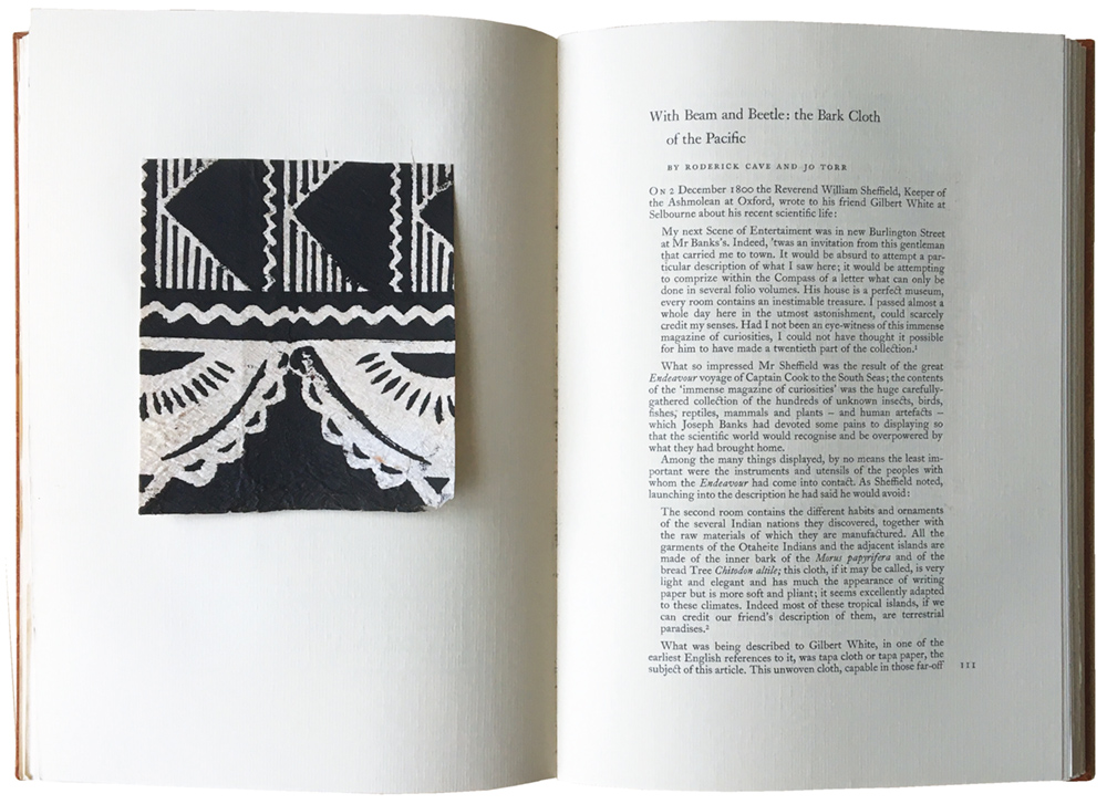
Sample of Pacific bark paper accompanying an article by Roderick Cave and Jo Torr, pasted into Matrix 11.
Other serious scholarship in that number included John Dreyfus’s reconstruction of the lecture Emery Walker gave on 15 November 1888, often described as the event that sparked off the Kelmscott Press in the mind of William Morris, who attended it. Among the other articles were Brooke Crutchley on Reynolds Stone’s wood engraved work for Cambridge University Press and other Cambridge customers, Christopher Skelton and Joseph D’Ambrosio on their printing, and Jonathan Stephenson on setting up a Monotype plant. My contribution was the last part of the Morison –Van Krimpen correspondence, including the Van Krimpen memorandum. Desmond Flower and Mark Arman looked back at their earlier days, Solveig Stone wrote about her Compton marbled papers and Marthe Armitage about her linoleum-block-printed repeat patterns. There were articles on artists working for Haslewood Books by Peter Tucker and on Christmas cards by Enid Marx, and obituaries of the New York printer Joseph Blumenthal by Jerry Kelly and of the engraver Gwenda Morgan by John. The death of Dame Hildelith Cumming of the Stanbrook Abbey Press was also announced.
David Chambers reviewed the private press output for the previous year. (This regular feature had been undertaken first by Michael Taylor; Chambers stepped in for Matrix 5 and the task was taken over by Paul Nash in Matrix 24.) Dennis Hall covered the 1990 Fine Press Book Fair. Other book reviews included John Bidwell on William Peterson’s The Kelmscott Press, John Dreyfus on Martin Hutner’s leaf-book on the Merrymount Press Book of Common Prayer, David Butcher on The Engravings of John Buckland Wright and the second edition of Colin Franklin’s The Private Presses, and Roderick Cave on A Typographical Masterpiece, John Dreyfus’s account of the printing of the Golden Cockerel Four Gospels. John Randle rounded up some other books and there was an endpiece on Art Workers Guild festive publications by Alan Powers.
Almost every article was illustrated, often lavishly, and some with original material. Samples of Compton marbled paper, lino prints for the Armitage patterns, and bark papers from the Pacific were pasted in, the last for Roderick Cave’s article on the subject. There was a whole inserted booklet, ‘Twins’, with two-colour wood engravings by John O’Connor. The Van Krimpen memorandum was another separate booklet bound in, printed at Whittington in its author’s typeface Romulus. A letterpress insert was contributed by Christopher Skelton. And there were lots of colour and monochrome offset reproductions. The two most extensively illustrated articles, Mosley’s and Dreyfus’s, had one Matrix peculiarity that was sometimes rather problematical. The offset reproductions on coated paper were interleaved with letterpress leaves on the text paper with the captions printed facing the pictures. This was fine for the main sequence of the engraved plates from the Arts et Métiers publication in Mosley’s article, since the annotations were lengthy, but in the case of the Dreyfus one, which illustrated Walker’s lecture slides, the captions were generally brief, and the result was a lot of blank paper. Over the years several ways of captioning the inserted or tipped in pages of illustrations were employed, including actually printing captions under the illustrations, but you sometimes had to search for them.
Occasionally, in a puritanical mood, I thought that a letterpress production of this kind was not best suited to complex editorial organisation involving the integration of text and images. The way so many illustrations were tipped in or inter-leaved on different papers, and the often rather awkward fold-outs, occasionally made a Matrix number seem like the roughly pasted-up dummy of the publication it would eventually become. But then of course I had to admit that this was also its strength, contributing to the unequalled tactile variety and sense of exploration the user feels. The variety of papers was the result of each one being selected as the best for the process being used, and the tip-ins of original material, especially wood engravings printed from the wood blocks and sometimes signed as well, were only possible in that form. Even the pasted-in glassine envelopes containing folded poster-size images, such as Patrick Randle’s wonderful letter ‘b’ in Matrix 32, a shaped tapestry composed with different typefaces at the Bethanien workshop in Berlin, can be forgiven. Matrix’s outstanding attraction was the amount of original material tipped or sewn in, which made each number, in David Butcher’s words, ‘a form of leaf book’.
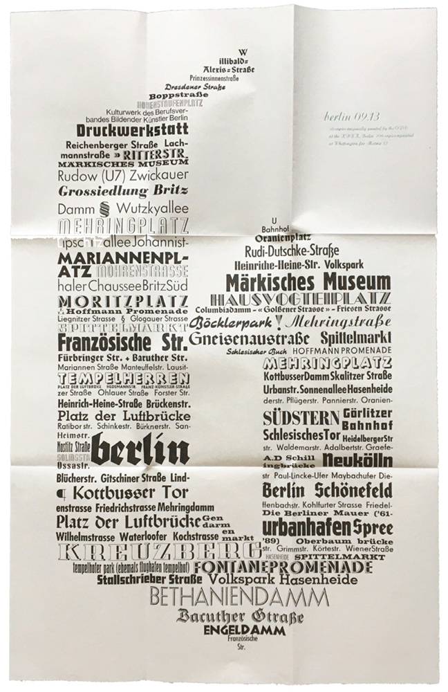
Large poster designed and printed by Patrick Randle in types from the Bethanien workshop, Berlin, incorporated into Matrix 32.
Several of the writers who appeared in Matrix 11 were already, or became, regulars. The indefatigable Roderick Cave, when not describing and providing samples of specialised papers from far and wide, edited a good deal of correspondence between private press owners and illustrators, notably Christopher Sandford with John Buckland Wright and John O’Connor, and also the private press chronicler Will Ransom with James Guthrie, Dard Hunter and Guido Morris. Cave contributed to every number between 1984 and 2007 with one year out. Very often there were two substantial articles in one number: the Ransom–Guthrie correspondence, for example, was in Matrix 14 together with his account of a visit to the Tallones in Alpignano. After 2007, there was one book review in number 31, and then John Randle’s obituary of Cave in the last Matrix.
John Dreyfus was not so prolific, but his authoritative articles on the Curwen Press and on Double Crown Club menus were particularly lavishly illustrated, and he looked across the Channel at the work of the designer Maximilien Vox, the Paris printing firm Draeger Frères, and Robert Doisneau’s wonderful war-time photographs of night-time printing workshops operated by the French Resistance. His Curwen article was one of a related cluster in Matrix 5, with others by David McKitterick on the collection in the Morison Room at Cambridge University Library, and by Noel Carrington. In addition, Ian Mortimer’s collection of the Curwen type material he had rescued from disposal and stored at his I M Imprimit workshop was illustrated with an eight-page bound-in section of samples of types and borders, proofed by Mortimer and printed by offset so as not to wear the type.
An earlier contributor was Hans Schmoller, the designer who took over from Jan Tschichold at Penguin Books and retired in 1976, after which he and his wife Tanya embarked on building a major collection of decorated papers. John Randle’s note in Matrix 6 on their collaboration with the journal recalled how it began. Schmoller wrote some ‘unsolicited comments’ about the first number, maintaining that the grain of the paper went the wrong way, the inner margins were too wide and the foot margins too small, and that all tip-ins should be gummed along the inner margins, not the top. John answered by asking him to write something, and finally convinced him that the Sommerville paper used in Matrix had the grain the right way, even though the orientation of the chain and laid lines suggested otherwise. (This was finally rectified in Matrix 32, when a new paper, Matrix Laid, was introduced, with the chain and laid lines right.) Schmoller still said the paper was too thick to drape properly, but he contributed several articles on decorated papers and Far-Eastern handmade ones. The first, in Matrix 3, ‘A Panoply of Paper’, had a large fold-out sheet of 43 colour reproductions of marbled and wood block-printed papers, paste papers and other forms of patterning from American, British, French, German, Indian, Italian, Japanese and other makers from the 18th century to the present. After Hans’s death, Tanya Schmoller continued with pieces on design at Penguin, where she had been Allen Lane’s secretary, and more articles on paper.
Indeed, papermaking and decorated papers were a major subject covered in Matrix articles. The entries on the subject in David Butcher’s Index volume of 2003 ran to over a column, and that was just the first 21 numbers. Handmade paper makers Maureen and Brian Richardson, Bridget O’Malley and Amanda Degener and others wrote about their work, and there were pieces on Barcham Green, Abbey Mill, Velké Losiny and a general survey of current Japanese washi production by Maureen Richardson. The coverage of marbled papers was also outstanding. Compton has already been mentioned, but there were articles by other marblers such as Anne Chambers, Robin Heyeck in California, on the Fancy Paper Company by Tanya Schmoller, and on Turkish marbling by Musa Igrek.
These articles were greatly, and in many cases unrepeatably, enhanced with tipped-in samples of the actual papers; and from the conservation point of view it is worth pointing out that they all still look as pristine as when the numbers were published. The most extraordinary example was in Matrix 4, where David Butcher’s article on Chinese paper-cuts was accompanied by three actual examples of astonishing delicacy, somehow pasted on to text pages. There is no trace of squeezed-out gum, and in my copy the cuts have not got torn or worn over time. How this was done in an edition of 590 copies plus a few contributors’ copies is hard to imagine. Another memorable inserted item was some pop-up cut lettering by Ron King of Circle Press in Matrix 19.
Wood engraving was another significant theme. A high proportion of engravers working in Britain at the time were the subject of articles on their work, with examples printed from the wood, usually on Zerkall mould-made paper. As well as the Russian work already mentioned, engravings from France, Germany, Sweden and the usa were also featured. Moreover, Whittington were unusually fortunate in having an exceptionally talented in-house engraver, Miriam Macgregor, who not only illustrated many books for them, including some she wrote herself, but was a compositor, and wrote about ‘The Forgotten Pleasures of Hand-Setting’ in Matrix 23. The first number had her engraving of the Press workshop on the front cover, and others were scattered throughout later ones.
Miriam’s engraving style is a spirited take on the British rural tradition. An artist conspicuously not in this tradition, who nevertheless worked closely with Whittington in its first decade, was the German emigré Hellmuth Weissenborn (1898–1982). His posthumous appearances in Matrix show the interweaving of message and medium that was another hallmark of the journal. His engravings appeared in many numbers (as well as on various Whittington letterheadings).
Weissenborn began concentrating on wood engraving only after his arrival in England in 1939. Before that, while he was teaching in Leipzig, he made a large number of colourful pictorial designs built from geometric type ornaments. These ended up in small editions of books and ephemera, including bookplates. I had noticed some monochrome reproductions of the last category in the Bookplate Journal, and asked John if he knew anything about them. It turned out that he had inherited two boxes of the ornaments in superb condition from Weissenborn, and he not only lent me the ornaments but put me in touch with the artist’s widow Lesley, who gave me some copies of the printed results dating back to the 1920s.
I wrote an article about this side of Weissenborn’s work in Matrix 5, and reconstructed two of his designs, printing them in four colours as a tip-in. There was also an engraving of his on the front cover. Much later, in Matrix 25, I wrote in more detail about the bookplates, and we reproduced 14 of them in colour. Moreover, for the jacket of that number, John wanted to reuse a design of a table-top with food, wine and a bird that I had concocted using the ornaments for a Double Crown Club invitation for a summer visit to Cambridge. This was printed from my standing setting in five colours at Whittington, using the original 1920s metal sorts from the Ludwig Wagner foundry in Leipzig. On the binding underneath there was a figure, ‘The Reader’, which I had made with the ornaments for the jacket of an anthology put together by Ali Smith for Constable. Greatly reconfigured, and given a mug of coffee, the figure reappeared as an occasional filler device in Parenthesis.
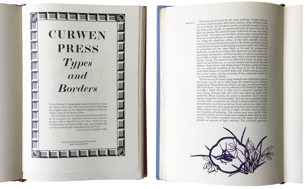
Insert printed by offset showing IM Imprimit’s collection of Curwen types and ornaments, in Matrix 5.
An actual Chinese paper-cut from David Butcher’s collection, pasted into Matrix 4.
Meanwhile, Weissenborn was attracting researchers interested in the German emigré experience and his family back-ground. He was not Jewish, but his first wife Edith was, and they moved to Britain before the war. He was briefly interned as a suspicious alien in the celebrated camp on the Isle of Man, and his life was told by Anna Nyburg in her book From Leipzig to London (2012). She wrote about her researches in her essay ‘In Search of Hellmuth Weissenborn’ in Matrix 31. Before that, in Matrix 26, William Waterhouse did some investigation into the family history. He was a professional musician and writer who had contributed entries to the New Grove Dictionary on the bassoon, his own instrument. A famous bassoonist of the past was Julius Weissenborn, who turned out to be Hellmuth’s grandfather. There were other talented musicians in the family, including Julius’s brother Louis, who worked as a copyist for Mendelssohn. This shows how far afield articles for Matrix could roam.
Among other themes, the few surviving examples of designer hand-punchcutters were duly celebrated, with Dan Carr on his Regulus and Parmenides faces, and Stan Nelson on his Carolingian minuscule-inspired Robin. The most heroically artisanal was the Swedish press owner Richard Årlin, with his Ungut and Stanislaus (the latter being the italic), based on a Spanish type from the incunabula period. He not only cut his own punches and cast the type in a home-made mould, but made the paper and ink for the book he had written and illustrated, and printed it. Type and paper were shown in Årlin’s printed specimen tipped into Matrix 17, and John used the type on the jacket. There were also articles by the designers who used slightly more industrial methods, like Nicholas Parry for his typeface Tiern, who employed Theo Rehak’s Dale Guild in New Jersey to make Ludlow matrices, and Jim Rimmer on Stern, for which he made matrices in the same way as Goudy, with a vintage pantographic engraving machine.
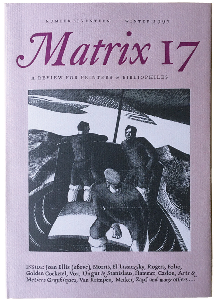
Matrix 17 jacket, showing Richard Årlin’s Ungut and Stanislaus typefaces, with a wood engraving by Joan Ellis.
This overview of the contents of Matrix cannot do justice to the wealth of subjects it dealt with. Among other themes that threaded their way through the numbers, besides the extensive coverage of the private presses of the early decades of the 20th century, there were articles on German design, European Modernism, Matisse and Picasso, Oxford and Cambridge University Presses and a long series of pieces by Enrico Tallone on Italian type and printing. Such a summary, however, just leaves me with a feeling of regret that so much has had be left out.
The Matrix bindings were always a colourful display. Up to Matrix 6, they were substantial glued-on card wrappers, which over time got rather bumped around the foot of the spine. After that there were thin flexible paper-covered boards and jackets, which are more resilient; my set has withstood a lot of handling during the writing of this essay. The boards were mostly printed with large pictorial designs: as David Butcher wrote, ‘from Matrix 7 it is worth looking under the wrapper’, which it certainly is. But there were a number of variants. Below the masthead, which remained broadly constant for the 36 numbers, if sometimes alluded to rather than reprinted exactly, the jackets usually had an engraving or other form of picture and a condensed version of the contents. (There are colour pictures of the jackets of the first 21 numbers in the Matrix anthology of 2003, Type and Typography: Highlights from Matrix, The Review for Printers and Bibliophiles, published by Mark Batty.) But for Matrix 10, Alan Powers drew an autolithographed dust jacket with a reduced version of the masthead in a small hexagonal panel, and for that number the contents were printed on the front board of the binding. Later, for Matrix 19 and 21, there were no contents at all on the jacket or binding, and sandwiched between them Matrix 20 had a huge swash M with very dense contents ingeniously woven into the gaps. This same M reappeared on the boards of Matrix 22, with one upside down overprinted on the other, printed in two colours; this combination was too good not to be repeated on the jacket of Matrix 30.
The first seven numbers were bound by Smith Settle in Yorkshire, and all the numbers after that by the Fine Bindery in the Wellingborough area, which became the Fine Book Bindery with Matrix 27. All the numbers had deluxe editions in quarter morocco with marbled paper or other patterned boards, with portfolios of extra material.
Matrix was scrupulous about thanking its assistants in the prelims. The proofreader Jacek Agopsowicz began with Matrix 2 and continued until his death in 2010 – John wrote an obituary in Matrix 29. He was joined by Jenny Stringer and Basil Wilks for Matrix 8, and Wilks was replaced by Anthea Steel in Matrix 17. The editorial team then stayed the same until the end. Peter J Sanderson arrived in Matrix 9 to do the Monotype keyboarding and casting, and remained, with some in-group-joke alterations of his middle initial and one appearance as ‘Captain Caslon Sanderson’, until Matrix 25. The composition was then outsourced to Stan Lane at Gloucester Typesetting for four numbers until it came back to Whittington, where it was done by Neil Winter for the last six numbers. John’s son Patrick joined the next year as an extremely accomplished pressman for the last five issues.
The limitation of each number was given in its colophon, although some contributors’ copies were produced in addition to the declared edition sizes. After the first number, the second went up to 450. The print run went above 500 with Matrix 4 and reached the 900s with Matrix 6. After peaking at 960 for Matrix 7 it trembled around or just below that until dropping down to the 800s with Matrix 17, where it stayed until Matrix 25. It then went down to the 700s until Matrix 31, which was 660. It stayed in the 600s until the end, except for a jump to 715 for Matrix 33. The extent of the numbers ranged from 70 pages plus inserts in Matrix 1 to 246 in Matrix 19. Thereafter, John constantly tried to keep the number of contributions under control. I found a note from him tucked into Matrix 23 saying ‘Am going to try to reduce the size of the beast in future.’ He had only moderate success: although many later numbers were a good deal slimmer, the last was 198 pages long. Unlike many journals, Matrix had no advertising, except for Whittington Press publications.
In a report in Matrix 10, John wrote that of the subscriber list of 925, 384 were in Britain and 358 in the usa, which reflected the amount of coverage of North American work. The next highest subscriber total was Sweden’s, with 58, and Canada, Australia, Germany and the Netherlands were close behind. France, Greece, Italy and the USSR had one each.
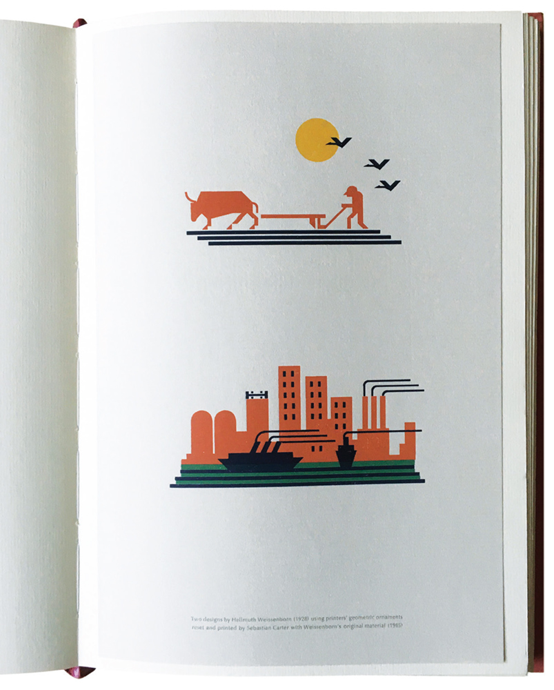
A reconstruction of two designs by Hellmuth Weissenborn, printed from Weissenborn’s original material from the 1920s.
The back of the wrapper of Matrix 35 listed a number of printers, presses and designers who had featured in the journal, set in Cochin italic, with one at the end in roman caps and smalls: it was vale [Press]. I wrote to John wondering if this had a coded significance, being the Latin for ‘Farewell’. He wrote back, ‘I didn’t expect anyone to pick up on Vale…. As you can see, I am rather in two minds about Matrix: I feel it’s said all I want it to say, yet it seems mad not to utilise Neil and Patrick’s unique skills in setting and printing it. Rather depends on what else comes through the letterbox.’ But the next number really was the last, and the word Vale was repeated very discreetly at the back, set in Goudy Mediaeval.
Reviewing Matrix 30 in Parenthesis 24, I wrote,
Matrix is by now so well established that there is a danger that we may take it for granted. People in the future will look back in amazement at its riches. The majority of its illustrations are not reproductions, but the real thing. It is like visiting a group of collectors who keep bringing treasures out of drawers for our inspection – which we are then allowed to keep.
I can’t improve on that.
Endnote
Going through my collection of letters, proofs and layouts relating to Matrix, which almost fill three A4 stationery boxes, has been an absorbing experience. They represent an interesting period in the evolution of archive material. One of the most obvious changes was when John and I started doing a lot of mundane communicating, such as notes accompanying proofs, via email, of which little record remains on paper. This was early in the new millennium. Of course, from before then I have only John’s half of such correspondence: there are large numbers of covering notes scrawled in brown ink on Whittington letterheadings printed on a curious mottled paper which I think was called Elephant Hide, and on coloured paper. And there are the remnants of the period when people sent faxes: I have my handwritten originals for mine, but John’s to me have faded away. For the longer and more detailed letters I have my own carbon copies, and John’s typed letters. Many of these have my hand-written responses noted in the margin. This already seems like the record of a vanished age.
Writing my essay, I was saved a huge amount of standing on a chair to consult copies of the journal when David Butcher very kindly sent me an advance Word file of his lists of contents of Matrix 22–36, part of his work preparing the complete Index to Matrix 1–36, announced at the back of Parenthesis 40, and still in preparation. This complemented his 2003 Index to Matrix 1–21 (see below), which has a particularly useful introduction by him, ‘Matrix at Twenty-one’, which I have quoted from in this article. David has also looked through this essay and corrected errors of fact. I also picked Michael Taylor’s brains about some of the background. Any deficiencies in the essay are not down to these two friends.
David Butcher’s article on the Whittington Press will appear in a future number of The Private Library.
Sources
David Butcher, The Whittington Press: A Bibliography 1971–81.
Whittington Press, 1982 (covered Matrix 1).
—‘Index to Matrix 1–5’, Whittington Press, [1985]. Bound into the Matrix 1 reprint volume, and also issued separately.
—‘Matrix 1–10: Contents and Index’. Bound into Matrix 10, 1990.
—‘Index to Matrix 11–15’. Bound into Matrix 15, 1995.
—The Whittington Press: A Bibliography 1982–93. Whittington Press, 1996 (covered Matrix 2 to Matrix 13).
—Index to Matrix 1–21. Whittington Press, 2003.