
Archive of Styles: Masterpieces of 20th-century type design
Tallone Editions, 2020
What is a type specimen? Not what it once was, that’s for sure. This set of cards is quite unlike the books or ephemera of yesterday designed to persuade us to part with money to buy (if a printer) or use (if a designer) a particular face for a particular job or client. Type manufacturers back in the twentieth century knew how much a particular typeface could do to evoke a particular emotion, or time, or aesthetic. They’d had several hundred years of practice, after all.
Not all specimens were created equal. Some were simply catalogues with one line renderings of the faces and their available sizes. But some were quite lavish, and as much effort seems to have gone into producing them as went into designing the face itself. In others the designer seems to have been indulged at play, while others again are clearly attempts to penetrate an already saturated market.
Type specimens also have shortcomings: they tell lies. We see these faces and we think ‘how grand’ (or whatever), and we don’t pause to think about their lives. We know the types existed, but were they ever actually used?
This set of cards by Tallone Editions is not a set of specimens in any of the old senses, although to some extent it shares both their wonder and their shortcomings. This is a very beautifully produced and designed set of some of the world’s most elegant advertising typefaces – the blurb says the collection encompasses founts from ‘most notable foundries, these original types each represent[ing] the pinnacle of modern aesthetic. Especially suited for advertising, they span from art nouveau to post-modern styles.’ It is hard to fault the selection. The faces are presented in a manner which is both more elegant than the type specimen books they used to inhabit, but also quite different from the use they got in their working lives. This is a historical document of a time past, a record of one press’s collection of mainly rare foundry types, and an exemplar of what fine printing is. And as as such it is a stunning record, and an immaculate example of setting, layout and presswork, on Fabriano, Rives, Magnani and Canson papers.
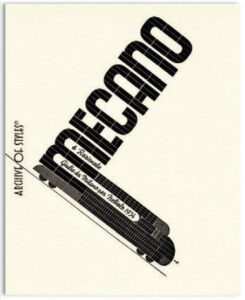
The faces chosen for this selection are examples of a third wave of experiment in typeface design (counting the first as the incunabula period and the introduction of Roman type, and the second being the nineteenth-century explosion of decorative forms for purposes other than books). They are all twentieth-century foundry types and have their origins in Europe and North America as the title says. They have been masterfully compiled and designed by Enrico Tallone and printed at the Tallone Press’s Experimental Typographic Studio. They include mainstream faces such as Futura as well as faces which would have been much rarer even in the days of metal type, such as Erbar Lucina Negativ, Landi Echo or Mecano: types which seem so redolent of the period in which they first appeared (1926 / 1939 / 1934) and which seem so imbued with the spirit of the age that they can’t help but say more about that than about the product or service.
Finding one printer with the whole variety of these faces would, I imagine, have been difficult even in the post-War period, but to find them together at one press is a testament to the Tallones’ tenacity in continually acquiring examples, and preserving and using them. I suspect the design of many cards is dictated by the availability of sizes, and maybe even characters. In letterpress work today, that is always to be expected: it has its good points and bad, you can make a burden of it, or you can – as here – make a virtue.
At first I thought that there wasn’t enough design variety. Many types are seemingly repetitively presented: a headword, either the typeface or designer’s name – large(ish) and horizontal; a vertical type element – often the date or foundry – and then another horizontal element – perhaps the place and year. But looking at the selection again, after a gap of several months, the subtleties are more evident and, anyway, this repetition allows the viewer to focus on the type itself, and the pertinent facts, without being too distracted by the layout itself.
If I can pick out a few.
Trio is a simple centred layout, nothing to shout home about, but which allows us to appreciate the verticality in the design – a fact only emphasised by the close stacking.
In Faro, a squarish, inline Egyptian, the type makes up three sides of a square: here the form of the layout is more playful and less predictable, but it doesn’t become overbearing. The square aspect of the type is emphasised by the layout. Subtle things happen: the vertical type’s cap height matches the serif of the ‘F’. Erbar Lucina Negativ has a simple design, two sizes with the type arranged a word-a-line over five lines. It doesn’t shout but it allows the cameo letters to draw attention to themselves, clearly the work of a confident setter.
And similar appreciative words could be written about all the selections.
It’s fair to say that the majority of these typefaces began lives in quite different circumstances. They were designed in the main for advertising purposes, and adventurous printers might have bought the less standard among this selection in order to draw the punters in, but would have little or no say on the stock they were eventually to be seen on. Here, the faces are elevated, the humdrum have become glamourous celebrities. Some are rare survivors ready to remind us of former glories, or future possibilities; some are reminders of their origins; some simply remind us of the age, seemingly long ago and without complications.
That they still exist as faces is reason to be grateful in itself; that they are championed in this way, so elegantly and so beautifully, is something to be truly thankful for, and we should support the press which has made them available again.
Full collection of 80 cards, €800. Smaller collection of 40 cards, €420. Folder of 4 cards, €40.