by Pauline Paucker. 80 tipped-in illustrations, samples, proofs, etc. Incline Press 1998 96 pp; 325 regular copies, slipcased. £125/US$225; 25 special copies, with 5 full sheets of Curwen patterned papers designed by Elizabeth Friedlander, £375/US$650.
As a child, my weekly pocket money was Id. per year of my life, so that by the age of 15 I received 1s. 3d. a week. At about this time, in the late 1950s, I started to buy the occasional book for myself, usually a Penguin edition, which would take a fortnight’s saving. The attraction was chiefly the contents, but also — although I did not know it then — the design: the black and white vignettes on the Classics, the patterned designs on the Poetry and Music Scores. I felt the look of these books was pleasing, but it never occurred to me to look for the designer’s name (which, in any case, would only rarely have been mentioned), so I never discovered that Elizabeth Friedlander was responsible for much of the appearance of these books.
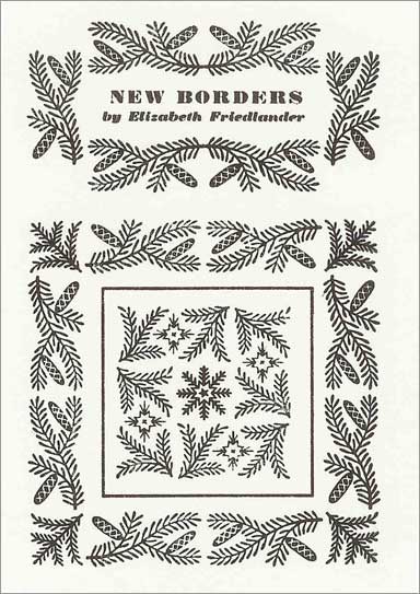
Frost and Fir borders commissioned by Stanley Morrison for Monotype.
In this Incline Press book, Elizabeth Friedlander receives a fitting tribute. She spent a lifetime in Germany, Italy, England and Ireland producing bookwork, calligraphy, and decorative designs from the 1920S until her death in 1984, one of those little-known yet vital designers. This book is based on her own workbooks, which she kept throughout her life and from which Pauline Paucker has written her often remarkable story.
Elizabeth Friedlander was part of that great exodus from Hitler’s Germany by which so many other countries gained. Born in 1903 to cultured and affluent parents, she eventually studied typography and calligraphy under E.R. Weiss at the Berlin Academy. Her magazine work for Die Dame, published by Ullstein, where she designed headings and lay-outs, attracted the attention of Georg Hartmann of the Bauer Type Foundry in Frankfurt, and he invited her to design a typeface. This was to become their Elisabeth- Antiqua — Elizabeth in English-speaking countries — although it was originally to have been Friedlander-Antiqua. Hitler came to power just as the type was ready for casting and Hartmann, always a true supporter and friend, suggested that the name of the face be changed to Elisabeth, since Friedlander, a recognisably Jewish name, would be inadvisable in the current political conditions. Then followed book burnings and worse. She had to apply for official registration to work, and was refused a permit. In a wickedly nonsensical letter she was told that, as a ‘non-Aryan’, she ‘[lacked] the necessary reliability and fitness to participate in the creation and dissemination of German cultural values.’
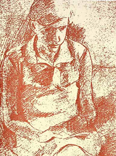
Friedlander: Self portrait, July 1928
She moved to Italy, where she was permitted to work so long as she was not politically active. She learnt the language and worked with the publisher Mondadori, but September 1938 brought harsh Italian Race Laws, threatening her with loss of rights and employment. Unable, as she had hoped, to go to the United States, where the New York office of the Bauer Foundry were eager to employ her, she obtained a Domestic Service permit for Britain and went to London.
Once again she learnt a new language. She was eventually rescued from the drudgery of life as a domestic servant by Francis Meynell, who found work for her and became a supportive friend. By 1942 she was in charge of design at Ellic Howe’s black propaganda unit, where she produced forged Wehrmacht and Nazi rubber stamps, false ration books, and so on, while at the same time carrying out freelance commissions. By the end of the war she had a wide circle of friends as well as good contacts in the printing and publishing world. She decided to stay in Britain, became a naturalised citizen and anglicised her name. Later work included the series Britain in Pictures, patterned papers for Curwen and Penguin Books, decorative borders for Linotype, printer’s flowers for Monotype, and calligraphy for the Roll of Honour at Sandhurst.
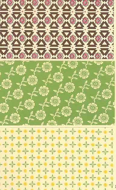
Curwen patterned papers; Friedlander named these: Zig-zag, Allegro, and Treasure
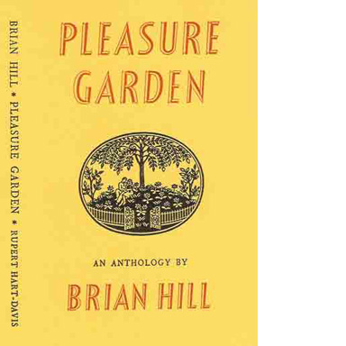
Dust-jacket designed by Friedlander for Pleasure Garden
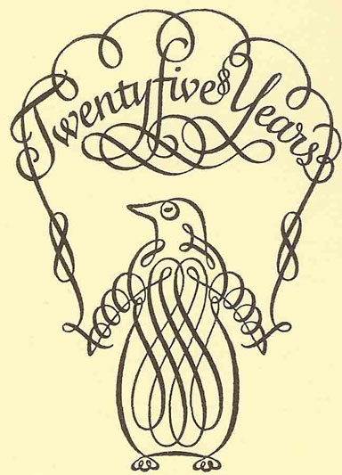
Calligraphy for the 25th anniversary of Penguin Books
In the early 1960s she retired to County Cork, Ireland, where with failing eyesight she continued working and took up gardening. She died in 1984.
The Incline Press book, New Borders, gives us this fascinating and beleaguered life in rich detail, with 80 tipped-in reproductions of Friedlander’s work as a visual counterpoint. The book is unusually constructed: the text pages are 10 1/2 inches tall, but the heavier pages on which much of the illustrative material is mounted run to 12 1/8 inches. These heavier pages are sewn in with the text sheets, and guards are sewn in as well to bulk out the spine in order to avoid the book’s yapping at the fore-edge. This inventive solution results in a moment’s disconcertion, but I have found in use that it provides easy access to the pages of examples, and allows one to skip past the illustrations when reading the text. It results in a book, which is slightly ‘squashy’ toward the foot, but in the reading that makes no matter, and the slipcase allows it to sit square on the shelf.
It is pleasingly set in Bembo, with the rarely seen ‘ct’ and ‘st’ ligatures. (I am glad. I must say, that the swash initials Elizabeth Friedlander designed for Bembo have been allowed to fade away: pleasing though they are, they have much more to do with a Weiss-j style modern face than an old-style roman.) The inking is occasionally a little heavy and shaken, with slight maculing here and there, but the book’s openings are strong and assured, the balance of text and illustration carefully judged. For once, the illustrations almost always face the text that refers to them, and if they do not, are found within a page or two. This is a delightful, fascinating and well-conceived book, a model of the kind of enquiry and celebration that the private press is so well suited to produce.
Patrick Fox is an expert on 20th century German book design and was a teacher of German.
