
Phil Madden and Paul L Kershaw, Grapho Editions, 2020. 227 x 326mm, 30pp, edition of 50. £280. www.plkershaw.co.uk/Flow
I distinctly remember when and where I first encountered the work of Paul Kershaw. I was a guest in a house where all available wall space was given over to the framed works of extraordinary wood engravers. For me, Kershaw’s work was a revelation. It stood out for its flair and energy, its exacting delicate draftsmanship, and its ability to create atmospheric images through the printing process itself, such as the softening of precise areas of fog and cloud through creative adjustments in impression and inking. Some time later, a well-regarded us-based wood engraver told me that Paul is regarded as ‘the wood engraver’s wood engraver’.
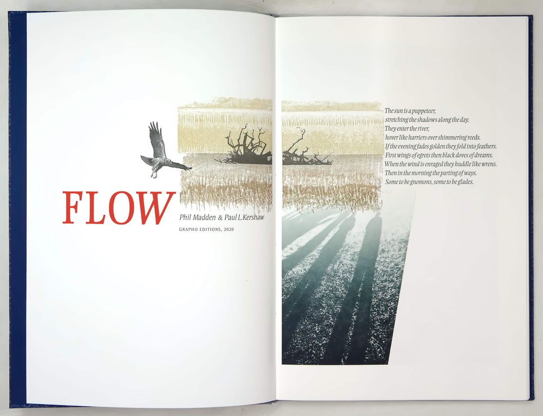
Flow is Kershaw’s fifth book in collaboration with poet Phil Madden. With each of these books we are taken on visual journeys through creative amalgamations of text and image, each presenting itself in new and interesting ways through design and format, yet visually linked through Kershaw’s playful incorporation of process and texture. Each previous book is a masterclass in expressive letterpress printing and Flow is no different. Design, graphics, printing and binding are all done by Kershaw himself (with the exception of his first book which was bound elsewhere).
Madden’s poems and Kershaw’s imagery here revolve around the theme of water, how it moves and travels and interacts within the environment. Madden’s poems evoke imagined underwater worlds, both ancient and enchanting:
Sea’s wolf loves estuaries.
No one will notice her
in the bubble and moil,
the pricing of salt,
the set sail of salmon,
the aegirs and bores,
the catch of the eye,
as she makes sleek escape.
Wolf into flow.
Kershaw’s imagery is multi-chromatic, overprinted layers that build in energy. The imagery is often abstract in nature and printers will find themselves studying familiar textures: the swirling patterns formed when washing up the press, the smear of ink on the mixing plate, the splitting of oil and water. These images have been created from observed scenes, the hand-drawn designs are then transferred to the computer and developed into polymer plates for printing. Appearing in blues, greens, browns and greys, the textures and patterns are distinctly wet; flowing, splashing and bubbling. Small detailed engravings of wild-life associated with rivers appear sporadically, printed black; pike, grebe, dragonfly.
The 15 main spreads in the book each carry a poem, curving and meandering effortlessly with the imagery, they are typeset in Michael Harvey’s Ellington Light Italic. Rather unusually for books in our field, these texts are reversed out of a solid shape, taking on the white of the paper or the colours of the plates printed beneath. I find myself looking for faults. There are three instances where photographic images are seen and these are the book’s least impressive features, somehow misplaced on a journey otherwise imagined and left to the viewer to make sense of. I have thought that Paul has struggled with title pages in the past but here he is fully redeemed, the 12(ish) printings (six on each side of the spread) imparting an excited sense of what’s to follow.
Personally, I collect books with an onus on design and technical strength. I enjoy books that make me marvel at their production values, and technically, this book is flawless. Kershaw’s decades of experience printing intricate wood engravings here pay their dues in how he manages the basics with which so many of us struggle ad infinitum; colour, impression, registration. Kershaw has employed two presses, a cylinder proof press for the polymer printing and an Albion handpress for the wood engravings. His choice of paper is 250gsm bfk Rives: thick, soft and textured and surely the most difficult on which to impart such finelytoned images, but he somehow manages it. I find myself looking through the loupe in disbelief. How many plates has Paul used to create such subtle depth? The changes in hue? How has he retained the seemingly microscopic accuracy of the half-tone plates which in less capable hands would surely fill in?
His binding here is also very accomplished, an imaginative interpretation of quarter cloth and patterned paper, which feels solid yet light in the hand due to the thin boards. I feel Flow deserves a slipcase but I respect the vision of the artist. Paul Kershaw might be regarded as the wood engraver’s wood engraver, but I think that he should also be considered the fine press printer’s fine press printer.