
Joy Law with Ruth Artmonsky and Neil Parkinson Early Days
Joy Law was Publications and Exhibitions Officer at the Royal College of Art from 1963 to 1984, responsible for the management of the Lion & Unicorn Press. Here and on page 15 are excerpts from an interview with Ruth Artmonsky (researcher) and Neil Parkinson (Manager of the RCA Special Collections Archive) in 2008 in which Joy talks of her experience before arriving at the RCA and then her assessment of the College Press. Sandwiched between these excerpts is Joy’s article on the Press from 1994.
Ruth Artmonsky: How did you arrive at the RCA? Can you tell us something about your background?
Joy Law: I worked in publishing at Longmans Green and then for a firm called Rainbird, McLean, which had only been going for six months. There were two chaps, George Rainbird and Ruari McLean, and in the early days we did anything to make money, like the Shell advertising – George had come from advertising. I used to go to the Royal College to look at degree shows because I wanted illustrators and graphic designers; for instance John Brinkley, John Lewis… John Brinkley did all the drawn artwork for headings for Eagle, Robin, and Girl magazines* edited by Marcus Morris. We also did the Eagle Annuals.. So I would go to the College every year to look at the graphic design degree shows and would employ people in my studio. I got to know the graphic designers. Then eventually I decided that I couldn’t bring up a young family in an expanding publishing firm with financial pressures so I talked to various people at the College and asked if there was anything I could do – I was very experienced in editing and production. They suggested that I should combine the publications ARK and the Press – and exhibitions. John Moon (Registrar) and Dick Guyatt (Head of Graphic Design) thought that these two [roles] couldn’t be put together but, in the end, they offered me the job and John drafted out the terms and so on, to be reviewed at the end of the first year, and of course with a young family the rhythms of the academic year suited me very well. I went there in 1963.
Ruth Artmonsky: So you had a wider remit than just publications?
Joy Law: Yes. I was officially called Publications and Exhibitions Officer. I didn’t realise the significance of [‘Officer’] and thought it rather pompous. But the point about being an officer was very important because it affected my salary and pension.
Ruth Artmonsky: So you were in publishing, did you come from an art or literary background?
Joy Law: When I came down from university [having read history] I wanted to go into publishing but getting jobs in 1947 was difficult, as it always has been. I worked for nine months at the BBC and then a friend sent me to an interview at Longmans where I worked in the advertising department for three years, writing blurbs and advertisements for the educational books. For a blurb to appear on a dust-jacket or in the press, I had to have five signatures and I was always in a hurry. And the only way I got them was by walking round the office which meant I saw what was going on in every department. So I learned what production involved and got a good overview of the whole publishing process. I also ridiculously had to design my own press advertisements, when I had no idea what a typographer was. But my boss, the advertising manager, was an ex-policeman and didn’t know either, so I learned on the job. And then in a very foolish way, after three years – which I loved – I could walk there. The people were very nice and we put on a splendid pantomime one year; it was great fun. They then took on a professional graphic designer, a young man who is now one of my very oldest friends. But I got very uptight about this. Mostly because he was a man he could walk round and get into the directors’ offices and had a social standing, while all the girls were inferior beings in the early 1950s. I got very uptight about this and thought, ‘I’m off’. Like an absolute idiot in a way, I flounced in and gave my notice, and then couldn’t get another job. I hadn’t any money, so I did all sorts of things like babysitting and going out and cooking people’s dinners, which was very demeaning . . . Then, through a friend of mine, I went to see George Rainbird who wanted a Girl Friday. I said, ‘I can do everything’, which I could, and went to work for him. There was me, an accountant who came in in the evenings once a week, Ruari and George had a secretary, and that was it.
Ruth Artmonsky: Some of your minutes read with such authority on technical printing matters. So you had acquired everything from your own interest and energy?
Joy Law: On the job, yes. I didn’t know too much about printing when I was at Longmans, but I certainly learned quickly about advertising and I learned about typography. I wouldn’t call myself a typographer, but one of the things that Ruari McLean used to make us do – that was a nightmare. If he wanted a title page, which we would lay out in pencil, he had to tell from our pencil rough what type it was, what size it was and how much letter spacing there was. So that was a very good discipline. There were courses in graphic design but nothing like it is now.
Ruth Artmonsky: What did you inherit when you arrived at the RCA?
Joy Law: I inherited nothing, except a bunch of prima donnas!
*The Eagle, Robin, and Girl mastheads were designed by Berthold Wolpe.
Joy Law The Lion and Unicorn Press
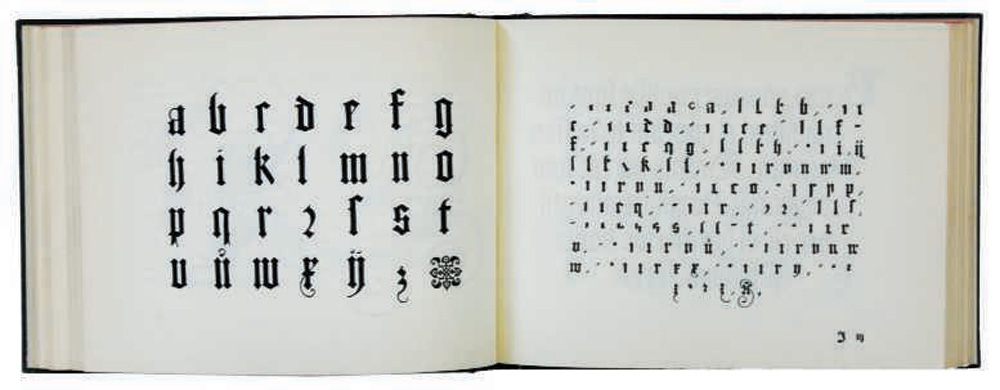
The Lion and Unicorn Press was started in 1953 as a practical outlet for Royal College of Art students’ talents, and to expose them to professional and commercial hazards. Four little publications were produced that year and two more substantial works – Births, Marriages and Deaths, and South Weald – appeared the following year. The response to them was so encouraging that a decision was made ‘to invite subscriptions of five guineas per annum which will entitle the subscriber to receive three productions of the Lion and Unicorn Press each year’. The first series, in an edition of 200 copies, consisted of Handwriting Manual 1553 by Wolffgang Fugger, Life of John Wilkes Patriot, and Sir Gawain and the Green Knight. For the fifth series, around 1962, the editions were increased to 400 copies; 200 at five guineas and 200 at seven guineas.
I joined the College in 1963 and so I have no reminiscences about the first five series. However, in 1978, when the press was about to close I wrote The Lion and Unicorn Press: A Short History which gives details of all the books, from 1953 to 1978, including the names of the designers (students and staff).
The activity of the press worked like this: a second-year student would be asked to design a specific book, and would then do so with the help of his or her tutor. Once the design and layout was finished I would usually find that I was left by default (though with whatever help was available from the tutors) to make the final decisions. By then the students were in their third year and concentrating on their degree examinations.
![]()
The Wood Engravings of Eric Ravilious, designed by John Carrod, printed at the Curwen Press (first edition). Contains 421 engravings, each printed one side only, 1972.

Splendour of Ornament, Stanley Morison, designed by Graham Percy. The cover features a specially woven gold silk brocade, 1968. (Title page is on the jacket of this issue of Parenthesis.)
My debut was with series six which consisted of Scrapbook Drawings of Stanley Spencer (1964) selected and edited by Adrian Stokes, and A Rake’s Progress (1967) with a poem commissioned from David Posner, a young American poet whose work David Hockney admired. The book included 16 half-size halftone reproductions of the etchings Hockney had had published in a limited edition by Editions Alecto.
Series seven started with Splendour of Ornament, Specimens from the Essempio di Recammi, by Giovanni Antonio Tagliente (1968) by Stanley Morison. One of my many treats during its production was to visit the great typographer in his dusty flat in Whitehall Court and be shown his collection of press cuttings illustrating present-day examples of ornament. They seemed mostly to be of women’s corsets.
The binding for Splendour of Ornament was a gold fabric into which one of Tagliente’s designs was woven. Although the Textile Department was responsible for producing the material, it was eventally sent out to be woven, and the first samples we received showed the pattern in reverse. It had to be started all over again. This was the kind of hiccough we could not explain to our patient subscribers, to whom we frequently sent postcards begging their indulgence over our severe delays. The Birds by Aristophanes (1971) illustrated by Quentin Blake and Paul Hogarth’s American Album (1973) followed.
Between 1972 and 1974 we also published three small delicate works, in editions of between 20 and 30, by Eileen Hogan: Caius Iocaste and Oedipus, Fragment from Sappho and Variations.
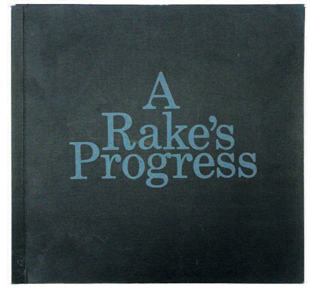
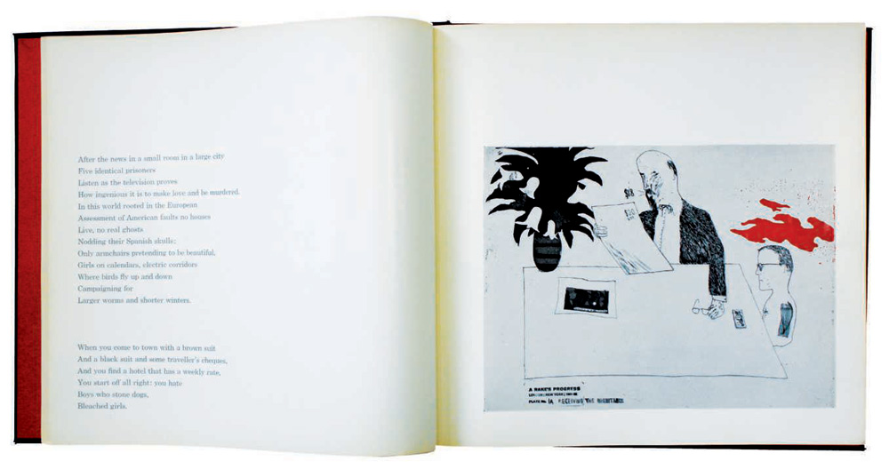
A Rake’s Progress, David Hockney, poem by David Posner, designed by John Tomlinson. Illustrated with 16 reduced half-tone letterpress blocks based on etchings by Hockney. Fine black cloth covers, with grey lettering, side-stapled and a slide-on plastic spine binder. The text is printed in grey on a coated paper, 1967.
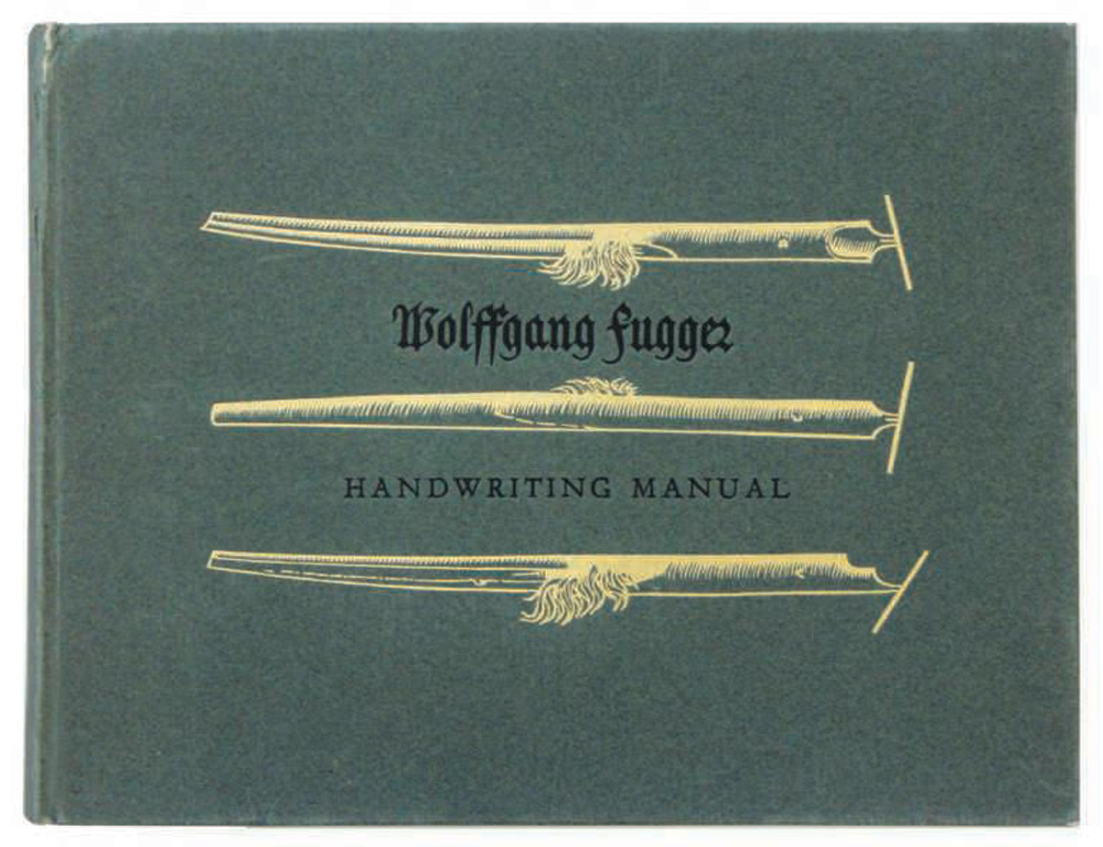
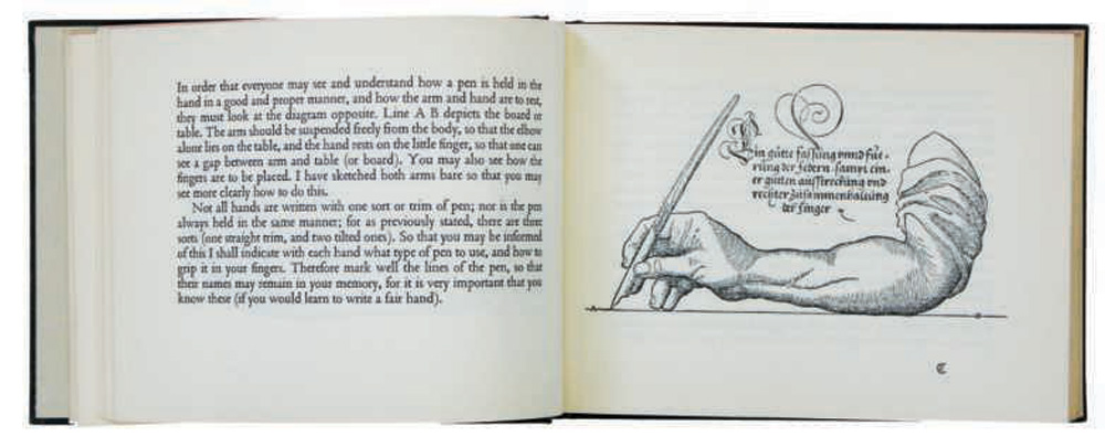
Handwriting Manual, Wolffgang Fugger. Paper covered boards, black and gold blocking. Foreword by Harry Carter and cover design by Patricia Davey, 1955. This was the first production of the Lion and the Unicorn Press, in an edition of 200 copies.
We then embarked on a much more ambitious project: the Wood Engravings of Eric Ravilious (1972); and some more modest books which included three in a series: The Restless Bullet (1974), Rubaiyat of Omar Khayyam (1974), and Britain in the Thirties (1975). There were also three one-offs: The Biggin Hill Frescoes (1975) by Johnny Ross, London Sketchbook (1975) by Hugh Casson, and A Sketchbook of the Natural History of The Country Round Wakefield by Richard Bell (1979).
From the time I joined the College, work had been going slowly and steadily on a major project, the rather inaccurately titled Captain Cook’s Florilegium, which took 12 years to come to fruition and with which students were not involved. After publication in 1973 I wrote a note on its publication (1976) which we offered to all our subscribers and which explained some of the trials and tribulations of its production. I, and many others, believe the Florilegium to be one of the most beautiful beaux livres published in the 20th century. It was designed by Jock Kinneir (then a Senior Tutor in the School of Graphic Design) and the text was printed letterpress in the department. Mr Page, our master printer, sat weighing every sheet of paper (how I wish I had a photograph of him doing so) and we printed one page at a time from type which was hand-set and then dissed before we could set and print the next.
For the special edition binding I was lucky. Through the good offices of Dr William J Stearn (of the Natural History Museum and co-author of the text with Wilfred Blunt) and Dr A L S Johnson and Mr R G Coveney (of the National Herbarium of New South Wales) I obtained actual specimens of Banksia errata; Banksia integrifolia, and Xylomemum pyriforme gathered in Botany Bay in 1973. These have been encapsulated in clear acrylic by David Watkins at Clarity Plastics, London, and set into Nigerian goatskin by Zaehnsdorf of London. The endpapers are pure silk and the hand-tooling, which includes as fleuron Drosera uniflora from Tierra del Fuego, is in 22 carat gold leaf.
There are two points about the binding not mentioned above, and perhaps to mention them now is immodest. The design for the special edition of 10 copies was put out to tender amongst staff of the Graphic Design School as we thought that we might produce 10 individual copies. I asked if I might join in the competition, and my entry suggested encapsulating plants into a thin sheet of acrylic which would then be inserted into a traditional green leather binding. Most of the tutors submitted more or less suitable designs but mine seemed so appropriate that it was agreed that all 10 copies should be bound this way. A fee of £100 had been offered for each successful design but when I asked for my £1,000 there were huge laughs. Still, I bought a copy of the Humphry Repton Red Books from the Basilisk Press (founded and run by Charlene Garry) with the proceeds.
After hubris, nemesis. Having had the idea how was I to turn it into reality? William Stearn said he would ask his friends in Australia if plants could be picked and sent to us, and six months later he called me over to the museum to hand me a box filled with dried branches. David Watkins said they could be inserted into clear plastic and proceeded to do some trials which seemed to be successful, so we commissioned him to produce the 10 that were required.
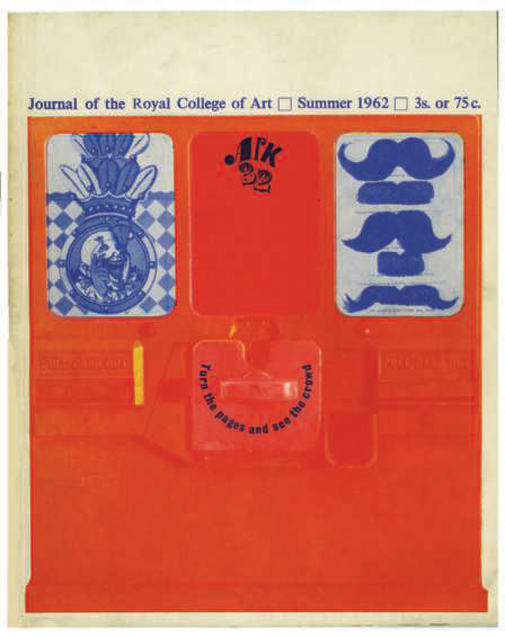
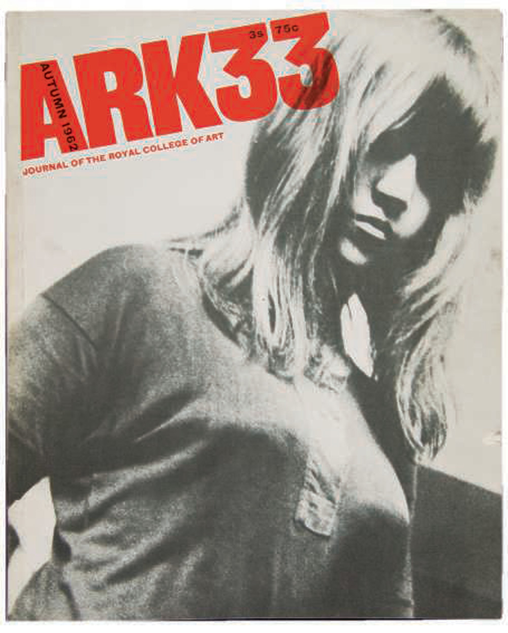
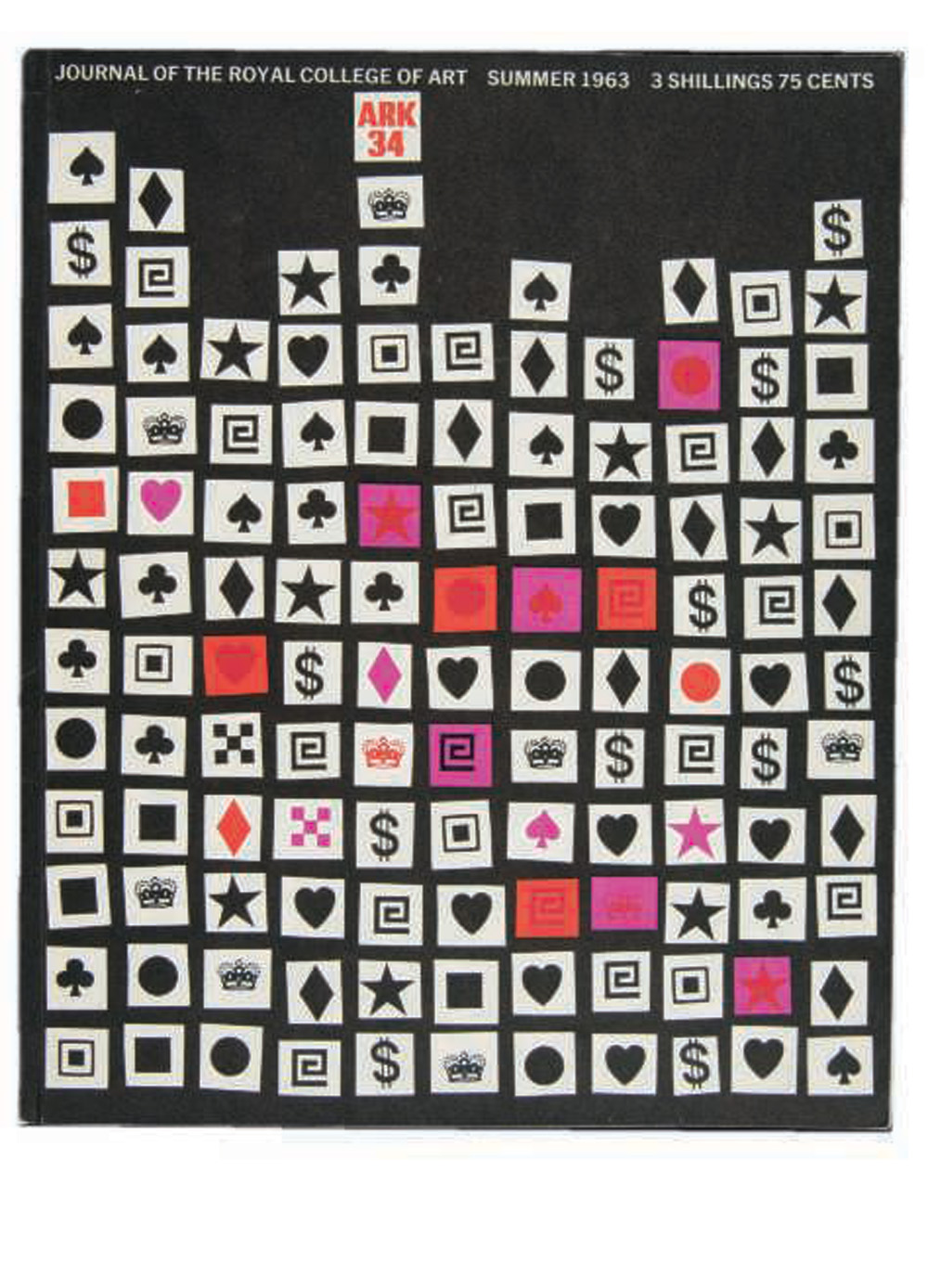
ARK, journal of the Royal College of Art. Number 32 (1962) Editor Bill James, Art Editors Brian Haynes, Sashi Rawal, and John Hutchinson. Number 33 (Summer 1962) Editor Bill James, Art Editors Brian Haynes, Sashi Rawal, and John Hutchinson (cover photograph Keith Branscombe). Number 34 (1963) Editor Gerald Nason, Art Editor Melvyn Gill. Photographs courtesy of the Royal College of Art archive.
While he was doing so, and because my office was over-crowded, I had taken his trial sheet in its prototype binding home with me and one day I noticed that the acrylic was crazed. It seemed too bad to be true. We carried out various experiments to see if we could make it happen again but failed. We thought perhaps the silk lining and the yellow paper with which we had backed the silk to give the background colour we wanted might contain some chemical which was vaporising. Bernard Meadows, Professor of Sculpture, rigged up a Heath Robinson contraption in the Sculpture School which blew hot air for 24 hours and then cold air for 24 hours across both silk and paper, in the hope of eliminating any chemicals there might have been in either. Eventually, we gave these air-dried materials to the binder and told him to go ahead with David Watkins’s final acrylic sheets. As far as I know there has been no crazing on any of the ten special copies we sold.
Financing the Lion and Unicorn books was a complicated business as our only income was from sales. However, our costs were mostly confined to materials and the only reason the Press was viable at all was because we had no labour costs. My salary (or a relevant proportion of it) and that of the technicians was lost in the general accounts.
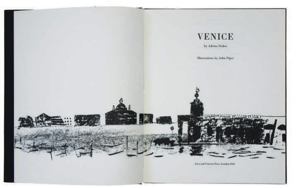
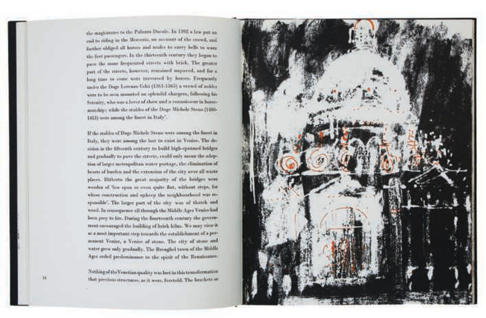
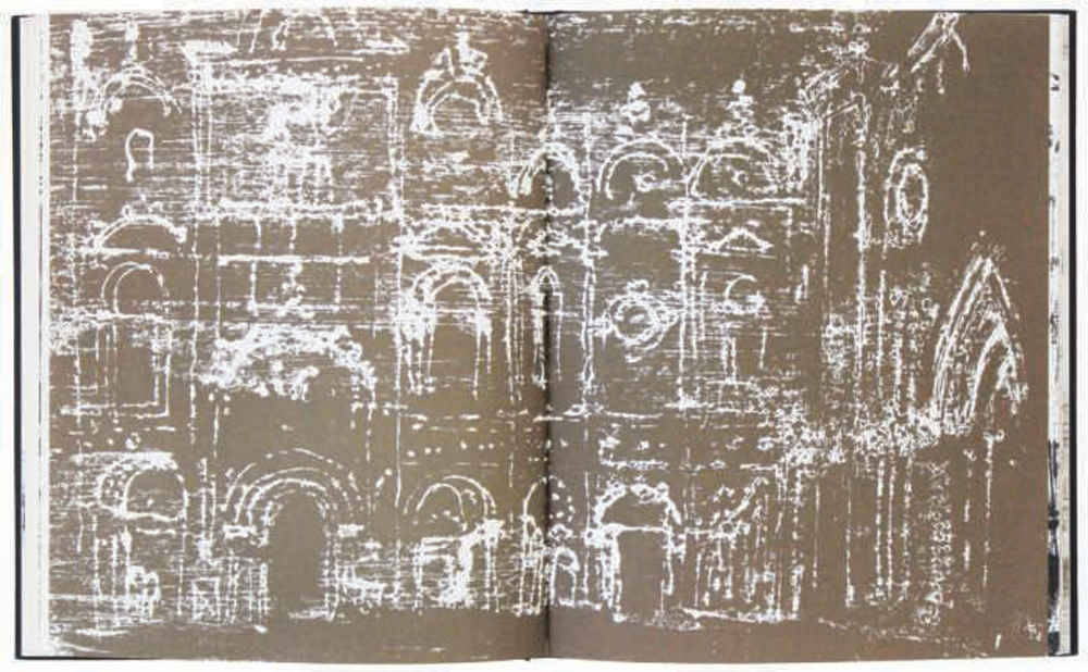
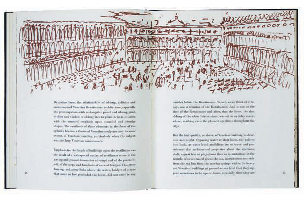
Venice, Adrian Stokes, with lithograph illustrations by John Piper, most in two colours (black and red) the rest in gold. Designed by Christine Malone and Roy Giles, 1965. Piper contributed a double-spread, title-page and 24 illustrations. The covers are black cloth covered boards with a Piper design debossed in black on the front.
The printing was virtually always done in the college (with the exception of the plates for Ruskin – more below) and was a nightmare to schedule, though it mostly took place in the long summer vacation. Letterpress would be hand-set by Mr Page and printed by Harry Greenaway or Mike Perry [who much later would work alongside Alan Kitching in the College’s Typography Workshop]. Litho plates were originated in the photolithography department by Don Beard and Syd Weston and printed by Roy Crossett. The finishing and binding was done in the College bindery (with the exception of Florilegium and Ruskin) by Ted Robbins and was possible because the editions were so small.
I handled the administration, the production, the subscription lists, the invoicing, the packing and the complaints. I was responsible to a committee which was mainly concerned with choices of title and overseeing the financial position. When I first joined the College I had to keep separate accounts for ARK (the College magazine) and the Press, but later both were included in the main college account. Nevertheless, although I had to include estimates for my expenditure and income, I was expected to keep Lion and Unicorn books self-financing. The system whereby we were not allowed to ‘roll-over’ from one year to the next made this difficult, and I resorted to such devious devices as forward-buying of paper or getting pro-forma invoices which did not relate to the current year.
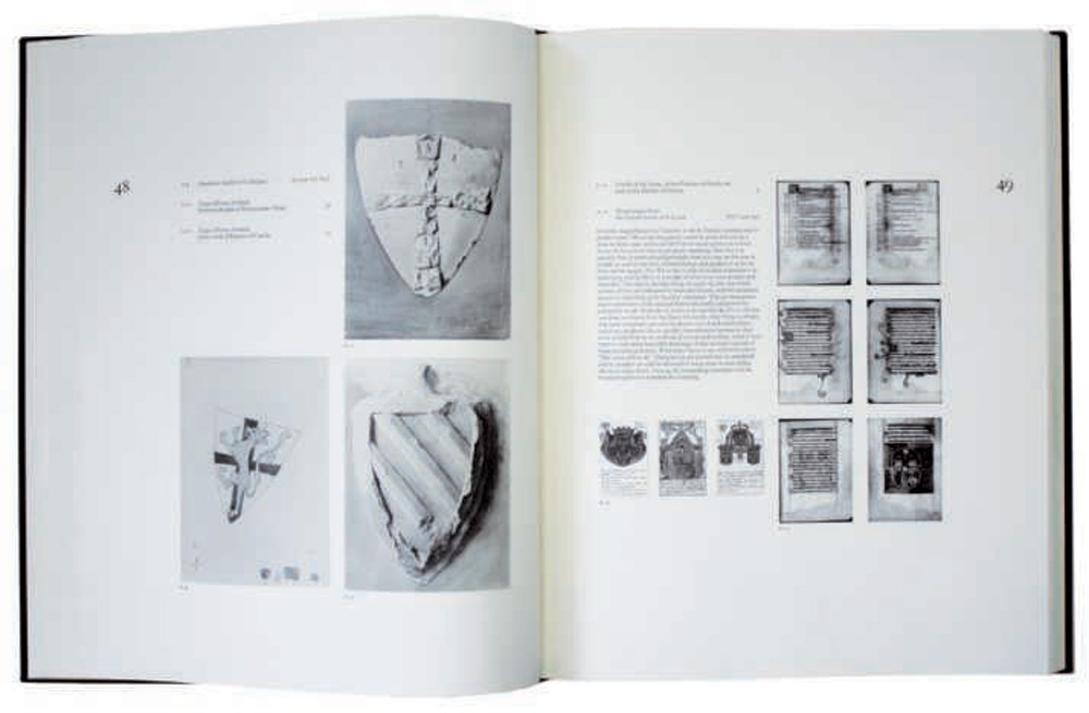
In 1982 we embarked on another beau livre. This was John Ruskin’s Catalogue of The Rudimentary Series, an attempt at reconstruction of one of the four series of examples Ruskin had put together for teaching purposes, and which were held by the Ashmolean Museum in Oxford. The book was edited by Robert Hewison and designed by Herbert Spencer. We letterpress printed the text in the College, the illustrations were printed by Lund Humphries and the Westerham Press; the binding, once again, was by Zaehnsdorf. It was published in 1984 after I had left the College, in an edition of 275 copies which failed to sell in any quantity.
I am happy to think that after more than 10 years with no publications there are plans to revive the press.
Editor: Despite oft-repeated platitudes from various authorities at the RCA about resurrecting the Lion and Unicorn Press no further books were published.
The last printed issue of ARK was published in 1978.
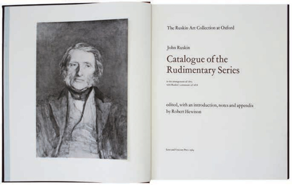
Catalogue of the Rudimentary Series : In The Arrangement of 1873 with Ruskin’s Comments of 1878. Edited and introductory notes by Robert Hewison, 1984.
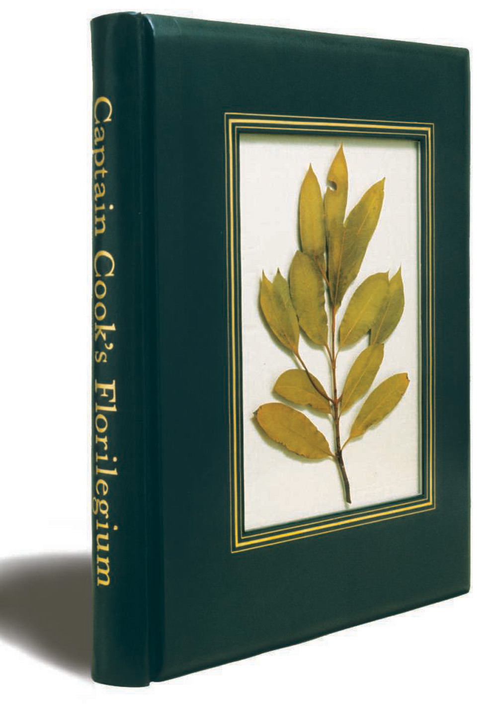
Captain Cook’s Florilegium, cover of the special issue with encapsulated botanical specimen. Designed by Joy Law. (Photograph courtesy of Royal College of Art Archive.)
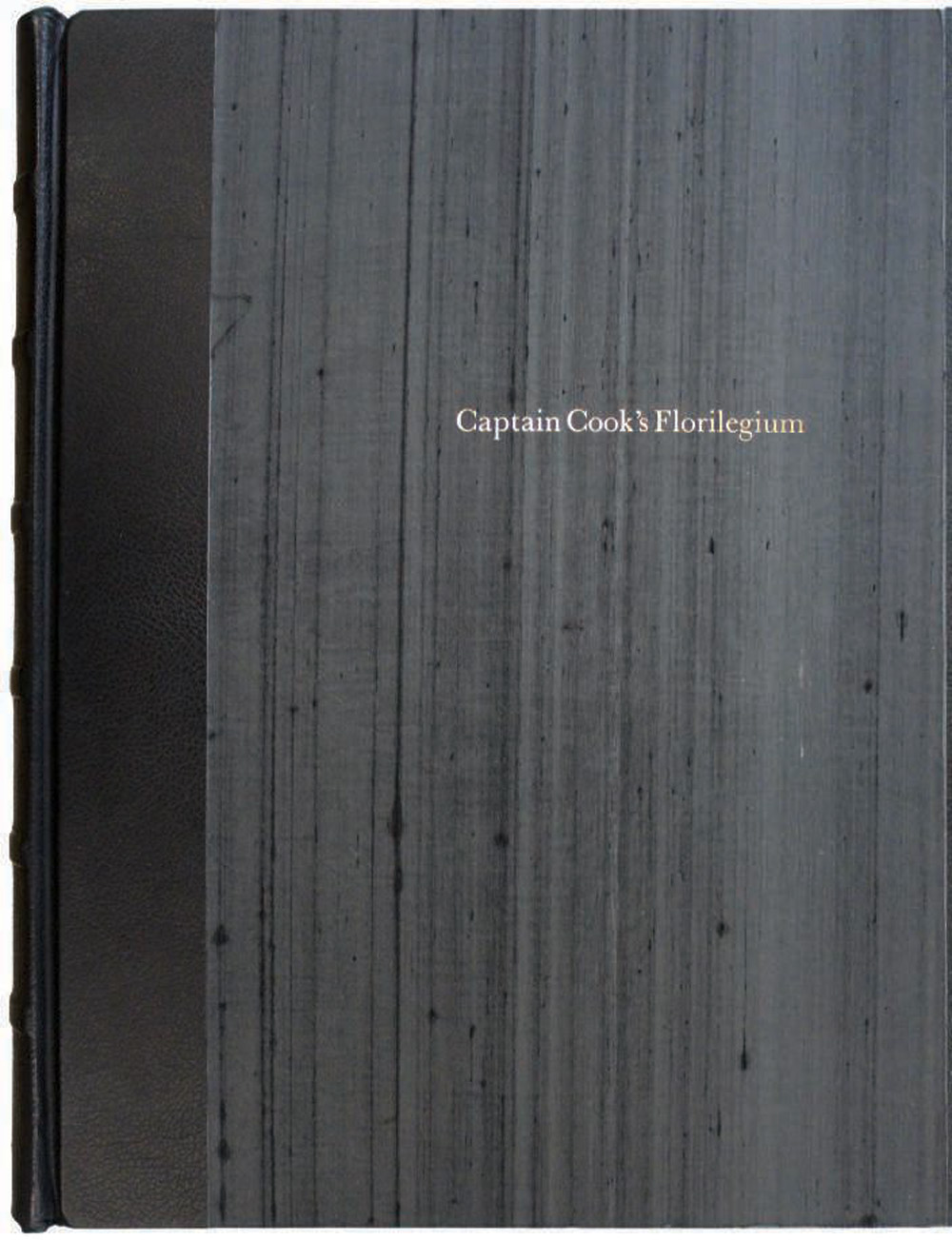
Standard cover with gold-blocked title, 1973.
Joy Law with Ruth Artmonsky and Neil Parkinson A Personal Assessment
Neil Parkinson: So the Press went through different phases, from initial souvenir editions to a grand subscription scheme and then back to one-offs. Was the abandonment of the subscription scheme a natural evolution or a drastic measure?
Joy Law: It was time. You’ve seen my postcards about this one [Captain Cook’s Florilegium]. We were always late because I could not get the designers to finish them, I couldn’t get them on to presses, and then it got stuck in the bindery. We simply could not keep it moving. That was really the problem.
Neil Parkinson: Which episodes stand out as the most difficult phases of the press? Captain Cook’s Florilegium was a long and tortuous process, and from looking at the archives we infer that working with David Posner was difficult.
Joy Law: I’d forgotten about that. I know I had long correspondence with him…
Ruth Artmonsky: He was telegramming you about line changes.
Joy Law: David was lovely!
Ruth Artmonsky: But he wrote you some very petulant notes.
Joy Law: Yes, but he was a poet. And an American. A combination.
Ruth Artmonsky: When you read about the history of 20th-century private presses, Lion and Unicorn is rarely ever mentioned. Yet Darwin and Guyatt had been saying it was going to lead fine printing in this country.
Joy Law: But it didn’t, did it? Look at the books, look at the books.
Ruth Artmonsky: People who were in the fine press movement seem to have ignored it…
Joy Law: Quite right! Look at the books! Which of them except Captain Cook’s Florilegium is a fine press book? Ruskin? They’re not fine press books in collecting terms. Have you read the history of Charlene Gerry and the Basilisk Press? Most of her books are fine press books.
Ruth Artmonsky: Apart from the Florilegium, were there any that came near it? . . . Ravilious’s Wood Engravings? I think that is as good as some private press books.
Joy Law: Well, I think it’s more a work of record than a fine press book. That one happened because Edward Bawden had a lot of Ravilious pulls. And Bawden who had taught there came in to the College and said, ‘I’ve got these’. I think they were supposed to be on their way to the V&A or the British Library. But I would not really call Ravilious a fine book. After Ravilious I wanted to do David Gentleman – I was going to call it The Best of Gentleman . . . We didn’t get the whole book laid out but we had a scheme for it. I left. It was quite clear to me, to my great sadness, that the Press was not going to go another step forward and as far as I know it never has … I said to David, ‘this isn’t going to go anywhere. My parting gift to you for letting you down: here they are – all the pulls I’d taken. No one will ever do anything with them.’ I left for a whole series of reasons. I’d been there for a long time and should have left sooner.
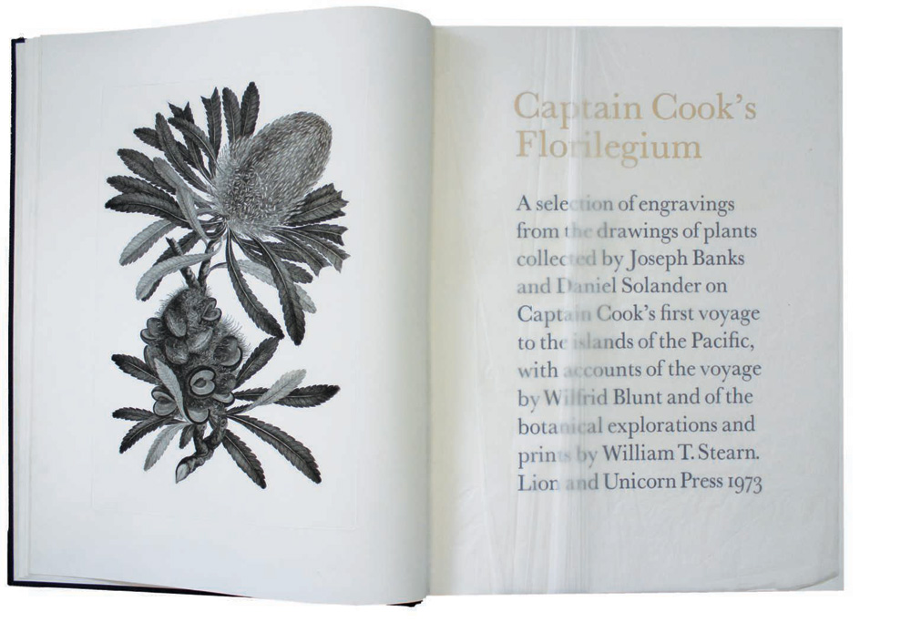
Title page of the standard issue, 1973.
The colophon of the standard Florilegium issue reads: Designed by Jock Kinneir and produced by the Lion and Unicorn Press, at the School of Graphic Design, Royal College of Art, London under the supervision of Joy Law.
Text © 1973 Wilfrid Blunt & William T Stearn. Handset in 24pt Baskerville by Alfred Page and printed by Harold Greenaway & Michael Perry, Royal College of Art.
Plates © 1973 the trustees of the British Museum (Natural History), London. Printed by Thomas Ross and Son Limited, London and Michael Rand, Royal College of Art from the original engravings.
Both text and plates printed on Crisbrooke handmade paper by Zaehnsdorf Limited, London and Edward Robbins, Royal College of Art.
The edition is limited to 10 numbered copies.