
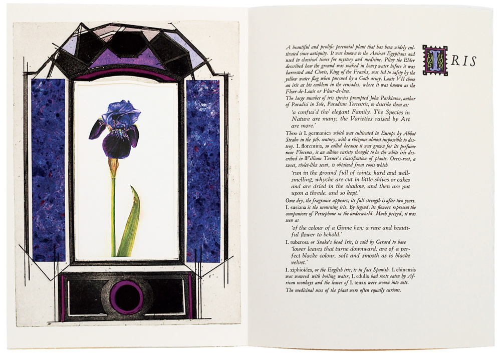
Spread from Acanthus Etc. A homage to the iris in the form of a baroque altarpiece, with a digital photograph of a watercolour painting of an iris by Allix printed on a sheet positioned behind the etched altar surrounds, with side panels constructed of blue hand-marbling and finished by hand-coloured wash, and with a wood-block print on the facing page.
In December 1973, Susan Allix’s first book was completed, and was sold in short order by Charles Traylen, the Guildford bookseller, and thus her long and successful career was launched. Over five decades, she has produced 77 books, as well as 38 bindings of other books made at the request of collectors, and nine children’s books for her grand-children. This semi-centennial moment thus seems an appropriate time to take an overview of her work – albeit in an interim fashion, for she continues to work with prodigious energy on making new books.
Susan Allix was trained as an artist and printmaker at Guildford College of Art (1961– 65) and the Royal College of Art (1965 – 68) and then spent two years in the British School in Rome, having been awarded the prestigious and competitive Prix de Rome Scholarship in Engraving (1968 – 70). It was in Rome that she discovered colour and verve, and it was there too that she held her first exhibition. These were formative years, and she returned to England as a printmaker with a promising future in terms of exhibitions and sales. Then, as a result of a chance meeting with Lewis Rouse-Jones, a letterpress enthusiast, Allix’s attention switched to book making. Her first book, an edition of the Rubaiyat of Omar Khayyam, was an immediate success; and for Susan Allix, after this, there was no turning back.
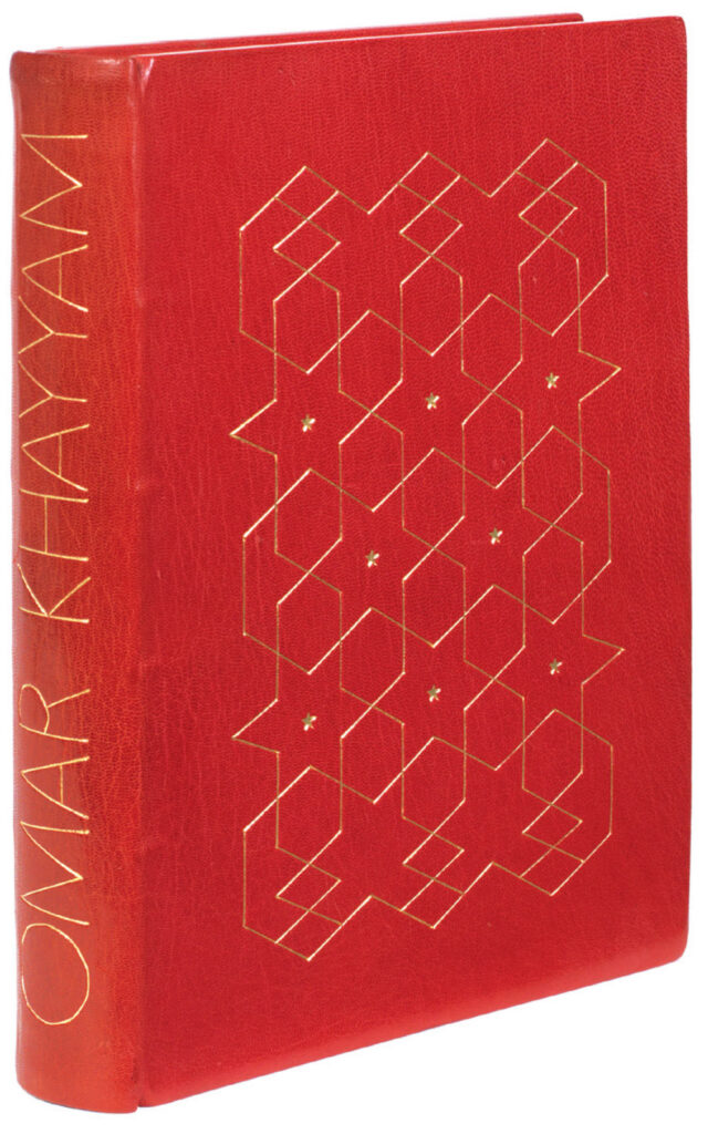
Rubaiyat of Omar Khayyan, edition of 25. 1973.
Several features distinguish her oeuvre from that of other book artists and book-makers. First, and frequently commented upon, is the fact that she makes all her books in their entirety. She designs and prints the text exclusively in letterpress (with the single exception of her first book in which the letterpress was set and printed by Rouse-Jones), designs and creates the often complex images herself, uses pigments she has mixed herself; and she binds her books herself, often incorporating complex and spectacular designs, and also makes the sometimes complicated containers. On occasions she has made her own papers, designed new letterforms, and she has written or translated the text for over a third of her books.
Second, and less often noted, is that Allix has forged an aesthetic which combines in a unique fashion elements of both fine press books and artists’ books. Fine press in the sense of meticulous attention to material and technique, very much in the tradition of William Morris and the English private press movement; and ‘artist’s book’ in the sense of experimental, radical and continuously evolving design, with an emphasis on image-making. In these ways, Allix has been a pioneer, striking out in a direction bravely taken.
Of the elements that make up her work, that which most immediately strikes the reader is the images. Allix is an artist, colourist and printmaker by inclination. Etching was the technique that she perfected in Rome, and this remains at the core of her image-making. The etchings in her first books are notable for deep embossing, bold lines and use of colour, features which have remained. But she then rapidly incorporated numerous other techniques of both intaglio and relief printing, not least etching of various types, linocut, aquatint, mezzotint, woodcut, collage, pochoir, watercolour, drawing, and airbrush. A remarkable feature is the mixing of methods in a single image, resulting in complex and subtle images, some requiring multiple printings. Allix makes up her own pigments for use in her images, seeing the resulting colours as friends with individual personae, feelings and character. Her sense of colour is intense yet subtle, and an interesting aspect is the frequent ‘progression of colours’(1) in her books, as there is a progression of shapes, and ‘just as in a novel there are crescendos, slow parts, then a murder.’
Many images derive from drawings or sketches made in the field that are then worked up into prints in her studio. The sketchbooks made during her travels are preserved in her archive and provide a unique insight into her method. Allix emphasises that she never draws entirely from memory and uses sketches to anchor the essential features of her subject (photographs are used less often as she finds the detail too unselective). The drawings are often swiftly completed and her genius is in part her ability to retain the expressive freedom and spontaneity of these sketches despite the slow and methodical processes entailed in her complex intaglio and relief printing – she sometimes spends weeks perfecting a single image. The transformation of free and rapid expressiveness processed through painstaking and exacting printmaking provides a key to the attractiveness of Allix’s images. Technical discipline has always been important and early in her training she rejected painting as her principal method exactly because it was ‘too easy to be uncontrolled’.
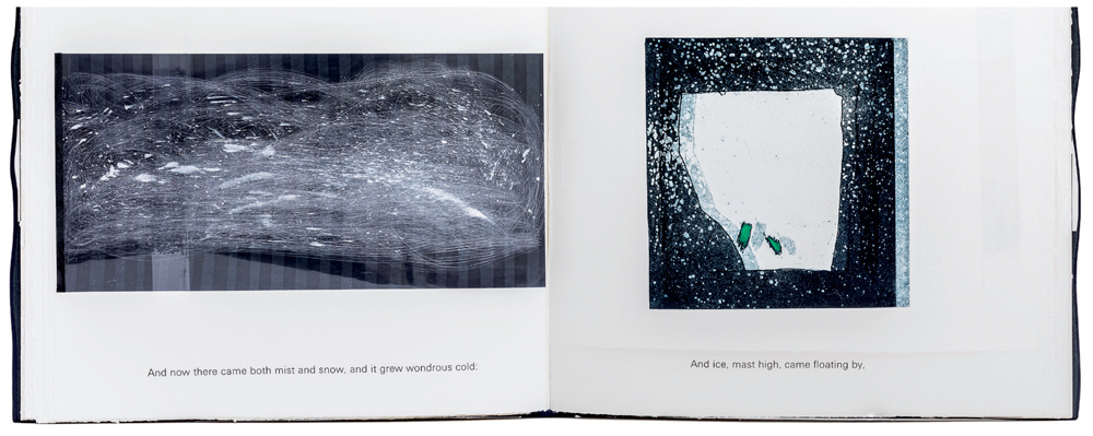
Spread from Sea Air. Mist, snow and ice. On the verso is a Perspex sheet roughly sandpapered and splattered with white ink, set on decorative paper, to create the impression of a snowstorm. On the recto is an abstract image of coarse aquatint, with hand-colouring in green, double printed to imitate the slow movement of the iceberg. The book is the subject of a chapter in The Book by Design (published by the British Library, 2023).
The images themselves take many forms. Many are abstract, often with repeating patterns and blocks of colour and with an obvious influence from Islamic art. Others are more representational often with a strong influence from classical or Eastern art and architecture, some expressive others impressionistic. Some are made with photographic-like accuracy.
The tendency towards intense illustration does not diminish the importance of text. To Allix an over-riding concern is for the integration of image and text, into a seamless whole. This principle underlies all her work – her interest is the book not just the printing or illustration. As she wrote, ‘I am concerned with visual things, so I see books as full of colour and form in a pictorial sense as well as through the images created in my mind by the words, and through the sculptural qualities a book possesses. In my work I try to achieve a combination of these elements into a single, whole experience.(2) All her texts (with the exception of that in her children’s books) are printed letterpress. The typography is often in novel and exciting designs, and she uses a wide range of typefaces, including some letterforms which she has created. The themes of her books include the relationship of time and space, travel, the cycles and transience of nature, and the ancient world. Many texts are literary and scholarly, others are light and humorous, and she has a penchant for the antique and classical as well as Eastern culture, architecture, and poetry.
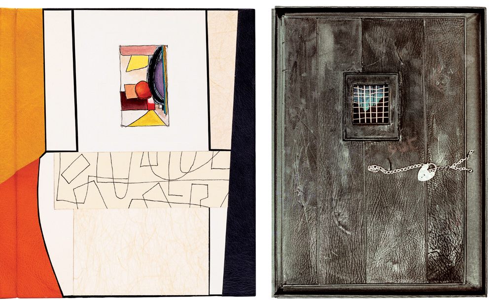
Left: Binding of Francisco’s Fields, cover and spine. This includes a ‘shadow gap’, a feature invented by Allix and based on architectural practice, created by black paper laid on the boards behind a narrow space left between leathers. Right: Box of The Ballad of Reading Gaol. To create a suitably battered appearance, Allix jumped up and down on the scratched and scuffed leather strips which make up the door.
Bindings are the third element, in addition to text and images, of primary importance to her quest for integration. As Allix wrote, her bindings are ‘neither just an advertisement nor a protective covering for a book, nor just an excuse for a binder to express his or her own art. I try to integrate the binding closely with the rest of the design, as it is important that appreciation of a book should start as soon as it is seen, even in its protective case, and the reader should be led from the binding to the title page and on to the body of the book.’ Because of this, she insists on making bindings herself, eschewing other binderies for their almost invariable failure to understand the rhythm and nature of her books. Having someone else bind is, to Allix, like ‘having to be made to wear the unrecognisable and ill-fitting clothes of another.(3) Her bindings are often complex, employing various kinds of leather and papers, sometimes with the incorporation of silver botanical ‘sculpture’ onto the bindings, or the addition of other metals, found objects and even magnets. The results are often striking and beautiful. The binding of Francisco’s Fields (above left) is an example, recalling the sunny nature of its Mediterranean location, by using ‘grass paper’, rectangular field shapes, different leathers in hot dry colours, pen drawings of dry-stone walls, and including a small etching, and informal lettering. Her book boxes and containers are equally inventive. The Ballad of Reading Gaol, for instance, is held behind a prison door, with a steel and silver grille, silver chain, and padlock.
The materials used in making Allix’s books and bindings are carefully chosen. A wide range of inks and hand-mixed pigments are employed, and she seldom uses commercially made colours. She pays particular attention to the qualities of the printing papers she uses, many of which are handmade. Sometimes she mixes these in a single book. She also uses a wide variety of decorative papers, quite a few of which were acquired during her travels especially in the East. She has made her own papers, with curving threads and pressed buttercups and bluebells, and used these in her botanic books. A remarkable range of leathers are employed in the bindings, sometimes appropriate to the text, for instance crocodile skins in Crocodile, or python skins in Pyramids.
Some of her books are in large format, the biggest being Bazaar in royal folio format, and others very small, for instance one of the volumes of Feste’s Songs is only 2 x 3 cms in size. In my opinion, her best works are the large-format books, which give full rein to her image-making and imagination. My favourites are Rubaiyat of Omar Khayyam, Song of Solomon, Poems of Wyatt and Petrarch, South Italian Journey, On Painting, Egyptian Green, Through Closed Doors, Colours of Persia, Blitz, Pagoda Memories, Sea Air, Acanthus Etc. and A Prospect of Gardens (illustrated on the cover). Some of the smaller books are also memorable for their precision and jewel-like conception, and of these my favourites are Elegy and the special leather-bound copy of Sudden Blue.
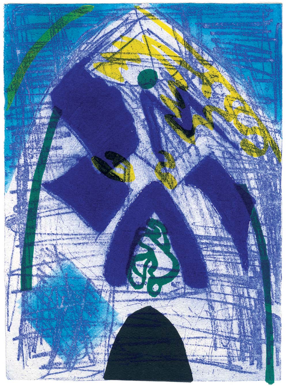
Image from Colours of Persia. The vivid colours of Isfahan are created by a mixture of soft-ground etching with aquatint, a three-coloured linocut and a turquoise surface roll.
Because of the individual nature of her images and of the bindings, Allix’s books are produced in very small editions, some in an edition of only one, and over 50 years she has produced around 1,250 copies in total of her 77 books, almost all numbered and signed. Well over one third have been acquired by university or institutional collections around the world (I have counted 100 such libraries, and undoubtedly there will be others), with the largest numbers in the United States. The largest single public collection is to be found in the Jack Ginsberg Centre for Book Arts in South Africa. The British Library has 20 of her books in their contemporary collections, and the National Gallery of Art in Washington and Library of Congress 12 each.
It was to mark the 50th anniversary of her work, that On Books: The Creative Work of Susan Allix with a Catalogue Raisonné was published by Martyn Ould’s Old School Press in November 2023.(4) It is based on around 150 hours of my interviews with Allix, and an examination of almost all her books, as well as her personal archive of sketchbooks, correspondence, trial proofs and pages. It contains an account of her life and training, her books and their aesthetic, her booksellers, collectors and collections, and ends with a detailed catalogue raisonné of all her work. It is illustrated with 65 images taken from her books, and archives.
In parallel, Susan Allix has produced a photographic catalogue of her books,(5) containing over 300 illustrations. These two books are designed to be a complementary pair but can be bought separately or together (via the Old School Press, at a small discount); and it is hoped that together they will serve to draw attention to the extraordinary nature of Susan Allix’s achievement.
The text of this article is loosely based on Simon Shorvon, On Books: the creative work of Susan Allix with a catalogue raisoneé. Old School Press, 2023.
Footnotes:
(1) Susan Allix, ‘Artist’s impressions’, Matrix 15, 1995.
(2) Susan Allix, About books. In: J Heller, The creative work of Susan Allix, A collection of 26 of her beautiful books. The work of three decades 1973-2003. Unpublished, 2008.
(3) Susan Allix, ‘Artist’s impressions’, Matrix 15, 1995.
(4) Simon Shorvon, On Books: The Creative Work of Susan Allix with a catalogue raisoneé. Old School Press, 2023.
(5) Susan Allix, A Catalogue, Fine Press Artists Books. Privately printed, 2023.